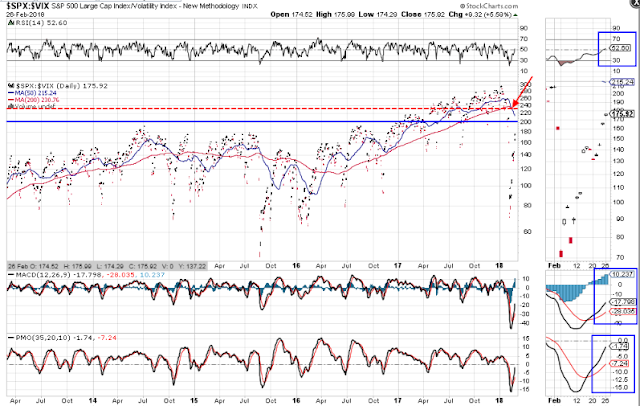
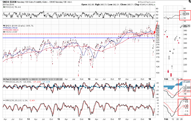
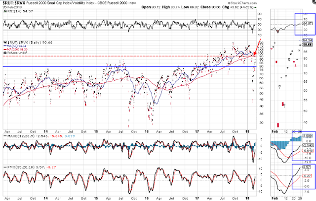
Volatility/Index Ratio Death Cross Retests
In my 2018 Market Forecast post I had identified important major support levels with respect to the Volatility/Index ratios of the S&P 500, Nasdaq 100 and Russell 2000 Indices as follows:
Since that date, these indices corrected by around 10% and their corresponding volatility ratios have produced a bearish moving average Death Cross formation on the daily timeframe, as price plunged below those major support levels.
As can be noted on the following three daily ratio charts, these support levels are represented by the blue horizontal line. The only ratio whose price is still below is the SPX:VIX ratio.
The Death Cross level is represented by the red horizontal line. The RUT:RVX ratio and the NDX:VXN ratio have come the closest to retesting this line, while the SPX:VIX ratio is still well below.
If we're to witness a resumption of an equity bull market, these ratios will need to break and hold above their Death Cross levels and create a whole new uptrend on this daily timeframe, since the last two-year uptrend has been thoroughly decimated by this correction. No doubt that will take some time, so we'll likely see more volatile swings in the SPX, NDX, and RUT in the meantime. Otherwise, failure to break above their crossovers will likely produce another leg down on rising volatility.