
Volatility Ramping Up In 2017
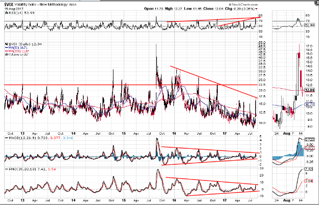
Further to my post of August 10th, the following Daily chart of the VIX shows that the same number of volatility price spikes has already occurred, so far this year, as made in all of last year.
A series of higher swing highs on the RSI, since Q4 of 2015, is hinting that each price spike made, since then, was done so with greater strength. We're seeing rising wedges form on the MACD and PMO indicators, suggesting that we may see the next price spike break out to new highs this year, with much higher force behind it, sending equity prices on the SPX plunging.
Call me cynical, but it seems to me that the escalating confrontational political rhetoric coming from the White House and Washington, of late, and the ensuing fallout playing out right before our eyes, indicates a fraying, or even an unraveling, of the current administration and its agenda...and, this is being reflected in this chart. So, as I said in the above article, buckle up!
Disclaimer: All the information contained within my posts are my opinions only and none of it may be construed as financial or trading advice... please read my full Disclaimer more


