
Volatility, Economy & The Fed - Weekly Market Outlook
What a wild week! Perhaps the wildest we've seen in years, with a 5.3% plunge over the course of the first two days of last week more than wiped away by the 6.4% rebound seen over the course of the last three. We're still in the hole by more than 5% since the pullback started two weeks ago, but given the swings we're clearly capable of making now, that gap could be closed in just a couple of days.
On the other hand, volatility is a two-way street - we could just as easily be seeing new multi-month lows two days from now.
We'll dissect the market's key indices below, as usual, but also as usual, we want to paint a bigger picture using the broad brush strokes of economic data.
Economic Data
We got a fair amount of economic news last week, but none of it as curious or compelling as Q2's second (of three) reading on GDP growth. Rather than GDP rising 2.3% last quarter as first expected, it actually grew 3.7%. It could change again with the third revision, but the number rarely changes between the 2nd and 3rd look.
GDP Growth Chart
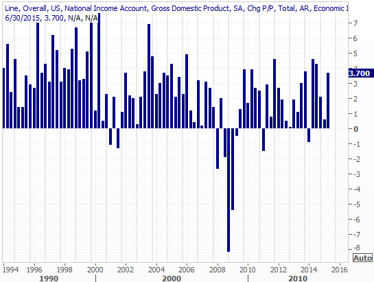
Source: Thomas Reuters
This strong figure has several implications, not the least of which is the fact that it gives the Fed a little more reason to go ahead and raise rates in September. The futures market says there was only a 28% chance of a September rate hike, although the number changes daily.
The strong GDP growth rate also begs the question, if the energy sector has been in contraction and the U.S. dollar has been such a headwind for U.S. multinationals, why was economic growth so strong? For that matter, if the economy is so strong, why is inflation still so tepid?
The answers will come in time.
The only other data of real interest from last week was an update on real estate prices. Though both figures are from June, both the Case-Shiller Index and the FHFA Housing Price Index say valued remain on the rise. The Case-Shiller Index was up 5.0% on a year-over-year basis, while the FHFA's reading rose 0.2% from May's level.
Home Prices Chart
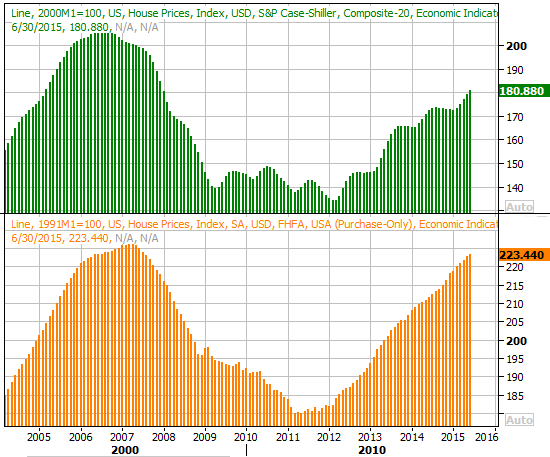
Source: Thomas Reuters
Everything else is on the following grid:
Economic Calendar
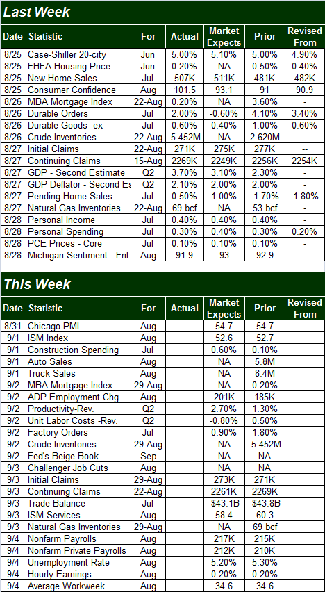
Source: Briefing.com
This week is going to be considerably busier, though the highlight for the week will clearly be Friday's unemployment report for August. Economists expect we've finally added enough (net) jobs to move the needle on the unemployment rate, from 5.3% to 5.2%. That progress would be on the heels of only 217,000 new payrolls for the month, however.
Job Growth and Unemployment Rate Chart
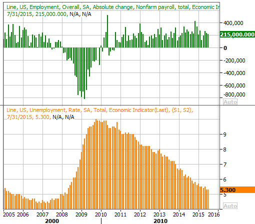
Source: Thomas Reuters
While the monthly jobs additions remain, on average, in the tepid 200,000-ish range, it's been enough to make slow (sometimes agonizingly slow) headway. At 5.2%, the unemployment rate may finally be low enough that we start to see some better economic traction... if China doesn't get in the way.
Stock Market Index Analysis
Just so there's no confusion, with the stock market now officially off the proverbial rails, nothing can be ruled out as a possibility. Traders are still in a bit of shock, and charts are in no-man's land right now with little trading context nearby with w potential rate hike hanging over our heads. For all intents and purposes, we're drifting, which means anything can happen in the very near-term.
Be that as it may, there are still several bigger-picture clues we can and should heed that will tell us what to look for once the market does finally start to test its own mettle (for better or worse).
First things first. As of Friday, the market is in a short-term uptrend in the midst of what is a bigger-picture downtrend.
As was noted above, the S&P 500 (SPX) (SPY) managed to gain 6.4% on Wednesday and Thursday, and held its ground on Friday. And, as the daily chart of the S&P 500 below shows, there's still lots of room for the S&P 500 to keep climbing before it bumps into a mess of resistance between 2043 and 2074.
S&P 500 & VIX Daily Chart
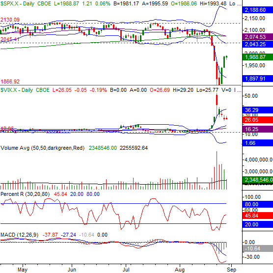
Chart created with TradeStation
The flipside is, as of Wednesday, the BigTrends TrendScore for stocks turned officially bearish -- and the market is on the wrong or bear side of other technical indicators currently.
This is as "at odds" as you might think. The plunge itself was big, and rapid, inflicting a lot of damage. It was so big and dramatic, though, that a dead-cat bounce of some sort could have been expected. Even with the relief rally, though, that bigger downtrend still hasn't been broken.
With all of that being said, the bears are in charge, and even if stocks manage to rekindle the rally early this week, it's up to the bulls to prove their case; the bears can simply step back and wait for the S&P 500 to test the resistance zone between 2043 and 2074. If the index fails to clear that resistance - and the odds say it will fail to do so - the downtrend is likely to get started again in earnest. In that event, last week's low around 1867 becomes the make-or-break level again.
The doubt that any rally will get any meaningful traction lies in a subtle nuance slightly evident on the daily chart, but clearer on the weekly chart. That is, the 50-day moving average line (purple) has finally fallen under the 200-day moving average line (green)... a so-called "death cross."
S&P 500 & VIX Weekly Chart
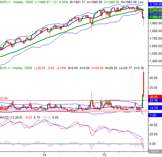
Chart created with TradeStation
We've not seen a death cross in more than four years, underscoring how dramatically game-changing the last few weeks have been.
Bottom line: What's happened in the recent past isn't nearly as telling as what's about to happen in the immediate future. The deck is still stacked against stocks, and it's going to take a ton of work - and likely a good amount of time - to redirect the downtrend.
Fed Funds Rate Predictions
In the discussion above we mentioned the possibility of the Federal Reserve raising interest rates, or more recently, the Fed deciding NOT to hike rates. To that end, a visual representation of what the market currently expects in the near-term and the long-term may help put things in perspective. The bubble plot below does this.
Based on the number of bets and strike price of the bets on future interest rates based on rate-futures themselves, the bond and bond-futures market has tacitly made a prediction about what the future holds. The bigger the bubble, the more likely it is we'll see interest rates at that level at that corresponding point in the future.
Federal Funds Rate Futures Rate-Prediction Chart
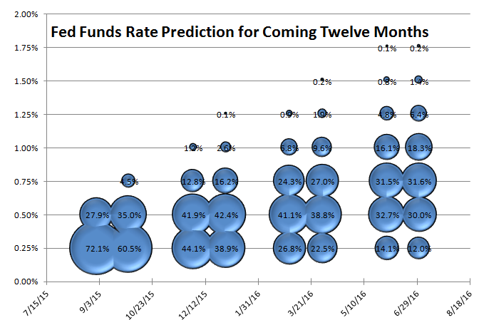
Source: CME Group
You'll see a total of eight columns, though there are only going to be four official regular opportunities for the Federal Reserve to raise rates over the course of the next twelve months. That's because the expiration of interest rate futures occur more often (eight more expirations in the next twelve months, in this case) than the Fed has to update its stance on rates, and change them if necessary.
In any case, traders don't reasonably expect to see a Fed Funds rate higher than 0.75% after June of next year, and there's only about a 50% chance of that. The market is still saying there's a good chance rates will only be at 0.5% by the middle of 2016.
Disclosure: None.


