
Valuations Aren’t The Main Catalyst Of This Bull Market
It’s obvious to most investors with any experience that they can’t justify buying an asset just based on the recent price action alone (technical analysis aside). You don’t buy based on price; you buy based on value. The price action means nothing without context. This point needs to be extended to multiples. When investors review stocks, they assign high multiples to companies expected to grow fast and low ones to firms expected to grow slowly. Every number when analyzing a firm has context. A software company is expected to have high margins because of its industry and a utility firm is expected to have a predictable earnings stream.
The key to understand is context isn’t a justification; it is an explanation. It’s ok to realize why investors expect something and then have a varying opinion. Context matters especially when you disagree with how an asset is valued because you can point to exactly where you think the market is wrong. We never know why investors are making trades because we can’t interview each one. That’s what makes context important. Anyone can look up the multiple a company trades at and analyze the expected cash flows. The important part is understanding why investors think the way they do. This part of investing takes experience with the company or asset to understand the tendencies and levers which matter.
Beware Of Anchoring Bias
Many bearish investors cite the CAPE ratio and the price to sales multiple as reasons to be negative without taking the analysis a step further to see why those metrics show those results. There is a fear of justifying high prices, but rest assured, we see the high numbers those stats show. However, no stat is right all the time. Secondly, if you act like those multiples are useful only because you just discovered them, you have an anchoring bias. Anchoring bias is when you focus too heavily on the first piece of information you see on a topic.
There are many points of analysis which project future returns based on current multiples. These types of charts are to clarify where stocks are expected to go based on the past; it’s far from a guarantee of where they are headed. Investing is much more difficult than following a metric and doing what it says. You need to get involved with the details to see why it’s priced where it is.
Why Stocks Are Up
The pie chart below breaks two popular narratives. The first is that the stock market is a bubble brought about by high valuations. The CAPE is supposed to show a multiple based on a cycle of earnings, but the multiple is now being inflated by the beginning of the expansion when earnings were low because this expansion is so long. The CAPE would match current multiples closer if a recession occurred 2 years ago and stocks fell.
The chart below uses trailing 12 month GAAP earnings to show stocks have increased mostly because of profit growth. The 24% coming from a valuation increase makes sense because stocks were cheap at the beginning of the cycle and we have more certainty that the recession, which was the worst in decades, is now over.
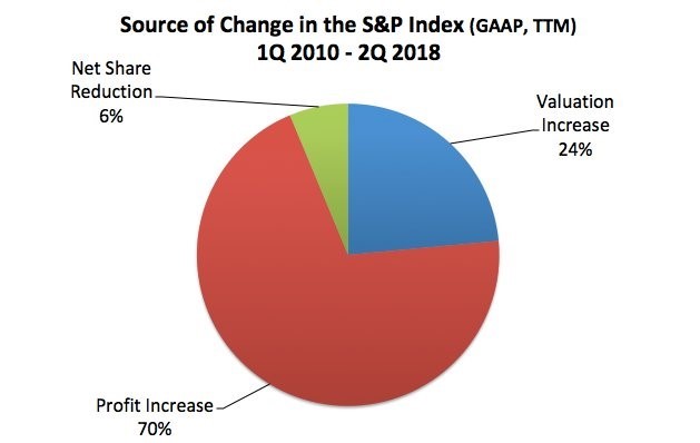
Source: The Fat Pitch
The second narrative which is corrected in this chart is that buybacks are driving stocks higher. Stocks are helped by buybacks, some more than others, but share reduction is a small part of the S&P 500’s great performance in this bull market. The extremely long bull market is killing the narrative that buybacks are for the short term because stocks have sustained the rally after buybacks increased, unlike the last cycle where stocks fell right after buybacks exploded higher.
The chart below goes into more detail on why stocks are up.
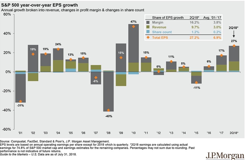
Source: JP Morgan
Margin improvements are the biggest driver of earnings growth since 2001 and have had a big impact on earnings this year, helping them by 16.2%. Growth in margins has occurred because of the advancement of software companies. Bearish investors who follow CAPE believe competition wipes away margin expansion for each sector equally, but that denies the fact that various sectors have structurally different margins. Tech stocks just happen to have high ones. On the negative side, one of the benefits tech stocks have is low regulations; that might change as they grow larger and control a larger part of the economy. Regulations could hurt margins.
Q2 Earnings Season Was Great
Now that earnings season is over for most firms, they can resume their record-breaking buybacks which can provide a modest bid under stocks. Stocks won’t need it though because firms have had amazing earnings results in Q2 which have boosted future estimates. As you can see from the top Earnings Scout chart below, earnings growth with 463 firms reporting has been spectacular as growth is 26.45%.
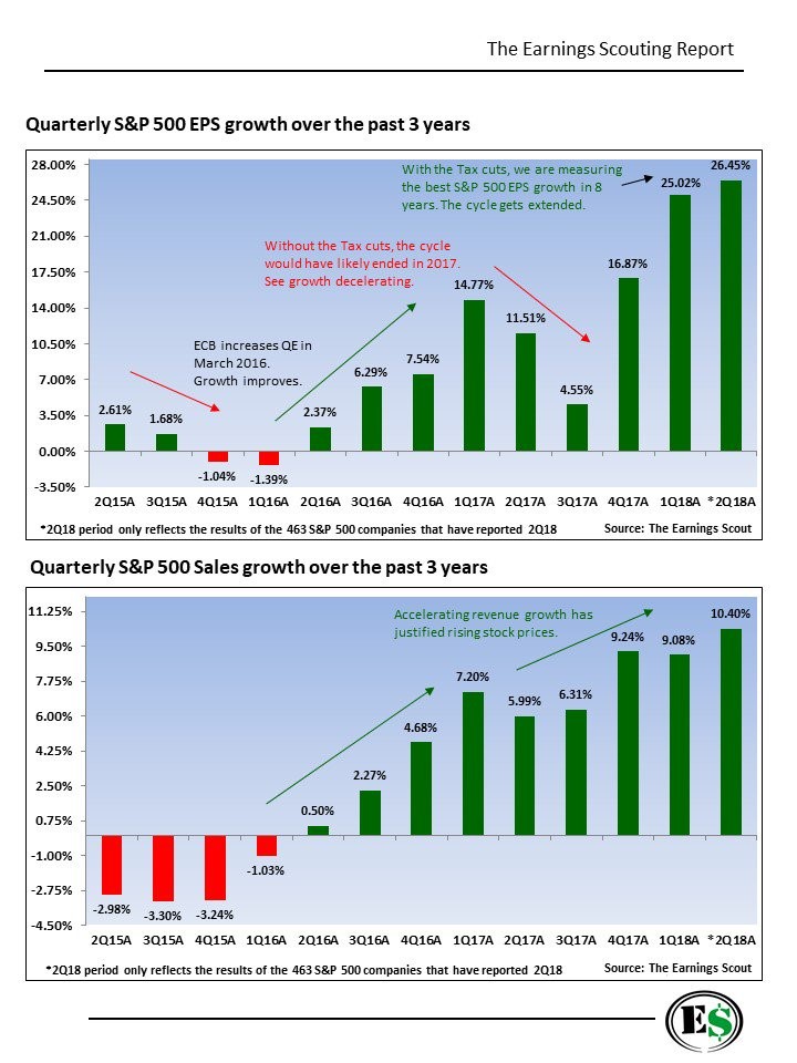
Source: The Earnings Scout
The tax cuts and increased government spending combined with the cyclical rebound which started in the 2ndhalf of 2016 to create the fastest year over year earnings growth since the post-recession period.
The second chart, which shows sales growth, is where the cyclical improvement shines because the lower tax rate doesn’t help sales. It’s common to point out that the cycle was extended by the fiscal stimulus, but let’s point out that the economy troughed in early 2016 which means it had momentum heading into 2018. The momentum is looking stronger in America than other nations because they haven’t had this big fiscal boost.
Time Is Running Out
The yield curve is showing time in the cycle is running thin as the difference between the 10 year bond yield and the 2 year bond yield is only 25 basis points. The Bloomberg chart below shows the rise of the 1 year bond yield in relation to the 10 year yield. It has accelerated along with rate hikes. The bottom chart shows the 10 year yield is only 42 more basis points than the 1 year yield which signals the expansion is getting to the late innings.
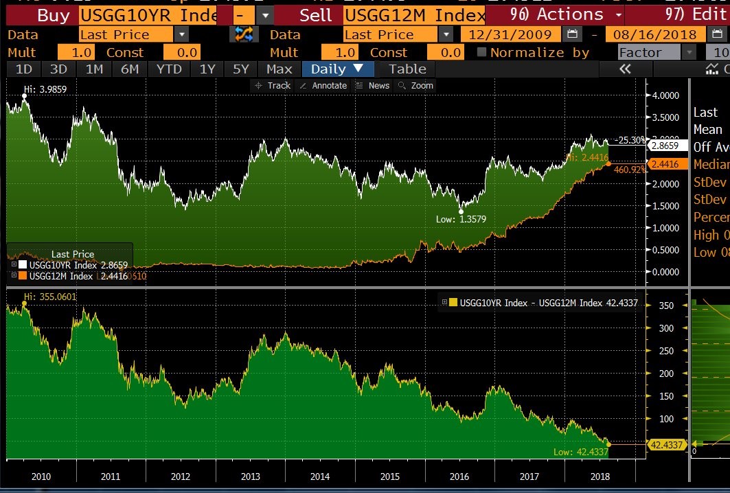
Source: Bloomberg
European Weakness
America is partially responsible for the weakness abroad as its rate hikes and the strong dollar are hurting emerging markets. The trade battles are hurting America’s trade partners more than America since U.S. GDP growth in Q2 was 4.1% and the consumer is strong, while China in particular looks weak.
The tariffs and cyclical weakness are hurting the Eurozone. Exports to non-Eurozone economies is 25% of the E.U.’s GDP. America is its largest trading partner which means the EU is feeling the pain from the tariffs. America is winning the trade skirmishes with both China and Europe. Europe is struggling as the ECRI chart below shows real export growth fell to a 5 quarter low in Q1. To be clear, this is cyclical weakness as the steel and aluminum tariffs on Europe were implemented in the second quarter. It will be interesting to see how much real export growth falls with the tariffs in place in Q2.
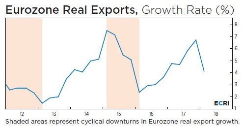
Source: ECRI
Conclusion
Valuations matter, but put them in context before blindly making a decision based on multiples without doing any research. Q2 earnings growth was magnificent and is supporting record high stock prices. The cycle is coming close to its end according to the yield curve as the 1 year yield has increased versus the 10 year yield. Europe is seeing cyclical weakness. It is vulnerable to a trade war with America as it relies on exports and America is its largest trading partner.
Disclaimer: Please familiarize yourself with our full disclaimer here.


