
The Year In Review: Even More Fantastical Pseudo Economics
To heck with facts… and the scientific method.
1. February. We don’t need no stinkin’ scientific method. From A Random Thought on the Scientific Method:
In response to this post, climate model skeptic Rick Stryker writes (in ALL CAPS no less):
JUST BECAUSE A MODEL DESCRIBES THE EXISTING DATA DOESN’T MEAN THAT IT WILL DESCRIBE DATA THAT HAS NOT BEEN OBSERVED
So far we’re in agreement; in fact I’m going to repeat this point to my econometrics class. He then continues:
You see, in science, you don’t prove the theory by showing that it describes the existing observations. You prove the theory by showing that it predicts data that haven’t been observed.
Well, gee, if this is the standard for proving or disproving hypotheses, either generally, or in econometrics, we’re not going to get very far. In this view, I won’t see our sun go nova, so might as well call it a day — science can’t proceed until we get the data! But this is the sort of nihilistic worldview that pervades the global climate change deniers.
For a more succinct critique, see below:
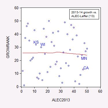
2. April. The non-informative index from ALEC and Arthur Laffer in Rich States, Poor States. From State Employment Trends: Does a Low Tax/Right-to-Work/Low Minimum Wage Regime Correlate to Growth – An Econometric Addendum:
The previous post on state employment trends sparked some debate regarding the generality of the negative correlation between the ALEC-Laffer “Economic Outlook” ranking and economic growth, as measured by the Philadelphia Fed’s coincident index. One reader argued four observations were not sufficient to make a conclusion, and I concur. Here, without further ado, is the correlation for all fifty states.
Figure 1: Ranking by annualized growth rate in log coincident index 2013M01-2014M03 versus 2013 ALEC-Laffer “Economic Outlook” ranking. Nearest neighbor nonparametric smoother line in red (window = 0.7).
Source: Philadelphia Fed, ALEC, and author’s calculations.
If a higher ALEC-Laffer ranking resulted in faster growth, then the points should line up along an upward sloping 45 degree line. This is not what I see.
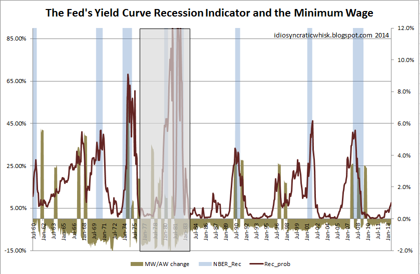
3. June. The abominable minimum wage. From More Curious Correlations:
Some argue that minimum wage hikes cause labor crises [1] or recessions [2] [3]. Is this true?
Source: Idiosyncratic Whisk.
This graph is at first glance highly persuasive. But then I realized the graph plots the minimum wage divided by the average level of compensation, so it’s tracking a ratio. Hence, average compensation (which declines during a recession) is also imparting some of the movement in the ratio. That prompted me to wonder what minimum wage increases look like in relation to recessions. Here is the relevant graph.
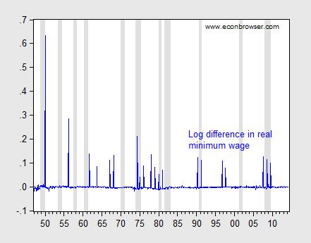
Figure 1: Log first difference of real minimum wage (blue), and NBER defined recession dates (shaded gray). Deflation uses CPI-all.
Source: BLS, NBER, and author’s calculations.
It certainly seems like plenty of recessions don’t follow increases in the minimum wage. But to test formally, I undertake some Granger causality tests (remembering that Granger causality is merely temporal precedence). Using four leads and lags, I find that I can reject the null hypothesis that recessions do not cause minimum wage changes, at the 10% significance level. On the other hand, I cannot reject the null hypothesis that minimum wage increases do not cause recessions.
What about the weaker proposition that minimum wage increases induce noticeable decreases in employment? The Employment Policies Institute (not to be confused with the Economic Policy Institute) has been a vociferous advocate of this view. [4] A recent study by Professor Joseph Sabia [5] documents negative impacts of minimum wage increases. I have repeatedly asked for Professor Sabia’s data set in order to replicate his results, to no avail. Using the Meer and West dataset, I have found little evidence of the purported negative effects (see here). However, the Meer and West dataset is freely available, and anyone with the requisite skills can replicate my results.
Update: Eight months after initial request, I still don’t have Professor Sabia’s data, but he did email me to tell me revised version will be soon published, listing data sources, etc. I still have no idea of the robustness of his results.
4. July. Only the undeserving poor get food stamps and Medicaid. From On the Characteristics of Those Covered under Some Government Programs:
“…SNAP and Medicaid. These are programs for People Who Do Not Work.”
Is this statement true?
From SNAPtoHealth:
Stigma associated with the SNAP program has led to several common misconceptions about how the program works and who receives the benefits. For instance, many Americans believe that the majority of SNAP benefits go towards people who could be working. In fact, more than half of SNAP recipients are children or the elderly. For the remaining working-age individuals, many of them are currently employed. At least forty percent of all SNAP beneficiaries live in a household with earnings. At the same time, the majority of SNAP households do not receive cash welfare benefits (around 10% receive cash welfare), with increasing numbers of SNAP beneficiaries obtaining their primary source of income from employment.
Medicaid
According to Garber/Collins (2014):
Prior to the waiver approval, working parents up to 16 percent of poverty were eligible for Medicaid…Currently, working parents under 33 percent of poverty and individuals ages 19 and 20 under 44 percent of poverty are eligible for Medicaid.
Now it is true that, as CBPP notes, many working poor do not qualify for Medicaid under the old provisions (and in states that refused to expand Medicaid):
In the typical (or median) state today, a working-poor parent loses eligibility for Medicaid when his or her income reaches only 63 percent of the poverty line (about $12,000 for a family of three in 2012). An unemployed parent must have income below 37 percent of the poverty line (about $7,100 in 2012) in the typical state in order to qualify for the program.
The irony is that Medicaid expansion would eliminate disincentives to earn income through working. As outlined here, most of the beneficiaries of a Medicaid expansion in those states that have not yet taken the offer would be working poor — between nearly 60 to 66% in Virginia, Missouri and Utah.
5. July. Still in search of hyperinflation and/or dollar collapse. From An Exchange Regarding Asset Price and Inflation Implications of Fiscal and Monetary Policies in the Wake of 2008:
This is not the most erudite debate, but it pretty much sums up matters.
(h/t Vinik/TNR)
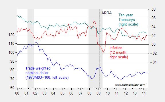
Reality check: Figure 1 below depicts the evolution of the nominal trade weighted dollar, inflation and Treasurys.
Figure 1: Nominal trade weighted value of the US dollar – broad currency basket, 1973M03=100 (blue, left scale), CPI 12 month inflation (red, right scale), and ten year constant maturity Treasury yields (teal, right scale). Inflation calculated as log differences. NBER defined recession dates shaded gray. Dashed vertical line at 2009M02, passage of American Recovery and Reinvestment Act.
Source: Federal Reserve Board for exchange rate, FRED, NBER, and author’s calculations.
By my viewing, the dollar has not collapsed. It’s about 7.6% weaker than when quantitative easing began, while inflation and the interest rate are both lower. I think it incumbent on the Santelli’s of the world to explain the intellectual underpinnings for their Weltanschauung.
6. August. Sometimes the mendacity is too transparent. From I Killed Some Brain Cells Today: Episode 2:
“Energy regulation efficiency” and economic growth.
Last time, we turned to the Phoenix Institute for some mind-numbing, soul-killing “research”. Today we look to the Pacific Research Institute for some dumbfounding “analysis”.
This particular piece of research was brought to my attention by Patrick R. Sullivan, who is fond of quoting talking points from the MacIver Institute, the National Center for Policy Analysis, Cato, in addition to the Pacific Research Institute. The study in question purports to show:
The most interesting relationship is between a state’s [energy regulation efficiency] ranking and its economic growth rate. High ranked states on average grow faster than those ranked low. Moreover, the higher rate of economic growth is associated with faster employment growth. Energy regulation can, therefore, be an important factor in determining the eventual prosperity of a state.
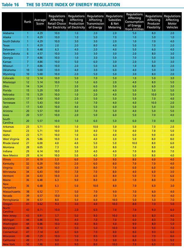
The authors painstakingly compile indices for all fifty states; the indices and aggregate index are reproduced in all their technicolor glory in Table 16 from the study.
Source: The 50 State Index of Energy Regulation.
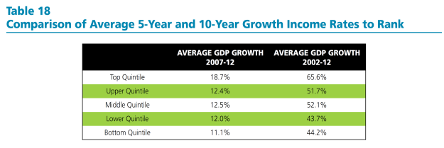
They then show the statistics for the quintiles for energy regulation efficiency ranking and growth, and note a positive correlation.
Source: The 50 State Index of Energy Regulation.
[NB: As far as I can tell, the authors have used the nominal growth rates of GDP, rather than real (which is pretty odd); the reported growth rates are not expressed in annual rates]
The document notes:
Interestingly, the strongest relationship to ranking is a state’s growth rate. High ranked states have faster growth rates than those ranked low. Table 18 below provides 5-year and 10-year growth rates by quintiles. The average growth rates for states within the quintiles follow a consistent trend. Over the 10-year period 2002-2012, states in the top quintile had on average cumulative growth rates that were more than 20 percentage points higher than those in the bottom quintile. The top quintile also had growth rates that exceeded those of middle three quintiles. The bottom quintile’s cumulative growth was lower than most of these other three.
The table and the text are notable for the omission of any discussion of statistical significance. At this point, any researcher worth his/her salt should hear the sirens going off. (The hand-waving in footnote 81 is also a tip-off, and also some cause for hilarity.)
If one estimates the regression analog to Table 18, using ordered probit, one finds that the relationship is not statistically significant at the 10% level for the ten year growth rate.
Of course, there is no particular reason to enter the dependent variable as a ranking (which requires the ordered probit estimation). One could just use the average growth rate (over ten or five years) as the dependent variable. Here are graphs of the underlying data.
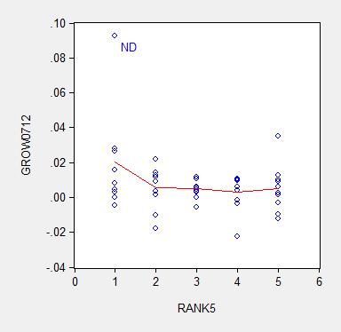
Figure 1: Average ten year growth rates 2003-13, by state, vs. Pacific Research Institute energy efficiency ranking (higher, such is 1, is “better” than lower, such as 5) (blue circles); nearest neighbor (LOESS) fit (red), window = 0.3.
Source: BEA, Pacific Research Institute, and author’s calculations.
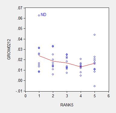
Figure 2: Average five year growth rates 2007-12, by state, vs. Pacific Research Institute energy efficiency ranking (higher, such is 1, is “better” than lower, such as 5) (blue circles); nearest neighbor (LOESS) fit (red), window = 0.3.
Source: BEA, Pacific Research Institute, and author’s calculations.
I estimate the regression:
y = α + β×rank + u
Where y is an average annual growth rate, and rank is a quintile rank. Estimation using ten year average growth rates leads to:
y = 0.025 – 0.002×rank + u
Adj.-R2 = 0.05. bold face denotes significance at 10% MSL, using heteroskedasticity robust standard errors.
Using five year average growth rates:
y = 0.018 – 0.003×rank + u
Adj.-R2 = 0.06. bold face denotes significance at 10% MSL, using heteroskedasticity robust standard errors.
Notice that dropping North Dakota (ND) further reduces statistical significance. Moreover, any borderline statistical significance is obliterated by inclusion of a dummy for states with large oil reserves (top ten). I include a dummy variable into the ten year growth rate regression, and obtain:
y = 0.018 – 0.001×rank + 0.012×oil + u
Adj.-R2 = 0.20. bold face denotes significance at 10% MSL, using heteroskedasticity robust standard errors.
Notice that the adjusted R2 increases substantially with the inclusion of the oil dummy, indicating the minimal explanatory power associated with the Pacific Research Institute index.
In order to allow people to confirm the fragility of the correlation highlighted by Pacific Research Institute, I provide the data here (raw real state GSP data here).
It is astounding to me that an organization can spend all the resources to compile these indices, and yet not do the most basic statistical analysis taught in an econometrics course. It is even more astounding that some people take these results at face value. Apparently the aphorism that there is “one born every minute” holds true.
7. September. The epitome of “don’t confuse me with facts”. From “Facts are Stupid Things”:
As Ronald Reagan once said (although he did mean to say “stubborn”)
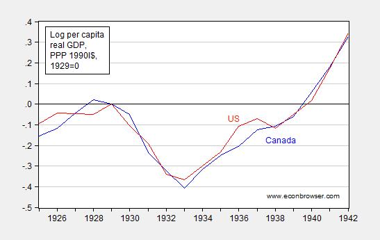
Regarding the implications of optimal currency area theory and Scottish independence, Reader Patrick Sullivan continues his reign of error, trying to argue that Canada did just fine, just like a bank crisis-free Scotland in a currency union would:
Canada didn’t have a central bank until sometime in the 1930s, and had a less severe depression than the USA.
Well, with a little help from Louis Johnston, (who knows economic history much better than I), I generate the following plot:
Figure 1: Log per capita income in 1990 International dollars for Canada (blue) and United States (red), normalized to 1929=0. Source: Maddison and author’s calculations.
I dunno, but these seem to be comparable declines in output. So, yes, no central bank operating until 1935 [1] (p.22), but no, Canada suffers a pretty big shock (Canada on a de facto gold standard until 1931 (p.21)).
It constantly amazes me how people make easily falsifiable statements with such astounding confidence…
So, I think Scotland should consider very carefully independence conjoined with monetary union with England.
By the way, Patrick R. Sullivan still refuses to concede his error, even after repeated inquiries.
8. September. From The Stupidest Paragraph in Perhaps the Stupidest Article Ever Published:
Bruce Bartlett brought my attention to this article, which Mark Thoma mused was “The Stupidest Article Ever Published”. From The Inflation Debt Scam, by Paul Craig Roberts, Dave Kranzler and John Williams:
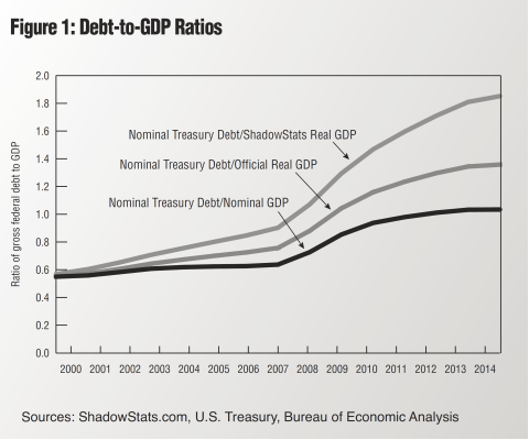
To understand how risky the rise of debt is, nominal debt must be compared to real GDP. Spin masters might dismiss this computation as comparing apples to oranges, but such a charge constitutes denial that the ratio of nominal debt to nominal GDP understates the wealth dilution caused by the government’s ability to issue and repay debt in nominal dollars. …
I’m not a spin master, and yet I cannot help but dismiss this calculation as exactly comparing apples to oranges.
Nominal debt divided by nominal GDP is expressed in years — essentially years worth of GDP necessary to pay off the debt. I can understand what this calculation yields. In contrast, nominal debt is in $, real GDP is in Ch.2009$/year, so nominal debt divided by real GDP is a number expressed in years times dollars per Ch.2009$.
The authors present this figure to buttress their case:
Source: Roberts, Kranzler and Williams, “The Inflation Debt Scam,” The International Economy (Summer 2014).
As far as I can tell, the article is merely an excuse for Williams to haul out the fully discredited “Shadowstats” one more time.
By the way, according to Shadowstats, the US economy has been shrinking nonstop since 2004-05, on a year-on-year basis…
So, if this is not the stupidest article ever, it is in the running (along with Don Luskin’s 2008 gem).
9. September. Assume a Can Opener – Wisconsin Variant:
The MacIver Institute, an organization of endlessly imaginative analysis, has highlighted this LFB memo that reports that under the right conditions, the structural budget balance will be +$535 for the 2015-17 biennium.
Those assumptions include a $116 million cut to this FY’s appropriations, revenues in the 2015-17 biennium would rise (annually) at the rate it has during the previous five fiscal years, 2.9%, and net appropriations in each of the years during the biennium would stay at FY2014-15 levels, “adjusted for one time commitments and 2015-17 commitments.”
I am not an expert in the intricacies of budgeting (here’s a start), and the evolution of Wisconsin tax revenues. However, what I can see in graph for Wisconsin here, for the period 2008-12, suggests to me that 2.9% figure is highly sensitive to sample period (gee, wonder why they picked that particular five year period?). If I use the data at the Governing website, I get a little less than 0.5% growth per annum.
In addition, the zero spending growth assumption is highly unrealistic. As Jon Peacock at the Wisconsin Budget Project wrote:
Some people who derided structural deficits in the past are now arguing that this isn’t a big deal because the state can grow its way out of this problem. That’s true in a sense, but also very misleading. Assuming tax collections increase as expected to about $14.4 billion in the current fiscal year, growth of 4% per year in 2015-17 would close the budget hole if total spending is frozen. But keep in mind that the spending needed for a status quo or “cost to continue” budget typically increases almost as fast as revenue – because of inflation and population growth. Thus, freezing spending in 2015-17 at the current level would not be a painless exercise; it would require significant cuts in areas like Medicaid, K-12 and higher education, and the corrections system budget.
It’s also important to keep in mind that the current structural deficit calculations focus only on the General Fund and assume that in 2015-17 the state will stop transferring dollars from the General Fund to the Transportation Fund. In light of the problems in state and federal financing for transportation, there will be significant pressure to continue to make those transfers.
In other words, the LFB tabulated at the direction of State Representative John Nygren what would happen if one let revenues move, but not spending. Mechanically, it must be that the balance looks better — no mystery there. It’s a well known trick, used earlier on a national stage; for more on the national version of the can opener assumption, see these posts on Ryan plan (I) and Ryan plan (II). For more on MacIver Institute analyses, see this post.
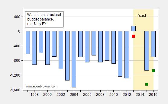
So, for me, a more honest appraisal of the situation is presented in Figure 1 below.
Figure 1: (Negative of) General Fund Amounts Necessary to Balance Budget, by Fiscal Year, in millions of dollars (blue bars); and estimate taking into account shortfall of $281 million for FY2013-14 (red square), and adding $380 million to each of the fiscal years in the 2015-17 biennium (green squares). “Structural” denotes ongoing budget balance, assuming no revenue/outlay change associated with economic growth.
Source: Legislative Fiscal Bureau (September 8, 2014), Wisconsin Budget Project, “Wisconsin needs $760 million more for Medicaid,” Channel 3000 and author’s calculations.
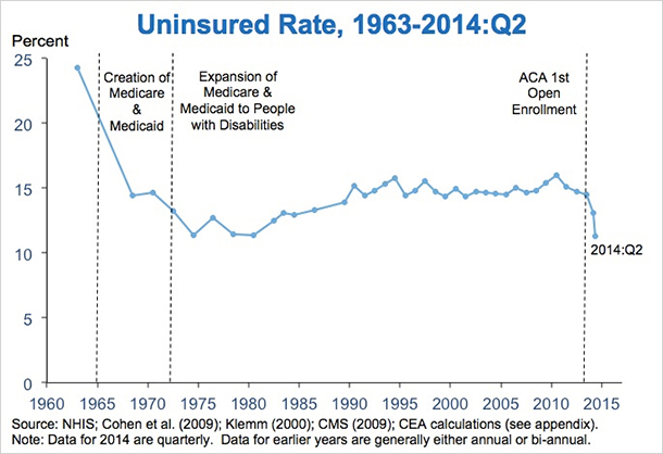
10. September. Where are all the folks predicting the apocalypse associated with the ACA? From From October 2013: “The Obamacare implosion is worse than you think”:
That’s a title from an oped by former GW Bush speechwriter and current AEI scholar Marc Thiessen nearly a year ago. We can now evaluate whether in fact the implementation of individual insurance mandate component of the ACA did implode. From “New Data Show Early Progress in Expanding Coverage, with More Gains to Come,” White House blog today:
From the post:
…today’s results from the NCHS’ National Health Interview Survey (NHIS) show that the share of Americans without health insurance averaged 13.1 percent over the first quarter of 2014, down from an average of 14.4 percent during 2013, a reduction corresponding to approximately 4 million people. The 13.1 percent uninsurance rate recorded for the first quarter of 2014 is lower than any annual uninsurance rate recorded by the NHIS since it began using its current design in 1997.
As striking as this reduction is, it dramatically understates the actual gains in insurance coverage so far in 2014. The interviews reflected in today’s results were spread evenly over January, February, and March 2014. As a result, the vast majority of the survey interviews occurred before the surge in Marketplace plan selections that occurred in March; 3.8 million people selected a Marketplace plan after March 1,with many in the last week before the end of open enrollment on March 31. Similarly, these results only partially capture the steady increase in Medicaid enrollment during the first quarter.
For this reason, private surveys from the Urban Institute, Gallup/Healthways, and the Commonwealth Fund in which interviews occurred entirely after the end of open enrollment have consistently shown much larger gains in insurance coverage. An analysis published last month in the New England Journal of Medicine based on the Gallup/Healthways data estimated that coverage gains reached 10.3 million by the middle of 2014.
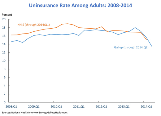
Update: second enrollment round seems to have progressed smoothly, and the uninsured rate has declined substantially. See Furman/CEA:
Source: Furman/CEA
11. October. Wisconsin Department of Workforce Development Determines $7.25/hour Is a Living Wage.
12. November. Did Republicans really think about putting Heritage’s Bill Beach at the head of CBO? From What have the nonpartisan research agencies ever done for us?:
(For the youth of today, here is the reference.)
I see Americans for Tax Reform is against reappointment of Doug Elmendorf as CBO head. It is a remarkable document, insofar as it is so full of factual errors that the head spins.Montgomery at WaPo provides a point-by-point rebuttal of each of Grover Norquist’s assertions. Here’s a debunking of one of the most hysterical assertions:
…the agency promotes a “Failed Keynesian Economic Analysis,” Norquist says, that asserts that “higher taxes are good for the economy, even to the point of implying that growth is maximized when tax rates are 100 percent.”
Did the CBO really say that a 100 percent tax rate would be good for the economy? As evidence, Norquist points to a 2010 post by the Cato Institute’s Dan Mitchell, titled “Congressional Budget Office Says We Can Maximize Long-Run Economic Output with 100 Percent Tax Rates.”
“I hope the title of this post is an exaggeration,” Mitchell writes, “but it’s certainly a logical conclusion based on” CBO’s claim that paying down the national debt — regardless of whether it’s through higher taxes or lower government spending — would be a good thing for the economy.
In other words, Norquist can’t be bothered to critique an actual CBO document — he relies on a paranoid fantasy of a CBO analysis.
My guess is that Mr. Norquist would want all tax provisions dynamically scored. I discuss an instance of CBO dynamic scoring of President Bush’s budget in this post. In that instance, dynamic scoring did not result in large differences. However, if dynamic scoring were to be applied to tax provisions, then I would say at a minimum, spending provisions should be also scored. Auerbach cites one criticism of only dynamically scoring revenues thus:
Dynamic effects of revenue legislation would come not only through supply-side incentive effects, but also
through budgetary effects. For example, tax cuts that encourage economic activity could still have negative
macroeconomic effects through the crowding out of capital formation. Thus, all revenue provisions, not just
those with significant incentive effects, would need to be evaluated. The same argument applies to changes on the expenditure side.
My additional guesses are that (1) Mr. Norquist would not be amenable to scoring spending provisions such as investment in infrastructure, education, R&D in renewable energy, etc., and (2) would welcome dynamic scoring à la the Heritage Foundation’s Center for Data Analysis. See examples of their approach [1], [2], and [3]. For a discussion of the challenges in implementing dynamic scoring correctly (i.e., not in the Heritage Foundation CDA style), see here.
13. Bonus. Pedant Watch. Get ready to type “estimated” before any economic variable. From Known Unknowns in Macro
Reader Tom argues that economic discourse should not include discussion of variables that are unobservable, to wit (or at least indicate that it’s an estimate):
You announce somebody’s estimations of a theoretical, unobservable phenomenon as “the output gap” or “the actual output gap” as if you and they actually know them to be the output gap.
If we used this criterion, what variables would be ruled out from polite conversation? A lot…let’s just take the real interest rate.
What is the real interest rate; conceptually (remember, this is a made-up concept), it is:
rt = it – πet+1
where it is the nominal interest rate at time t, and πt+1 is the inflation rate between time t and t+1, and the “e” superscript denotes the market’s expectation.
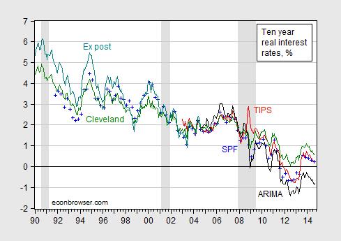
Since the market’s expectation is unobservable, then the real interest rate is in some sense not “knowable”. This is demonstrated in Figure 1.
Figure 1: Real ten year interest rate measured as constant maturity ten year nominal interest rate minus median survey response from Survey of Professional Forecasters (blue +), minus Cleveland Fed expected inflation (green), minus ARIMA predicted ten year inflation (black), minus ex post inflation (teal), and from TIPS (red). ARIMA(1,1,1) estimated over 1967M01-2014M09 period. NBER defined recession dates shaded gray.
Source: Federal Reserve Board via FRED, Philadelphia Fed, Cleveland Fed, BLS, NBER, and author’s calculations.
In point of fact, in modern macroeconomics where expectations of the future are central, the most important variables are often not observable. So when one hears a criticism like that leveled by Tom, realize that taking such a criticism to its logical conclusion means that almost no macroeconomic discussion can proceed. Everything will have to have appended to it the adjective “estimated”.
Now, to blow your mind, think about a stock price “fair value”. A stock price should equal the present discounted value of the expected stream of dividends. Once one allows that this equality might not hold exactly (I think Summers, J.Finance (1986)), then “fair value” might be construed as a “counterfactual”, in Tom’s lexicon.
Here is the edited version of the offending article, see here, where I have inserted “estimated” to placate Tom. Not sure my high school English teacher would approve, but it sure is clear for those who can’t make inferences. See also the discussion of estimated PPP
Looking forward to the New Year, the Nation can be like Kansas, if dynamic scoring by diktat comes to pass at CBO and JCT.
Best Wishes to all for 2015!
Disclosure: None.


