
The Best Trump Trade Wasn't Made In America
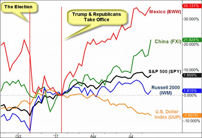
Sometime a picture says it all. This week’s Market Outlook commentary is simply the observation you choose to find in this chart. All politics aside (although they are likely the driving force behind these trends).
The chart illustrates the percent change trends of key markets since President Trump’s inauguration.In an effort to avoid misrepresenting the longer time frame which should include election day, that time frame is also included so you can see how the assets traded after the election.
As you’ll read below, this week’s video is filled with some interesting market development from what may have appeared to be an uneventful week.
If you’d like to read my commentary on last week’s price action you can find it in Mish’s Daily.
This week's video starts with the key price levels that are likely to make or break the US stocks, but then veers off into trading ideas that include:
- The county that looks like it may go parabolic,
- A commodity infamous for huge rallies (back in the day) that looks to have double bottomed
- A leading sector to trust if it breaks higher
- A leading sector to trade with caution
- A beat up sector that may have just turned up
- The consumer focused sector that is set up to collapse if the market doesn’t save it soon and more.
Video length: 00:28:42
If you'd like more information about
the additional free trading education mentioned in the video ...
more

