
Technical Picture Worse Than It Seems – Weekly Market Outlook
The bulls pushed back after last Monday's meltdown, but it just wasn't enough to undo the damage… at least not yet. The market did manage to work its way back above a relatively important line in the sand, until the Greek vote results came out. The bad news is, we're closer to a re-entry into a decided downtrend than we are to a rekindling of the rally.
We'll look at where we are in relation to the line in the sand below, after a quick run-down of all of last week's economic news.
Economic Data
We had plenty of economic data to work our way through last week, but none of it was as critical as June's unemployment data from Thursday. The unemployment rate fell from 5.5% to 5.3%, though only 223,000 new payrolls were created. Economists were expecting 230,000 new jobs for June.
Although it was progress, the bulk of the reason the unemployment rate fell as much as it did was the contraction in the size of the total labor pool. Nevertheless, we continue to see improvement, with job openings reaching multi-year high levels last month.
Payroll Growth and Unemployment Rate Chart
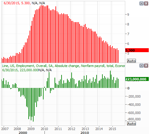
Source: Thomas Reuters
The only other truly noteworthy data from last week was the Conference Board's consumer confidence measure. It ticked higher from a 94.6 to 101.4. That's not a multi-year high, but it does rekindle a broad uptrend.
Consumer Sentiment Chart
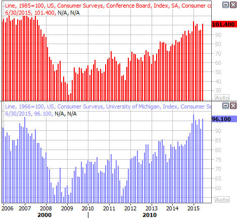
Source: Thomas Reuters
Everything else is on the following grid:
Economic Calendar
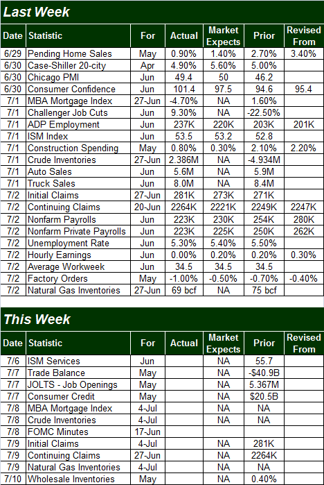
Source: Briefing.com
Other than news coming out of Greece, the coming week is going to be much lighter in terms of economic numbers. In fact, the only items of interest are Monday's ISM Services Index update and Wednesday's release of the minutes from the most recent Federal Reserve meeting. Although no change in interest rates is in the cards, the recorded discussion itself will offer insight as to what the Fed's members are thinking.
Stock Market Index Analysis
Just to set the stage, while things may not be terrifying just yet, things are worse than they seem at first glance. You just have to look at the indicators rather than the market's indices to see it.
The good/bullish news is, the market bounced right back after last Monday's meltdown, with the S&P 500 (SPX) (SPY) moving back above the critical floor at 2072 (which up until that point had propped the market up since April). The CBOE Volatility Index (VIX) (VXX) also still seems to be pulling back, with room to keep falling.
The bad/bearish news is, the MACD lines are not only showing a bearish divergence, but both MACD lines are below the key zero line. You can also see the S&P 500's 20-day moving average line (blue) is putting some distance between itself and the 50-day moving average line (purple) after the crossunder two weeks ago.
S&P 500 & VIX Daily Chart
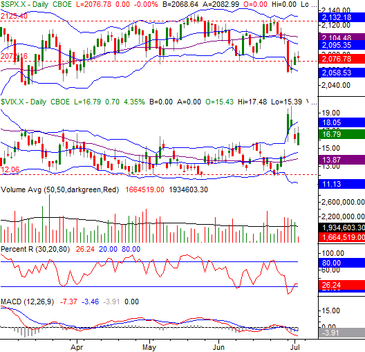
Chart created with TradeStation
Something to look for as a key confirmation of a continued downtrend in the SPX: the next time we see the Percent R line break under the 20 level on the same day the S&P 500 makes a lower low. Think of it as the market squandering its last chance for a rebound. This is a technique/signal we've used for some time in some of our trade recommendation services, usually with excellent results.
For what's it worth, the BigTrends Trendscore on stocks stood on Thursday's close at a neutral reading of 45.3 (although it may be a bearish reading below 30 by this Monday's close). Keep an eye on the Daily TrendWatch for changes to the TrendScore, not just for equities but also gold, oil, and the dollar.
Looking at the weekly chart of the S&P 500 doesn't change the reality that the market is teetering dangerously close to the point of no return. It does give us some more perspective on why it's happening, and which levels we need to watch from here.
First and foremost, although it's not been a decisive breakdown yet, the 26-week moving average line (currently at 2084) is clearly struggling with the pressure it's been getting as a support level since April. Last week's close at 2076.78 was a good poke, however, and a weekly close below 2076.78 at any point in time from here is likely going to trigger a more serious correction.
S&P 500 & VIX Weekly Chart
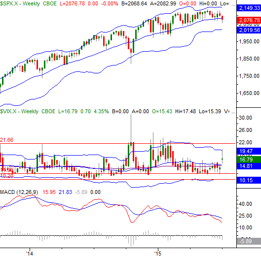
Chart created with TradeStation
Of course, even a stumble for the S&P 500 wouldn't necessarily have to mean a major meltdown. The lower 26-week Bollinger band – currently at 2019.56 – has been support before and will likely be support again. There's no reason to assume the worst until the bears carry the market below that floor, wherever it is at the time it's tested.
The NASDAQ Composite (COMP) has several key levels to watch too.
The big one is 4956, which is where the composite bottom last Monday and where the lower 20-day Bollinger band is now. You don't have to look too far back in time to recognize the lower band line has been responsible for every bounce since March. If it fails to spur another one if tested again, it could be a sign of a bigger bearish thrust.
NASDAQ Composite & VXN Daily Chart
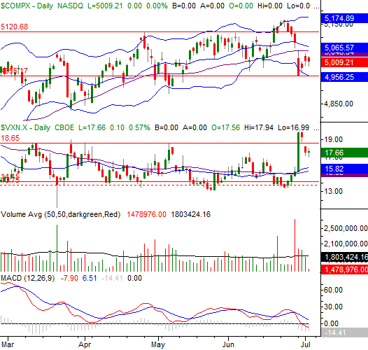
Chart created with TradeStation
Of course, the discussion of any downside could still be rendered moot without a miracle. All it would take is a move above 5065 from the NASDAQ and a move above 2104 from the S&P 500, and the bulls are right back in charge. And in this volatile environment, with earnings season coming up and Greece still hanging in the balance, nothing can be ruled out.
Gold, U.S. Dollar Nearing Boundaries
We mentioned above the BigTrends Trendscore for Gold (GLD) was bearish, while Dollar (UUP) readings were stronger. A closer look is merited.
First and foremost, the opposing scores should come as no surprise since gold is priced in U.S. dollars and generally moves in the opposite direction because of it. More important right now, though, is the fact that their respective trends are heating up again, with both approaching key levels that could really open the floodgates.
For gold, a move below the recent floor of $1142 per ounce would put the commodity at new multi-year lows, which may wall spark a big wave of panic selling. For the dollar, if it gets squeezed out of a wedge pattern, that will be a rather big red flag. If it breaks above May's peak near 97.55 though, that could be a clue that it's going to move on to even higher highs. And if that happens to the dollar, odds are very good gold will find its way below $1142. If either (or both) happen, look for a ripple effect to adversely impact the stock market not too soon afterwards.
Gold and U.S. Dollar Charts
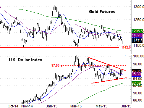
Chart created with TradeStation
Trade Well,
Price Headley
Disclosure: None.


