
Reviewing Last Week’s Stock Market Decline In Historical Context
How bad was last week’s rout in US equities? The slide is the biggest weekly drop for the S&P 500 Index in over two years. But that’s not saying much, given how calm the upside bias for the equity trend has been lately. Perhaps the bigger surprise is that we’ve gone so long without a meaningful setback. But don’t be too quick to dismiss the latest fall from grace as insignificant. A deeper review of the numbers reveals that the S&P’s 3.9% slump over the five trading days through Feb. 2 marks one of the deepest on record for the past six decades-plus.
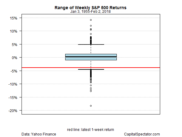
Ranking weekly percentage changes for the S&P since 1955 puts last week’s tumble at roughly the third percentile. In other words, about 97% of the weekly returns since Eisenhower was in the White House have been higher.
For visual context, here’s how the latest weekly plunge (red line) stacks up in a boxplot. As you can see, last week’s drop is well below the core of performance results, shown by the blue box — the 25th-to-75th percentile range, or interquartile range.
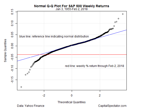
For another perspective, the next chart uses a so-called Q-Q plot to compare the S&P’s actual weekly returns (y axis) against the theoretical quantiles for weekly performances (x axis). The red line marks the latest weekly return, which is approaching the deepest part of the left tail for historical results. The blue line, by the way, shows how the returns would line up if performance perfectly matched a normal distribution, which obviously isn’t the case here, as shown by the deviations of weekly returns in history (black circles) relative to the blue line at the extremes.
The last chart shows the S&P 500’s drawdown history. In the wake of last week’s slide, the market’s drawdown is now 3.9%, which is quite mild as peak-to-trough declines go over the last six decades.

The question is whether last week’s setback is a sign of things to come? No one knows at this point, but a key positive factor to consider is the upbeat trend for the economy. Using the latest set of numbers for a range of indicators still points to an expansion that’s set to roll on for the near term. The market weakness could be an early sign that the macro trend is at risk of deteriorating, but it’s premature to say so with any confidence at this stage.
Granted, hard economic data arrives with a lag and so it’s unclear if the market’s forward-looking radar is telling us something that’s not currently showing up in the macro profile. Perhaps, although Mr. Market’s been known to issue false signals about the economic outlook. In late-2015 and early 2016, for example, the US equity market appeared to be pricing in a high probability of a new recession. As it turned out, it was noise in terms of the macro trend, which never slipped over to the dark side. Accordingly, it’s far too early to see last week’s trading action as a persuasive sign of genuine business-cycle risk.
Nonetheless, the incoming economic data deserves careful monitoring and analysis in the days and weeks ahead for deciding if the market’s stumble is noise (or just a garden-variety correction after a sharp run-up) vs. a clue that the positive macro trend that’s been (mostly) humming since mid-2009 has finally run out of gas. Based on what we now today, however, it’s reasonable to argue that the correction theory is convincing–until or if the macro profile begins to indicate otherwise.
Disclosure: None.


