
Optimism Doesn’t Match Economic Growth
In this article, we will be showing various data points from different perspectives. We like to give you all the information to make the best possible decisions. The goal isn’t to push any narrative, political agenda, nor market perspective. The value provided is helping you understand the details behind various economic reports and indicators. The explanations give you an understanding of why you can’t blindly follow any indicator. There are always reasons behind changes in the data. You need to understand the whole picture when reviewing economic reports or you will come to the wrong conclusions. It’s super easy to display a few charts which fit a narrative, but it’s difficult to explain where these charts can be wrong. Charts and indicators show the past, but past is not the future.
Biased Small Businesses
The NFIB small business survey indicates small businesses are the most optimistic in the 45-year history of the survey. The economy was relatively strong in the first half of 2018, but it wasn’t the best in 45 years, so there’s a disconnect between the optimism of small businesses and reality. Small businesses drive economic growth; it’s tough to get data on them because they don’t report earnings because they are private entities. Just because the NFIB survey is a relatively rare piece of information on small businesses, doesn’t mean we should blindly follow it.
(Click on image to enlarge)
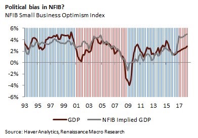
Source: Renaissance Macro Research
The optimism in 2018 doesn’t match economic growth. The chart above proves this as the NFIB implied GDP growth rate is way higher than the actual GDP growth rate. This is one of the biggest gaps in the past 25 years. The blue background shading shows when there were Democratic Presidents and the red bars show when Republicans were President. As you can see, small businesses are more optimistic when a Republican is President. Whenever any data point makes a 45-year record or something of similar proportions there needs to be a confluence of factors to make it happen. Small businesses love the growth rebound, the tax cuts, the regulatory reform, and they are politically biased to favor Republicans.
Americans Are Optimistic
Sentiment polls can show various sides of the economy and market. In a previous article, we discussed a University of Michigan poll which showed buying conditions for houses were the worst since 2008. Now we have the opposite side of the coin.
The chart below shows the percentage of Americans who think now is a good time to buy a house because “times are good/prosperity”.
(Click on image to enlarge)
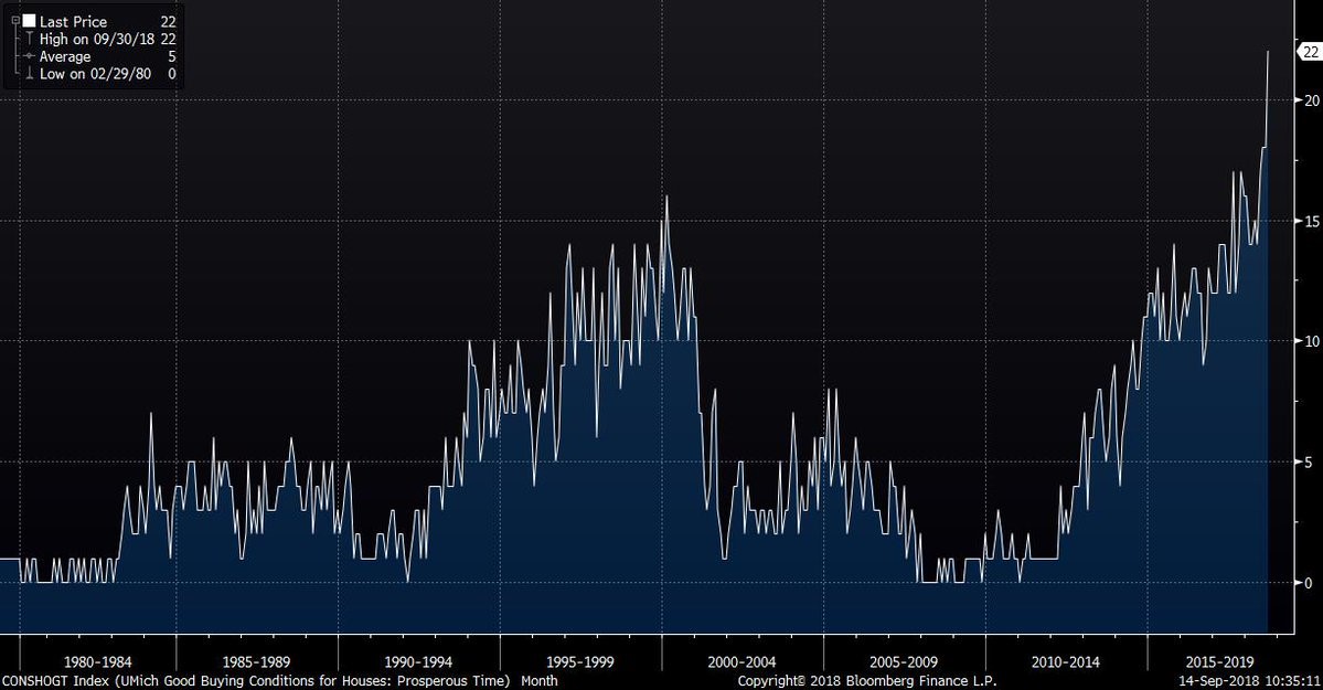
Source: Bloomberg
The stat is at 22 which is much higher than the peak at 16 in 2000. The average is only 5. It’s interesting to see how the stat didn’t get that high during the peak of the housing bubble as Americans weren’t necessarily euphoric about the economy even though they were euphoric about house prices. In conclusion, buying conditions are poor because prices aren’t affordable, but it’s a good time to buy a house because the economy is strong. You would think if the economy was very strong, people would be able to afford expensive housing.
There is a low bar to reach euphoria about the economy since median real household incomes only hit a record in 2016, and surpassed that record in 2017. They were up 2.2% from the 1999 peak. Much of the euphoria is probably about the stock market and the stability of the jobs market. The job market is so stable that the quit rate hit 2.4%. That’s the highest level since January 2001 when it peaked at 2.6%. The data started being calculated in December 2000, so the current level is the second highest in recorded history.
Are Consumer Pessimistic Or Optimistic?
It’s amazing how the same results can tell such a variety of stories depending on how you look at the data. Even though consumers are very optimistic about the economy and the housing market, Deutsche Bank contends that they are too conservative because they are scarred from the housing market bust 10 years ago. The chart on the left shows there is an inverse correlation between the household wealth to income ratio and the savings rate. The correlation from 1980 to 2007 was -0.89.
(Click on image to enlarge)

Source: Deutsche Bank
The chart on the right shows how the savings rate is far away from where it should be based on this historical pre-2007 correlation. Clearly, consumers don’t have to save less when financial assets increase since they have a decent savings rate this cycle. According to the prior correlation, the savings rate should be near 1%. It’s possible this historical correlation has been broken since the savings rate is close to zero while the household savings rate is above 6%. This chart implies the savings rate could go negative if household wealth continues growing, but that’s probably an unrealistic assumption.
Retail Sales Good Or Bad?
Retail sales results missed across the board on a month over month basis as the headline and the control group had a growth of 0.1% which both missed estimates for 0.4% growth. Retail sales growth without autos were 0.3% which missed estimates for 0.5% and retail sales without autos and gas growth was 0.2% which missed estimates for 0.4%. To be clear, some parts of the report were weak such as autos which saw sales fall 0.8% after 0.1% declines in the prior two months.
However, this report wasn’t weak because the month over month comparisons became tougher with the latest revision. Overall sales growth was revised from 0.5% growth to 0.7% growth. Both excluding autos and excluding autos and gas saw growth go from 0.6% to 0.9%. The control group increased from 0.5% to 0.8%. The chart below shows year over year retail sales growth only fell from 6.7% to 6.6%.
Source: Econoday
The part of the report with the biggest divergence between monthly and yearly sales growth was restaurants which had a 0.2% monthly sales gain and a 10.1% yearly sales gain.
Are Stocks Cheap?
The chart below shows stocks are expensive based on a variety of metrics such as forward P/E which is in the 89th percentile for median stocks.
(Click on image to enlarge)
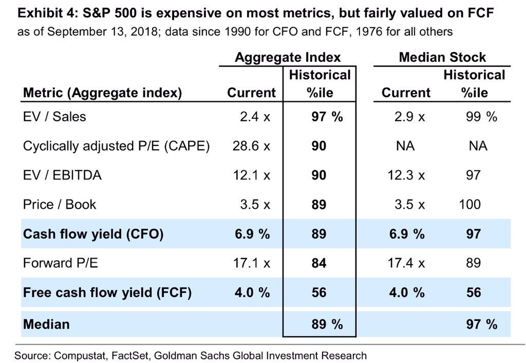
Source: Goldman Sachs
The exception is the free cash flow yield which is in the 56th percentile which means it is normal. You can debate the merits of both metrics since some say tech stocks should be valued based on free cash flow, thereby, using that argument, the market isn’t expensive since it is now tech-heavy. However, those debating this are missing the chart misdemeanor that is the fact that the FCF metrics use data since 1990 and the others use data since 1976. Stocks were very cheap from 1976 to 1990, so the metrics including that old data are going to make the current market look more expensive than the metrics without this data.
Conclusion
We provided arguments for various theses which aren’t often discussed. We like to get away from surface level discussions and dive deep into the data to see new ideas and concepts. The goal isn’t to promote a bullish or bearish narrative; it’s to show you aspects you didn’t realize based on reading reports from most business news outlets.
Disclaimer: Please familiarize yourself with our full disclaimer here.


