
One Chart Will Not Predict The Next Recession
I had the fortune to read an article yesterday, Uh-oh: Unemployment Falls Below 4%, that noted,
"On each occasion that the unemployment rate sank beneath 4%… recession was soon on tap. To remind, it now rests at 3.8%. But why should recession rapidly follow peak employment?"
The article included the below chart and provided several reasons that would seem to justify the fact a recession is near when the unemployment rate is below 4%. Often times these scary or miracle charts are highlighted in an attempt to scare investors out of the market.
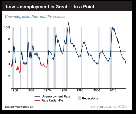
How 'near' to the start of the next recession was the unanswered question. The 1969-1970 recession was cited in the article which closed out the economic expansion that began in early 1961. During this expansion, the unemployment rate fell below 4% in February 1966 and the expansion ran another 3+ years before the onset of the 1969-1970 recession.
It is unlikely that one variable will provide an investor with the exact insight into the next economic recession. One variable I have highlighted recently is the yield curve. If the longer term Treasury yield (in this case the 10-year Treasury yield), falls below the shorter-term Treasury yield (the 2 year Treasury yield,) we say the yield curve has inverted. Every recession since 1950 has been preceded by an inverted yield curve. Below is a chart of the yield curve (maroon line) along with the unemployment rate.
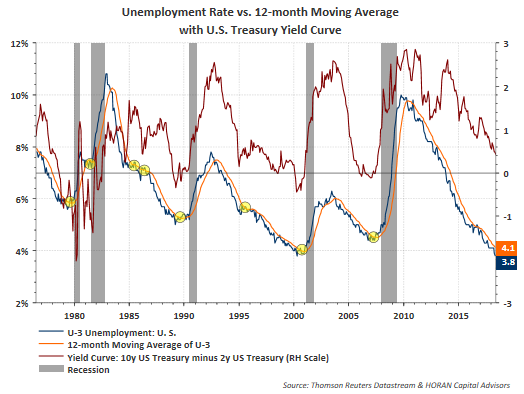
Also included in the chart is the 12-month moving average of the unemployment rate. More importantly, from a recession prediction standpoint, when the unemployment rate crosses the 12-month moving average of the unemployment rate from below, this acts as a better potential recession predictor versus the unemployment rate itself. Evaluating the unemployment rate along with the yield curve also adds higher recession predictability too. The yield curve is certainly flattening, but it has yet to invert and we do not believe an inversion occurs near term. I discussed the strong equity market returns that tend to occur around yield curve flattening periods in an earlier article, Potential For A Stronger Second Half In Stocks.
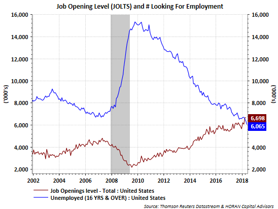
If it were only as easy as one chart providing one the ability to predict a recession, a lot of economists might be out of a job. Certainly, the current expansion looks to be going into the record books in terms of length and there are a number of other factors that warrant heightened attention, but the unemployment chart alone is highly unlikely to provide an investor with the Holy Grail to recession predictability. The trend in the unemployment rate may actually continue lower in light of yesterday's JOLT Survey. For the second straight month, more jobs are available than those unemployed and actively looking for work.
Disclosure: None.


