
New Dow Theory Signal - What Does It Mean For Stocks?
Critics of technical analysis often mistakenly believe that using charts discounts the importance of fundamental data, such as earnings, employment, and economic growth. Charts allow investors to monitor the aggregate investor interpretation of all the fundamental data. Said another way, charts are efficient tools allowing us to monitor vast amounts of fundamental data, which is important since fundamentals ultimately determine the market’s long-term fate. When the economy is healthy, stocks tend to beat bonds. When economic fear dominates, bonds tend to beat stocks. In this article, we will cover the latest signal from the markets that came on July 3.
Dow Theory Is Based On Economic Common Sense
Dow Theory is based on a series of Wall Street Journal articles written by Charles Dow. The basic tenets of Dow Theory are easy to understand. Charles Dow believed that:
- In order for industrial companies to increase their earnings, they had to produce and sell more goods.
- If industrial companies are selling more goods, then transportation companies must be delivering more goods to retailers and wholesalers.
- Therefore, in a healthy economy, both industrial companies and transportation companies should be experiencing revenue growth.
- If industrial and transportation companies are growing their revenues, then the industrial and transportation stocks should be attractive to investors.
- If industrial and transportation companies are doing well and are attractive to investors, both the Dow Jones Industrial Average and the Dow Jones Transportation Average should be making new highs, serving to confirm a healthy economy.

Behind The Averages
After reviewing the companies in the industrial and transportation averages, it is easy to see why they represent logical vehicles to monitor the pulse of the U.S. economy. In 2017, our economy is driven by more than just industrial or manufacturing companies. The present day Dow Jones Industrial Average
contains traditional producers, such as IBM (IBM), 3M (MMM), Boeing (BA), Chevron (CVX), and Johnson & Johnson (JNJ). However, the Dow (DIA) also contains Visa (V), Goldman Sachs (GS), and American Express (AXP), since the present day economy relies heavily on the financial sector. The Dow Jones Transportation Average (IYT) still has railroads, such as Union Pacific (UNP) and Norfolk Southern (NSC), but it also contains more modern logistics companies, such as United Parcel Service (UPS), Fed-Ex (FDX), and J.B. Hunt (JBHT).
Just Reconfirmed Primary Bull Market
If investors believe industrial and transportation stocks are healthy and thus, attractive investments, that speaks to demand. When demand is strong, stock prices rise. Despite recent stock market volatility, the Dow Jones Industrial Average broke out and posted a new high in early June. Notice the slope of the blue 50-day moving average in the chart below; you can compare it to the early stages of a 2011 correction in stocks and to the 2008-2009 bear market later in the article.
(Click on image to enlarge)

Similarly, the Dow Jones Transportation Average also posted a new high on July 3. Again, note the look of the blue 50-day moving average.
(Click on image to enlarge)

How Can Stocks Continue To Climb With Weak Growth And The State Of The World?
This week’s stock market video addresses two major questions: (1) Is the party ending for the Nasdaq? and (2) Have stocks exceeded expectations in the past after a period of tepid growth and political instability?
2011: How Can This Help Us Manage Risk Today?
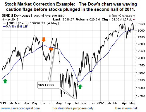
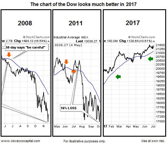
If Dow Theory offers a way to monitor the aggregate interpretation of the economy, earnings, and central bank policy, then we would expect charts of the DJIA and DJTA to be helpful in terms of managing investment risk. Since a picture is worth a thousand words, when the Dow’s 50-day rolled over in 2011 (see orange arrows below), the index dropped an additional 16%. Notice how the Dow failed to make a new closing high before the big reversal in 2011. As of July 2017, the 2014 Dow chart looks much better (slope of 50-day is up, recent higher high).
(Click on image to enlarge)
2007-2009: Economic Pessimism And Investor Fear
Similar economic warnings came in 2007 and 2008 (see orange arrows in chart below). Notice during the 39% drop in the Dow in 2008 the 50-day never gave a “things are improving” signal, meaning it was helpful from a cash-redeployment perspective. In late 2007/early 2008, Dow was not making new highs; instead it was making a series of lower lows, which reflected a period of economic pessimism and investor fear. The 2017 chart of the Dow looks much better, which is indicative of more favorable economic expectations.
(Click on image to enlarge)

The differences are easy to see side-by-side. The stronger bullish conviction tells us even if stocks pull back in the short-run, the odds are good that buyers would step in and attempt to test the recent highs. Reversals tend to be a process rather than a one-day binary event. The charts below speak to probabilities.
(Click on image to enlarge)
Investment Implications – Time To Pay Closer Attention
Does the recent Dow Theory bullish confirmation mean it is all fun and games for the economy and stock market? No, it simply tells us the market is currently healthy and the next bout of significant weakness is more likely to be a correction, rather than a full-blown bear market. A correction always remains a possibility in 2017.
Disclosure: This post contains the current opinions of the author but not necessarily those of Ciovacco Capital Management. The opinions are subject to change ...
more


Thanks