
Instilling Fear In Investors Via Charts
In the mid 1990's famed investor Peter Lynch stated, "Far more money has been lost by investors in preparing for corrections, or anticipating corrections, than has been lost in the corrections themselves." With this quote in mind it seems a number of investment pundits are once again trying to sell fear regarding the current equity market. This morning I ran across the following chart on Twitter.
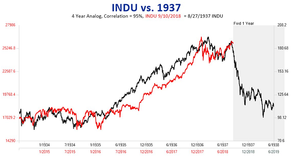
Source: Roosevelt Capital
Just looking at the above chart one would conclude a significant market correction is imminent. I have noted these 'scary chart' presentations in prior blog posts and the issues around how they are constructed. One issue with the above chart is the fact the time periods are so far apart and the index values are so different, comparison of the two time periods should be based on percentages.
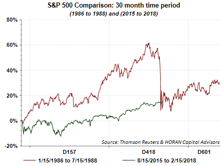
I published a post in May of last year regarding this issue, The Unfortunate Rise Of The Misleading 'Scary Chart' Comparisons Again. In this post, the S&P 500 Index was compared to the market's performance in 1987 as seen below.

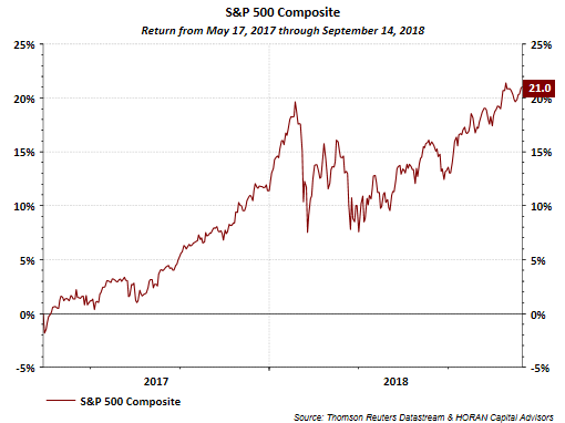
Had Nautilus used percentages instead of price, the chart would have appeared as below and an imminent correction conclusion would not have been evident. The second chart below shows the S&P 500 Index is up 21% since the Nautilus chart date ofMay 16, 2017.
By not using percentages in the first chart in this post, incorrect conclusions could be drawn from the graph. I have recreated the first chart using percentages and monthly Dow Jones Index data.
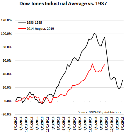
Based on the chart alone, one might conclude a correction is possible over the next year, but the size is significantly less than the price chart used initially. Price in and of itself is not the cause of corrections. The second question is why the time period 1933-1937 is used and not some other time period.
In earlier posts, I have shown the current market advance compared to the 1950's and 1980's and provided commentary on why these two earlier decades might be good comparison periods to the current bull market. I first noted this in November 2016 in a post titled, Equity Market Beginning To Resemble Bull Market Of The 1950's And 1980's. Below is an update of that earlier chart.

I believe it is as reasonable, if not more so, to compare the current market to the 1950's and 1980's versus a comparison to the 1933-1937 time period. The current economic and earnings backdrop provides a positive environment conducive to higher stock prices. This being the case, it is plausible that this bull market is only halfway through its advance in terms of time. The advance is highly unlikely to be an uninterrupted trend higher though.
Disclosure: None.


