
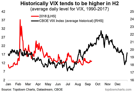
Chart: Tis The Season For A Higher VIX
Studying historical averages can produce useful and interesting insights into the market. Looking at the historical average level of the VIX we can see that the CBOE Volatility Index tends to be higher around this time of the year. We showed elsewhere that this tendency is also mirrored in US high yield credit spreads (which makes sense as they are both basically market measures of risk pricing). The key conclusion then is that there is a decent chance, based solely on historical seasonal patterns, that the VIX heads higher over the coming weeks. There are always exceptions to historical average rules, but it is something to consider given the global macro risk backdrop (stress in EM, Fed tightening, political risk, softer global growth pulse).
(Click on image to enlarge)
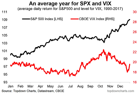
BONUS CHART: The chart below shows the seasonality map for both the S&P500 and the VIX.Shown in this way you can see how the tendency for the VIX to be higher around this time of the year is mirrored in the generally poorer market performance.
(Click on image to enlarge)
For more and deeper insights on the global markets, good charts, and actionable investment ideas you may want to more


