
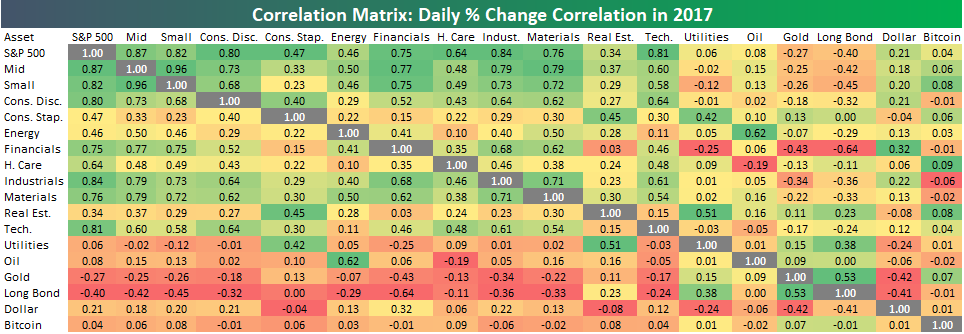
2017 Sector And Asset Class Correlations
Below is a matrix that shows the correlation between the daily price changes (%) of various sectors and asset classes so far in 2017. The closer the reading is to 1, the more correlated the pair. The closer the reading is to -1, the more negatively correlated the pair. Readings near 0 mean the pair have very little correlation with each other on a daily basis.
The Industrials sector has been the most closely correlated to the S&P 500 so far in 2017, while the Utilities sector has been the least correlated to the S&P. Another interesting correlation trend between sectors is that Real Estate and Financials have a correlation close to 0. This is notable because prior to last year, the Real Estate group was part of the Financial sector until S&P broke it off into its own sector.
It’s unsurprising of course, but the Energy sector is very closely correlated with the price movement of oil, while all other sectors are relatively uncorrelated with oil. Also, while there are plenty of sectors with correlations to the S&P 500 above 0.70, just one sector pairing (Industrials and Materials) has a correlation above 0.70. This speaks to the sector rotation we’ve been seeing in 2017. Sectors have been highly correlated with the S&P 500, but they haven’t been as highly correlated with each other.
Looking at equity versus non-equity asset classes, Financials and the Long Bond have the most negative correlation in the entire matrix at -0.64. As the Long Bond rises, interest rates fall, and vice versa.A major theme this year has been how closely the Financial sector has moved with interest rates, and this correlation reading speaks to that. Banks make more money when they can collect more interest on their loans.
The Utilities sector, on the other hand, typically moves in the opposite direction of interest rates (or the same direction as bond prices). This no-growth, high dividend paying sector becomes more attractive when interest rates are lower (bond prices higher), and vice versa. As shown in the correlation matrix, the Utilities sector has the highest correlation with the Long Bond of any sector, although it’s not all that high at just 0.38.
Finally, we’ve included Bitcoin in our correlation matrix for the first time, but as you can see, Bitcoin has not been very correlated with any other asset class in our matrix in 2017. None of the other asset classes have been able to keep up!
(Click on image to enlarge)
Disclaimer: To begin receiving both our technical and fundamental analysis of the natural gas market on a daily basis, and view our various models breaking down weather by natural gas demand ...
more

