
To Log Or Not To Log, Part III
<< Read Part II: To Log Or Not To Log, Part II
Has nonresidential fixed investment risen faster than GDP since the dot.com peak?
This is a follow up to this and this. If one wanted to answer the question of whether the share of expenditures devoted to nonresidential fixed investment was rising or declining, one could divide nominal investment expenditures by nominal GDP.
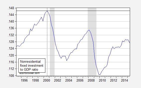
Figure 1: Ratio of nominal nonresidential fixed investment to nominal GDP, SAAR. NBER defined recession dates shaded gray. Source: BEA 2015Q2 advance release, NBER and author’s calculations.
It seems like the answer to the question posed in the subtitle is “no”, and in fact the share is about 2 percentage points lower at the recent (local) peak than in 2000Q3. But suppose one wanted to know if the quantity of nonresidential fixed investment was rising faster than quantity of output. In the old days (with fixed weight deflators), one could divide one “real” value by another, and look at the ratio. But with the advent of Chain weighted quantity indices, one cannot legitimately do that because of the non-additivity of these measures. But what one could do is to log the ratio and compare to the ratio in a base period. Suppose one wanted to compare Z against W relative to 2000Q3, then one could calculate the difference in cumulative growth rates:
log(Zt/Z2000Q3) – log(Wt/W2000Q3) = log(Zt/Wt) – [log(Z2000Q3/W2000Q3)]
The right hand side of the expression is the log ratio of Z/W, minus a constant pertaining to the base period, in the [square brackets]. Figure 2 depicts this series.
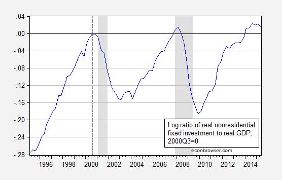
Figure 2: Log ratio of real nonresidential fixed investment to real GDP (in Ch.2009$), normalized to 2000Q3=0. NBER defined recession dates shaded gray. Source: BEA 2015Q2 advance release, NBER and author’s calculations.
The 2015Q2 value is 0.015, which means that the cumulative growth differential of nonresidential fixed investment relative to GDP since 2000Q3 is 1.5%; that is, investment has increased (slightly). Interestingly, this graph conveys a drastically different story than that conveyed by Figure 1 (particularly if one does not think very deeply about the units of measurement). This (log) depiction also has the advantage that a constant slope indicates a constant percentage growth rate.
Disclosure: None.


