
The Bottom 90% Rely On Pension Funds
The stock market continued on its torrid pace in 2018 as it was up again on Thursday. The S&P 500 was up 0.4%. This is the third straight day with a record. The last time the S&P 500 started off the year with 3 straight records was 1964 (it did it 6 straight days). That was the only time it has ever happened. The last time the Nasdaq started the year with 3 straight records was 1999 (also 6 straight days). The other unbelievable streak which is still going is the stretch without a 5% pullback in the S&P 500. There has been 384 days without a 5% correction which is the 3rd longest streak since 1930. The 2nd longest is 386, which occurred in the 1960s, and the longest is 394, which occurred in the 1990s. The record will be broken on Friday January 19th. Goldman said the realized volatility in 2017 was 7 which is in the 1st percentile since 1930. The risk adjusted returns were in the 97th percentile. I still think the stock market is due for a pullback next week as the CNN Fear and Greed index is at 72/100 and the weekly RSI for the Dow is at 87. The determining factor for whether the record without a 5% pullback is reached will be earnings season.
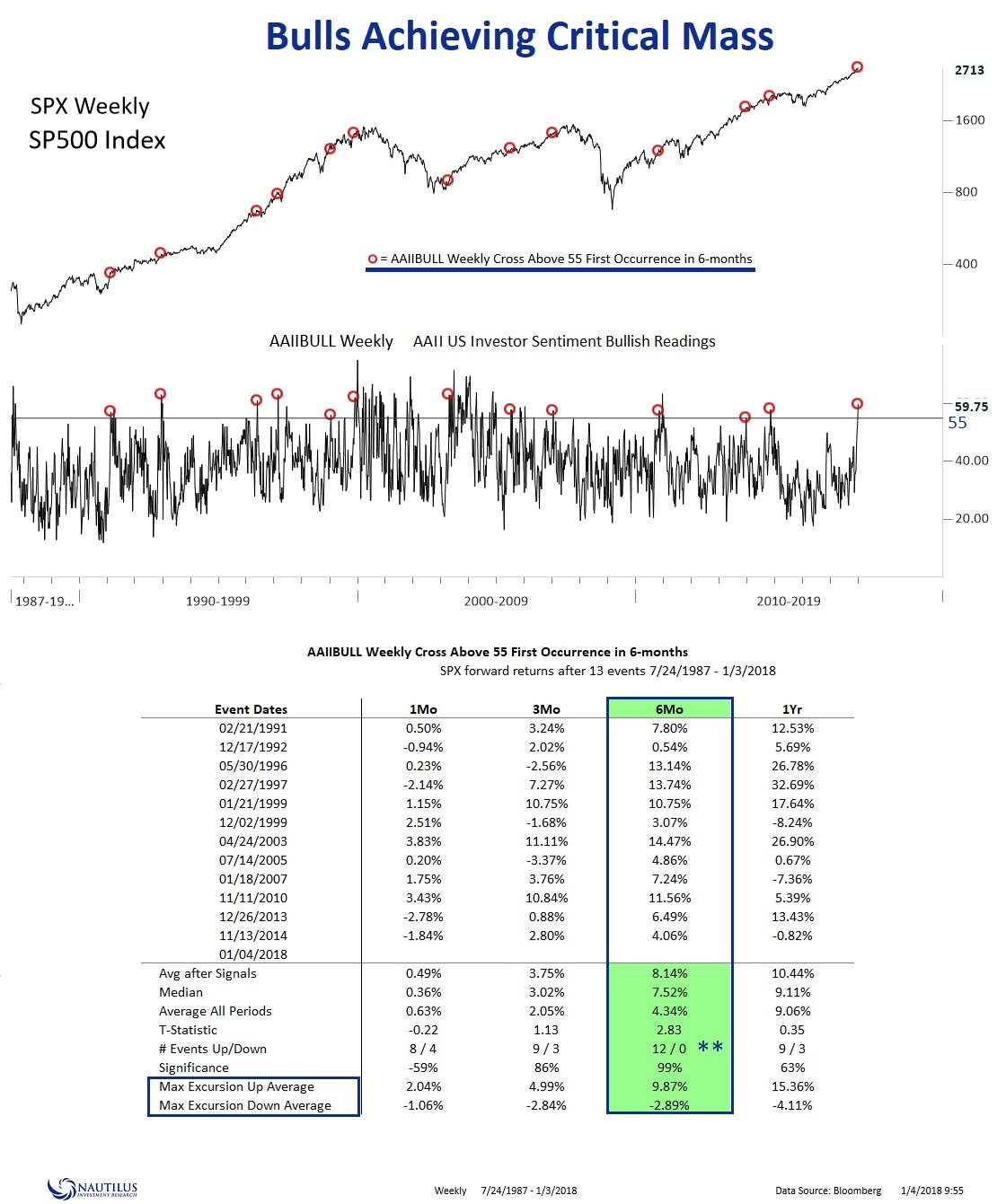
While it’s intuitive to believe when investors are optimistic, it’s time to sell, the chart below shows an indicator which goes against that belief. As you can see, the stock market has had great results in the 6 months after the bullish sentiment reading hit 55. It is up 12 out of 12 times for a median return of 7.52%. This is a near term momentum index. It’s the exact opposite of the Shiller PE which is a long term valuation forecast. Therefore, it’s reasonable to be bullish on the next 6 months, but bearish on the next 5-10 years.
Rally In Stocks Is Increasing Wealth Inequality
The wealth effect the stock market creates was one of the reasons QE was implemented this business cycle. I’m not saying the rally since then has been exclusively caused by QE, but what I am saying is that the rally mainly helps the wealthiest people. The chart below shows the stock ownership is heavily concentrated. The top 20% owned 93.3% of stocks in 2016. I’m interested in how the crypto rally has helped millennials. Considering the fact that young people are more technology savvy, you’d expect millennials to be the most involved with crypto. The good news is that young people have much less wealth than older people, so the wealth effect of the crypto rally is greater than stocks per dollar cryptos go up. Obviously, the rally in stocks is still a bigger deal in total because the size of the crypto market is only $754 billion which is puny.

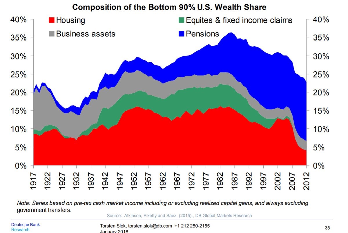
The chart below goes into detail where the bottom 90% has its assets. As you can see, the amount in equities barely exists on its own; the equity holdings the bottom 90% have are all in pensions. The wealth equality peaked in the late 1980s and has been falling since. Housing has been going down ever since the housing bubble burst because the homeownership rate has fallen. Pensions remain the last bastion of wealth for the bottom 90%. This is why the health of the public pension system is so important. If stocks fall, pension funds won’t be able to meet their goal of growing 7% to 8% per year. That would be the equivalent of kicking the bottom 90% while they are down. Since wage growth has been relatively weak and the bottom 90% don’t own stocks directly, they aren’t in a great position to be hit with a recession.
CAPE Works Even In A Changing Tax & Interest Rate Environment
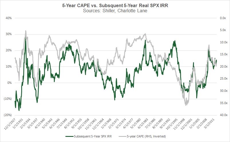
As I mentioned in a previous article, the stock market probably won’t return the 7%-8% per year that pension funds need to reach their goals. As you can see from the chart below, when the 5 year Shiller PE was at about 20, the IRR was 10%. That prediction worked out well just like most of them have since 1927. This chart leaves off sometime in 2011. The latest 5 year Shiller PE is 29.91 which implies a negative real IRR for the S&P 500 over the next 5 years. Pension funds won’t be able to make up that weakness with the alternative investments they own. If you’re curious about other Shiller PE lengths, the 30 year Shiller PE is at 42.11. That’s only slightly below the peak which is 49.9 in December 1999. The median 30 year Shiller PE is 18.15. In previous analysis we’ve looked at, the Shiller PE doesn’t have as great of a track record of predicting 30 year annual returns as it does with 10 year returns. I’m not sure if that chart used the 30 year or 10 year Shiller PE. It’s easy to see why that wouldn’t have a great track record, since stocks usually go up and 30 years is a long time. You could also argue that a 5% annualized return for 30 years is worse than a 3% annualized return over 10 years because the difference between total expected returns on average and the actual returns is larger.
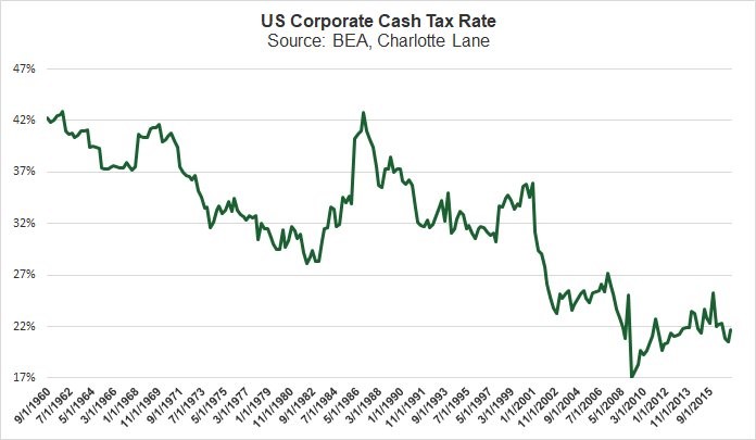
The reason why the CAPE is glorified by value investors is because it has a great long term track record even as interest rates, geopolitical events, and tax rates change. Those who say stocks will have great returns over the long term (next 10 years) because of low interest rates and low tax rates are ignoring the accuracy of the CAPE. As you can see from the chart below, the corporate cash tax rate has been falling for decades, yet the chart above shows the CAPE is great at making 5 year predictions. It’s also worth noting that stocks have had terrible years when tax rates were low. Low tax rates are not a guarantee stocks will do well in the next few years.
Disclaimer: Neither TheoTrade or any of its officers, directors, employees, other personnel, representatives, agents or independent contractors is, in such capacities, a licensed financial adviser, ...
more

