Saturday, March 26, 2016 5:51 PM EDT
This weekend, I decided to do still images instead of videos. Showing charts like this takes much, much longer than doing a video, but I know some people prefer it since they can just skim. In any case, the charts this weekend have these things in common:
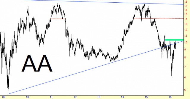
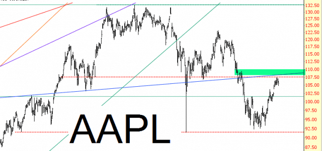
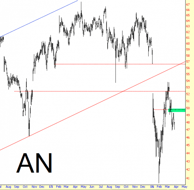
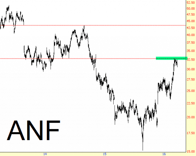
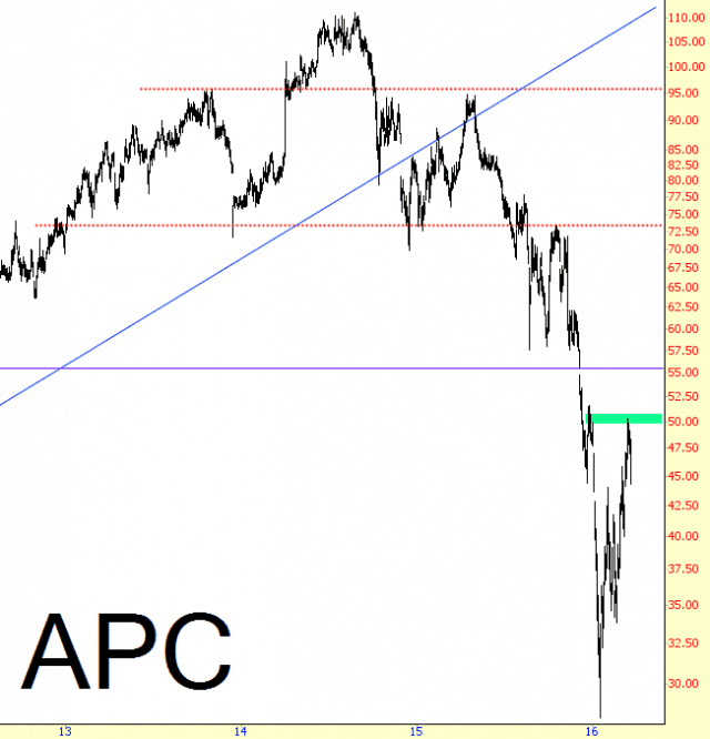
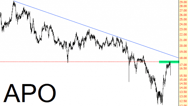
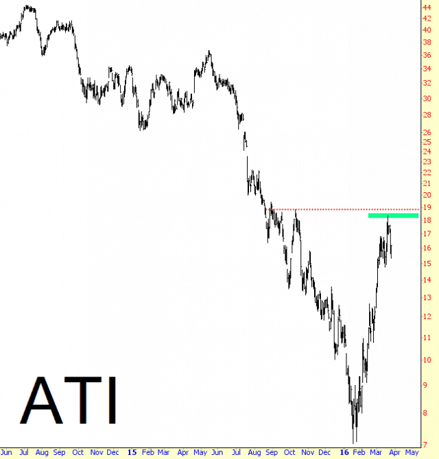
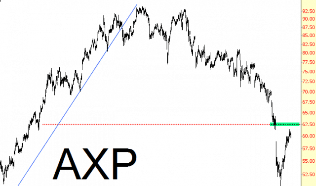
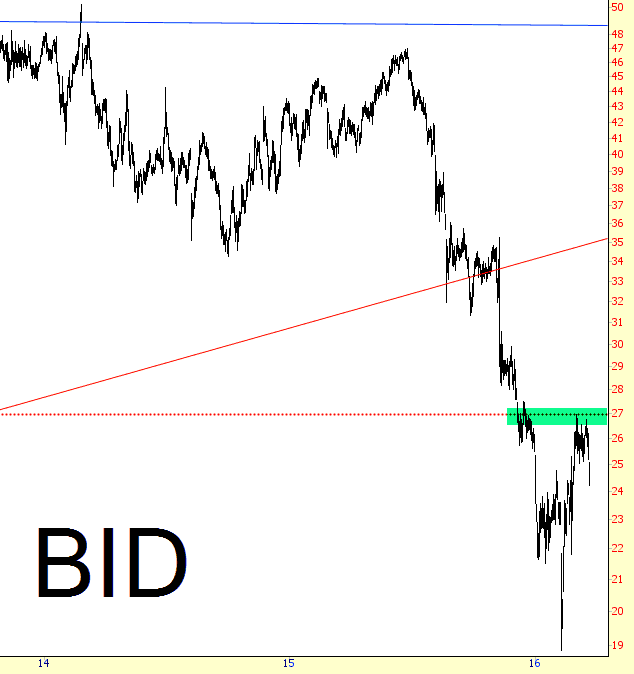
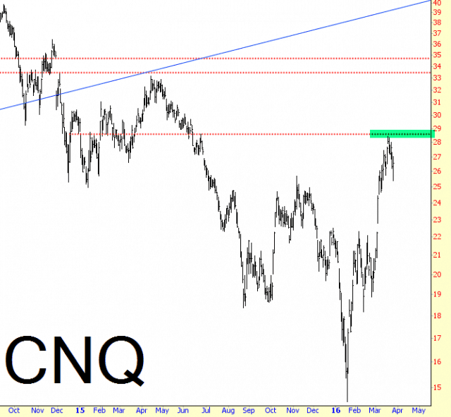
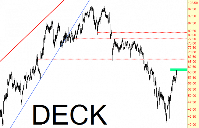
(1) I am NOT presently short any of these positions, although I intend to be so;
(2) I have tinted in green the zone which the price must not penetrate, since if it does, I will not enter the position (or, if in it, will stop out)
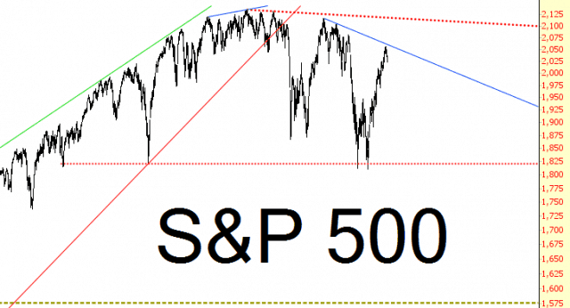
For me, the “big picture” of the massive topping pattern is unchanged, in spite of the sickening rally which ran from February 11th through March 18th:
Here are the charts; as always, I’m setting aside 50% of them exclusively for my Slope Plus subscribers. More will come tomorrow.
Disclosure:Short Workday This blog is not, and has never been, investment advice. It is a place that allows me to express my own views on the market and specific securities – as well as make ...
more
Disclosure:Short Workday This blog is not, and has never been, investment advice. It is a place that allows me to express my own views on the market and specific securities – as well as make whatever cultural observations or other odds and ends strike me as worth writing about. So I take absolutely no responsibility for the losses – or any credit for the gains – you may or may not make from reading this forum. Whether you lose your life savings or make a fortune is entirely up to you and your own skills/luck/fate.
Please note I am the principal of Tim Knight Organization, LLC, a California-registered investment adviser. The content of the postings and investment strategies and discussions provided herein do not necessarily reflect the views, opinions or policies of Tim Knight Organization, LLC and Tim Knight Organization, LLC makes no warranties regarding the accuracy of their content or their completeness.
less
How did you like this article? Let us know so we can better customize your reading experience.


