
The X’s And Y’s Of Jerome Powell And The Long End, As Calculated By Eurodollar Futures
For the end-of-bond-bull-market-crowd, 3% is a line in the sand. There is no inherent significance in that number, except that it’s a round one. The benchmark 10s as of now trade with regard to that level as if it’s a ceiling. That’s what makes it so momentous. In 2013, the yield finally broke 3% the day after Christmas, getting as high as 3.04% on New Year’s Eve. It hung around there until January 8, 2014, before finally declining back below 3% and remaining less to this day.
Back in 2010, though, 3% was meaningless. At that time, the level to beat was 4%, which the 10s did exactly once that year on April 5. The difference between 2010 and 2013 was the long end’s view of this possible ceiling.
Ceiling for what? It’s this part that I think so many get confused about in being confused over the yield curve. There’s two parts to it, the short as well as long end. The latter is an economic indication while the former is tuned by perceptions of money substitutes (including policy rates like IOER and RRP). It’s in the middle where those come together.
Eurodollar futures are nothing but short-end stuff. After all, they settle on 3-month LIBOR. But the various outer maturities of eurodollar futures have to take into considerations of not just money substitutes but also the possible future economic conditions that will drive them. It’s a mix of short and long attributes focused on how those will result in short-end mechanics.
What eurodollar futures show is the imposition of that ceiling on the short-end, confirming the long end’s reticence from 2013. It’s weird to see it now this many years later, but during reflation #2 that year the eurodollar futures curve was still closer to a normal one than not. It diverged significantly from the UST curve in that it was trading as if future LIBOR, driven by policy normalization due to a more complete economic recovery, was to be relatively unrestrained.
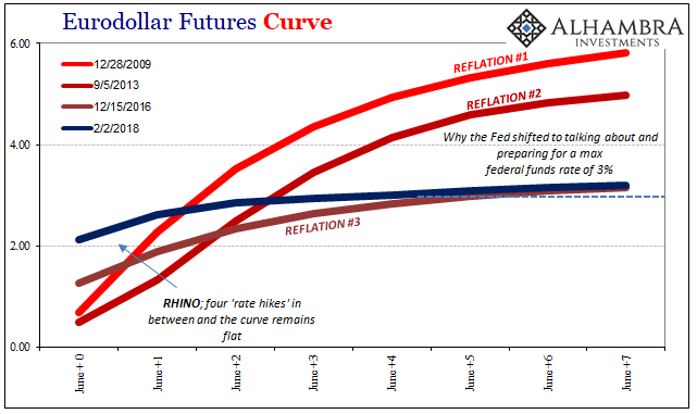
The difference between then and the curve during reflation #1 was an almost compromise with the long end of the UST curve – that money traders took seriously the growing monetary/economic doubts (interest rate fallacy) expressed in that part of the UST market. The Fed would try to raise rates at some point over the time horizon, but the eurodollar market was growing doubtful about what that might mean.
We need to be careful, however, when analyzing this part of the process. It’s not necessarily the case that the eurodollar curve was agreeing with the Fed in how it at that time thought it would normalize, only that there was a good possibility the FOMC would try to normalize no matter what and be able to achieve some substantial altitude for its money substitutes. That’s the central bank part of the equation – the ability to ignore fundamental reality in favor of an often distorted and twisted sense of future propositions.
In other words, the eurodollar futures curve of reflation #2 wasn’t so much outright disagreeing with the apparent lower ceiling from the long end of the UST curve so much as trading as if there was a good chance the Fed could ignore this difference for quite some time. It’s a fundamental distinction that predates even the 2008 panic (“conundrum”).
The Fed thinks the economy is X when it is really Y; the bond market trades more so on Y while the Fed motivates monetary policy (these money substitutes) in anticipation of X. Eurodollar futures further out in time must trade off the probability differences between X and Y.
The 2013 eurodollar futures curve was thus splitting, so to speak, the difference between the long end’s ceiling at Y and the mainstream idea of Ben Bernanke’s intentions to get to X.
That’s all changed now. The eurodollar futures curve is now like the UST 10s trading on an almost hard limit at around the same 3% area (eurodollar futures prices don’t extract to an exact number, but close enough for our purposes).
What’s been going on with eurodollar futures at the closer maturities is traders increasing their probability forecasts for Janet Yellen now Jerome Powell’s Fed using the recent inflation hysteria to get a little higher in those money substitutes. It works out to increasing future 3-month LIBOR (X), while still respecting the long end of the UST curve’s judgment (Y) that the economic fundamentals don’t justify the hysteria, the policy, or the economy. That’s why the eurodollar curve remains so flat.
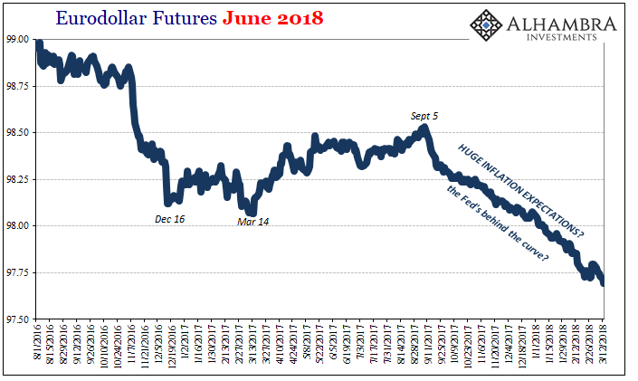
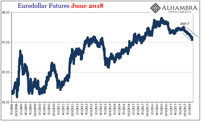
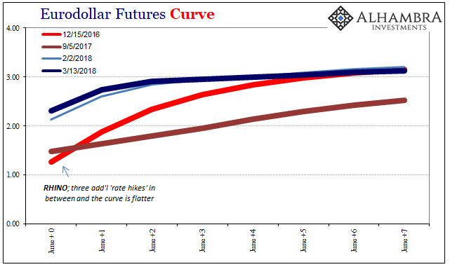
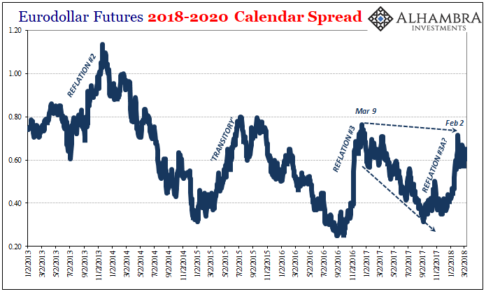
I think part of this change since September 5 last year is due to CNY and its effects on other “reflation” indications (as well as the unknown consequences of the breakdown in prior correlations like JPY). More than that, however, it was during this period where the hurricanes Harvey and Irma appeared to accelerate a great many economic accounts. That would seem to have totally cleared the path for Powell’s scheduled “rate hikes” at least as far as this June.
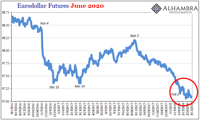
If you look a little further down the eurodollar curve to the June 2020’s, however, the market was thinking it might clear a path getting further out in time. Unlike the 2018’s, the 2020’s (shown above) have stumbled a bit since around February 2. Given the nearly month and a half since then, this proposes that the eurodollar market is no longer so sure the Fed gets that far (or goes as fast as the narrative tries to make it seem likely). Contrary to the inflation frenzy, this important market seems to have taken heavy notice of what it was that happened on February 2:
The Dow closed down 666 points, or 2.5%, its biggest percentage decline since the Brexit turmoil in June 2016 and steepest point decline since the 2008 financial crisis.
This is not an immediate worry, else the 2018’s would be pulling up (in price) in the same way the 2020’s have. There are two ways of looking at this. First, the mainstream narrative is how inflation expectations are rising, which is supposedly bad for stocks. That’s, after all, how the stock market plunge was uniformly characterized:
A strong jobs report showed wage growth is finally starting to pick up. That’s great news for workers, but it reinforced investors’ concern about inflation and the bond market.
The contrary view, the one that is in my mind far more consistent with the actual bond market and it’s steadfast holding to 3% (Y), is, of course, liquidity risks embedded in what was truly a breakout of global liquidation.
It might propose that for the last six weeks as the 10s failed to pierce 3% and all the other stuff that went along against the inflation scenario are starting to weigh on this future indication of the short-end – the Fed’s future ability to be unrestrained by contrary reality (why only the one hike finally at the end of 2016).
As you can see above, this is a pretty repetitive process simply because the Fed is always going to intend upon shooting for X no matter if it’s realistic. The market is trading as if there are certain times when X is possible even if Y remains the baseline reality.
The 3% ceiling is merely the eurodollar and bond market agreeing that nothing has changed overall. No matter the inflation hysteria of the past few months or half year, under the hurricanes’ economic boost, all that has done for at least the eurodollar futures market is shift the probability not of inflation but that the Fed won’t be stopped in hiking rates until a little further into the future. What will eventually stop them?
That hasn’t changed since 2010. It’s still Y.
Disclosure: None.


