
US Business Cycle Risk Report - Friday, August 17
Geopolitical risk is rising, but if there’s a price to pay in terms of sharply softer economic growth or worse for the US it’s not showing up in the numbers, at least not yet. With most of the July data published the macro profile remains upbeat and near-term projections suggest the positive trend will persist.
Several risk factors bubbling on the world stage (a trade dispute with China and a financial crisis in Turkey, for example) could upend the rosy outlook – or not. But using the figures published to date continues to paint an encouraging macro picture for the US.
On the GDP front for the third quarter, several nowcasts point to another round of solid growth. Note, however, that some models reflect a deceleration in expected output, albeit following a strong 4.1% increase in Q2 (seasonally adjusted annual rate). Today’s revised Q3 estimate via Now-casting.com, for instance, calls for a slowdown to 3.2% — down from 4.0% in late-July. The current projection still marks a solid gain, but it’s early in the quarter and so there’s plenty of uncertainty about how the estimates for the current quarter will evolve — uncertainty that’s magnified due to concerns about a trade war and a possibility of escalating headwinds for emerging markets.
To be fair, other models see growth accelerating for the US. Yesterday’s update of the Atlanta Fed’s GDPNow model points to a 4.3% advance in economic activity for Q3.
Whatever’s in store for Q3 and beyond, this much is clear: US economic activity has been healthy to date. The Capital Spectator continues to estimate a virtually nil probability that a new NBER-defined downturn started in July, based on a diversified set of economic indicators. (For a more comprehensive review of the macro trend with weekly updates, see The US Business Cycle Risk Report.)

Aggregating the data in the table above continues to indicate a strong positive trend overall. The Economic Trend and Momentum indices (ETI and EMI, respectively) remain well above their respective danger zones (50% for ETI and 0% for EMI). When/if the indexes fall below those tipping points, the declines will mark overt warning signs that recession risk is elevated and a new downturn is imminent. The analysis is based on a methodology that’s profiled in my book on monitoring the business cycle.
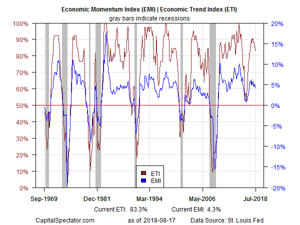
Translating ETI’s historical values into recession-risk probabilities via a probit model also points to low business-cycle risk for the US through last month. Analyzing the data in this framework indicates that the odds remain effectively zero that NBER will declare July as the start of a new recession.

For the near-term outlook, consider how ETI may evolve as new data is published. One way to project values for this index is with an econometric technique known as an autoregressive integrated moving average (ARIMA) model, based on calculations via the “forecast” package in R. The ARIMA model calculates the missing data points for each indicator for each month — in this case through September 2018. (Note that May 2018 is currently the latest month with a complete set of published data for ETI.) Based on today’s projections, ETI is expected to remain well above its danger zone through next month.

Forecasts are always suspect, but recent projections of ETI for the near-term future have proven to be reliable guesstimates vs. the full set of published numbers that followed. That’s not surprising, given ETI’s design to capture the broad trend based on multiple indicators. Predicting individual components, by contrast, is subject to greater uncertainty. The assumption here is that while any one forecast for a given indicator will likely be wrong, the errors may cancel out to some degree by aggregating a broad set of predictions. That’s a reasonable view, based on the generally accurate historical record for the ETI forecasts in recent years.
The current projections (the four black dots in the chart above) suggest that the economy will continue to expand. The chart also shows the range of vintage ETI projections published on these pages in previous months (blue bars), which you can compare with the actual data (red dots) that followed, based on current numbers.
Disclosure: None.


