
Walking A Fine (Trend) Line
In last week’s missive I noted:
“While it seemed for a while that volatility had been completely eliminated from the market by an ever present Fed, I warned this was a dangerous assumption to make.
On Friday, volatility returned with a vengeance.”
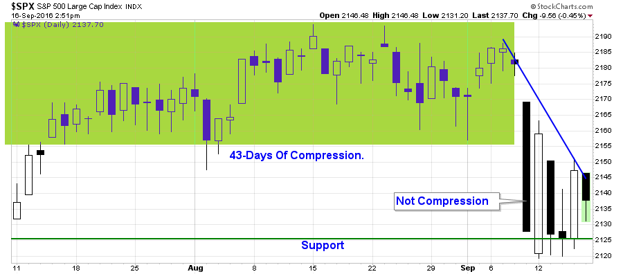
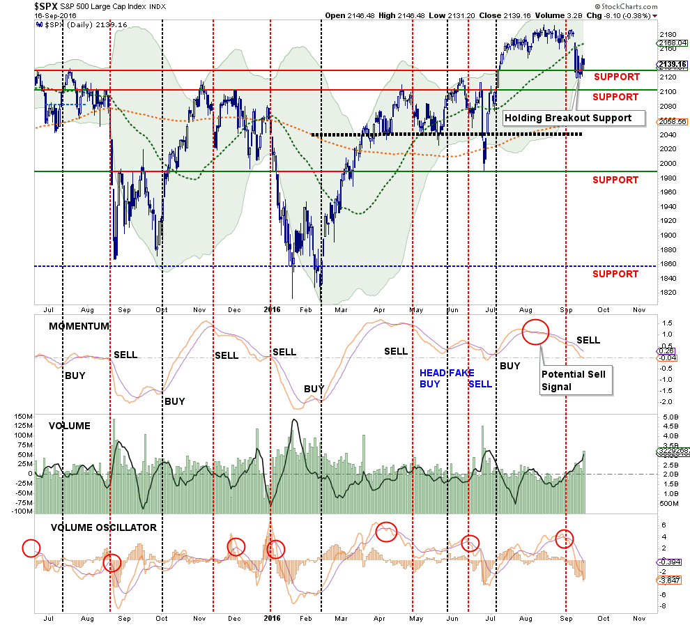
Not only did volatility pick up on Friday, it remained present all week with the market swinging wildly between positive and negative days as shown in the chart below.
Analysts, the media, and Wall Street talking heads rushed to grab every excuse available to explain the sudden sell-off this past week from the Fed, poor economic data, election rancor. It really was not a surprise as I have been warning about a pending correction over the last month as market extensions had reached extremes.
However, while the sell-off certainly woke investors from their complacent slumber, let’s step back from the ledge for a moment and analyze what has happened. As I wrote three weeks ago:
“As shown, a reversion to the current bullish trend line, which coincides with the market’s recent breakout levels, is a likely target in the short-term.
However, there is a more than reasonable chance, as I laid out two weeks ago for a deeper correction in the next 60-days. The chart below shows the potential drawdowns from current levels.”
The chart has been updated through Friday afternoon.
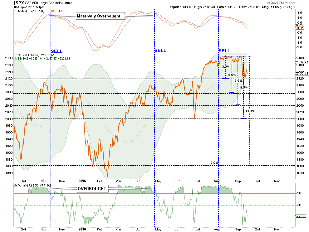
Despite all of the hand-wringing from the mainstream media this week, the markets have only experienced a very slight 3% correction to date.
But it is in the chart above the most important questions reside. Let’s take a closer look.
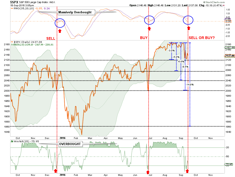
Notice the bottom indicator suggests the market is now short-term oversold. With the top indicator only about half-way through its resolution process. In late June, the oversold condition marked the bottom of the Brexit sell off.
Of course, this was at a time the Federal Reserve, and global Central Banks, rushed to the rescue with liquidity programs and verbal easing to reignite the bulls.
“So we should buy now, right?”
Maybe not.
The same conditions also existed back in the December of last year. The correction, and oversold condition did lead to a subsequent bounce which only lured unwitting investors into the subsequent January-February swoon.
“So, you are saying we should sell? “
Here is the honest answer to both of those questions: “I. Don’t. Know.”
I realize, of course, such a statement is of little help or comfort. But it is simply the case with which we are confronted with currently. Let’s review the “Bull” and “Bear” case from last week.
The Bull Case (Buy The Dip)
There is little reason to believe, at the moment, the current bull market has ended. I say this for the following reasons:
- Central Banks are still engaged globally which continue to provide liquidity support for the markets.
- The Federal Reserve is unlikely to tighten monetary policy in September.
- Overall investor sentiment is still in “greed mode.”
- Intermediate-term “buy” signals remain intact currently.
- Bullish trend lines remain supportive.
- Short-term oversold conditions have been achieved.
The Bear Case (Deeper Correction)
The problem is despite the bullish supports that currently remain, the list of bearish detractions has grown markedly in recent months.
- Economic data continues to deteriorate. (See here)
- Fundamentals remain detached from prices. (See here)
- Current oversold condition is in conjunction with momentum “sell signal” (see chart above.)
- Intermediate-term “buy signals” are close to being reversed from high levels (see first chart below.)
- Long-term “sell signals” have been triggered (see second chart below)
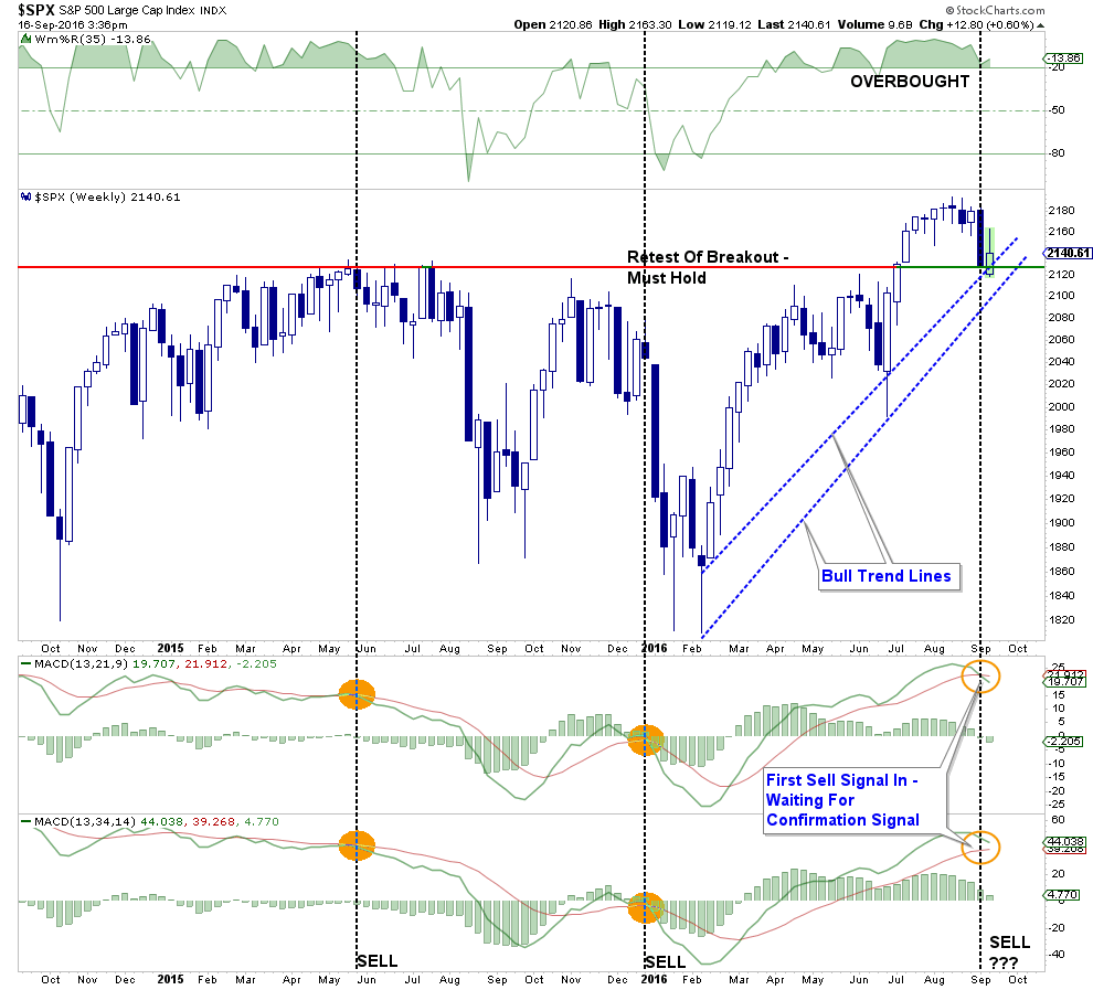
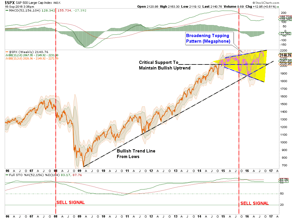
If the market fails to hold short-term support, a deeper correction could begin to develop. A violation of the long-term bullish trend from the 2009 lows would be a key indication of a trend change in the market. Currently, that level is around 2050.
I said last week:
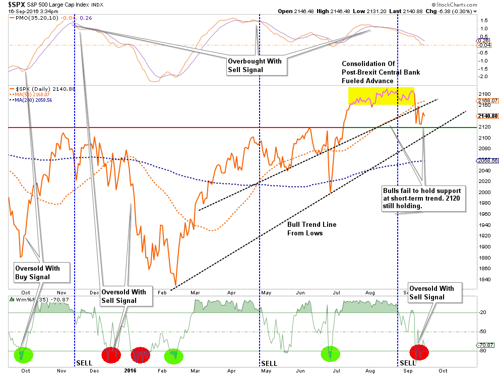
“I want to give this current market action a few days to play itself out. As shown in the chart below, the oversold condition of the market (green dots on bottom) suggest a very likely bounce next week. However, as I have highlighted (blue boxes) bounces near market tops have generally preceded eventual deeper declines.”

The action this past week was both good and bad.
The good: The market held support at the previous breakout highs.
The not-so-bad: The market remains below the 50-dma but is oversold which is providing some short-term price support.
The bad: There was very little improvement from last week which would suggest the “bulls” have regained charge of the market.
Importantly, the longer-term “buy signals” are still intact, along with the long-term bullish trend, which maintains the cyclical bull market currently. This means that one should NOT become overly defensive in portfolio postures as of yet.
As I continue to reiterate, I remain on the lookout for an opportunity to “SAFELY” increase equity exposure in portfolios. That opportunity has not yet presented itself as of yet.
There is also, at this late stage of the bull market cycle, a chance it may not.
I Don’t Like My Gut
One of the biggest mistakes that investors consistently make is allowing “emotions” to drive investment decisions. This is why I do my best to remain focused on my discipline and the 15-trading rules that drive the overall process.
Currently, while the markets are holding their current bullish trend lines from February, there is a nagging voice that suggests something has changed.
Call it a “shift in the wind.”
Or a “change in the temperature.”
Whatever it is, it is nagging me the current correction may not be over as of yet.
Michael Kahn wrote an interesting piece for Barron’s suggesting the same:
“There are certain days in the market when change is palpable. Many times, they originate with proclamations by governments or major corporations. On Friday, the sell off was triggered by talk of interest-rate hikes by the Federal Reserve. Yet rather than registering as a non-important technical move on the chart – as was theBrexit vote in June – last week’s decline created a very important pattern breakout (see Chart 1) that suggests the ‘fun’ is far from over.”
“With the market on edge about the timing of the Fed’s next move, any clarity, whether real or imagined, has the ability to change the market’s mood instantly. Just look at the reaction of interest-rate-sensitive areas such as utilities, real estate, and high-yielding consumer-staples stocks. These groups actually foreshadowed recent events with their market-lagging performance last month.”
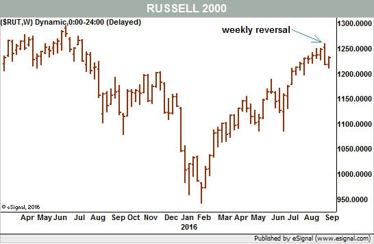
“As we can see in the chart, the Russell’s weekly range opened above and closed below the range of the week before, in a fairly textbook version of the pattern. Unless the bulls retake control immediately with a rebound of at least half to two-thirds of Friday’s loss, we have to assume that the new trend to the downside is already in place.”
Tom McClellan’s view also noted an interesting point last week that only adds to the current conundrum of whether, or not, investors should be “buying the dip.”
“This particular version of the McClellan Oscillator for High Yield Bonds is calculated the same way as for the NYSE A-D data. But because the number of issues traded are different for each market, the raw scaling is therefore necessarily going to be different.”
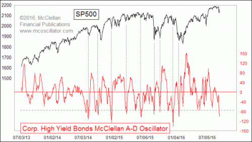
“Once we get past that notion of scaling, and just focus on the chart itself, we can pretty easily see where ‘high’ and ‘low’ readings are. I drew a horizontal line at the arbitrarily chosen level of -75 to help focus the eye on the situation we see right now.Very low readings below that line tend to reliably be associated with meaningful bottoms for the SP500. I should caution that the notion of ‘meaningful’ bottoms does not mean the same thing as ‘final” bottoms.
But such bottoms are usually followed by meaningful bounces, if not outright up moves. That is the important message. What we are seeing with this very low reading is a message that the stock market is at a meaningful bottom and ought to see a brief pop, at a minimum. What happens after that is a more difficult question to address.
It is not only the McClellan Oscillator for these data which has merit. A raw Advance-Decline Line (A-D Line) can have value on its own, when it signals a trend change.”
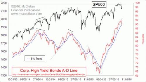
“When the High Yield Corporate Bond A-D Line crosses through a long trendline, it is a pretty darned good signal of a trend change. Some examples are shown in this second chart.
This is important now because we have just seen such a crossing, this time below the rising bottoms line that dates back to the Feb. 2016 low. That line has been fairly authoritatively broken, and now this A-D Line is also threatening to close below its own 5% Trend (AKA 39-day EMA), an act which would add further confirmation of a trend change.
High yield bonds had come back into fashion in 2016, as the central banks’ policies of zero or negative interest rate policy has pushed investors into more risky assets. The pendulum appears to be swinging back again, although it has swung really far already on the first push, as evidenced by the extremely negative McClellan Oscillator reading shown above. That says the initial down leg may have gone too far too fast all at once.
But the broken uptrend lines says we are seeing a significant trend change getting started right now. Both messages are worth acknowledging.”
Still confused? Me too.
I am going to sit tight for now and wait and see what Monday brings us.
If you subscribe to the website and I will email you the technical update on Tuesday which will note any changes to allocations.
For now, we wait.
THE MONDAY MORNING CALL
The Monday Morning Call – Analysis For Active Traders
Time To Buy Bonds? Probably
Last week, I discussed what I believe to be the premature calls for the death of the “bond bull market.” As I wrote:
“Given that interest rates had gotten extremely oversold during the ‘Brexit,’ as money poured into bonds for safety, it is not surprising to see rates have a reflexive move higher. What we saw on Friday was likely rate “shorts” being blown out of positions.”
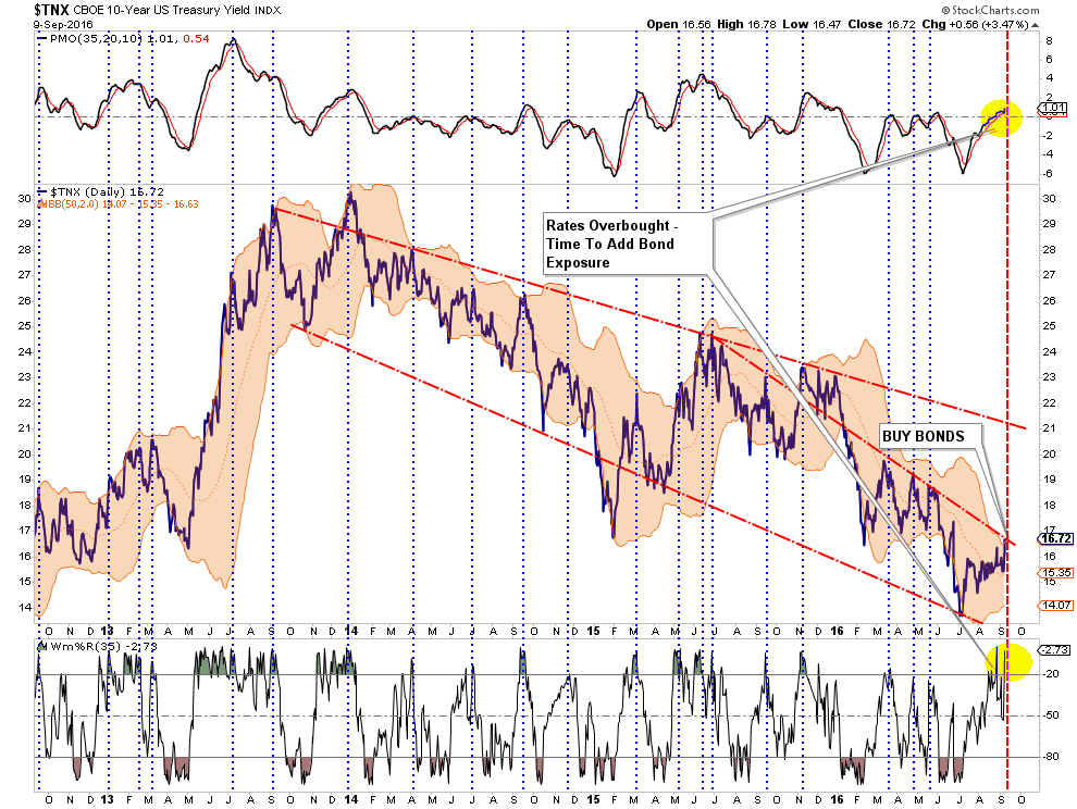
“Importantly, while interest rates could possibly tick higher to the long-term downtrend line at 2.1%, (OMG, run for the hills), the reality is the economy is not growing strongly enough to support substantially higher rates which will push the economy more quickly towards the next recession.
Of course, during recessions interest rates fall sharply which is why I still suspect, given the majority of global economies in negative territory, them to ultimately approach zero.“
Jennifer Thomson from GaveKal Research also acknowledged much the same.
“Today, the topic du jour seems to be the impending rise in U.S. rates and the bursting of the multi-decade bond bubble. Before we get too worked up over the chances for an aggressive sell-off in government bonds, let’s consider the following chart. In the top pane, we have the spread between U.S. and German 10-year bond yields (green line). The orange dotted lines represent the 25-year average (about 30 bps) and the first and second standard deviations from that average. In the bottom portion of the chart, the pink line is the U.S. 10-year yield (currently 1.70%) and the blue line is the German bund (at 0.03%).”
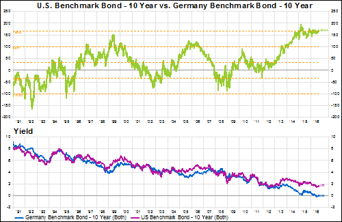
“Excepting the years following the fall of the Berlin wall, U.S. rates have been higher than their German counterpart in nearly every non-recessionary/ financial crisis year. In addition, the spread has been at a quarter-century, two standard deviation high for almost two years now (since October 2014). At other extremes– highs in 1999 and 2005/6 and lows in 2002 and 2008/9– the spread has reverted back towards the average much more quickly.
Based on this relationship over the last 25 years, we might expect the spread to narrow from current levels. In order for that to occur, there must be some combination of a fall in the U.S. 10-year yield and/or a rise in the German 10-year yield. Given the ECB’s current quantitative easing efforts (and its reliance on German debt, in particular), the probability of a rise in German yields would seem unlikely at best. Which means that the normalization of this relationship is dependent on a further decline in the U.S. yield. No imminent signs of a bursting bond bubble here, folks.”
As I said last week – all interest rates are relative. I am still buying bonds.
Walking Up A Down Elevator
A look at momentum currently suggests that investors may have to wait another week, or so, for a short-term trading opportunity to set itself up.
As shown in the chart below, and noted in the missive above, the market is currently holding support at the previous breakout highs. However, the overall momentum of the market is continuing to decline from previously high levels. Looking back over the last 5-quarters, such corrections have tended to correct further after a short term bounce.
As Adam Koos penned on Friday:
“Buying stocks in this environment is like trying to walk up an escalator that’s going down. The momentum is not in our favor and we should always analyze how much risk we’re willing to take for an assumed reward.
So, at least for the moment, it would be wise to focus on other asset classes for more immediate, positive risk/reward ratios (such as Treasury yields, for instance). As the next six weeks unfold, the market will give us a better picture of what direction it wants to move in the longer-term and from there, we can determine whether we want to buy into this weakness.”
I tend to agree.
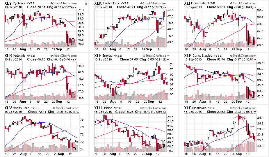
Sector Snapshot – Looking For Opportunity
The correction in the broader market is much more interesting when looking at the underlying sectors. Had it not been for Apple’s (AAPL) surge last week on hopes for strong iPhone7 sales, the market decline would have been substantially worse.
“The iPhone maker accounted for about 80 points of the Dow’s 127-point gain for the week, or more than half.
Apple was also responsible for about 60 percent of the S&P 500’s weekly gain of 0.53 percent, with the technology sector surging 3 percent as the best performer.
Without Apple, the tech sector would have gained just 1.57 percent and the S&P 500 would have gained just 0.19 percent, according to Howard Silverblatt, senior index analyst at S&P Dow Jones Indices.”
As shown in the chart below, there are moving average crossover (sell signals) in Discretionary, Industrials, Materials, Staples, Healthcare, and Utilities.
Furthermore, with the exception of Technology, every sector has broken their respective longer-term moving averages suggesting downside risk currently prevails.
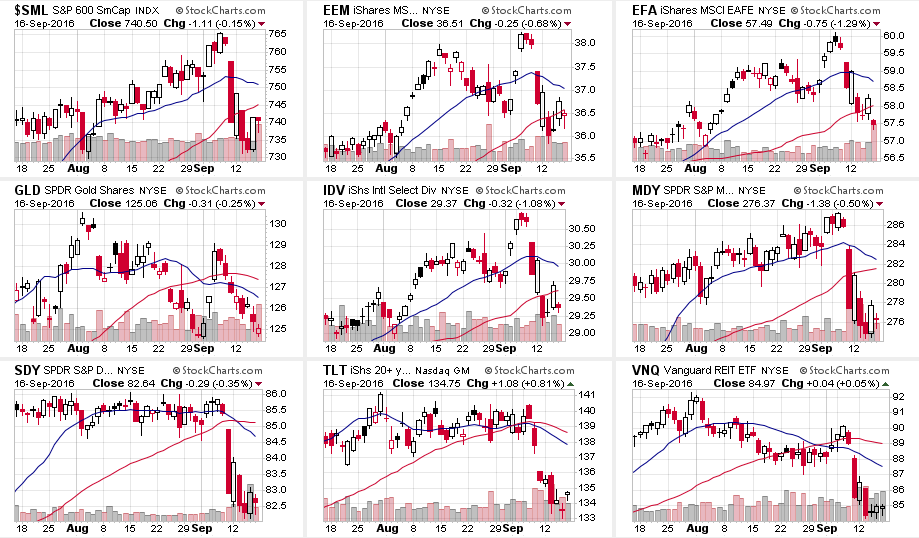
The picture doesn’t improve much when looking at major indices.
EVERY index has broken the longer-term moving average which suggests more pressure to the downside in the days ahead.
While it is entirely feasible the markets could bounce higher next week, any failure to reverse the short-term damage to the market will likely show up in renewed selling pressure.
On a short-term trading basis, traders may be well advised to sell into any short-term rallies to take profits and rebalance portfolio related risks.
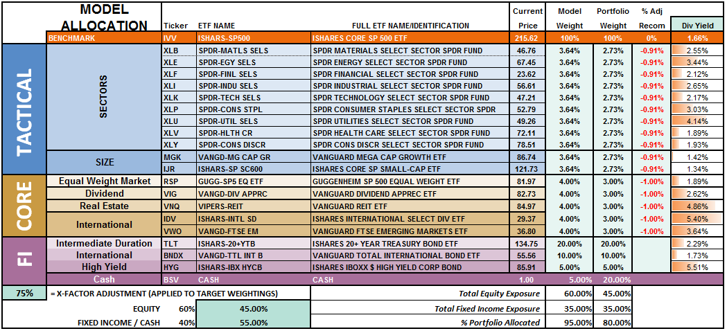
Model Update
S.A.R.M. Sector Analysis & Weighting
Well, last week wasn’t boring. The market swung in a 2% range all week as portfolio managers repositioned for options expiration on Friday. The question now – is it over yet? The internal damage to the market was substantially greater than the headline index would suggest, so some caution is advised heading into next week. However, we have been looking for an opportunity to increase equity exposure in portfolios and we may get that opportunity soon. We will patiently wait and let the market “tell us” what to do next rather than “guessing” at it.
While actual portfolio equity risk weightings remain below our target of 75% again this week, the odds of a further correction next week keeps us on hold for now until we find a short-term bottom and can redetermine risk/reward ratios.
(Note: This is an equally weighted model example and may differ from discussions of overweighting/underweighting specific sectors or holdings.)
Relative performance of each sector of the model as compared to the S&P 500 is shown below. The table compares each position in the model relative to the benchmark over a 1, 4, 12, 24 and 52-week basis.
Historically speaking, sectors that are leading the markets higher continue to do so in the short-term and vice-versa. The relative improvement or weakness of each sector relative to index over time can show where money is flowing into and out of. Normally, these performance changes signal a change that last several weeks.
As noted above, the recent spike in interest rates has now reached the top of the long-term downtrend and suggests that staples, utilities, and bonds will improve in performance over the next couple of weeks. Such improvement will most likely coincide with an ongoing market consolidation or correction.
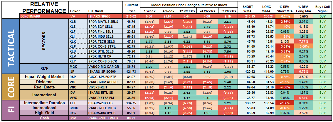
Notice in the next to last column to the right, the majority of sectors which have previously been pushing extreme levels of deviation from their long-term moving average, have corrected much of those extremes.
Basic Materials, Staples, Utilities, REIT’s and Bonds are currently at the biggest deviations below their short-term moving average. Historically speaking, and as noted above, such deviations would suggest these sectors deserve some attention in portfolios as this is where buying opportunities TEND to exist. It also supports the comment above that a further consolidation or correction in the markets is likely as these more defensive sectors tend to benefit from the rotation from “risk” to “safety.”
Importantly, if the current pullback is a “buy the dip” opportunity, the sectors that maintain their technical underpinnings and resolve the extreme deviations from short and long-term moving averages will provide good opportunities to add to portfolios.
The two charts below graphically show the relationship of each position’s performance relative to the S&P 500 Index. If we are trying to “beat the index” over time, we want to overweight sectors/asset classes that are either improving in performance or outperforming the index, and underweight or exclude everything else.
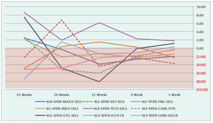
Sectors Currently Outperforming by >1%
- Technology (Weakening – $AAPL related push, narrow advance)
- Utilities (improving)
Sectors Currently Performing In Line <>1%
- Healthcare (improving)
- Staples (improving)
- Discretionary (improving)
Sectors Currently Under Performing By >1%
- Energy (weakening)
- Materials (improving)
- Industrials (improving)
- Financials (weakening – $WFC related, could spread to other majors.)
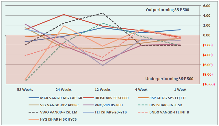
Index/Other Asset Classes Out Performing S&P 500 By >1%
- Mid-Cap (improving)
Index/Other Asset Classes Performing In-Line With S&P 500 <>1%
- Equal-Weight S&P 500 (improving)
- Small-Caps (weakening)
- Dividend Stocks (improving)
- International Bonds (weakening)
- High Yield Bonds (weakening)
Index/Other Asset Classes Under Performing S&P 500 By >1%
- REIT’s (improving)
- Emerging Markets (weakening)
- International Stocks (weakening)
- Domestic Bonds
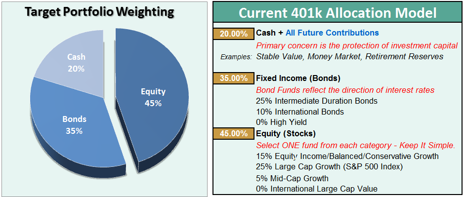
The risk-adjusted equally weighted model has been increased to 75%. However, as stated above, further consolidation in the markets is needed before making any changes.
Such an increase will change model allocations to:
- 20% Cash
- 35% Bonds
- 45% in Equities.
As always, this is just a guide, not a recommendation. It is completely OKAY if your current allocation to cash is different based on your personal risk tolerance, time frames, and goals.
For longer-term investors, we still need to see improvement in the fundamental and economic backdrop to support the resumption of a long-term bullish trend.Currently, there is no evidence of that occurring.
THE REAL 401k PLAN MANAGER
The Real 401k Plan Manager – A Conservative Strategy For Long-Term Investors
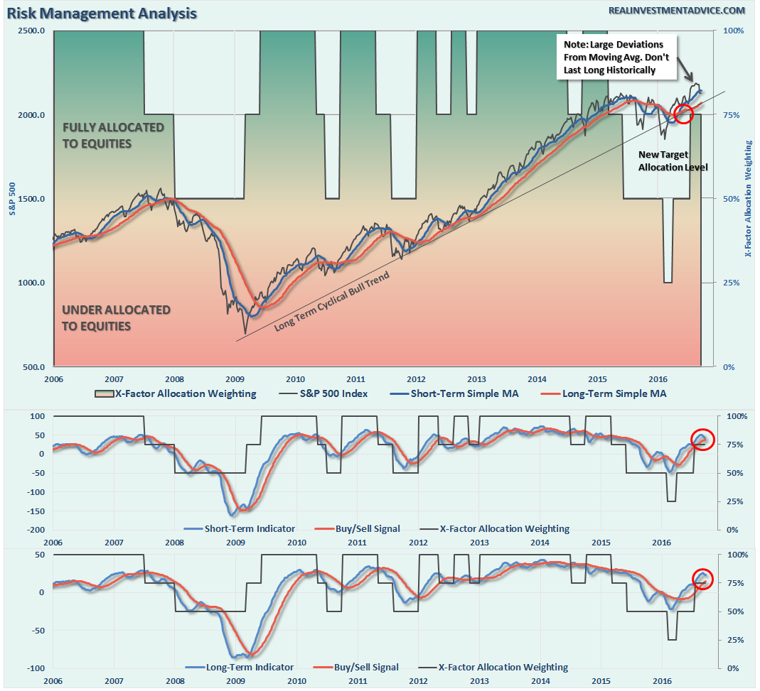
NOTE: I have redesigned the 401k plan manager to accurately reflect the changes in the allocation model over time. I have overlaid the actual model changes on top of the indicators to reflect the timing of the changes relative to the signals.
There are 4-steps to allocation changes based on 25% reduction increments. As noted in the chart above a 100% allocation level is equal to 60% stocks. I never advocate being 100% out of the market as it is far too difficult to reverse course when the market changes from a negative to a positive trend. Emotions keep us from taking the correct action.

Got Volatility?
This past week certainly got investors attention. After a month of doing “nothing,” the “something” evolved to a whipsaw of emotions all week.
Don’t worry. It’s probably not over yet.
Over the past several weeks, I have continued to suggest reviewing portfolios, reducing risk, rebalancing and preparing for “whatever comes next.” That advice paid off this week by increasing cash allocations and reducing volatility in portfolios. If you haven’t done anything yet, I would continue to suggest on any bounce early next week take some action to clean up allocations by:
- Tightening up stop-loss levels to current support levels for each position.
- Taking profits in positions that have been big winners
- Sell laggards and losers
- Raise cash and rebalance portfolios to target weightings.
As I stated last week, we are on the lookout for one of two outcomes of the current pullback/correction:
- If the market pulls back to support and confirms the recent breakout is indeed a continuation of the bullish long-term trend, we can begin to increase equity risk exposure in portfolios. (This is what has happened so far.)
- If the recent breakout turns out to be a “head fake,” the reduction of “risk” protects the portfolio against any substantial decline. (This remains a possibility into next week.)
In the chart above, the first “warning” signal has been triggered which suggest more weakness in the week ahead. Furthermore, I noted a couple of weeks ago that the deviation above the short-term moving average could not, and would not last long. That has now happened.
See, technical analysis is completely full of ****.
Very likely, depending on what happens over the next week, we will be able to make a determination as to what actions to take next. The markets are currently waiting, once again, for the next Fed meeting to get confirmation the Fed will NOT raise rates before the election.
The two biggest risks to the markets in the short-term are the Fed and the election. Once we clear those two hurdles we should have a much clearer view into the end of the year.
No one knows for sure where markets are headed in the next week, much less the next month, quarter, year, or five years. What we do know is that not managing risk in portfolios to hedge against something going wrong is far more detrimental to the achievement of long-term investment goals due to the inability to recover the “time” lost getting back to even.
If you need help after reading the alert; don’t hesitate to contact me.
Current 401-k Allocation Model
The 401k plan allocation plan below follows the K.I.S.S. principal. By keeping the allocation extremely simplified it allows for better control of the allocation and a closer tracking to the benchmark objective over time. (If you want to make it more complicated you can, however, statistics show that simply adding more funds does not increase performance to any great degree.)
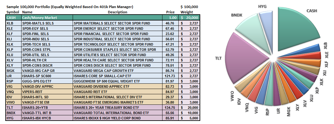
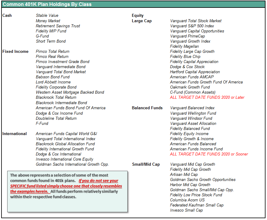
401k Choice Matching List
The list below shows sample 401k plan funds for each major category. In reality, the majority of funds all track their indices fairly closely. Therefore, if you don’t see your exact fund listed, look for a fund that is similar in nature.
Disclosure: The information contained in this article should not be construed as financial or investment advice on any subject matter. Streettalk Advisors, LLC expressly disclaims all liability in ...
more

