
The Coming "Snap-back" Of Markets

Last week, I addressed some interesting stats from Adam Taggart via Peak Prosperity:
- “It has been over 100 months (more than 8.5 years) since the current bull market began in April of 2009
- It has been 15 months since the last (and very brief) drop of 5% in the S&P 500
- This past September saw record low volatility, including a stretch now claimed to be “the most peaceful days in the history of the markets”
- Since last year’s presidential election, at which point the markets were already considered dangerously overvalued, the Dow Jones Industrial Average is up over 20%
- As of this article’s publishing, the Dow, the S&P, and the NASDAQ are all trading at record highs.”
Or visually:
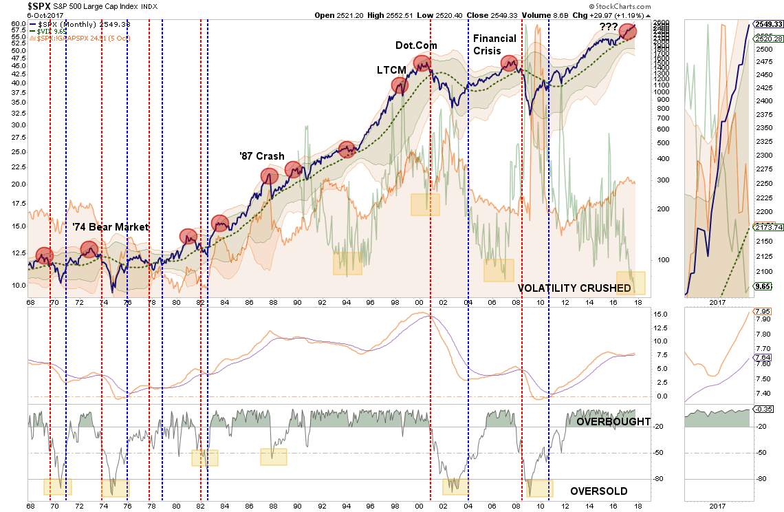
A week later, and nothing has changed with markets once again registering “all-time” highs.
As I have shown previously, the seemingly “impervious” advance since the election last November, has had an interesting “stair step” pattern with each advance commencing from a breakout of a several month 3%-ish consolidation range. Furthermore, each advance then pushes to a 3-standard deviation extreme, black circles, of the 50-dma before beginning the next consolidation trading range.

Notice that in both charts above, the market is currently pushing 3-standard deviations above their moving averages. This is an important concept to understand.
You’re Making My Brain Hurt
I know. It’s boring. But stay with me for a moment as this is important to understand.
Standard Deviation is defined as:
“A measure of the dispersion of a set of data from its mean. The more spread apart the data, the higher the deviation. Standard deviation is calculated as the square root of the variance.”
In plain English this means, and as shown in the chart below, is that the further away from the average that an event occurs the more unlikely it becomes. As shown below, out of 1000 occurrences, only three will fall outside of the area of 3 standard deviations. 95.4% of the time events will occur within two standard deviations.
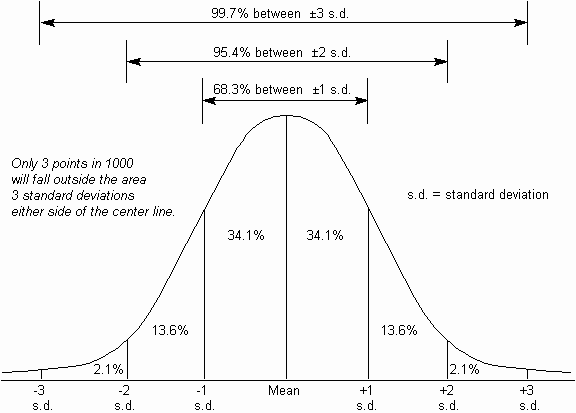
For the stock market, and as shown in both charts above, the standard deviation is measured is with Bollinger Bands. John Bollinger, a famous technical trader, applied the theory of standard deviation to the financial markets.
Because standard deviation is a measure of volatility, Bollinger created a set of bands that would adjust themselves to the current market conditions. When the markets become more volatile, the bands widen (move further away from the average), and during less volatile periods, the bands contract (move closer to the average).
The closer the prices move to the upper band, the more overbought the market, and the closer the prices move to the lower band, the more oversold the market.
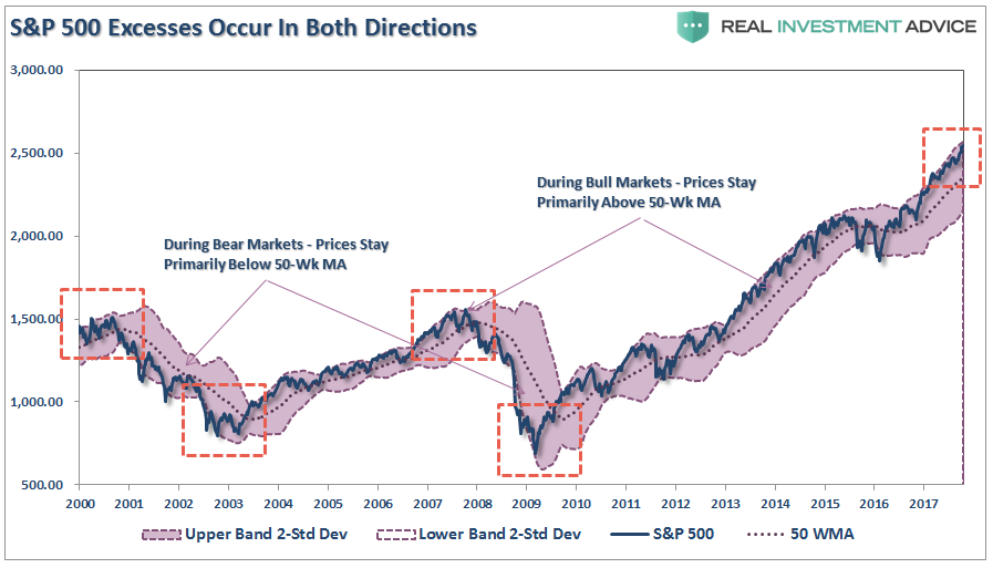
The dashed purple line is the 50-week moving average (or mean) with shaded area representing 2-standard deviations. As shown in the chart above, 2-standard deviations encompass 95.4% of all probable price movement. Even during the 2012-15, QE3 driven, stock advance, there were several corrections back to the 50-week moving average which allowed for increases in equity risk.
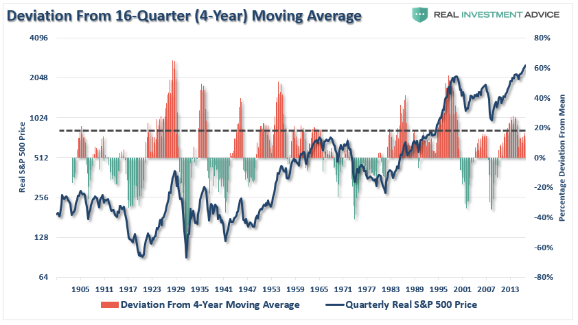
But, historically speaking, this is also where both intermediate and major peaks have formed. I showed this in detail in last Monday’s chart of the day which showed the S&P 500 based on Dr. Robert Shiller’s inflation adjusted price data and is plotted on a QUARTERLY basis. From that quarterly data I calculated:
- The 12-period (3-year) Relative Strength Index (RSI),
- Bollinger Bands (2 and 3 standard deviations of the 3-year average),
- CAPE Ratio, and;
- The percentage deviation above and below the 3-year moving average.
- The vertical RED lines denote points where all measures have aligned
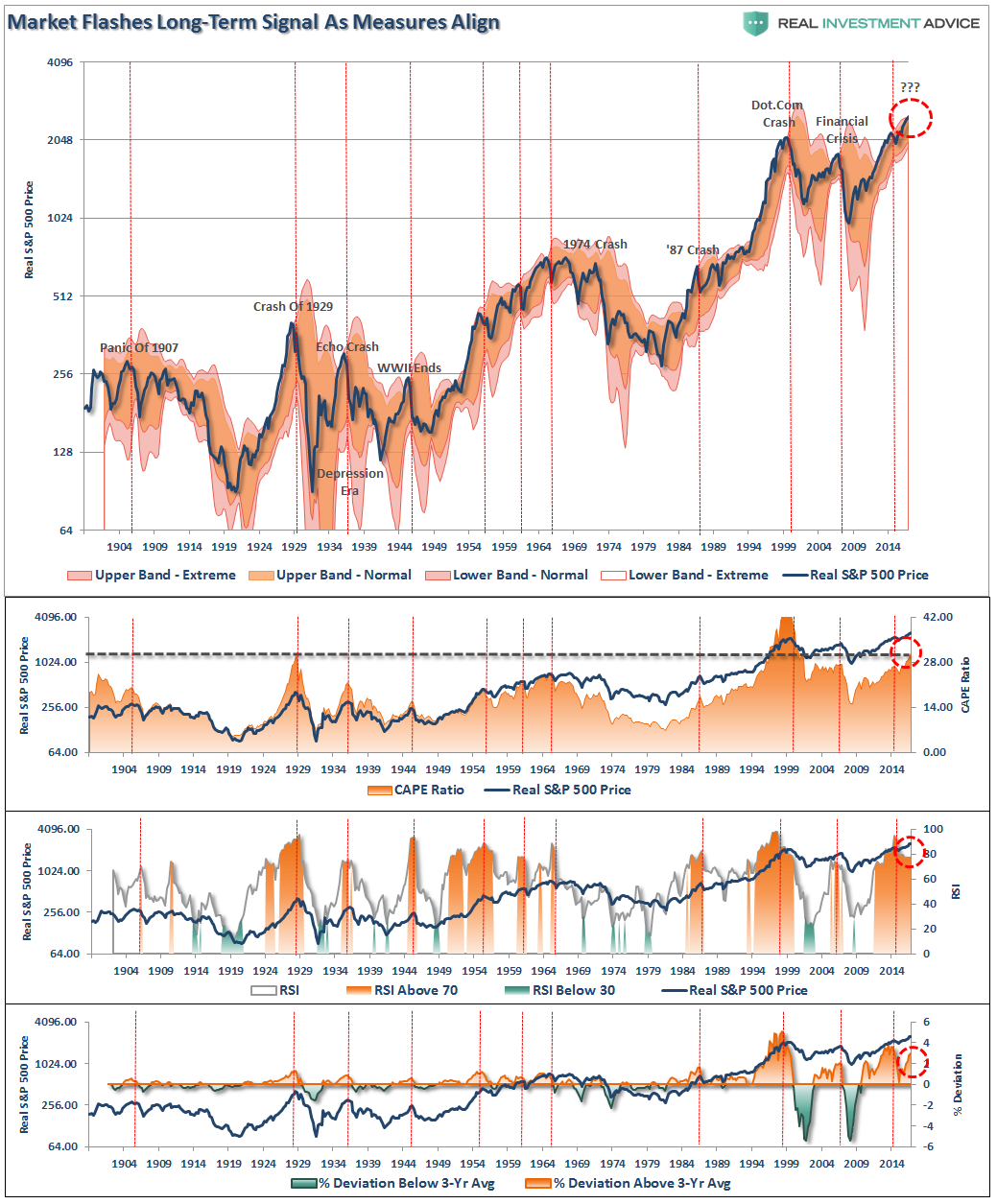
As shown above, the extensions of valuation, deviations from extremely long-term means and very high long-term RSI readings are flashing caution signals for investors.
But, as I penned last week:
“Over the next several weeks, or even months, the markets can certainly extend the current deviations from long-term mean even further. But that is the nature of every bull market peak, and bubble, throughout history as the seeming impervious advance lures the last of the stock market “holdouts” back into the markets.”
Currently, with the index more than 6% above its 50-week moving average, there is little questioning that the markets are extended to the upside. The most likely outcome, at some point, is a “reversion to the mean.”
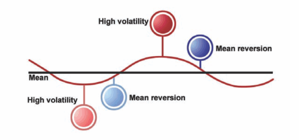
“Reversion To The Mean” – Is That Really A Thing?
The reality is that all markets eventually “revert to the mean” which is described as:
“Mean reversion is the theory suggesting that prices and returns eventually move back toward the mean or average. This mean or average can be the historical average of the price or return, or another relevant average such as the growth in the economy or the average return of an industry.”
Mean reversions occur both from levels above the long-term moving average (bear markets begin) and below (bull markets begin.)
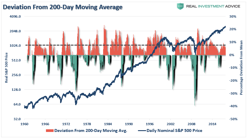
The deviation from long-term moving averages from the S&P 500, on various time scales, is at levels that have historically always preceded a mean-reverting event. The charts below look at the deviation above moving averages on a daily, weekly, monthly, quarterly and annual basis.
The first chart is the percentage distance between the price of the market and the 200-day average price. Historically, when the deviation approaches 10% or greater, the risk of a reversion increases.
Does it happen immediately? No.
Does it happen? Yes, every time.
Stepping back to a weekly basis, the same can be seen that deviations above the 1-year moving average of 10% or greater have also been predictive of reversions.
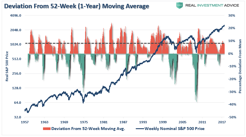
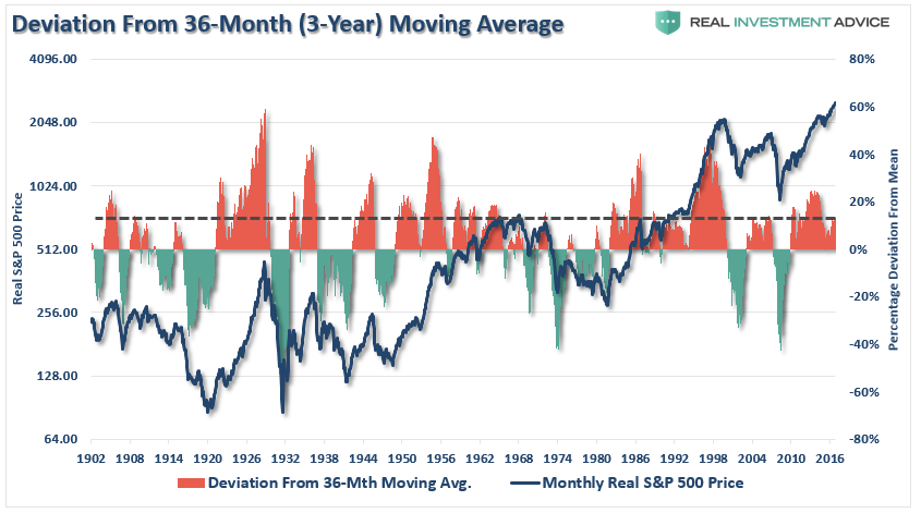
NOTE: To go back further in history, the next 3-charts use the Shiller Data, versus the S&P data above. I have also used the inflation adjusted price of the S&P 500 for the next three charts.
Looking back even further into history, deviations of 10% or greater from the 3-year moving average have denoted markets closer to a peak, than the beginning of a bull market cycle.
The same is true for quarterly data and a 4-year moving average.
As well as annual data and a 6-year moving average.

Here is all you need to take away from the charts above:
“All bull markets end. Period.”
More importantly, note that during ANY time period you observe, a mean-reverting event NEVER occurred by prices going sideways. There was always a decline, a correction, a bear market or a full-blown crash.
Regardless of what current reasoning that we wish to apply that somehow “this time is different,” it simply isn’t, and the ultimate outcome will be the same that it always has been.
As Vitaliy Katsenelson penned last week:
“Starved for yield, investors are forced to pick investments by matching current yields with income needs, while ignoring riskiness and overvaluation. Why wouldn’t they? After all, over the past eight years we have observed only steady if unimpressive returns and very little realized risk. However, just as in dating, decisions that are made due to a “lack of alternatives” are rarely good decisions, as new alternatives will eventually emerge — it’s just a matter of time.
The average stock out there (that is, the market) is very, very expensive. At this point it almost doesn’t matter which valuation metric you use: price to ten-year trailing earnings; stock market capitalization (market value of all stocks) as a percentage of GDP (sales of the whole economy); enterprise value (market value of stocks less cash plus debt) to EBITDA (earnings before interest, taxes, depreciation, and amortization) — they all point to this: Stocks were more expensive than they are today only once in the past century, that is, during the dot-com bubble.”
Ironically, or not, Jason Zweig from the Wall Street Journal just wrote much the same thing:
“Old bull markets don’t produce new ideas. They just produce new ways for investors to hurt themselves with old ideas.
With stocks at record highs and the income on bonds not far from record lows, circumstantial evidence suggests investors are getting restless — if not desperate.
Chasing ‘yield,’ or trying to get higher investment income, is one form of desperation. Last month, $1.6 billion in new money poured into exchange-traded funds holding high-yield corporate bonds, according to FactSet.
Another aspect of the problem: The longer markets go on producing decent performance at little apparent risk, the more investors come to believe that high returns must be a kind of entitlement.”
The reality is that investors who are stampeding into expensive stocks through passive index funds are buying what has worked. Chasing performance has always been the hallmark of overly bullish, overly extended and exuberant markets. It will, as always, eventually stop working.
As Vitaliy concluded:
“In 2016, less than 10 percent of actively managed funds outperformed their benchmarks (their respective index funds) on a five-year trailing basis. Unfortunately, the last time this happened was 1999, during the dot-com bubble, and we know how that story ended.”
To summarize the requirements for investing in an environment where decisions are made not based on fundamentals but due to a lack of alternatives, we are going to paraphrase Mark Twain:
‘All you need in this life [read: lack-of-alternatives stock market] is ignorance and confidence, and then success is sure.’”
What We’re Doing Now
It is that large deviation from the moving average that has us currently taking the following actions within our portfolio management process.
- Added bonds to portfolios across the board with the recent spike in interest rates which suppressed bond prices.
- Trimmed exposure in positions that were extremely overweight.
- Moved stop levels on all positions to recent support levels.
- New accounts – we swept excess cash into our cash management model to improve yield.
- New accounts – holding cash slotted for equity allocation until a better risk/reward opportunity is presented.
As I have repeatedly stated over the last several months, while I may consistently point out the“risks” that currently prevail in the markets, our portfolios remain long-biased. But positioning will change when the current “bullish” trends become decidedly bearish.
When that occurs, or what the catalyst is that causes it, is currently unknown…to everyone. Ignoring the risks with the idea this time is somehow different, is not an investment strategy – it is “hope.”
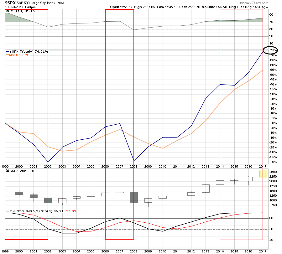
As Adam summed up last week::
“The stock market is now 75% higher than it was at the previous bubble peak immediately preceding the 2008 Great Financial Crisis (and the Dot.com crash)
Reflect for a moment how painful the crash from Oct 2008-March 2009 was. How much more painful will a crash from today’s much dizzier heights be?”
The chart below illustrates Adam’s point. There have only been two periods since the turn of the century where RSI on a 10-YEAR basis was above 70, as it is today, and both times ended poorly.
The market currently remains in an extremely bullish trend, but the opportunity to add “new money” to the markets will have to be waited out at this juncture.
We remain bullishly biased for now. Importantly, we continue to remain invested. However, we do so with a realization that every good party comes to an end. We just plan to be gone before the police arrive.
If you’re the last one out…be polite and get the lights.
Market & Sector Analysis
Data Analysis Of The Market & Sectors For Traders
S&P 500 Tear Sheet
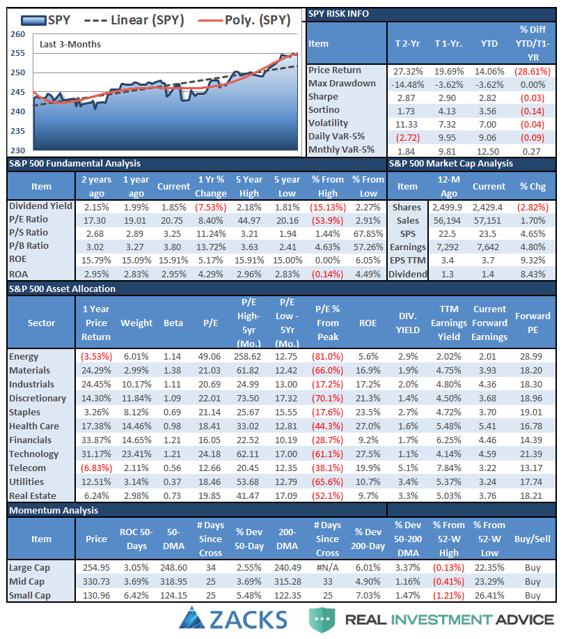
Performance Analysis
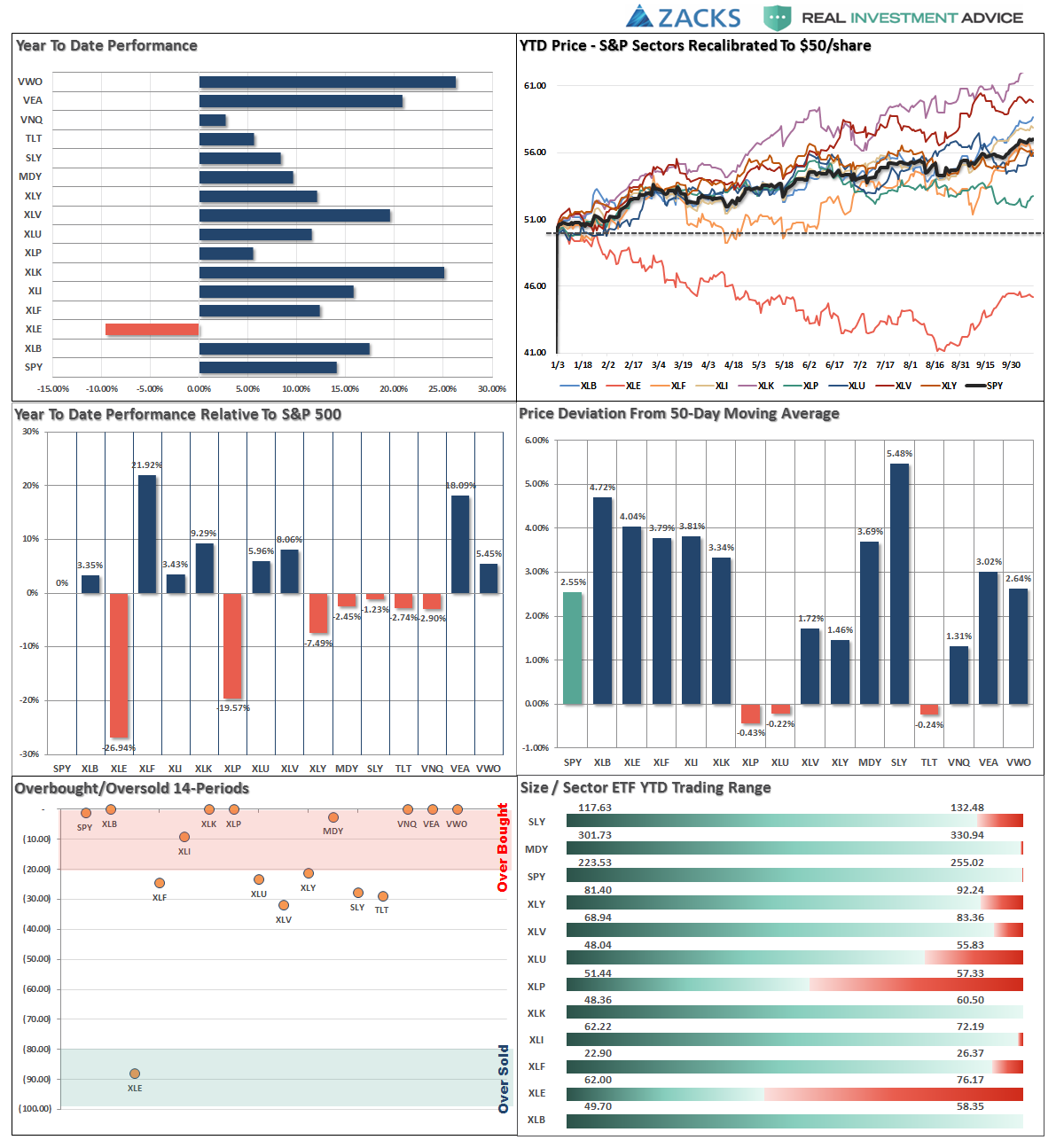
ETF Model Relative Performance Analysis

Sector & Market Analysis:
This bull market seems to be an unstoppable train. However, we have seen similar rallies previously from oversold conditions, and this one has all the same hallmarks that we are likely to the point where further gains are going to be much more difficult to come by.

With the current long-term MACD at very high levels, watch for a sell-signal as a good indication of a point to reduce overall portfolio risk.
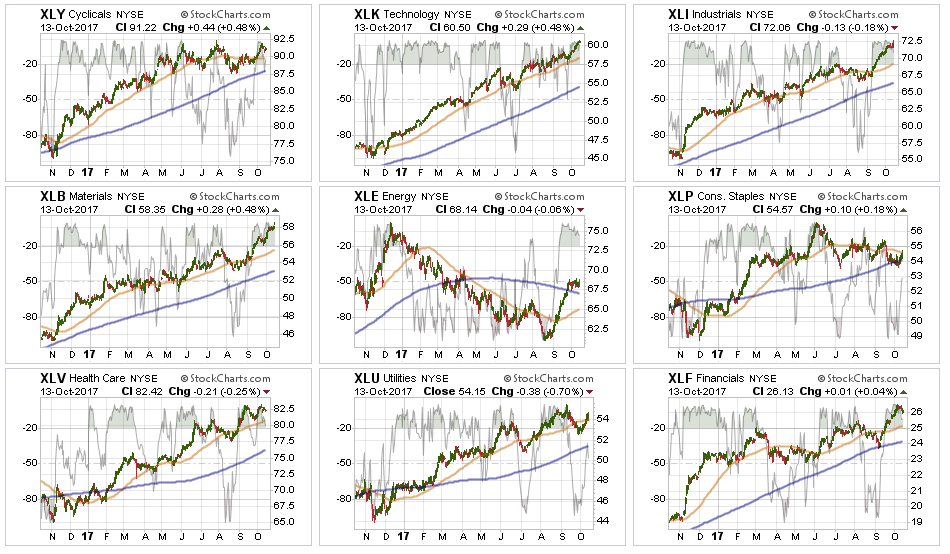
Technology, Industrials, and Materials – continued to lead this past week. With these sectors now back to very overbought levels in the short-term, some profit taking is advised. However, maintain weightings as the momentum currently weighs in their favor.
Financials and Healthcare stumbled last week but remain in bullish trends. However, with the sectors very overbought and showing a bit of weakness, profit taking, as advised last week, remains a good idea.
Energy has mustered a decent bounce but the trends and backdrop remain sorely negative. With oil prices struggling at $52/share, the current price move is largely done for now. While the underlying technicals are beginning to improve, the sector must stay above the 50-dma while working off the extremely overbought condition that currently exists. A violation will likely return the sector back to it previous downtrend. We continue to remain out of the sector entirely currently, but if the recent improvement can reverse the negative trends we will add weight to portfolios.
Discretionary and Staples have been under pressure as the consumer weakness continues to spread through the underlying companies. That story is a macroeconomic story that is being ignored by the rest of the market currently, however, it will eventually be the “tail that wags the dog.” Remain long both sectors for now but watch major support lines.
Utilities, as noted last week, were VERY oversold and the pop in interest rates following the announcement of the Trump Tax Plan led to a violation of the 50-dma. However, with the reality of “Trump Tax Cuts” beginning to fade, money flows into Utilities have picked up. Stops should be moved up to recent lows and any violation of the 200-dma should be watched closely.

Small and Mid-Cap stocks despite stalling last week, remain extremely overbought. Stops should be moved up accordingly. The moves to new highs for both markets provides some impetus for the market’s push higher in the short-term. We took profits in both of these sectors as they are now pushing 4-standard deviation extremes of the moving averages.
Emerging Markets and International Stocks continue to hold support and money has been chasing performance in these sectors as of late. Remain long these sectors for now.
NOTE: Correlation between all markets is extremely high. What goes up together also comes down together.
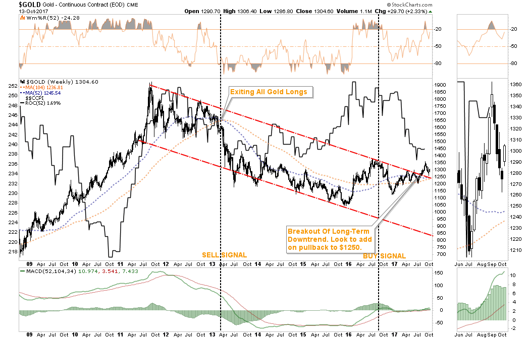
Gold – Last week, the precious metal found support near the 200-dma and rallied into the end of last week. The markets are beginning to sniff out a failure of tax reform in the months ahead and falling inflation suggests a weaker economy ahead. As I have stated previously, we exited gold longs back in 2013 and have remained on the sidelines. The recent break above the long-term downtrend has gotten us looking closely at adding gold back into portfolios. With gold extremely overbought, we will look for a “dip” towards $1250/oz to add weight to portfolios.
S&P Dividend Stocks, after adding some additional exposure recently the index broke out to new highs. We are holding our positions for now with stops moved up to recent lows. Take some profits and rebalance accordingly. Dividend stocks have gotten WAY ahead of themselves currently as the yield chase continues.
Bonds and REIT’s after taking profits in bonds previously, I noted over the last two weeks that we had become much more aggressive bond buyers. That has paid off well with bond prices improving last week and interest rate sensitive REIT’s pushing higher. We will continue to add more exposure if rates push towards 2.5% which is our target for this reversal.
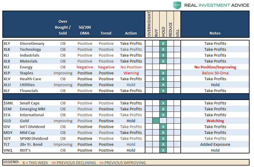
Sector Recommendations:
The table below shows thoughts on specific actions related to the current market environment.
(These are not recommendations or solicitations to take any action. This is for informational purposes only related to market extremes and contrarian positioning within portfolios. Use at your own risk and peril.)
Portfolio Update:
See Notes Above.
We used the pop in interest rates to move cash management accounts, and larger cash holdings, into our cash allocation strategy providing for better yields. We also added some new bond exposure to accounts and are looking for additional opportunities if rates push higher over the next couple of weeks.
We remain extremely vigilant of the risk that we are undertaking by chasing markets at such extended levels, but our job is to make money as opportunities present themselves. Importantly, stops have been raised to trailing support levels and we continue to look for ways to “de-risk” portfolios at this late stage of a bull market advance.
As always, we remain invested but are becoming highly concerned about the underlying risk. Our main goal remains capital preservation.
THE REAL 401k PLAN MANAGER
The Real 401k Plan Manager – A Conservative Strategy For Long-Term Investors

There are 4-steps to allocation changes based on 25% reduction increments. As noted in the chart above a 100% allocation level is equal to 60% stocks. I never advocate being 100% out of the market as it is far too difficult to reverse course when the market changes from a negative to a positive trend. Emotions keep us from taking the correct action.

Bulls Still Running
As noted last week, bullish trends remain in place, so portfolio allocations remain at target levels for now.
The markets are now extremely extended on several fronts. As noted in the chart above, it would require a near 12% decline just to intersect with the support and the long-term bullish trend. Extreme deviations from long-term trends don’t last forever, so caution is advised with overly aggressive exposure. We suggest taking the recent advance as an opportunity to rebalance risk in portfolios by trimming overweight equity exposure and adding to fixed income exposure is a prudent goal this week.
Specifically, reduce small and mid-capitalization exposure back to TARGET percentages. Use the cash raised from rebalancing to increase bond exposure back to target weights as well.
All NEW contributions to plans should currently be adjusted to cash or cash equivalents like a stable value fund, short-duration bond fund or retirement reserves. Stop loss levels should be moved up accordingly.
Current 401-k Allocation Model
The 401k plan allocation plan below follows the K.I.S.S. principle. By keeping the allocation extremely simplified it allows for better control of the allocation and a closer tracking to the benchmark objective over time. (If you want to make it more complicated you can, however, statistics show that simply adding more funds does not increase performance to any great degree.)
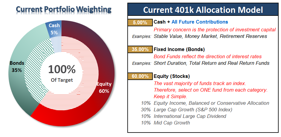
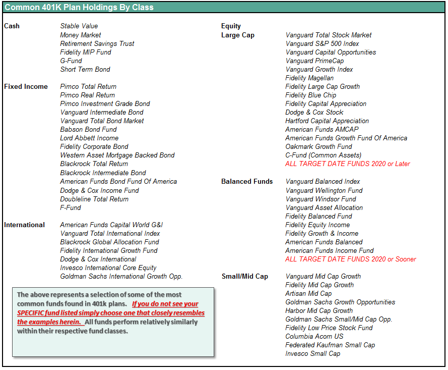
401k Choice Matching List
The list below shows sample 401k plan funds for each major category. In reality, the majority of funds all track their indices fairly closely. Therefore, if you don’t see your exact fund listed, look for a fund that is similar in nature.
Disclosure: The information contained in this article should not be construed as financial or investment advice on any subject matter. Streettalk Advisors, LLC expressly disclaims all liability in ...
more

