
Mapping Out The Market’s Next Moves

“Could you add a few more lines to the chart!”
That was one of the funniest comments I got last week.
I get it.
Over the last couple of months, I have been tracking the correction of the market based on three (3) potential outcomes mapped out in late March. However, for new readers seeing just the latest version, without the previous context, I get the confusion. (I laid out the progression last week if you want to review.)
First, let’s start with where we left off last week, updated through Friday’s close.
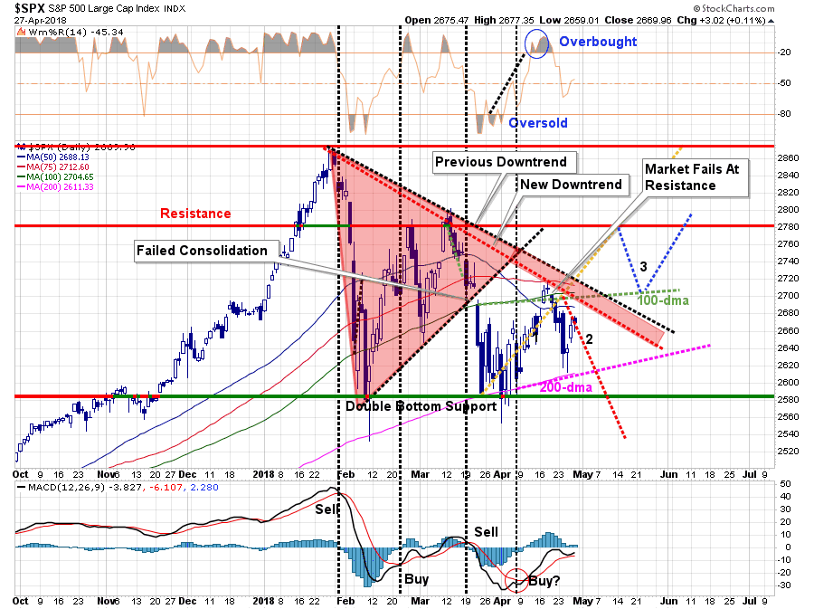
Let’s start out with the “good news.”
- The market maintained support at the 200-dma again which furthers strengthens that support level.
- The advance on Thursday and Friday kept the short-term “buy signal” positive through the end of the week, although just barely.
- The 50-dma, which has broken below the 100-dma, has flattened out.
The “not so good news” remains:
- The market remains confined to a broader consolidation pattern.
- The sell-off early last week did not get the market back to short-term oversold
- There is a massive cluster of resistance just above where the market closed on Friday.
Let me review our expectations from last week.
“In last weekend’s missive, as the rally approached the 100-dma, we recommended that investors use the rally to take action and rebalance risk in portfolios. We also discussed the benefits of holding extra cash.
This week, we are continuing to carry an overweight position in cash.However, we are monitoring the possible actions heading into next week:
- With the market on a short-term “buy” signal, there remains a potential for another rally attempt next week. If the market can clear the downtrend, then we will be looking for an opportunity to redeploy cash.
- However, the failure at resistance applies more downward pressures to prices in the short-term which keeps risk elevated. Pathway 2 is becoming much more viable if market action doesn’t improve soon.
- Over the next couple of weeks, it is critically important for the market to regain its footing and not break the 200-day moving average which will likely accelerate the correction process.
Over the last week, the market fulfilled all three points as the initial decline and retest of the 200-dma set up a rally that left the market below resistance and effectively unchanged (-0.01%) for the week. This is despite “great earnings” and a relaxation of geopolitical. issues.
That’s not great news.
However, what has changed is that our previous three pathways are now no longer valid.
When I first went through this exercise of laying out possible pathways, I stated:
“Considering all the various factors, I begin to layout the ‘possible’ paths the market could take from here. I quickly ran into the problem of there being ‘too many’ potential paths the market could take to make a legible chart for discussion purposes. However, the bulk of the paths took some form of the three I have listed below.”
In laying out new pathways, the same problem remains. However, once again, I have chosen three possible paths which include a majority of the potential outcomes, or more commonly known as “a guess.”
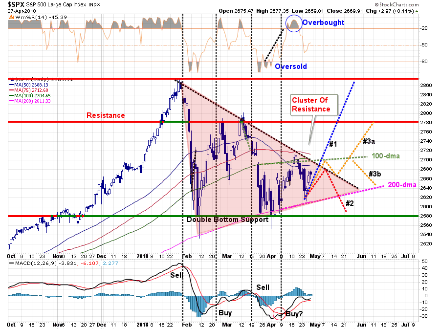
- Pathway #1 is the most bullish of potential outcomes. With earnings continuing next week, and short-term conditions mildly oversold, the market is able to push through resistance and rally back towards old highs. (Probability = 20%)
- Pathway #2 is the most bearish with the market failing at the cluster of overhead resistance once again but this time violating the 200-dma. This decline begins a process of a deeper correction as we head into the summer months. (Probability = 30%)
- Pathway #3a and #3b suggest a further rally to the 100-dma, a pullback to the previous downtrend and then either an advance that breaks above the 100-dma and begins a more bullish rise, OR a failure and another test of the 200-dma.(Probability =50%)
I am currently giving the pathways #3a and #3b the most weight only because we are in the midst of earnings season which could continue to provide some short-term support. However, as we will discuss momentarily, as we head into the summer months, things become much more unstable.
Let me restate that these potential pathways are only “guesses” at what the market could do next.
- Those in the bullish camp are expectorating the market to move straight up.
- The bears are expecting it to move straight down.
Neither ever happens.
As a portfolio manager, I don’t have the luxury of being either “bullish” or “bearish” which can lead to substantial career risk when things inevitably go wrong.
However, since I have to make some guesses at potential outcomes in order to allocate portfolios and manage risk accordingly, this process of mapping and writing out potential pathways forces me to weigh options. Without such a process, investing would be akin to “driving with your eyes closed” which tends to have rather unhappy endings.
With portfolios still weighted towards equity, but overweight in cash and shorter-duration fixed income, we can afford to sit still into next week and allow the market to choose its path.
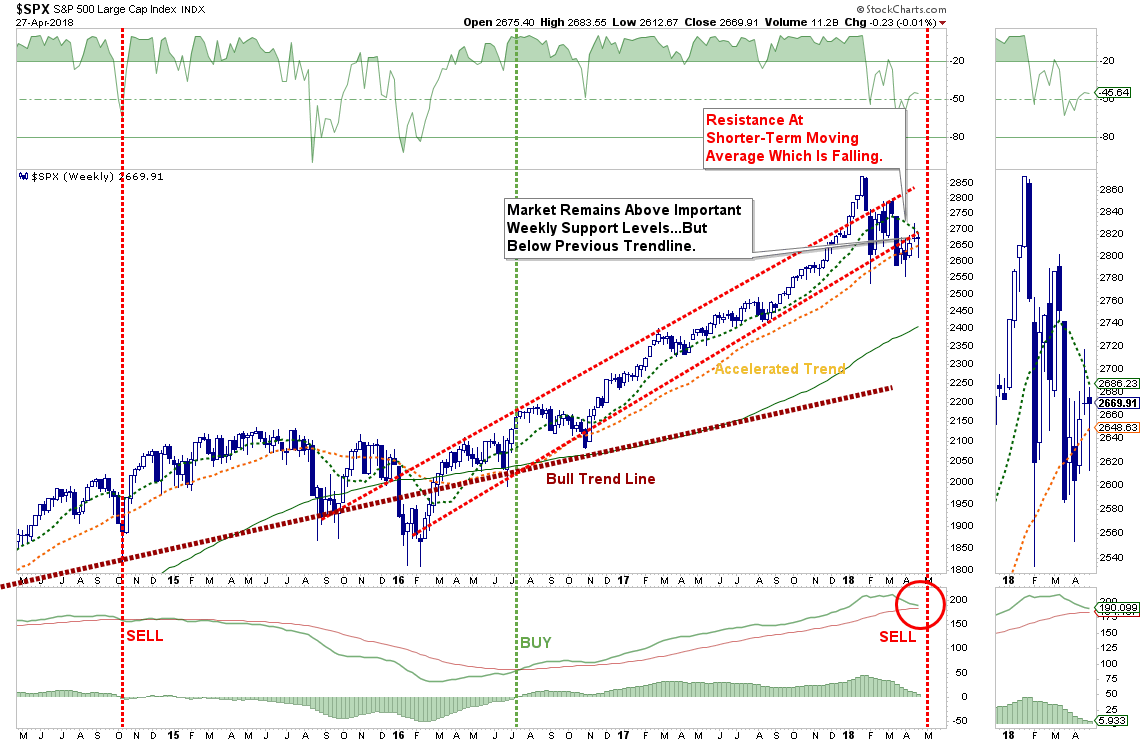
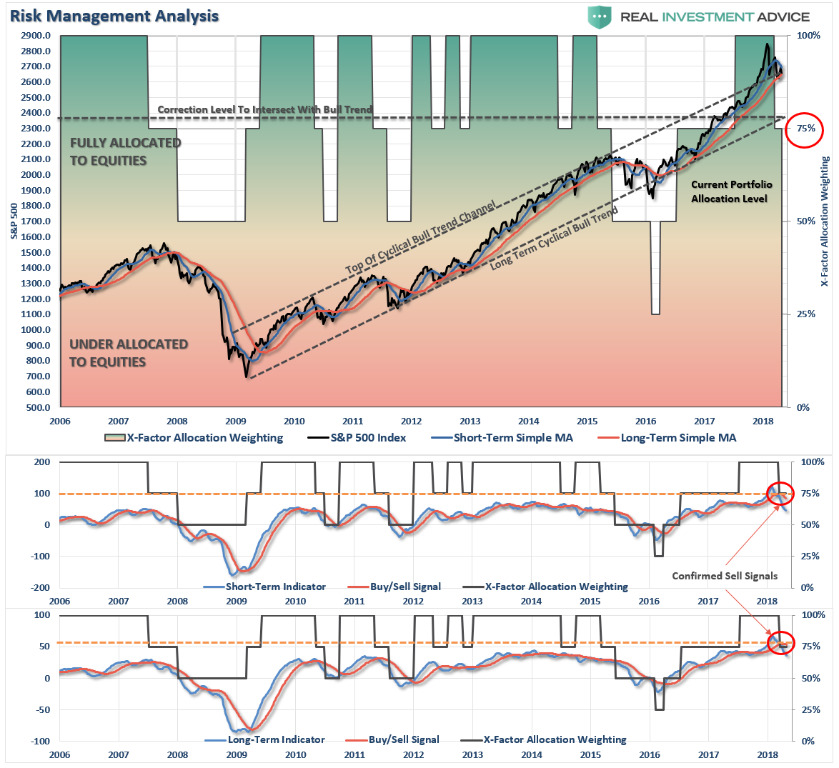
Intermediate-Term Picture Remains Bearish
On a intermediate-term basis, both of our weekly “sell signals” remain, and as shown below, the market once again failed at its overhead trend line last week as well as the downtrend resistance from the previous peaks. These failures keep downward pressure on the market as prices continue to follow the “path of least resistance.”
The weekly chart below also shows the rare “buy” and “sell” signals issued on a longer-term basis. Currently, as the market struggles with its current correction process, it is also very close to triggering a more important “sell signal” which could indicate a further correction process over the next several months.
How rare are these “sell signals” exactly?
The chart below the same chart as above except over a 25-year period.
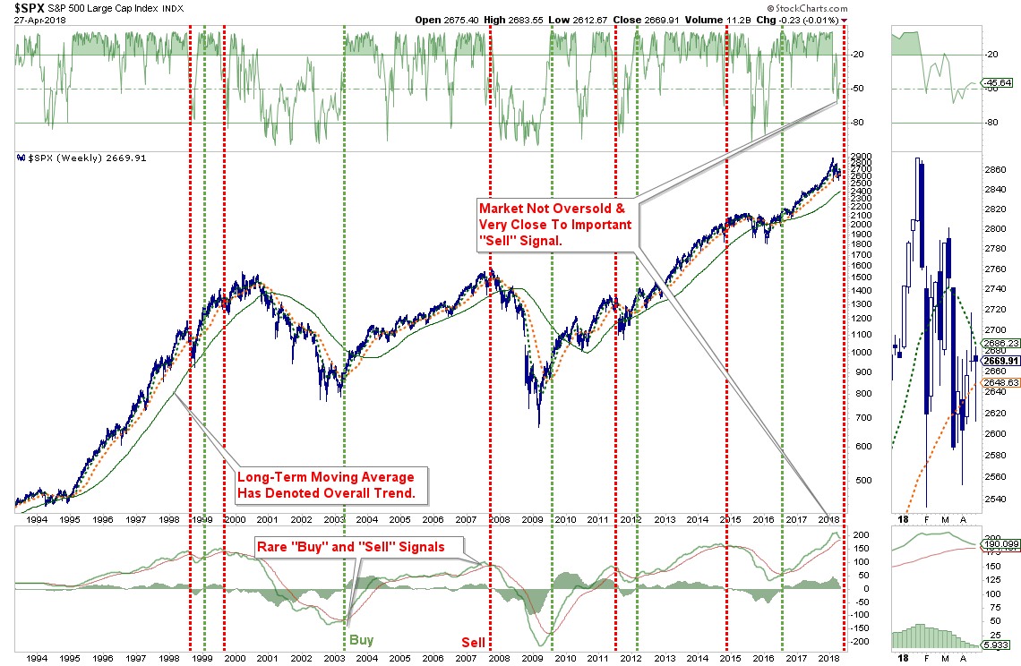
Over the last 25-years, these sell signals have only been triggered 5-other times.
- At the peak of the market prior to the “Asian Contagion”
- Just prior to the peak of the market in 2000
- At the peak of the market in 2007
- At the peak of the market 2011 as QE-2 ended and the U.S.was facing the “debt ceiling debate.”
- Near the peak of the market from the collision of the end QE-3, the “taper tantrum” and “Brexit.”
Think about this for a minute.
How did a simple technical indicator catch what every mainstream and media analysts missed?
Market prices are a reflection of the overall psychology of the market. While in the very short-term the media and most investors opt to “hope” for a “never-ending bull market.”
Why not? Making money is fun.
However, prices, and more importantly “price momentum", is the collective wisdom of all market participants. These indicators are simply a reflection of the “forecasts” of the “collective mind".
There are many who continue to espouse the idea this market will right itself and regain its bullish footing, which is certainly a possibility I laid out in our pathways above. But, with these indicators warning of a different outcome, it is certainly worth considering the alternatives.
As I have often written in the past:
“Making up a lost opportunity in a rising bull market is substantially easier than making up lost capital from a bear market.”
Time is not your friend.
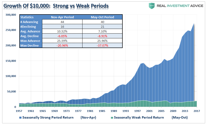
We remain cautious as the “best 6 months” of the year have now come to an end.
May Begins Worst 6 Months Of The Year
Jeffrey Hirsch of “Stocktraders Almanac,” recently penned the following note:
“May officially marks the beginning of the “Worst Six Months” for the DJIA and S&P. To wit: “Sell in May and go away.” May has been a tricky month over the years, a well-deserved reputation following the May 6, 2010 “flash crash” and the old “May/June disaster area” from 1965 to 1984. Since 1950, midterm-year Mays rank poorly, #9 DJIA and NASDAQ, #10 S&P 500 and Russell 2000, #8 for Russell 1000. Losses range from 0.1% by Russell 1000 to 1.9% for Russell 2000.
For the near term over the next several weeks the rally may have some legs. But as we get into the summer doldrums and the midterm election campaign battlefront becomes more engaged, we expect the market to soften further during the weakest two quarter stretch in the 4-year cycle.”
Just as a reminder, it pays to be more cautious in summer months.
Fed Is Behind & Screwing Up
by Tom McClellan
Make me Emperor for a day, and I would compel the FOMC to outsource interest rate policy to the bond market. Why should we pay 12 experts, most with expensive Ivy League PhD degrees, to do what the bond market can do far more efficiently (and cheaply)?
This week’s chart compares the 2-year T-Note yield to the stated Fed Funds target rate. The FOMC has actually said that the target rate is 1.5% to 1.75%, so I’m splitting the difference by calling it 1.625%. What this chart shows is that first, the two interest rates are very strongly correlated over time, which is as one would expect. But second and more importantly, the 2-year yield knows best what the Fed should do. And the Fed screws up when it does not listen.
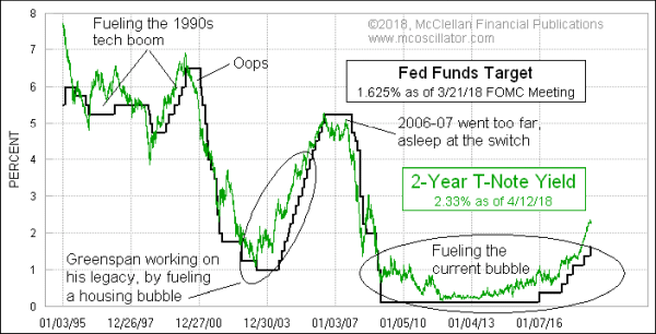
If the FOMC would just set the Fed Funds target to within a quarter point of wherever the 2-year T-Note yield is, we would have fewer and quieter bubbles, and also much less severe economic downturns. For whatever reason, the FOMC members have not learned this lesson. None of them, as far as I know, is a subscriber, which is their loss.
The “Taylor Rule” for setting short term rates is an equation involving figures for GDP, inflation rate, and “potential output”, all of which are numbers which can be fudged by statisticians.
The “McClellan Rule” is much simpler: listen to the 2-year T-Note Yield, which the statisticians cannot monkey around with. By this rule, the Fed is still being overly stimulative, by setting the Fed Funds target well below where it ought to be. In other words, the Fed is being “too loose” with interest rate policy, according to this measure.
But complicating that equation is what else the Fed is doing, in terms of liquidating its holdings of Treasury debt and Mortgage Backed Securities (MBS). During 3 separate rounds of “quantitative easing” or QE, the Fed got up to total holdings of $4.25 trillion. At the most rapid rate of acquisition, the Fed was buying up $85 billion per month in 2014.
In 2017, the Fed announced it would be starting to unwind those holdings, slowly at first, but accelerating to a rate of $30 billion per month of “quantitative tightening” (or QT) now in Q2 of 2018, and supposedly going to a rate of $40 billion per month in Q3. So while interest rate policy is still arguably stimulative, that effect is counteracted by what the Fed is doing in other ways, sucking liquidity out of the banking system with its QT.
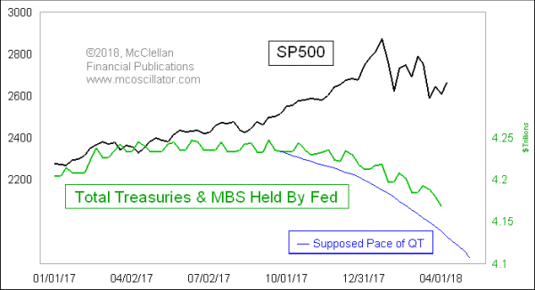
The Fed was a little bit slow at first in keeping up with its stated rate of QT, but it is catching up now. One could argue that the Fed is not really selling off these assets, and instead it is just allowing them to expire and not be renewed. But it is still the case that several billion dollars of debt are having to be absorbed by the market place instead of by the Fed. It is also true that the size of QE between 2009 and 2015 was small compared to the total amount of federal debt, but it was still important enough to lift the stock market in a huge way.
Now the amounts of the QT unwinding are pretty small compared to the total debt, but they are having a similar effect of depressing the stock market, just as QE elevated it. And this is where the modeling gets difficult – – interest rate policy is stimulative, by the Fed Funds target rate being below the 2-year yield. But at the same time the Fed is being repressive by sucking liquidity out of the banking system with QT. I don’t know how to construct a “balance of forces equation” to depict how those two factors interact with each other, as this is pretty new territory for market history.
But I can say that when the Fed worked hard to reduce the size of its balance sheet in 2008, during the worst liquidity crisis in decades, the effect was pretty direct and pretty obvious. The Fed blew up Bear Stearns and Lehman Brothers by sucking too much liquidity out of the banking system.
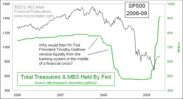
In a text note within this chart, I pose the rhetorical question of why the then-president of the NY Fed, Timothy Geithner, would orchestrate a huge reduction in the Fed’s holdings of Treasury debt during the worse liquidity crisis in years. Part of the answer can be found in the historical observation that this bear market helped to assure the election of President Obama in November 2008. And Mr. Obama very quickly appointed Timothy Geithner as his Treasury Secretary. You can insert your own conspiracy theory here, since I don’t have subpoena authority to investigate contacts between the Obama campaign and the New York Fed in 2008.
The point of that historical lesson which we should remember in the current moment is that having the Fed reduce the size of its balance sheet carries an enormously powerful effect on banking system liquidity. My expectation is that by sometime later this summer, the FOMC is going to realize that its reduction of holdings of Treasuries and MBS is creating a big liquidity problem, and they will abandon or curtail those plans. But it is going to require a lot of damage to the stock market to get them to realize what they need to do. I expect that realization to hit them sometime around August 2018, and it should lead to a huge stock market rebound into year-end. But it will be a rebound from a big selloff.
Market & Sector Analysis
Data Analysis Of The Market & Sectors For Traders
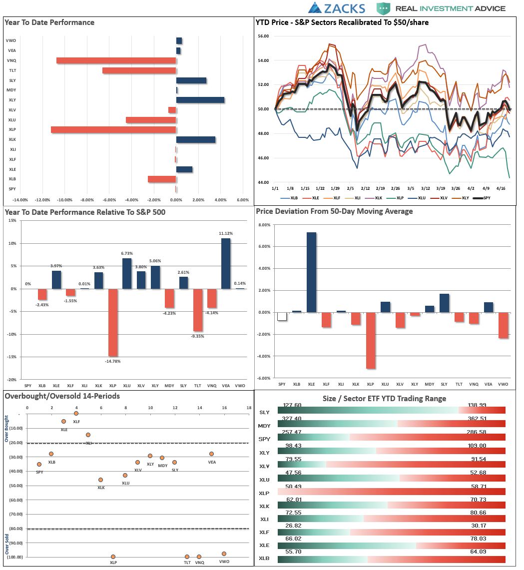
S&P 500 Tear Sheet

Performance Analysis
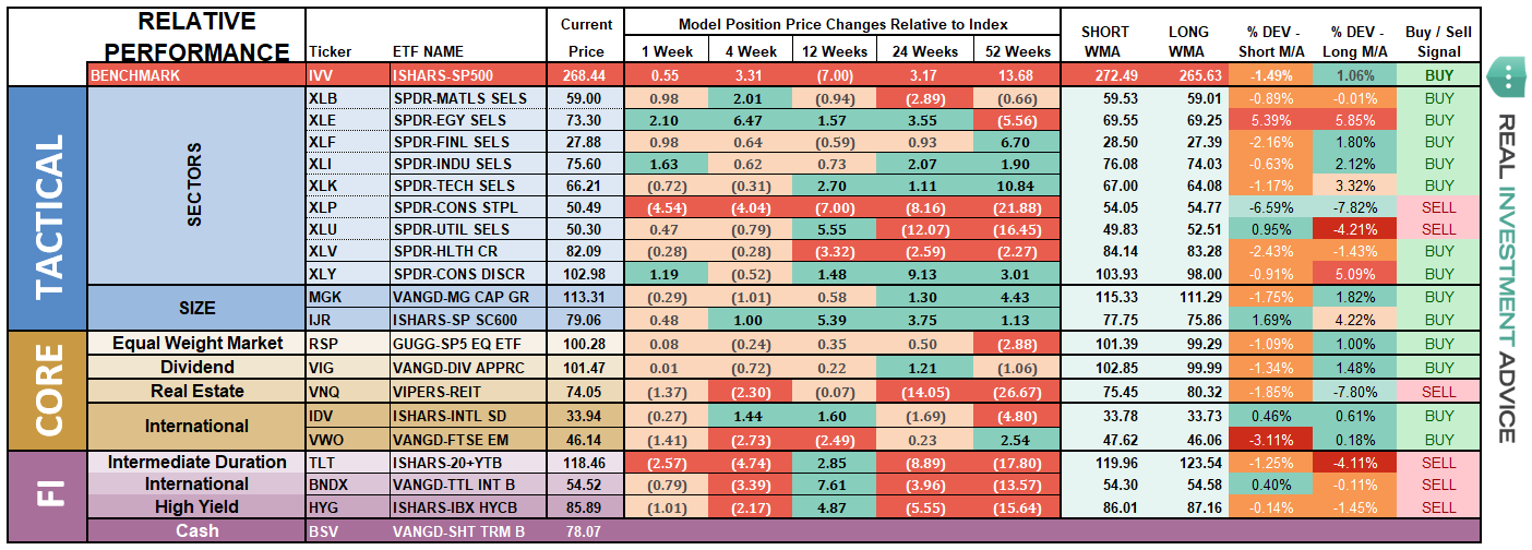
ETF Model Relative Performance Analysis
Sector & Market Analysis:
As I noted last week, the market is on a very short-term trading “buy” signal. However, with the market still on longer-term “sell” signals, remaining below important resistance and still contained in a downtrend, this rally should be used to raise cash rather than take on additional risk. That advice remains this week as well.

Discretionary, Energy and Health Care are the only three sectors actually above their respective 50-dma currently. However, while that is the case, with the exception of Energy, performance has been lackluster at best and rallies have been more useful for taking profits than taking on further exposure. Energy, on the other hand, has had a parabolic surge higher that should be faded. Take profits in energy and hold the cash for now.
Technology, despite earnings surprises from FB and AMZN, the sector put in a rather tepid performance over the last week. While we remain market weight in the sector currently, we are watching performance closely as we move further into earnings season. Technology, because of its massive weighting in the S&P, is the sector to watch to determine the overall market trend.
Materials, and Industrials – We closed out of our positions in these two sectors earlier this year as “trade war” talk begin to gain momentum. With that threat still present, plus higher borrowing and energy costs, there is more downside risk currently. We remain watchful for a potential entry point, but with both sectors flirting with their 200-dma we will sit on the sidelines and watch for now.
Financials and Health Care have recovered recently, but continue to lag on a relative performance basis. Financials, in particular, remains weak. We remain long these sectors for now, but are cautious and underweight relative to normal positioning.
Staples – after completely falling apart after a rally back to the 50-dma, the rotation from “risk” back into “safety” late last week gave the sector a bounce. There is likely an opportunity being formed currently, but it will take some more time to develop first. More importantly, the sector speaks much more broadly about the real health of the economy. Pay attention to the message.
Utilities have significantly picked up performance in recent weeks and have broken back above the 50-dma. We are not recommending adding to the position yet as the moving-average crossover remains negative. However, the 50-dma is beginning to improve. Utilities are now trying to break above their 200-dma which would suggest an increased exposure in portfolios. Like Staples, the rotation from “risk” to “safety” last week is much more indicative of concerns about overall market risk.

Small Cap, Mid Cap, and International indices all pushed back above their 50-dma but continue to struggle with multiple tops. This is particularly the case with Small-caps which have put in a triple top, Mid-cap is continuing to build a downtrend as well as International. Remain patient at the moment.
Emerging Markets are still struggling. We previously removed our holdings in this sector and remain flat currently. We will continue to monitor performance for improvement.
Dividends and Equal weight continue to hold their 200-dma. We continue to hold our allocations to these “core holdings", but are closely monitoring performance. The continued development of a downtrend channel is concerning.
Gold continues its volatile back-and-forth trade but remains confined below a massive level of multi-top resistance. As of this past week, Gold not only failed another test of recent highs but broke back below its 50-dma. We currently do not have exposure to gold, and have been out for a long-time, but if you are already long the metal hold for now. $123 on GLD is a hard stop.
Bonds and REITs – Last week interest rates peaked over 3% for just a brief moment before plummeting back. This led to a sharp whipsaw in bond prices. We bought more bonds last week as rates crested 3%, but from a trading perspective, we remain flat until prices improve and the short-term “sell-signal” is reversed. The 50-dma is flattening out which suggests the current sell-off may be near its end.REIT’s, on the other hand, continue to build an uptrend after finding support at the 50-dma. While the sector is very overbought, a correction that maintains the bullish trend will be buyable.
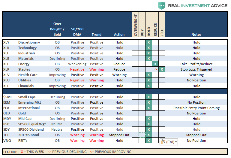
The table below shows thoughts on specific actions related to the current market environment.
(These are not recommendations or solicitations to take any action. This is for informational purposes only related to market extremes and contrarian positioning within portfolios. Use at your own risk and peril.)
Portfolio/Client Update:
Over the last several weeks we have continued to maintain higher levels of cash than normal as market volatility has markedly increased. This past week, we tested the 200-dma once again and held support but continue to remain confined to a downtrend overall. This keeps us cautious at the moment and we continue to use rallies to sell “out of model” positions so portfolios can be positioned to enter into our models as the opportunity presents itself.
While we continue to honor the current “bullish trend", we remain very aware of the rising risks and continue to look for opportunities to derisk and re-hedge portfolios while “sell signals” remain firmly intact.
In our equity/option wrap model, we continue to just let options mature/expire and allow that process to derisk portfolios automatically. That model will be rebuilt as premiums in options in our selected equity screens rebalance to more profitable levels.
As noted last week, the rally has been extremely week and lacked real conviction. However, if the market can break above the current downtrend channel on heavy volume, confirming a breakout, we reallocate and rebuild portfolio models accordingly.
For the moment, we are just letting the markets determine the best course of action and we continue to raise cash on technical breakdowns. Our bigger concern, remains the relative risk to capital if the 9-year old bull market is ending. If the current correction expands into a more meaningful reversionary process, we will become much more aggressively risk adverse. There is plenty of evidence to support the latter case.
It is crucially important the market maintains the current uptrend from the recent lows. After having reduced exposure a couple of weeks ago, we remain on alert for the next opportunities.
We remain keenly aware of the intermediate “sell signal“ which has now been “confirmed” by the recent market breakdown. We will continue to take actions to hedge risks and protect capital until those signals are reversed.
THE REAL 401k PLAN MANAGER
The Real 401k Plan Manager – A Conservative Strategy For Long-Term Investors
There are 4-steps to allocation changes based on 25% reduction increments. As noted in the chart above a 100% allocation level is equal to 60% stocks. I never advocate being 100% out of the market as it is far too difficult to reverse course when the market changes from a negative to a positive trend. Emotions keep us from taking the correct action.

Market Continues To Struggle
As I wrote two weeks ago, the “reflexive rally” to reduce exposure finally got into the “neighborhood” of our initial target area that we laid out nearly a month ago. The market failed at that target on Friday which confirms the reduction measures we laid out previously.
If you have not already taken action in your 401-k plan, I would advise using last weeks recovery to move to target allocations next week and mitigate risk temporarily. With both confirmed “sell signals” in place, and becoming more negative, the risk to equity exposure currently remains to the downside. If conditions improve we will rebalance equity risk in portfolios back to full allocations but a LOT has to happen first.
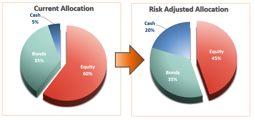
If you have already reduced equity exposure just sit tight this week and let’s see what happens.
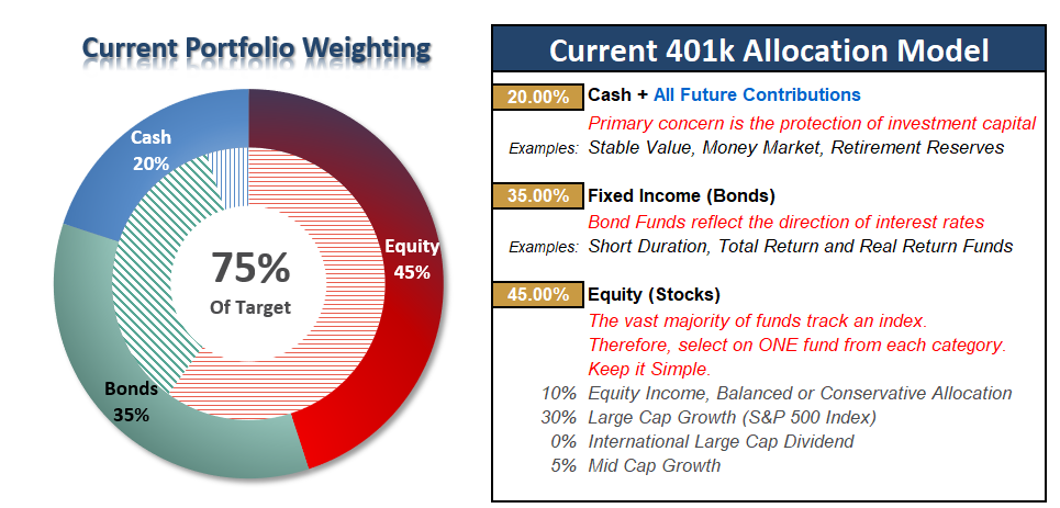
Current 401-k Allocation Model
The 401k plan allocation plan below follows the K.I.S.S. principle. By keeping the allocation extremely simplified it allows for better control of the allocation and a closer tracking to the benchmark objective over time. (If you want to make it more complicated you can, however, statistics show that simply adding more funds does not increase performance to any great degree.)
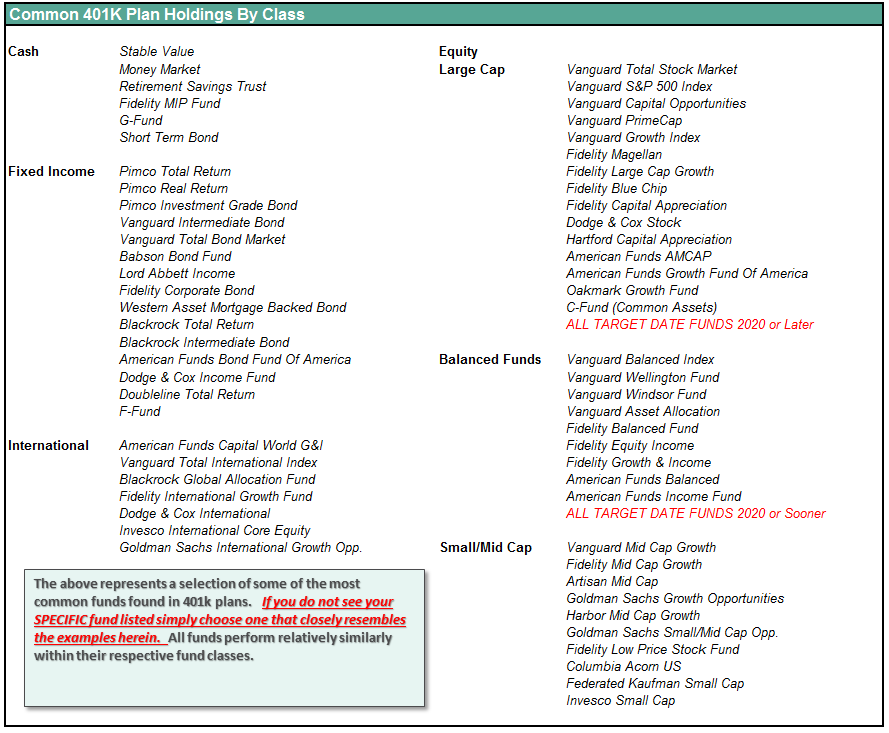
401k Choice Matching List
The list below shows sample 401k plan funds for each major category. In reality, the majority of funds all track their indices fairly closely. Therefore, if you don’t see your exact fund listed, look for a fund that is similar in nature.
Disclosure: The information contained in this article should not be construed as financial or investment advice on any subject matter. Real Investment Advice is expressly disclaims all liability in ...
more

