
Why The Housing Market Collapse Is Set To Resume
by Keith Jurow, Capital Preservation Real Estate Report
Analysts continue to be baffled by the weakness of the housing recovery. Mortgage rates have remained exceptionally low for several years. Yet new home sales are still at one-third the level of the bubble years. Existing home sales have never come close to peak year levels.

Last week, the Case-Shiller home price index for March 2015 was released. Although the 20-city composite index showed a year-over-year gain of 5%, this was down substantially from the 13% increase reported at the end of 2013.
For nearly five years, I have shown why this housing recovery has never been anything but an illusion – a mirage that disappears on closer examination. Had those analysts considered even a few of the key factors I have focused on, they would not be so perplexed.
Let me explain why the housing collapse is ready to resume in earnest.
Deception of mortgage delinquency data
Housing optimists always point to the consistent decline in the percentage of first liens that are seriously delinquent. The latest foreclosure report from CoreLogic showed that the national delinquency rate had declined to a mere 3.9%, down from the record 8.6% in early 2010.
How could this not be a good sign for the housing market?
Let’s tackle this question head on by taking a look at the first-lien mortgage portfolio of the too-big-to-fail banks – Wells Fargo, JPMorgan Chase and Bank of America. Together they own nearly $600 billion first mortgages on their balance sheet.
In their latest call reports filed with the FDIC, these three banks show the following mortgage delinquencies:
Wells Fargo – 13.8%
JPMorgan Chase – 13.3%
Bank of America – 12.9%
How could the delinquency rate of these huge banks be more than three times the CoreLogic figure? Let me explain.
First, the delinquency rate for these banks is based on the total outstanding balance of their mortgage portfolio. So 13.7% of the outstanding mortgage balance of Wells Fargo’s portfolio is delinquent. The same is true for the other two banks.
The CoreLogic data is completely different. Their delinquency rate of 3.9% is based on the number of loans. So 3.9% of the outstanding loans in CoreLogic’s massive database were delinquent as of March 2015. It has nothing to do with outstanding balance.
Why is this important? The vast majority of outstanding mortgage loans are relatively small loans originated in smaller towns, cities or metros that never experienced a housing bubble. You can see this in the size of the average loan guaranteed by Fannie Mae – $159,000.
The housing bubble was not nationwide. It was highly concentrated in roughly 25 larger metros in California, Florida, Arizona, Nevada, and the Northeast. It is in these metros where speculation was rampant, prices skyrocketed in 2004-2006 and the bulk of jumbo mortgages were originated.
For more than four years, I have shown that mortgage servicers have been reluctant to foreclose on the large loans that were shoveled out in these bubble metros. But they have had no problem foreclosing on smaller loans.
Large bubble-era jumbo loans make up the bulk of the delinquent inventory of the too-big-to-fail banks. The latest data we have for securitized jumbo loans not guaranteed by the GSEs – from March 2013 – shows delinquency rates of 17-19%. That is why the delinquency rate for the first-lien portfolio of these huge banks is so high.
Here is further proof that the delinquency problem is much worse than the CoreLogic data would have you believe. CoreLogic’s data comes from the database of its subsidiary – Loan Performance. Its database includes roughly 97% of all the non-Agency (i.e., not guaranteed) securitized mortgages outstanding today.
The firm BlackBox Logic has sophisticated tools to analyze this non-Agency database. They have provided me with up-to-date details on the delinquency rate of these non-guaranteed mortgages in major metros. The numbers are truly shocking.

The delinquency percentage includes all distressed properties – those delinquent anywhere from 30 days to more than 90 days, in foreclosure with a notice of default (NOD), repossessed by the lender (REO) or where the borrower has filed for bankruptcy.
What stands out immediately is that the highest figure belongs to the huge New York City metro area – covering three states with roughly 19 million residents. How could nearly 40% of all first liens be delinquent or already foreclosed?
For four years, I have written in-depth articles explaining what has been happening in the New York City metro. The speculative bubble was enormous there and mortgages were offered to just about anyone who applied. Many were jumbo loans too large to qualify for Fannie/Freddie guarantees.
When delinquencies soared and prices tanked in 2008 and early 2009, the servicing banks made a conscious decision to radically cut back on foreclosing. They also dramatically reduced the number of repossessed properties put back on the market. For more than five years, this strategy has continued.
The refusal of servicing banks to foreclose on New York City properties was more egregious there than anywhere else in the nation. Take a look at this shocking chart from NYU’s Furman Center.

This report on the state of NYC housing released recently by the Furman Center explained that a total of 306 properties were foreclosed in 2014. This is for a city with eight million residents.
What do you suppose happened in 2010? The word got out on the streets of New York that banks were not taking action against delinquent homeowners. The temptation of NYC property owners to stop paying their mortgage became almost irresistible.
Since early 2011, I have been posting clear evidence of this massive defaulting. Take a good look at this table that has not been published by the NY State Division of Banking since late 2010. No problem. My contact there has been updating me quarterly since then.
90-Day Pre-foreclosure Notices Filed with the NY State Department of Financial Services

This table needs some explaining. A 2009 NY State law required all mortgage servicers to send a pre-foreclosure notice to delinquent owner-occupants at least 90 days before they made any attempt to begin foreclosure proceedings. This notice warned them that their property was in danger of foreclosure and advised the owner of steps they could take to prevent it.
The servicers were also required to report the mailing of all notices to the NY State Division of Banking. This table shows the quarterly totals of mailed notices for the five counties of NYC and Nassau and Suffolk Counties on Long Island. Because of this requirement, these seven counties provide us with the most comprehensive data on delinquent mortgages in the entire nation.
I have been publishing updates of these figures for four years. But many skeptical readers do not believe the accuracy of these numbers. Suffolk County has had the highest number of pre-foreclosure notices sent to delinquent borrowers – more than 234,000 through the first quarter of 2015. How many outstanding first mortgages are there in the county? Roughly 210,000.
Hold on. More pre-foreclosure notices have been sent during these five years than there are outstanding first liens in this county? You are probably thinking: No way! So let me explain.
I talk regularly with my contact at the New York State Division of Banking about these numbers. He has done some serious digging into the database and found that roughly 40-50% of the pre-foreclosure notices sent for delinquent NYC properties are repetitions – second and third notices sent for the same delinquent property.
These are not duplicate notices. Servicers have been sending follow-up notices to seriously delinquent borrowers because they think this is required under the 2009 statute. Many of the property owners have not paid a nickel on their mortgage for three, four or more years. The following chart from the Furman Center’s housing report confirms this.

In New York State, foreclosure proceedings begin with the filing of a notice of default, known as a lis pendens. Here is the catch. They expire after three years if no further action is taken to foreclose. The mortgage servicer then has to re-file the default notice if the property is still seriously delinquent. What you see in this chart is that in 2014, half of the foreclosure filings were re-filings because the borrower was in default for more than three years. Amazing, isn’t it?
What is even more incredible is that with a cumulative total of more than 424,000 pre-foreclosure notices having been filed on NYC properties through the first quarter of this year, only 306 properties were actually foreclosed last year.
With all this evidence in front of you, let me repeat what I have been saying in my writings for four years. The lenders and their mortgage servicers do not foreclose on seriously delinquent properties in the largest city in the nation.
The world according to the Case-Shiller Index
Discussion of home prices in the media is almost a joke. The gold standard for Wall Street and the pundits is still the Case-Shiller Index. Without a doubt, this price index has more credibility than any other. Its former publisher – Standard & Poors – put out a 41-page explanation of the methodology behind the Index, which I have actually read.
The index uses what is known as a “repeat sales” model because it takes recent home sales and matches them with a previous sale of that property. At the foundation of the index are certain key assumptions. The most important is that different weighting is assigned to matched pairs of home sales depending on certain criteria.
Paired sales are assigned a weight anywhere from zero to one depending on how far the pair differs from the “average price change for the entire market.” The purpose of this is to smooth out distortions that the creators believe are caused by extreme price changes that differ markedly from most of the other price changes in a given metro.
Here is an even more important weighting factor. A home that has a longer time interval between its two paired sales is given less weight than one where the interval is much shorter. For example, a home in which the interval between sales is 10 years may be assigned a weight equal to only 80% of a paired sale with a six-month interval. A longer time between paired sales could be given a weighting as low as 55%.
The S&P explanation describes the assumption behind the weighting given to different time intervals this way: “Over longer time intervals, the price changes for individual homes are more likely caused by non-market factors” (i.e., physical changes in the property such as a room addition).
The result is that the sale of two houses in a metro area can be given significantly different weighting. It continues to baffle me why this is done. A sale is a sale, isn’t it? Apparently not to the economists who created this index.
Why am I digging into this? The weighting of paired sales and the assumption underlying it necessarily cause the index to grossly distort the raw sales data. To put it differently, the Case-Shiller Index is in no way an accurate measurement of what is going on in any major housing market.
If this is true, what can we do to get a more accurate picture of trends in housing markets?
The reality of home price declines
In my view, the most accurate portrayal of home prices is one that uses only raw data, not indices. The monthly statistics posted by Wm. Raveis and Co. on their website – www.raveis.com – do this better than anyone. I have used their housing market statistics in my articles for several years.
The following table shows home prices in Connecticut – where I live – for the months of February through April 2015:

The table includes home sales data for the entire state of Connecticut and for Fairfield County. This county is known as the “Gold Coast” and includes the town of Greenwich – center of the hedge-fund world. I also added eight representative towns and cities in the state.
The middle column is the most important. It shows the average price per square foot (ppsf) for all homes sold in February, March and April 2015 compared to the same period in 2014.
I use ppsf because it gives a more accurate picture of what is occurring in a given market. The widely used median price figure can badly distort price changes. That is what happened when the number of low-priced repossessed houses plunged after servicers kept them off the market beginning in 2010.
I realize that three-bedroom homes generally sell for a slightly higher ppsf than four bedroom houses. However, I have found that in the raveis.com figures, the mix of three and four bedroom homes does not change dramatically from month to month in a town. So I am confident that their ppsf figures give us a good indication of what buyers are willing to pay per square foot for homes in a particular town or city.
The table shows year-over-year price declines for both Fairfield County and the entire state of Connecticut. Although three of the eight towns in the table show price increases, this was a rare occurrence in the raveis database. I know because I searched more than half of the more than 160 towns and cities in the state.
Don’t think that this price decline is limited only to Connecticut. For the past couple of years, Boston was one of the hottest markets in the country. Not any more. Raveis.com showed that in April, the three-month average price-per-square-foot figure was down by a whopping 18% from a year earlier. For the entire state of Massachusetts, the average ppsf was up by a piddling 2% from the same period in 2014 as was New Hampshire.
Other New England states showed declines. Rhode Island ppsf was down by 4.3% and Vermont dropped by 1.7%.
Is this decline in prices spreading beyond New England?
Skeptics will respond to these statistics by asking whether I have any solid evidence that these price declines are occurring outside of a few New England states. Here is my answer: There is not much reliable data for any metros beyond the New England states.
However, I do have extremely reliable statistics and charts for the Phoenix metro area. Phoenix realtor Leif Swanson has been compiling data and developing charts for quite a few years.
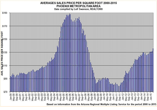
You can see that the average ppsf began to rise sharply in early 2012 in Phoenix as the percentage of home sales that were repossessed properties continued their precipitous plunge. However, the increase in prices has flattened out in the last 12 months and is up by less than 5% in April 2015 from a year earlier.
Phoenix suffered one of the sharpest drops in price for any bubble area metro. Fortunately, much of its delinquent and repossessed properties have now been sold off. Take a look at this other Phoenix chart.

From mid-2008 to the end of 2011, mortgage servicers threw more than 100,000 repossessed properties onto the housing market. Perhaps the worst is over for Phoenix. The same cannot be said for any other major bubble metro.
The other bubble metros will need to go through the same delinquent mortgage liquidation and home price collapse before they can return to anything resembling normal.
Conclusion
Skeptics will argue that I have overstated the delinquency problem because mortgage modifications have kept millions of homeowners from losing their house to a foreclosure.
But the re-default rate on the non-guaranteed securitized mortgages that have been modified ranges from 30% to 80%. The rate of re-defaults on the most recent modifications continues to climb sharply.
The fact that the delinquency rate is low in small towns and cities across America is of little consequence. My concern is with the jumbo mortgages of $400,000 and up in the major bubble metros with double-digit delinquency rates. These are sitting on the balance sheets of numerous mortgage REITs, which I discussed in my previous article.
Those mortgages are also on the balance sheets of the too-big-to-fail banks. Let’s not forget the more than $200 billion of home equity lines of credit (HELOC) that the big three banks hold. Most of these HELOCs are on underwater homes and – because almost all of them are second liens -- have little value at all.
Here is my specific advice for your clients:
-
Sell the big three bank stocks before they are forced to mark down the value of their weak first- and second-lien mortgage portfolios.
-
Sell your mortgage REITs before the true value of their mortgages becomes evident.
-
Unload your investment homes before the home price decline worsens.
Disclaimer: The views expressed in this post are those of the authors and do not necessarily reflect the position of the Federal Reserve Bank ...
more


From your data, we can see foreclosure rates in NY were the highest in 2009, then fell for few a years and increased again in 2012/13 before dropping again last year. I would have expected foreclosures to continue to fall. Maybe the reason for the increase in foreclosures has been due to many consumers being enticed into jumping into mortgages that they couldn't afford to pay because of historically low interest rates, and only later defaulting when they were later unable to keep up payments.
The statistics don't lie. According to Zillow, around 10 million households are under water on their loans and still owe more on their mortgages than the market value of their homes, or 20% of all mortgaged homes. Many Americans continue to be at risk of foreclosure, joining five million other households that have suffered the same fate since the real estate market collapse in 2007. Where does the market go from here?