
Why Odds Still Favor New Record Highs In Stocks
This Is What Increasing Fear Looks Like
The chart below shows the S&P 500’s 100-day moving average (blue), 200-day (red), and 300-day (green) during the transition from a favorable period to an unfavorable period (2005-2008). Moving averages allow us to focus on longer-term trends rather than inevitable day to day volatility.
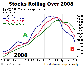
Charts cannot predict the future; they simply help us better understand the odds of good things happening relative to the odds of bad things happening. The left side of the chart above shows a more favorable look with blue, the fastest moving average, on top and the slopes of all three moving averages are positive (bullish trends). The right side shows a lower probability look with blue, the fastest moving average, on the bottom and the slopes of all three moving averages are negative (bearish trends).
How Does 2017 Compare To The 2007-2008 Peak?
The charts below allow us to look at markets through an unbiased lens. Reviewing the trends below requires no discussion of politics, the Fed, or our personal views on any topic. Do trends in 2017 look more like a favorable period (point A in first chart) or an unfavorable period (point B in first chart)?

A Major Shift Has Occurred In The Markets
This week’s video covers three important developments and provides a big picture historical context (1980-2017). Like the charts above, the charts in this week’s video speak for themselves.
The Dow
Does the Dow look more like a favorable period or unfavorable period? You can decide using the charts below.

Financial Stocks
In early October 2007, just as the S&P 500 was peaking, financial stocks’ (XLF) 100-day moving average (blue) dropped below both the 200-day (red) and 300-day (green), telling us the odds of bad things happening had increased relative to the odds of good things happening. How close is the 2017 100-day to dropping below the 200 and 300-day? The answer tells us something about the strength of the long-term trends in 2017.

Small-Caps
When we take a longer-term view, the trends in small-caps (IWM) and mid-caps (MDY) remain in the favorable camp.


The Nasdaq
The same concepts apply to the April 2017 version of the Nasdaq’s daily chart.

Bullish Trends Make Higher Highs
By definition, a bullish trend makes a series of higher highs and higher lows. Therefore, if the trends shown above remain in place, the S&P 500, Dow, XLF, IWM, MDY, and the NASDAQ will eventually make higher highs after the current pullback. To illustrate the concept of higher highs and higher lows, we will focus in on the left side of the chart below, during the bullish phase.
The chart below shows only the bullish phase (2005-2007). Notice how the pullbacks are followed by higher highs. Compare the look of the moving averages during the bullish trend below to their look in April 2017.

A quote from the book Market Wizards provides some additional insight:
“Investors tend to confuse short-term volatility with long-term risk. The longer the time period, the lower the risk of holding equities. People focus too much on the short term, week-to-week and month-to-month price changes, and don’t pay enough attention to the long-term potential.”
Richard Driehaus
The 2017 moving averages below help us stay focused on the long-term potential.

Is it possible the trends flip over in a bearish manner? Yes, it is very possible. However, the evidence we have in hand today (see charts above) does not support an imminent trend reversal. If the evidence shifts, bearish odds will begin to increase. That may happen, but it has not happened yet.
Disclosure: This post contains the current opinions of the author but not necessarily those of Ciovacco Capital Management. The opinions are subject to change ...
more

