
What Do These Two Charts Have In Common?
The premise of a currency war is that by devaluing its currency a country is able to sell things overseas more cheaply, which gooses its growth and generally makes it easier for incumbent political parties to hold power.
If it actually works that way, then you’d expect this chart of the euro plunging against the dollar…
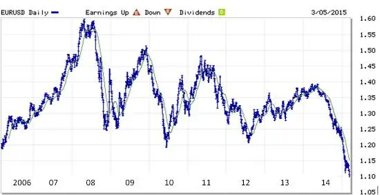
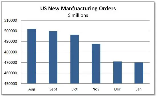
…to be reflected in some sort of strong-dollar related downturn in the US. And right on cue, the Fed reported this morning that American manufacturers are now in the sixth month of a new-orders slowdown:
If things continue to play out according to script the coming year will be slightly better than expected for Europe (but only slightly because of all the other messes those guys have made of their common currency experiment) and quite a bit worse than expected for the US (because we actually think we’re recovering).
Then comes the next and final stage of the cycle, where the US realizes that it’s tipping back into recession, with all the unacceptable things that that implies for the equity bubble, tax revenues and campaign contributions, and shifts gears from tightening to open-the-floodgates loose, hoping to push the dollar back down against the euro, yen and yuan. The difference this time around will be that, as Europe is now discovering, easing monetary policy when interest rates are already zero means pushing into negative numbers. And that means yet another leap of faith into uncharted, experimental, very possibly disastrous territory.
Disclosure: None.


