
Weekly Market Outlook - Not Yet Time To Breathe Easy
Weekly Market Outlook
It took a while to get started... the first four days of last week, to be precise. But, once the bulls got rolling on Friday, they didn't look back. Thanks to that day's 2.5% advance from the S&P 500 (SPX) (SPY), the index finished the week 1.7% higher, and perhaps more importantly, finished the week above a couple of key resistance lines.
It remains to be seen if Friday was a fluke or an omen of what's to come. As it stands right now, however, the momentum is clearly bullish.
We'll dissect last week's action below, right after a closer look at this week's and last week's key economic numbers.
Economic Data
We got a fair amount of economic news last week, but only a couple of items were hard-hitting.
We knew headed into last week that the real estate picture was still looking pretty solid, given December's strong reports of new home sales and existing home sales. This strength was confirmed by the Case-Shiller Index and the FHFA Housing Price index. The former grew 5.8% on a year-over-year basis in November, while the latter was up 0.5% on a sequential basis for the same month. This ongoing ascension against a backdrop of a growing number of unit sales continues to suggest a firm real estate market even though the stock market is wobbly.
Case-Shiller, FHFA Housing Price Index Chart
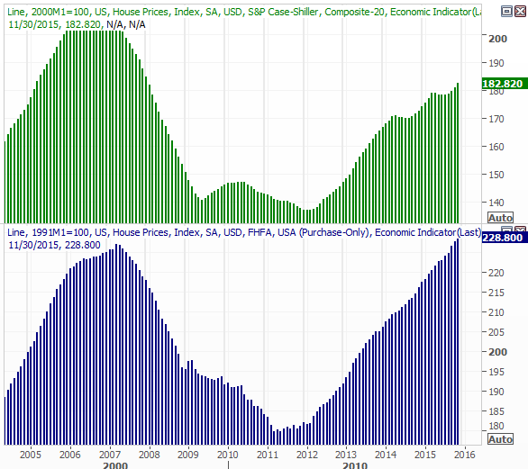
Source: Thomson Reuters
As for sentiment, the Conference Board's consumer confidence level rose from 96.3 in December to 98.1 in January, pretty much assuring that measure of sentiment remains in a bigger-picture uptrend. As for the Michigan Sentiment survey, though, does remain. It slipped from 93.3 to 92.0 for January, and while that slide lower follows three consecutively higher readings, we seen a streak of lower peak readings since the beginning of last year... something that can also be said of the Conference Board's data... although to a lesser degree. The data broadly remains "on the fence."
Consumer Sentiment Data Chart
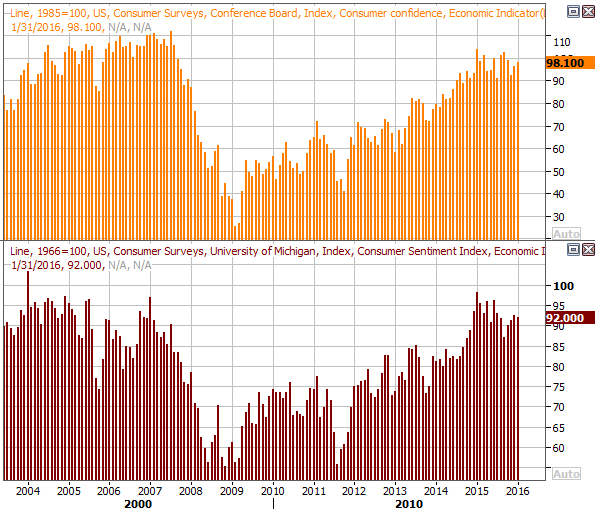
Source: Thomson Reuters
All the other data is on the following grid:
Economic Calendar
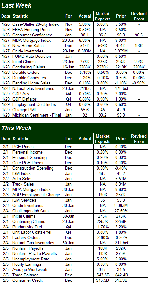
Source: Briefing.com
We've got several items on this week's dance card as well, but the highlight is going to be Friday's unemployment report. Economists don't expect the unemployment rate to fall below the current reading of 5.0%, though it's worth noting 5.0% may be at or near the absolute minimum level of unemployment possible. As for jobs, the pros are thinking we will see 188,000 new jobs added last month vs. December's 292,000 newly-created payrolls. This news could make or break this fragile market.
Unemployment and Job Growth Chart
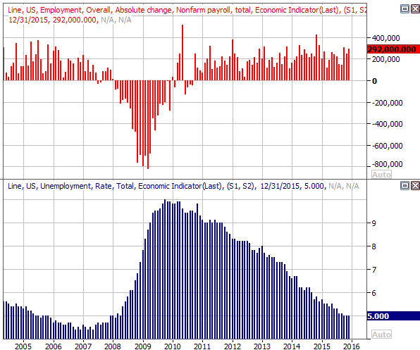
Source: Thomson Reuters
Finally, we'll be getting both ISM readings this week. Although the ISM services index remains above the critical 50 level, it's stagnated, wildly - ISM manufacturing index is not only already below the 50 mark (suggesting a recession), it's been trending lower for over a year now.
ISM Chart
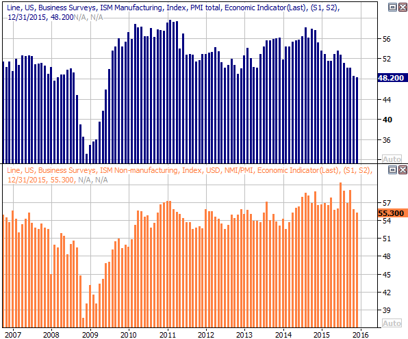
Source: Thomson Reuters
Should the ISM manufacturing index continue lower and/or the ISM services index taper off and moves towards or even under 50, they could become a liability for the market faster than one might expect.
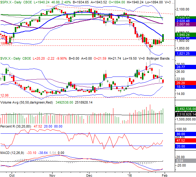
Stock Market Index Analysis
The market may have eked out an encouraging gain last week, but it's far from a well-developed uptrend. There's a lot more work to be done before the trend has any momentum. Still...
As of the end of last week, the S&P 500 saw a bullish MACD crossover. The index also broke above a short-term technical ceiling around 1907, and even pushed its way above the 20-day moving average line. All together, it's a good clue the undertow turned bullish.
S&P 500 & VIX Daily Chart
Chart created with TradeStation
It's a good start for the bulls, if a rebound is in the cards. But, it's only a start... not a finish.
Perhaps first and foremost, the Percent R indicator has yet to enter into confirmed bullish territory. It will need to get - and stay - above 80 to suggest any sustained bullishness is on the table. The S&P 500 will also need to move above a key ceiling at 2007 and then the 200-day moving average line (green) at 2045 before we can say this is anything other than just the market's normal ebb and flow.
All the same, working in the market's favor right now is the way the CBOE Volatility Index (VIX) (VXX) is starting to edge lower, and the fact that there's plenty of (and getting progressively bigger) bullish volume.
The weekly chart of the S&P 500 below puts the VIX's pullback and the degree of bullish volume we're now seeing in perspective. There's plenty of room for the VIX to keep falling, just as there's room and reason for the S&P 500 to continue its bullish reversal that started with a long-tailed hammer-shaped bar two weeks ago.
S&P 500 & VIX Weekly Chart
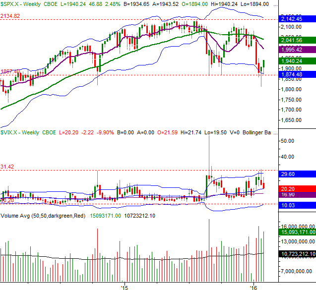
Chart created with TradeStation
The weekly chart of the NASDAQ Composite (COMP) offers a better explanation of how and why the market was able to reverse a downtrend two weeks ago and finally followed-through last week. Not only did horizontal support around 4300 come into play (that's near where August's low was), but a long-term support line (black, dashed) also played a role in the bullish pushback. That low from two weeks ago was the first, best area for the market to stage a rebound effort.
NASDAQ Composite & VXN Weekly Chart
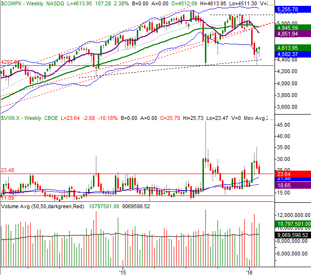
Chart created with TradeStation
Again, as it stands right now, the rebound effort is little more than volatility-driven effort, and not even a confirmed one. Nobody can afford to turn their back on the market just yet... not even for a day.
Seasonal Bullishness Ahead for Apparel and Accessories
While it can be dangerous to assume a historical tendency will always repeat itself, if the tendency repeats itself far more often than not, it's at least worth considering.
With that as the backdrop, we're now entering a time of year that is almost always bullish for apparel, accessories, and luxury goods - the main Retail ETF is (XRT).
The chart below tells the tale, plotting the percent-change of stocks in the aforementioned industries over the course of the typical year. The overall average for the past eighteen years is plotted in black, in the middle. The red line is the average path of the group in a bearish year; the green line is the average progress during a bullish year. As you can see, in good years or bad, from February through April, the group enjoys a tailwind. It's one of the few that does in late-Q1 and early Q2.
Apparel, Accessories, & Luxury Goods: Average Annual Performance Chart
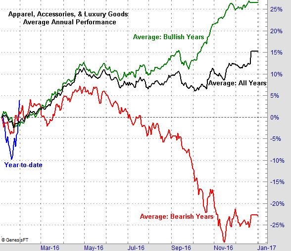
Chart created with TradeNavigator
Again, there are never any guarantees. When even the bearish years and the bullish years yield the same result at the same time though, it's a tendency to at least consider.
Disclosure: None.


