
VIX Vs. Stock Market Volatility: Similar But Different
The recent plunge in the US stock market ended the extended run of tranquility in equity returns. The media’s metric of choice to cite this change is the CBOE Volatility Index, or VIX, which surged earlier this week to the highest level in nearly three years, based on daily data. The upward explosion was even sharper on an intraday basis.
As useful as the VIX is for quantifying market volatility, it’s not the only metric at our disposal. This is a distinction worth considering if you’re modeling volatility for tactical asset allocation strategies, forecasting risk, and related tasks.
Minds will differ on which methodology shines the brightest for quantifying “risk”, including the many flavors of return volatility. The larger point is that the metric (or metrics) you favor can influence the analytics by something more than a trivial degree.
That’s not surprising, given the differences in calculation methodologies. VIX, for instance, reflects the crowd’s expectations of market volatility via the price of S&P 500 index options. That’s quite a different animal from realized volatility over a trailing period in history. Note, too, that defining historical volatility is also a black hole of possibilities. The two main decisions: the model and the historical period for crunching the data.
Not surprisingly, the output for quantifying vol is all over the map. As an example, consider how the VIX compares with four measures of realized historical volatility for the S&P 500 based on daily returns as follows:
- Standard deviation over a rolling 30-day period
- Standard deviation over a rolling 90-day period
- GARCH (1,1) model using a normal distribution
- GARCH (1,1) model using a (fat-tailed) t distribution
The chart below shows the rescaled output (for easier viewing by normalizing the data). The obvious point: volatility measures are not created equal.
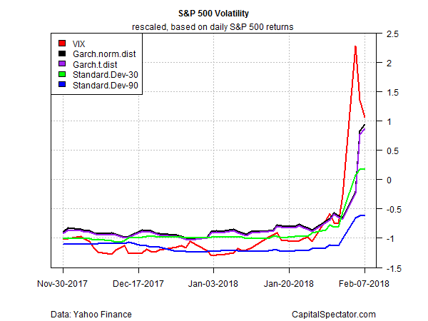
Although all the metrics jumped in recent days, the VIX’s rise (red line) was considerably sharper. Note, too, that it’s already started dropping whereas the other metrics have yet to reverse through yesterday (Feb. 7). It’s also clear that the recent change in the market’s risk profile looks considerably tamer by some measures of vol.
The obvious question: Which definition of risk is superior? The answer depends on what you’re trying to measure and how you plan to use the data. In other words, there’s no universally right or wrong vol metrics. Each has its own strengths and weaknesses, and so each will shine or stumble in different applications for risk analytics. All the more so when you consider that the short list of vol measures above merely scratches the surface of possibilities for quantifying volatility.
Looking at market risk through VIX-colored glasses is everyone’s favorite yardstick for talking about vol. But don’t confuse popularity and endless references in the media as a sign that the VIX is the only game in town.
Disclosure: None.


