
U.S. Household Incomes: A 51-Year Perspective
Last month the Census Bureau released its annual report on household income data for 2017. Last year the median (middle) average household income rose to $61,564, a 4.1% increase over 2016 and a record high. The median average income adjusted for inflation is also at a record high, above the peak of $60,421, set in 2016. Let's take a closer look at the quintile averages, which dates from 1967, along with the statistics for the top 5%.
Most people think in nominal terms, so the first chart below illustrates the current dollar values for the six cohorts across the 50-year period (in other words, the value of a dollar at the time received — not adjusted for inflation). What we see are the nominal growth patterns over the complete data series. In addition to the five quintiles, the Census Bureau publishes the income for the top five percent of households.
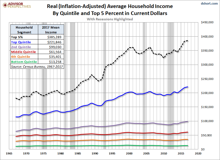
The next chart adjusts for inflation in chained 2017 dollars using a research variant of the Consumer Price Index, the CPI-U-RS, which is the CB's preferred deflator for inflation adjustment. In other words, the incomes in earlier years have been adjusted upward to the purchasing power of the most recent year in the series. We've included a table to document the impressive year-over-year growth in 2017 for all six cohorts.

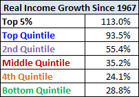
As for the cumulative household income growth by segment over the past 50 years, the adjacent table shows the real, inflation-adjusted, difference between 1967 and 2017.
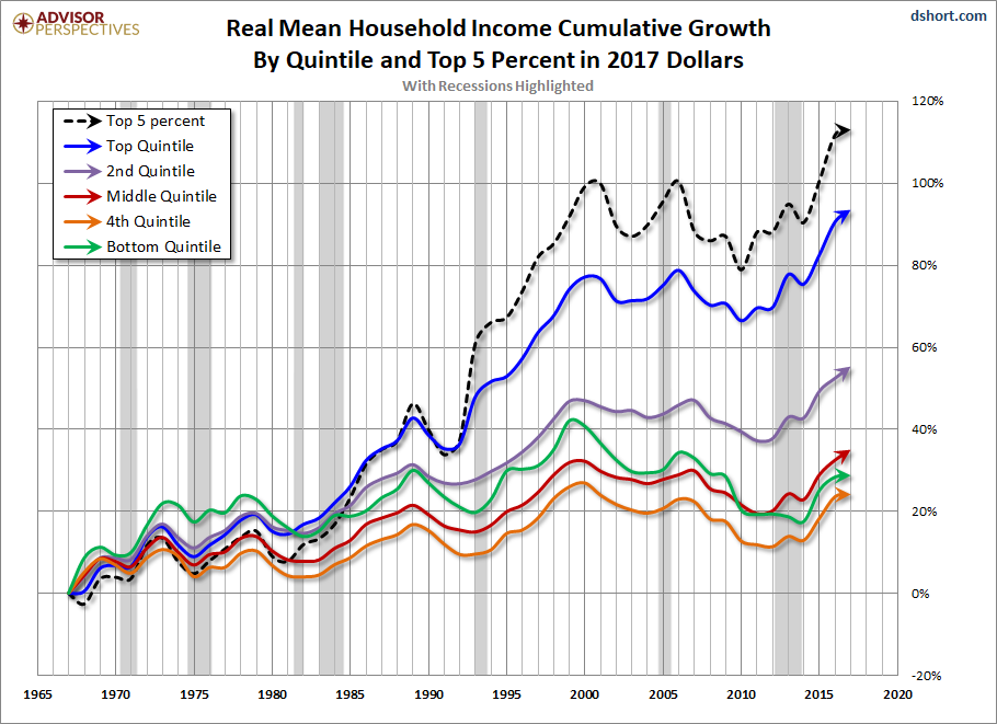
To give us a better idea of the underlying trends in household incomes, we've also prepared a chart of the real percentage growth since 1967. Note in particular the growing spread between the top quintile (and especially the top 5%) and the other four quintiles. The growth spread began in the mid-1980s during the Reagan administration, the era of Supply Side Economics (aka "Reaganomics" and Trickle-Down Economics). As this chart illustrates, tax and other policy changes to benefit the wealthier households didn't have the heavily promoted trickle-down effect. We've also highlighted recessions to show the correlation of household incomes to the business cycle.
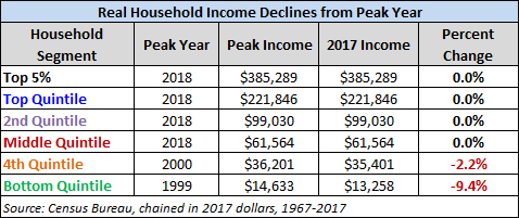
All of the cohorts in this analysis saw impressive increases in 2017, and the top three quintiles and top 5% hit record income levels in 2017. However, the two lower quintiles remain below their record highs in inflation-adjusted terms. The table below documents the percent change from the peak year. The list shows the two lower quintiles peak year: 2000 for the fourth quintile and 1999 for the bottom quintile.
It's important to understand that the data in the charts above is for the mean (average) income for each of these segments. For US households quintiles, the mean (average) income is higher than the median (middle of the range). We'll have more to say about this negative skew in a follow-up article on household incomes by age bracket.


