
Treasury Snapshot: 10-Year Yield Highest Since 2013
Note: We've updated this commentary with data through today's market close.
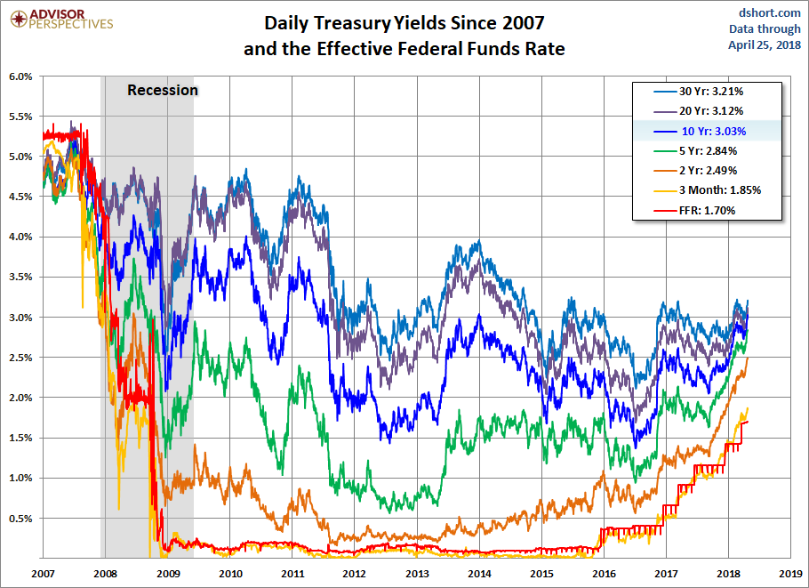
Let's take a closer look at recent activity in US Treasuries. The yield on the 10-year note ended Tuesday at 3.03% and the 30-year bond closed at 3.21%. The 2-10 yield spread is now at 0.54%.

Here is a table showing the yields highs and lows and the FFR since 2007 as of Tuesday's close.
The chart below shows the daily performance of several Treasuries and the Fed Funds Rate (FFR) since the pre-recession days of equity market peaks in 2007.
(Click on image to enlarge)
A Long-Term Look at the 10-Year Note Yield
A log-scale snapshot of the 10-year yield offers a more accurate view of the relative change over time. Here is a long look since 1965, starting well before the 1973 Oil Embargo that triggered the era of "stagflation" (economic stagnation with inflation). The blue trendlines connect the interim highs and lows following those stagflationary years. The red trendline starts in 2006, prior to the 2007 interim high and subsequent 2008 low. Note the 1987 closing high on the Friday before the notorious Black Monday market crash. The S&P 500 fell 5.16% that Friday and 20.47% on Black Monday.
(Click on image to enlarge)
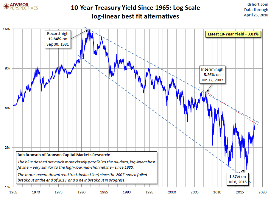
The dashed lines on the chart above were provided by Bob Bronson of Bronson Capital Markets Research. Bob comments:
"The blue dashed lines are much more closely parallel to the all-data, log-linear best fit line — very similar to the high-low mid-channel line — since 1980. Then there is the even more currently relevant downtrend (black dashed line) since the 2007 high."
We saw a failed breakout of the downtrend at the time in December of 2013 and a new breakout has been underway, requiring a readjustment of the red upper trend line.
(Click on image to enlarge)

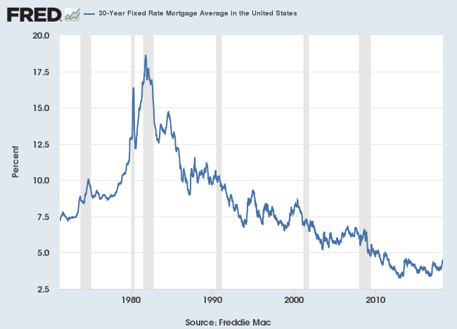
The 30-Year Fixed Rate Mortgage
The latest Freddie Mac Weekly Primary Mortgage Market Survey puts the 30-year fixed at 4.47%. Here is a long look back, courtesy of a FRED graph, of the 30-year fixed rate mortgage average, which began in April of 1971.
(Click on image to enlarge)
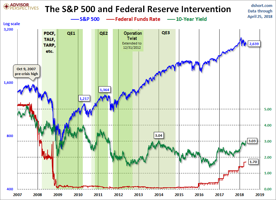
Now let's see the 10-year against the S&P 500 with some notes on Federal Reserve intervention. Fed policy has been a major influence on market behavior.
(Click on image to enlarge)
Disclosure: None.


