
This Market Takes Lessons From A Chameleon

The markets pushed higher yet again last week extending their impressive 2017 rally, however this week was a little different than prior weeks in ways you should pay close attention to.
A quick look at our sector summary page, which includes the charts shown below, highlights the interesting difference in the markets this week.
In the chart below you’ll find our unique summation of the number of sectors with a positive 6-month change. This summation uses the 14 sector ETFs found in our Sector Summary table (also shown below). The number of positive sectors represent by the green histogram was already in very bullish territory prior to this week, but as you can see it jumped to even more ”bullish” this week.
However, sometimes more is not better.
Sectors Up vs. Down (Over 6 months)
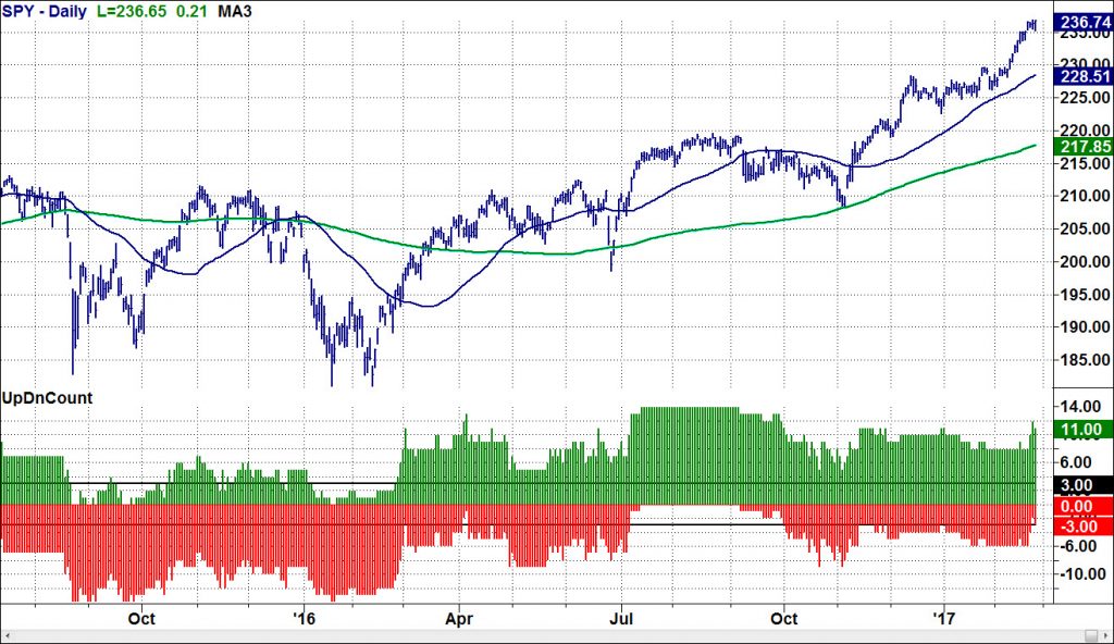
The new bullish sectors that pushed that chart higher included ones that are often considered defensive. For example Utilities, Consumer Staples, Real Estate, and Health Care.
Rallies in defensive sectors aren’t a good way to time always very timely way to predict market tops, especially in this market.
The current bull market has been very adept at changing its look with Chameleon like skills to enable new sectors provide opportunities and endurance to further its climb. This continues to confuse the bears who can’t seem to recognize this bull market’s true source of strength.
You can see the rotation I’m referring to in our Sector Summary table. You’ll notice in the “5 Day” performance column (in the red box) of the Sector Summary table below that the top of the table was weak last week while the bottom half of the table was the source of this week’s strength.
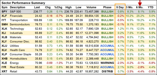
This table is ordered by the “6 Mo.” column (see red arrow) because 6 month momentum has been proven to be a strong indication of 3+ months of future performance. And an even stronger way to leverage 6 month momentum is to combine it with relative strength (i.e. focus on the top of the Sector Summary table!)
This week’s Market Outlook video (below) will cover the market rotation in more detail, and you can find both of the table above updated daily in the Little Big View section of our website blog.
In addition to the obvious rotation into Utilities last week, our Real Motion indicators have been highlighting some very interesting sector rotation and trading opportunities in the Solar sector for weeks, and last week several solar stocks began to break out of big bases.
These moves in the solar sector look like big trends developing from multi-month bases.
We covered how our Real Motion indicators identify hidden trends within sectors and stocks including the Solar stocks in a free training session which you can find here.
For more insights into the health and future direction of the market watch this week’s Market Outlook video.
Video length: 00:09:20


