
There Is Still A Phillips Curve In The USA Too
Has the Phillips curve vanished? There is widespread discussion of the possibility that the Phillips curve has become horizontal. I am old enough to remember when all serious economists agreed that, in the long run, it is vertical. The reason for the thought that it might be horizontal is that large important countries have unemployment lower than estimated non accelerating inflation rates, and yet still have low inflation (including low wage inflation).
I looked at the old Europe 15 (the countries which were in the European Union in 1997 so the European Commission has harmonized time series going back to the 1960s). The Phillips curve is still very clear in that data set. There is no sign that it has a lower slope in the 2st than in the late 20th century. So I wonder why people are convinced it has vanished. One possible explanation is that more attention is focused on the USA than on other countries (maybe than on all other countries put together). So I will look at the case of the Phillips curve in the USA (probably the most over studied topic in economics). It still slopes down. Even in the US I estimate, at most, a mild reduction of the slope. This makes the puzzle more puzzling.
Before going on, I should note that I just learned that Joe Gagnon has written a much better version of this post right here .He argues that there is no inflation puzzle.
I will present the US evidence after the jump.
I will puzzle over perceptions here.
I will puzzle over perceptions here.
I think one key issue is that inflation hawks must argue that the Phillips curve is steep — not just downward sloping. It is hard to argue that we must accept 6% unemployment because 4.1% might lead to inflation of 2.5% for a few years starting next year. This means that a gradual increase in inflation (consistent with data from the 20th century) is considered anomalous because it contradicts the inflation hawk and generally austerian ideology. I think this is an important factor, but I have trouble determining how important using objective evidence.
second, Policy makers, commentators and even academic economists discussing real time economic issues focus intensely on the past months or, at most, the past few years. Reality is stochastic and the Phillips curve is useful but crude. We can’t really expect to be able to forecast the change in inflation from one month to the next. But we do. This means that there are constantly puzzles which turn out to have no interesting explanation. Gagnon puts this very well
The unexpected drop in inflation in mid-2017 is not particularly large in historical context. The figure displays the location of the latest observation (2017Q3), which is well within the historical Phillips curve experience.[5] In February 2017, the unemployment rate was equal to the estimated natural rate of 4.7 percent. By October 2017, it had dropped to 4.1 percent, implying that overall employment was 0.6 percentage points above potential. Based on the [accelerationist] Phillips curve, we would expect inflation to rise by about half a percentage point over the next year. But historical experience suggests that inflation may end up anywhere from 1 percentage point lower to 3 percentage points higher. In other words, the Phillips curve remains an important fundamental driver of inflation, but we should not overstate the precision with which it operates.
Third, I think there is great faith, based on little evidence , that the non accelerating rate of inflation (NAIRU is known and fairly high — definitely higher than it used to be back in the good old days (note that Gagnon does not share this view 4.7% is about what the NAIRU was guessed to be when the term was coined) . I think a very large part of this is the conviction that unemployment can not stay far above the natural rate for years and years. This is, I think, an article of faith. If unemployment can’t be far above the natural rate for years, fact that unemployment is much lower than it was in recent years implies it must be far below the natural rate. Marco Fioramanti and I have written a lot about this. I just include a google search.
This is a good place to start. People who rely on bad estimates of the non accelerating rate of inflation will be surprised by observed inflation.
fourth, the Phillips curve curves. I think the habit of linearizing for convenience mislead people. The slope of the curve is low at high unemployment rates. This is true for approximately all specifications with all data sets. But it surprises people again and again.
fifth, finally, and importantly, I think there is an odd attitude towards the expected inflation term in the Phillips curve. The relationship estimated since the 60s give wage inflation as expected price inflation plus a function of unemployment. The old approach was to include lagged price inflation as a variable and consider the coefficient to give expected inflation as a function of past inflation. This approach was refuted by a though experiment (that is it was not shown to fail empirically as an approximation to the behavior of the variables of interest). It was argued that constant high inflation must eventually be 100% expected. There are a number of responses, but the one chosen by practical people was to keep expected inflation a linear function of lags of inflation and impose the assumption that the sum of coefficients was one. Then, to make things simple by using only one lag. And so the accelerationist Phillips curve was born. In this equation, the change of inflation is a function of unemployment.
It wasn’t ever respectable theory and it doesn’t fit data from the past 30 years well. It just became the conventional approach of practical people. It performed less well than more flexible models in the 20th century. It performs terribly in the 21st. This isn’t really a major change — I can’t find a specification so that the null that the relationship is the same in the 20th and 21st century is rejected. The accelerationist Phillips curve was always hard to detect, and it isn’t surprising that it doesn’t show up clearly in less than 17 years of data.
Oddly, one popular alternative to the accelerationist curve used by extremely practical people who don’t like fancy stuff like OLS is the original Phillips scatter of inflation and unemployment. This is odd. No one (including Phillips) ever argued that there shouldn’t be any expected inflation term (expensive book warning).
that simple relationship has shifted. There was stagflation in the 70s and early 80s. This is not news to anyone. What is news to me at least, is that, when I drop the data from 1970-1984, the remaining points in the original Phillips scatter form a curve. This would occur if expectations which were anchored except during those 15 years. I can’t resist putting the graph right here.

Quarterly data from FRED fred.stlouisfed.org. Winf is the annualized rate of change of the average hourly wage of production workers (AHEPTI). Unem is the ordinary headline unemployment rate (UNRATE). Data are quarterly from the late 60s (64-69 — oddly the FRED AHEPTI series start in 1964) or first quarter of 1985 on.
After the jump, I will show another scatter and a bunch of regressions. I don’t see strong evidence that the relationship between unemployment and wage inflation has changed recently even in the USA. There is strong evidence there (as in Europe) that the coefficient on lagged inflation is much lower than it was in the 70s and early 80s. This is consistent with anchoring of expectations. A quick simple story is that expectations were well anchored until the early 70s, then de-anchored until around 1985 and have been well anchored since. I, personally, can’t tell that story, because I insist that (some people’s) inflation expectations are not anchored based on TIPS breakevens ( evidence from bond markets ). I think the explanation might be that the expectations of employers and employees negotiating wages are anchored even if the expectations of bond traders aren’t.
In any case, the coefficient on unemployment is fairly stable. Various authors have noted that, in sophisticated state space/random coefficients models, the series of estimates isn’t flat, but there are not changes dramatic enough to refute the null of no change with old fashioned econometrics (a Chow test).
I think that the belief that the Phillips curve has vanished has two principle causes. Most importantly, people who look only at the last couple of years of data often see no particular pattern. Also, insistence that the right specification of a Phillips curve must be accelerationist has kept people from seeing that the pattern described sixty years ago is still in the data.
Some very simple analysis of US data on unemployment and inflation (the most over analyzed data in economics) after the jump.
OK my basic regression is annualized quarterly wage inflation (winf) as a function of lagged price inflation (lpcecinf) and lagged unemployment (lunem). All data are from FRED https://fred.stlouisfed.org. I use the average hourly earnings of production workers (AHEPTI) for the wage level, the personal consumption expenditure deflator less food and energy (PCEPILFE) for the price level, and the standard U3 headline unemployment rate (UNRATE). The full sample is from the third quarter of 1964 to the third quarter of 2017.
The basic regression
winf | Coef. Std. Err. t
lwinf | .5354412 .0622317 8.60
lpcecinf | .3216097 .0586172 5.49
lunem | -.1726757 .0525373 -3.29
_cons | 1.873617 .3789183 4.94
data from 1964q3 throught 2017q3
Now for data from 1985 q1 on
winf | Coef. Std. Err. t
lwinf | .425808 .0771612 5.52
lpcecinf | .097185 .056639 1.72
lunem | -.2118061 .0467124 -4.53
_cons | 2.739998 .4540891 6.03
data from 1985q1 through 2017 q3
The coefficient on lagged unemployment is virtually the same. The striking change is the reduction of the magnitude of the coefficient on lagged price inflation. It looks as if inflation expectations had become anchored.
As I mentioned above, this is a bit odd, since lagged price inflation remained a useful predictor of price inflation. In particular, inflation was around 4% in the late 80s then declined during the early 90s to around 2% where it has remained. This change was not reflected in wage growth.
This is a regression for data from 1985q1 on.
pcecinf | Coef. Std. Err. t
lpcecinf | .7694454 .0564084 13.64
_cons | .4961972 .1364719 3.64
data from 1985q1 through 2017 q3
wage setters seem to have ignored the 13.64 t-statistic explanatory variable. It is odd.
The autocorrelation did drop dramatically later. This is the regression for 21st century data
pcecinf Coef. Std. Err. t
lpcecinf .2774083 .1161058 2.39
_cons 1.22659 .2075027 5.91
data from 2000q1 through 2017 q3
But I am not supposed to be worrying about expectations in this post. The relevant point is that the Phillips coefficient on unemployment changed very little.
Now a 21st century Phillips curve
winf | Coef. Std. Err. t |
lwinf | .5672049 .0889564 6.38
lpcecinf | .3132316 .1321626 2.37
lunem | -.1137661 .0460363 -2.47
_cons | 1.341417 .5311709 2.53
data from 2000q1 through 2017 q3
The coefficient on lagged unemployment is considerably smaller — about half as large as the coefficient estimated with data from 1985q1 on. However, the change is not dramatically large given the imprecision of the estimates.
Now a regression with data from the great recession and the slow recovery.
winf | Coef. Std. Err. t
lwinf | .5515472 .1289046 4.28
lpcecinf | .2305712 .1681629 1.37
lunem | -.0874903 .0509945 -1.72
_cons | 1.313794 .6361179 2.07
data from 2008q1 through 2017 q3
The coefficient on unemployment is even smaller. There has been (as widely noted) a reduction in point estimates of this parameter. However, that doesn’t prove that there has been a shift in the relationship.
To test the null of no change, I add lunemg2008 to the regression. This is lagged unemployment times an indicator for data from 2008q1 on.
winf Coef. Std. Err. t
lwinf .5355386 .0623803 8.59
lpcecinf .3181722 .062585 5.08
lunem -.1678844 .0606314 -2.77
lunemg2008 -.0055443 .0347737 -0.16
_cons 1.862855 .3857557 4.83
data from 1964q3 through 2017q3
The null is nowhere near rejected. This is actually odd given the regression above. The reason is that in this last regression the constant and the coefficients on lagged wage and price inflation are estimated with the full data set.
Finally, the reduction of the coefficient on unemployment after 2000 is not significant either. lunemg2000 is lagged unemployment times an indicator that the data are from 200q1 on.
winf Coef. Std. Err. t
lwinf .5355386 .0623803 8.59
lpcecinf .3181722 .062585 5.08 .
lunem -.1678844 .0606314 -2.77
lunemg2008 -.0055443 .0347737 -0.16
_cons 1.862855 .3857557 4.83
data from 1964q3 through 2017q3
There is some limited evidence of a reduced effect of unemployment on wage inflation in the 2st century. But nothing really dramatic.
Finally (since I promised another figure) a scatter of US wage inflation on unemployment with only 2st century data.
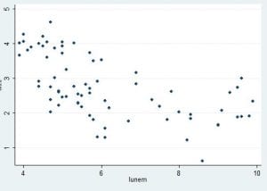
data from 200q1 on.
That looks like a Phillips curve to me. There are a few quarters at the very trough of the recession in which unemployment was very high but wage inflation wasn’t low, but the overall pattern is remarkably similar to that plotted by Phillips before I was born.
I think the sense that the Phillips relationship has vanished is based on two things. First (as noted by Gagnon) the intense focus on the past few months. Second the devotion to an accelerationist Phillips curve which causes people to refuse to see the pattern which is still in the data (even though it should never have been).


