
The Great Central Bank Permabubble
A considerable amount of time has passed since the financial crisis of 2008 and the “great recession” that followed. March 2016 marks the seventh year since the economy began its long, slow recovery and the current bull market in stocks began.
The current economic recovery and stock price gains have been accompanied by a considerable degree of skepticism, however. Many have argued that we’re in the least-respected bull market in history, and discredited naysayers with nicknames like “permabear” and “Dr. Doom.” In this article I will take a long-term view of the pros and cons regarding the past and current state of the U.S. economy and financial markets, explain why such a wide range of opinions prevail among analysts, investors and the financial media, and identify the main force that propelled stock prices to record levels in 2015.
We’ll start by considering Figure 1, which shows the long-term growth rates of corporate profits, stock prices, gross domestic product (GDP, the value of all goods and services produced in the U.S. over time), and new orders for capital and durable goods (spending on big-ticket items by businesses and consumers). Following the 1991 recession, orders for capital and durable goods grew rapidly, with profits and stock prices following along until the late 1990s. Although spending by consumers and business continued at a brisk pace until 2000, it is now widely-recognized that the stock values had crossed over into “bubble” territory, which happens when stock prices rise without accompanying growth in fundamentals (such as corporate profits). Because the excess technology investments of the late 1990s did not lead to further increases in profits, stock prices retreated into bear market territory in 2000, with the events of 9/11 prolonging the decline all the way into early 2003.
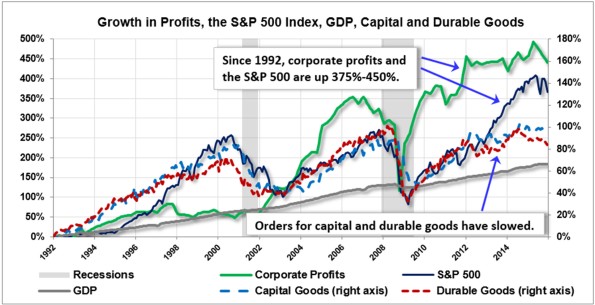
The bull market of the early 2000s seemed poised to right the wrongs of the previous bull, as this time capital and durable goods orders grew proportionately with stock prices, and corporate profits grew even faster – what could go wrong? It turned out that markets had yet another lesson to teach, because profits and stock prices had received significant tailwinds from dual bubbles in real estate and credit. In 2008 the bear caught up with markets again, and the carnage in both the economy and financial markets was more severe than anything seen in the 2000-2003 bear market.
Free markets are resilient, however, and starting in 2009 profits and stock prices rebounded once again. This time prosperity seemed to be on more solid footing until late 2012, when signs of a cooling economy began to surface (note the slowdown in spending on capital and durable goods). Profits and stock values continued surging ahead for two more years, but in 2015 volatility began spilling over from global markets. Since then profits and stock prices have declined, capital goods orders have stagnated, and durable goods orders have fallen sharply. This leads to our first question: after all the lessons that were supposedly learned in the previous two market bubbles, how is it possible for profits and stock prices to surge ahead to new highs without support from basic economic fundamentals like spending by businesses and consumers?
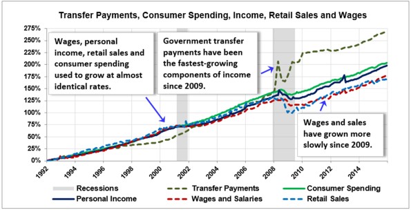
To answer this question, let’s examine Figure 2, which takes a closer look at long-term growth in key fundamentals such as consumer spending, personal income, retail sales and wages and salaries. Even a casual glance at the graph makes one thing clear – during the bull markets of the 1990s and early 2000s, these economic fundamentals all grew at nearly identical rates, as expected. During the 2008-2009 recession, however, the relationship among these fundamentals suffered a key interruption that has yet to be corrected. Although personal income and consumer spending declined before resuming their upward trend, retail sales and wages and salaries fell by much more, and have continued growing on a slower trajectory throughout the current economic expansion. The fastest-growing component of personal income since 2009 has been – drumroll, please – transfer payments – essentially checks from the government, which is not consistent with expanding prosperity. It’s clear that profits and stock prices are not getting any help from standard fundamentals.
This leads to our second question: can we identify the factor that enabled profits and stock prices to achieve new highs when basic economic fundamentals were growing much more slowly?

Figure 3 introduces the villain in our story: debt. Despite the poignant lessons of the 2000s credit bubble, and the apparent deleveraging in the Federal and corporate sectors from 2008-2010, debt levels remain excessive, and have given corporate profits and stock prices a considerable boost in their march to new all-time highs. Figure 3 depicts the obscene explosion in student debt since 2009, which shows how free markets are always ready to invite new borrowers to the party when old borrowers are tapped out. We’ll have more to say about the “apparent” deleveraging in a moment, but first let’s pose our third question: how has it been possible for debt levels to remain so high since 2009 – especially when we were supposed to be unwinding a credit bubble?

Figure 4 provides a long-term view of interest rates, inflation and commodity prices. First, half the answer to our previous question can be found by tracing the trajectory of interest rates. The U.S. Federal Reserve Bank, for reasons too obscure for the rest of us to understand, have persisted in their mistake of keeping interest rates too low for too long. The accompanying low cost of borrowing has led to yet another debt bubble – the U.S. and global economies have been drowning in excessive debt for years. Figure 4 also shows some of the unintended damage to another factor considered crucial for modern economies: inflation, or in this case, the lack of it. The global commodity index shown in the graph (based on everything from oil to aluminum to copper) has crashed and taken energy-dependent economies down with it. For now, bankruptcies have been manageable because, with interest rates still so low, it costs little to extend and restructure the terms of existing debt contracts.
Figure 4 also shows the “spread” of interest rates that markets are requiring from low-quality debt (rated BBB) vs. higher-quality Treasuries. Notice how the spreads have widened to levels associated with previous recessions, although still not close to the crisis levels of 2008. Why does this matter? Because credit and stock market bubbles don’t pop simply because asset prices are overvalued – they pop when investors suddenly become risk averse, sell out of risky assets and find safe havens in which to invest. The rise in credit spreads indicates that markets have been concerned with repricing risky debt since early 2015, and these concerns have spilled over into the prices of all risky assets, including stocks.

Figure 5 introduces our last perspective. When describing trends in corporate and consumer debt in Figure 3, I had referred to the slight deleveraging by business as “apparent” – now I’ll explain further. All of the debt in existence today doesn’t show up on the chart, because over $4 trillion of public and private debt now resides on our own Federal Reserve Bank’s balance sheet, conveniently out of sight – at least for awhile. Most readers have probably heard the term “QE,” short for “quantitative easing,” thrown around in the last few years. Figure 5 shows what QE means. In addition to its obsession with low interest rates, the Fed has used its powers to buy up a substantial amount of the excessive debt in financial markets. Notice how the Fed begins implementing this highly unconventional support for markets in late 2008, and how stock prices begin responding in March 2009. The rest of the story is told by the graph itself. When the Fed is buying debt and injecting more liquid assets back into the banking system, some of the excess liquidity may get loaned out, but most of it winds up chasing stocks and other risky assets. The size of the Fed’s balance sheet and U.S. stock prices have been rising in lockstep since 2009. Stock prices haven’t been rising because economic fundamentals are growing, they’ve been rising because global central banks have pumped over $20 trillion of liquidity into financial markets, and they all plan to accelerate these programs in 2016.
Only the U.S. Federal Reserve says it doesn’t like this game anymore, and to prove it, they raised interest rates a paltry 0.25% in December. The market’s extended tantrum over this rate increase should tell you all you need to know about markets in 2016. If the Fed keeps raising rates, as they’ve promised, expect the tantrums to continue all year. If, on the other hand, economic and financial conditions weaken precipitously, the Fed may very well find itself rejoining forces with all the other major central banks around the world, which continue depressing interest rates. In case you haven’t heard, Japan, Denmark, Sweden and Switzerland are all quite proud of their negative interest rate policies, yes, you read that right, and some are already forecasting that the U.S. Fed will be forced to follow along within another year or two.
So, if you’ve found the recent volatility in markets entertaining . . . you’re in luck. My prediction is that stock, bond and commodity prices, not to mention the grand wizards at the Federal Reserve Bank, have more surprises in store for us in 2016 and beyond. Buckle up.


