
Survey Of Technical Condition And Portfolio Attributes Of Key Bond Fund Types
There may seem to be a bewildering array of bond fund types. This survey of key bond types may help you chose which if any are appropriate for your particular circumstances and portfolio.
We looked at 24 types of bond funds in terms of price chart slope:
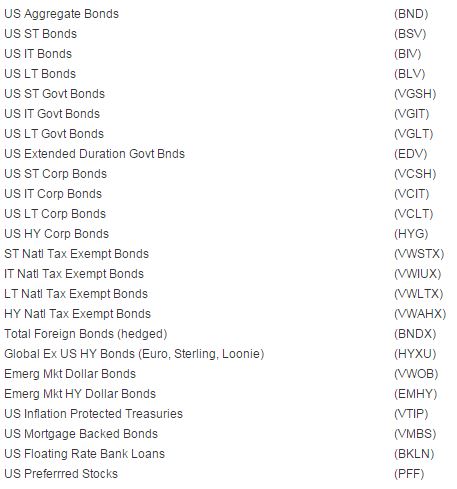
We included a preferred stocks ETF in the list of “bond” funds. because preferred stocks can be arguably said to be closer to bonds than to common equity in their characteristics; and in this period of very low interest rates preferred stocks have been adopted by many investors as bond substitutes in the search for yield.
Figure 1: Technical Condition of Key Bond Fund Types
The most basic form of chart analysis is a binary determination — is the slope of the price pattern is UP or NOT
Figure 1 below includes 6 binary Yes/No (1/0) measurements of the slope of the price chart as of Friday April 10, 2015 (from most important on top of list and least important on bottom of list):
- 12 mo direction (is the 12 month average now higher than 10 days ago? Y/N)
- 3 month av / 12 mo av (is the 3 month average above the 12 mo average? Y/N)
- 3 mo direction (is the 3 month average now higher than 10 days ago? Y/N)
- 1 mo / 3 mo (is the 1 month average now higher than 10 days ago? Y/N)
- 1 mo direction (is the 1 month average above the 3 month average? Y/N)
- Price / 1 mo (is the last price above the 1 month average? Y/N)

We have highlighted those with all 6 binary answers as Yes (1) with a bold border. Of the 24 (as of Friday April 10, 2015), 13 of the 24 has a “perfect” 6 binary YES (1) slope ratings:
BND, BSV, BIV, VGSH, VGIT, VCSH, VCIT, VWIUX, VWLTX, VWAHX, BNDX, VMBS, PFF
Figure 1 also presents 4 other chart price pattern attributes: 12 mo, 3 mo and 1 mo Z-scores (number of standard deviations the price is from the corresponding moving average price); and the 14-day money flow index (a volume weighted version of the relative strength index — itself a measure of the tendency of the price to position itself within its average daily range).
For Z-scores look out for +/- 2 or more, as being possibly too far from its average to be likely able to maintain that distance. For Money Flow (MFI14) values over 70 are seen as overbought, and under 30 as oversold).
This binary data was produced using custom formulas in Equis Metastock with data feed from Reuters. Note that Reuters adds suffixes to many securities to identify where they are traded.
Figure 2: Bond Fund Type Rolling Returns, Trailing Yield and Expense Ratio
Note that some of the fund types have a 12 month trailing yield that is greater than the 12 month total return (returns are as of last month-end(. That means the price declined (See high yield corporate bonds, short-term municipal bonds, emerging market Dollar denominated bonds, emerging market high yield bonds, inflation protected Treasury bonds, and floating rate bank loans).
No adjustment has been made to express municipal bond yields on an after-tax basis. A 1-to-1 comparison of presented yield between taxable and tax-exempt bonds should not be made — rather an estimate of your pre-tax equivalent yield is up to you to estimate.

Figure 3: Bond Fund Type Spread to Aggregate Bonds, Duration and Credit Quality
Take note of the different credit qualities and average durations, not just the yields on the different fund types.

Also keep in mind that duration for a fund (note is called “average” duration) has potentially quite different implication in a period of changing interest rates when compared to a single bond with a the same duration. A bond fund of any particular average duration may not respond to interest rate changes in the same way that a single bond would do. Similarly two bonds funds of the same average duration may respond differently as well
Consider these two hypothetical bond funds, each containing 10 individual bonds, and each bond fund having an average duration of 5.5 years. The first fund has 10 bonds each with a duration of 5.5 years. The second fund as 10 bond each with a different duration (1,2,3,4,5,6,7,8,9, and 10 years), also with an average duration of 5.5 years.
When interest rates change, and the shape of the yield curve changes, these two funds will no react to the same degree.
This is not even to consider the mix of credit qualities that might react differently due to perceived changes in credit risk that may be happening at the same time that interest rates are changing. And, to the extent that the fund uses derivatives to emulate bonds, a liquidity crisis could create an entirely different ball game for those funds versus funds that only hold real bonds.
Figure 4 Bond Fund Type Spread of Credit Qualities Within Each Fund
When thinking about your risk level, it may be helpful to look not only at average credit quality, but also the spread of quality levels that result in the average quality level, as shown in Figure 4.

Figure 5: Bond Fund Type Composition by Type of Bonds
When thinking about your risk level, it may be helpful to look not only at average credit quality (and the spread of qualities), but also at the type of bond: government issued, corporate issued, securitized, municipal and synthetic (derivative).

The data in Figures 2-5 is from Morningstar Advisor Workstation.
Price Charts for Bond Fund Types
Here are the charts for each of the bond funds in the table above, listed in the same order as in the tables. These charts were produced mid-day April 15, whereas the tables were produced as of end-of-day Friday April 10.
You can judge for yourself how useful the binary evaluation of slope and moving average stacking tells the story, and how well it assets you in keeping your eyes honest as you look at charts, and how using a simple set of binary decisions enables you to compare many charts, each of which may have more information that you remember.
Each chart shows the 1 year percentage total return (as calculated by StockCharts.com) in black, the 200-day exponential moving average in gold, the 50-day exponential moving average in dashed blue, and he ratio of the funds performance to the performance of BND (aggregate US bonds) in green in the lower panel.


Disclaimer: This article provides opinions and information, but does not contain ...
more

