
S&P 500 Snapshot: A Modest Gain On Some Inauguration Volatility
The S&P 500 surged at the open, hitting its 0.59% intraday ten minutes into the session. The index then drifted downward to the noon hour presidential inauguration. President Trump's inauguration speech, however, was not well received by the market. A noon-hour selloff took the index to its 0.06% intraday low followed by a relatively volatile afternoon, presumably spent dissecting the speech. The 500 closed with a 0.34% gain for the day but a 0.15% loss for the holiday-shortened week.
That mid-day selloff on Trump's speech was in response to the President's focus on working-class middle America with nothing specific to please the wealthy investor class. Earlier today we published a review of wages over the previous nine presidential terms: Five Decades of Middle-Class Wages: A Year-End Update as Trump Becomes President. Our research estimates that real (inflation-adjusted) annual salary at the current monthly wage rate is about $36,500. Compare that the salary of JPMorgan CEO Jamie Dimon, who is reported today as having received a 4 percent pay raise to $28 million. It would take 767 people receiving that $36.5K working-class average wage to match Mr. Dimon, who, incidentally, was reported today by CNBC as ready to work with the new President. Check out "Trump presidency is 'a moment of opportunity'".
But back to the S&P 500 — here is a snapshot of the past five sessions.
(Click on image to enlarge)

The yield on the 10-year note closed at 2.48%, up one BP from the previous close, although the CBOE 10-Year Treasury Index hit an intraday high of 2.51%.
Here is a weekly chart of the index. The Trump rally has been on hold for the past six weeks.
(Click on image to enlarge)

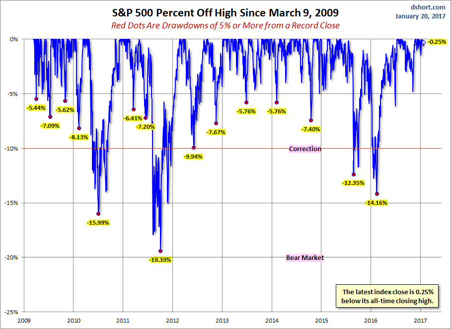
A Perspective on Drawdowns
Here's a snapshot of record highs and selloffs since the 2009 trough.
(Click on image to enlarge)
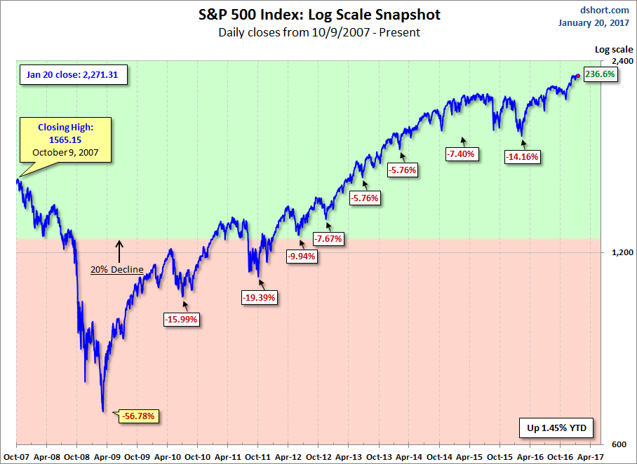
Here is a more conventional log-scale chart with drawdowns highlighted.
(Click on image to enlarge)
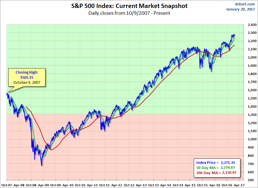
Here is a linear scale version of the same chart with the 50- and 200-day moving averages.
(Click on image to enlarge)
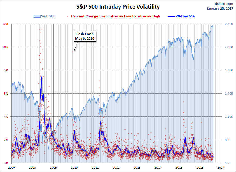
A Perspective on Volatility
For a sense of the correlation between the closing price and intraday volatility, the chart below overlays the S&P 500 since 2007 with the intraday price range. We've also included a 20-day moving average to help identify trends in volatility.
(Click on image to enlarge)
Disclosure: None.


Thanks fr sharing