
Somebody Call Warren Buffett - Quick
A few years ago Warren Buffett was interviewed on CNBC. The interviewer asked him: “Where do you think gold will be trading five years from now?” His answer showed an ongoing dislike for gold as he replied: “I have no views as to where it will be, but the one thing I can tell you is it won’t do anything between now and then except look at you. Whereas, you know, Coca-Cola (NYSE:KO) will be making money, and I think Wells Fargo (NYSE:WFC) will be making a lot of money and there will be a lot — and it’s a lot — it’s a lot better to have a goose that keeps laying eggs than a goose that just sits there and eats insurance and storage and a few things like that.”
Here are some charts (courtesy Stockcharts.com unless indicated), that Warren may be interested in seeing.
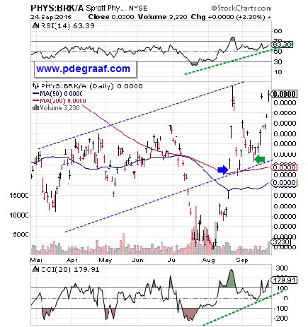
Featured is a chart that compares PHYS, the Sprott gold trust, to Warren Buffett’s Berkshire-Hathaway (BRK-A). Since bottoming in August and trapping a number of bears, PHYS has taken the lead by breaking out above the 200DMA (blue arrow), and successfully testing the breakout (green arrow). The supporting indicators are positive (green lines), and the moving averages are beginning to turn up.
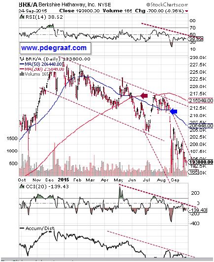
Featured is the Berkshire-Hathaway chart. Price broke down at the 200DMA in June (purple arrow). That was the first warning to bail out. In July price tried to rise back above the 200DMA and was rejected.That was the second warning. Price then broke down at the blue arrow along with the heaviest volume of the year. That was the third warning. The supporting indicators are negative, and the 50DMA is in negative alignment to the 200DMA, while both are declining. Warren’s pet stock is toast – stick a fork in this one.
In 1932 at Englehurst NJ some sailors were holding onto a German blimp with long ropes. A gust of wind caused the blimp to rise suddenly and quickly. Some sailors let go after hanging on for a few seconds. Some dropped from a height of 6 feet, others from 10 feet.Three hung on for dear life. One was hauled onto the blimp – two fell to the ground from a great height and died. Knowing when to let go is very important. (Visit Youtube for a short film of this disaster).
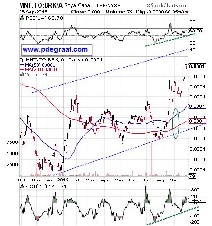
Featured is a chart that compares MNT.TO, the gold trust of the Royal Canadian Mint to Berkshire-Hathaway. Since December this gold trust has quite obviously outperformed Berkshire-Hathaway.The supporting indicators are positive and the moving averages are in positive alignment and rising. Warren could have made some serious money by selling BRK.A in December and putting the money into this gold trust.
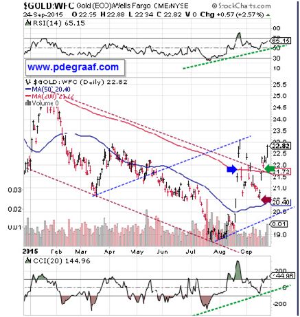
Featured is a chart that compares gold to Wells Fargo, one of the stocks mentioned by Warren Buffett as being preferred to gold. Price bottomed in August, broke out at the 200DMA, (blue arrow), tested the breakout (purple arrow), and is now confirming the breakout (green arrow). The trend is in the process of changing from down to up, via the new blue channel.
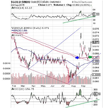
Featured is a chart that compares gold to the Dow Industrials. Price bottomed in July and quickly broke out at the 200DMA (blue arrow). Then the breakout was tested and confirmation came a few days ago at the green arrow. The moving averages are turning up and the supporting indicators are positive. The blue channel is indicative of the new uptrend that favors gold bullion over Wall Street stocks.
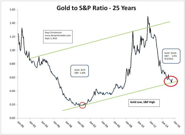
This chart courtesy Gary Christenson www.deviantinvestor.com shows the expected future trajectory, for the index that compares gold to the S&P 500 index.
Warren Buffett should know better than to claim gold is not a good investment. For the past 50 years gold has outperformed stocks by a wide margin. The next chart is courtesy Bill King’s ‘The King Report’ and was recently featured in an article at Zerohedge.com by Phoenix Capital Research.
In this chart the Dow Industrials are black, the S&P is pink and gold is blue (and at the top of the chart).
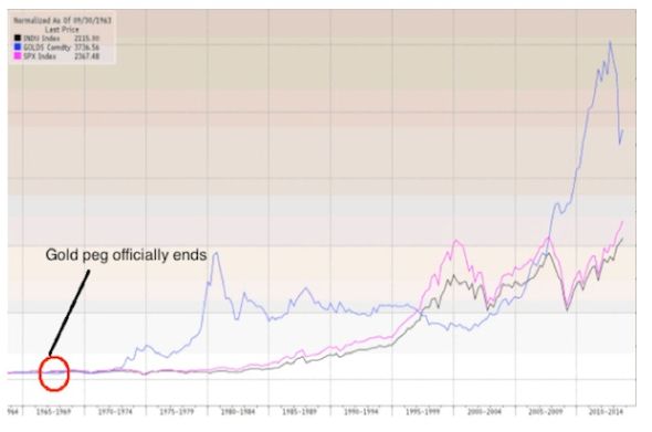
According to King, Gold has risen 37.43 fold since 1967. That is more than twice the performance of the Dow over the same time period (18.45 fold). So much for the claim that stocks are a better investment than Gold - long-term.
It could be that Warren Buffett is overdue to get his knuckles rapped, for supporting Planned Parenthood to the tune of 1.2 billion dollars, while Planned Parenthood is in the disgusting business of selling body parts from aborted babies. Sometimes these actions will come back to bite you. He’s had an easy time during the Obama presidency, with at least one sweetheart deal in 2011, involving billions of dollars worth of Bank of America stock, at a price and with a dividend not available to anyone else. Without special treatment he may find future trends not nearly as much to his liking, (unless he changes his attitude towards gold that is).
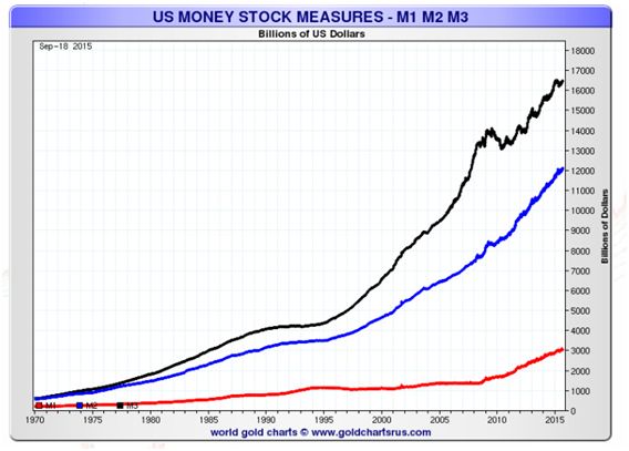
This chart courtesy Nick Laird, the genius chartist at Goldchartsrus.com, features three US money supply trends. This picture guarantees a rising gold price for many years to come.
P.S. Don’t be surprised by short-term reactions to the new down trend in Wall Street stocks, (a trend that is becoming obvious to more and more technical analysts).
Courtesy of Jim Quinn
During one of the greatest market collapses in history (in terms of numbers), the stock market soared by 5% to 11% in one day, six times. Here are the data points:
2008-10-13: +936.42
2008-10-28: +889.35
2008-11-13: +552.59
2009-03-23: +497.48
2008-11-21: +494.13
2008-09-30: +485.21
Disclaimer: Please do your own due diligence. Peter Degraaf is NOT responsible for your investment decisions. Investing involves risk.


