
Signs Of Bullish Hope - Weekly Market Outlook
Despite the bearish start to the week on Monday and a bearish initial response to Friday morning's employment report for September, the bulls managed to reversal course Friday afternoon to hammer out a big gain for that day and even a small gain for the week. A couple of the key indices even managed to climb back above their short-term moving average lines.
There's still work to be done -- from both sides of the table -- if we're ever going to get out of this rut. But, a bullish break out of the rut is once again a possibility.
We'll paint a picture of it below, after running down last week's and this week's major economic announcements.
Economic Data
Last week's economic dance-card was plenty full, but the highlight of the week was the grand finale... September's unemployment data, unveiled on Friday. The unemployment rate held steady at 5.1%, even though payroll-creation slowed to 142,000. July's and August's job-growth numbers were also revised in a downward direction.
Employment Growth, Unemployment Rate Chart
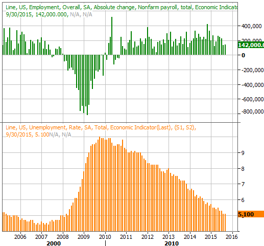
Source: Thomas Reuters
It's also worth mentioning hourly wage growth was stagnant last month.
The data is a bit of a double-edged sword. On the one hand it's alarming to see job-growth slow down, as is suggests economic growth is stalling. On the other hand, it gives the Federal Reserve time, room, and reason to postpone any rate hike that was in the cards. The odds were still technically favoring a March hike rather than a December hike, but the odds of March being the month it begins were raised even further on Friday.
We also heard September's consumer confidence (Conference Board) score last week. Amazingly enough - and despite the fact that the Michigan Sentiment Index score fell - consumer confidence jumped from 101.3 to 103.0, whereas economists were looking for a decline.
Consumer Confidence, Sentiment Chart
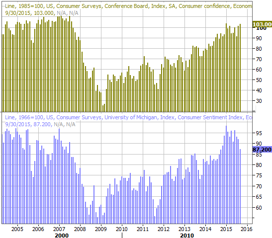
Source: Thomas Reuters
Everything else is on the following grid:
Economic Calendar
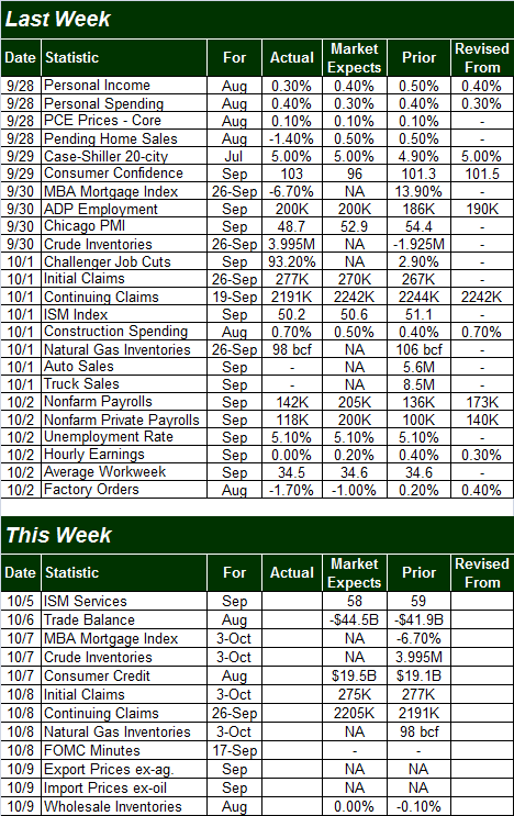
Source: Briefing.com
This week is going to be downright quiet by comparison. The main item of interest will be Thursday's release of the minutes of the FOMC's last meeting. It's not a meeting that involves an interest rate decision, though the language and conclusions packed into the minutes can be just as telling... and market moving.
Stock Market Index Analysis
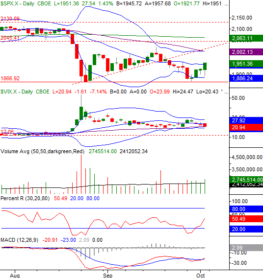
Stocks finished the week on a high note with Friday's gain not only marking the fourth straight day of daily gains, but being the biggest winner of the four. The move was just enough to push the S&P 500 index (SPX) (SPY) above the semi-critical 20-day moving average line.
A reason to be bullish? Maybe, though it may be a tad premature to assume the best (in a bigger-picture way) just yet. Not only have we seen similar rally efforts peter out in the recent past, there's a rather big wall of resistance looming above. For the S&P 500, that's the convergence of the upper Bollinger band and the 50-day moving average line (purple) at 2002.
S&P 500 & VIX Daily Chart
Chart created with TradeStation
The bullish move in the latter half of last week led to a bullish MACD crossover, and it pulled the Percent R line back above the 20 threshold. That's vaguely bullish, but not yet a confirmed bullish sign. The Percent R line will need to move back above - and stay above - the 80 threshold to confirm a bullish trend. The S&P 500 would be above 2002 when and if that happened.
The NASDAQ Composite (COMP) looks pretty similar, although the NASDAQ didn't edge its way above its 20-day moving average line. [It also didn't give us a bullish MACD cross.]
NASDAQ Composite & VXN Daily Chart
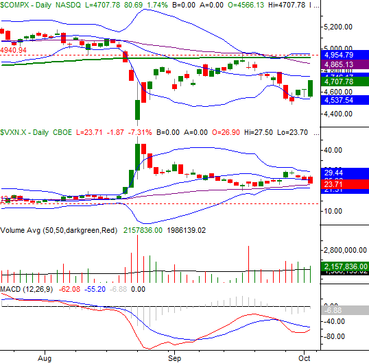
Chart created with TradeStation
In both cases, the volatility indices (the CBOE Volatility Index (VIX) and the Nasdaq Volatility Index (VXN)) may be the deciding factors here. Each peeled back after peaking on Tuesday/Wednesday (at or near upper Bollinger bands), and each is now within reach of breaking under their lower Bollinger bands and/or their 50-day moving average lines. If the VIX and VXN do break below their respective floors, that's going to offer a tailwind to stocks.
Still, just like the S&P 500 has a major ceiling in view at 2002, the composite has some fairly serious resistance forming all around 4924.
Zooming out to a daily chart of the S&P 500, we see something a little more encouraging.
Take a look. It's in this timeframe we have to wonder if last week's low of 1872 was close enough to the August lows of 1867 to call a double bottom; the long-tailed hammer-shaped bar the S&P 500 made in the meantime last week is certainly the kind that suggests the last of the would-be sellers took their action and then were immediately followed by a strong buy-in from all the would-be buyers.
S&P 500 & VIX Weekly Chart
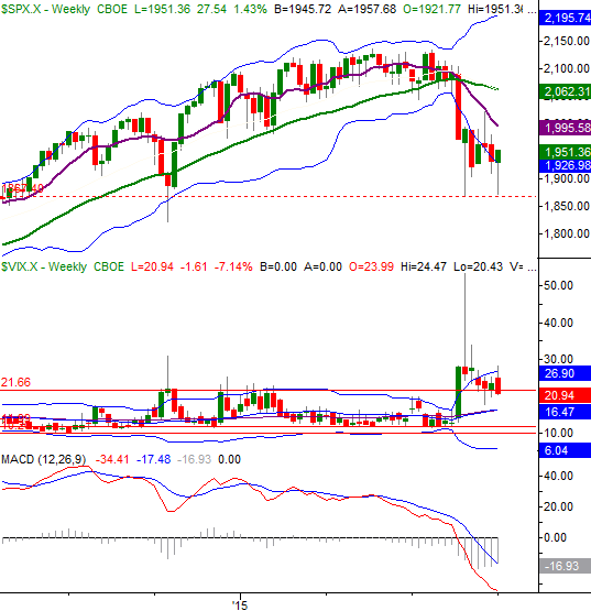
Chart created with TradeStation
Stocks finished the week on a bullish foot, but it may be too soon to say a new meaningful uptrend is underway. So far, everything we've seen can be chalked up to volatility, and we're still just as close to a break under a key floor as we are to a break above a key ceiling. We just happen to be facing toward the ceiling at this time.
Something to think about: It doesn't look like we've made a really firm, decided, capitulation move yet to hit the market's "reset" button. It'll be interesting to see how or if that matters as we push into Q4.
U.S. Dollar Still Knocking on the Door
Over the past month or so we've taken a couple of looks at the weakening of the U.S. Dollar (USD) (UUP). Thus far it's been able to sidestep a meltdown (by rebounding at the proverbial 11th hour), but the potential meltdown is still very much on the radar. In fact, over the past couple of weeks we got some fresh clues that it is indeed the dollar bulls that are fighting an uphill battle.
There are two major red flags evident on the chart below. The first one is the simple fact that the U.S. Dollar Index has been completely unable to get and stay above its 50-day moving average line (purple).
U.S. Dollar Index Chart
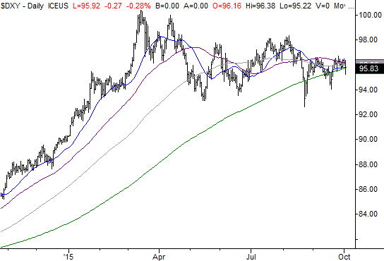
Chart created with TradeStation
The other clue is more of a philosophical one... the convergence of several moving average lines as a precursor to a swing in the other direction.
Assuming the forces that drive the greenback higher and lower are as cyclical and self-reversing as they are for stocks, bonds, and commodities, it's interesting to see how the widely-diverged moving average lines seen in the first half of the year are now all converging again.
It makes sense. Periods of high volatility are followed by periods of low volatility, and vice versa. And, there's no better indication that we've moved from a period of high volatility to a low volatility phase than the convergence of all those key moving average lines. Thing is, this convergence simply sets up -- you got it -- another divergence.
As to whether it will be a bearish one or bullish one remains debatable. But, in that the strong dollar has caused enough pain for U.S. multinationals over the past couple of quarters while it's caused too little inflation would lend itself to the idea that the dollar's bullish undertow is at or near the end of that cycle.
Trade Well,
Price Headley
Disclosure: None.


