
Real Wage Growth Usually Weak Before Recessions
There are many stories in the financial press about how wage growth is accelerating as the labor market tightens. It’s important to contextualize these claims. Nominal wage growth is accelerating as seen in the hourly earnings growth and the weekly earnings growth. The Employment Cost Index, which measures wages and salaries as well as benefits, has been accelerating as well. The Q1 2018 report showed 2.7% year over year growth which is the strongest since Q3 2008, which was during the last recession.
Real wage growth has been much more difficult to realize because the last few quarters of accelerated nominal wage gains have coincided with increased inflation. This is why the Fed needs to raise rates at the end of cycles as inflation eats into wage improvements. Politicians, who claim to speak for workers, often advocate against rate hikes because they don’t understand the difference between nominal and real wage growth.
Inflation Has Recently Hurt Wage Growth
As you can see from the BLS chart below, the real weekly wage growth for all employees increased from -2.6% in July 2008 to 2.5% in January 2009 because inflation fell. At the same time, CPI decreased from 5.5% in July 2008 to -0.1% in January 2009.
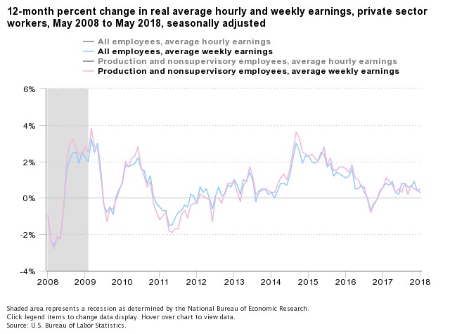
Source: BLS
Obviously, the rise of unemployment during that recessionary period isn’t preferable, but the point is that declining inflation can result in more wage growth than a low unemployment rate. To be clear, we highlighted the weekly earnings to avoid the noise from changes in the workweek length. As you can see, the production and nonsupervisory weekly earnings growth is highly correlated with the growth seen from all workers.
Monetary policy can’t force employers to pay workers a higher percentage of their profits. Ultimately, politicians criticizing FOMC members are barking up the wrong tree. For investors, the goal is to predict when there’s a Goldilocks economy which has high wage growth boosted by productivity improvements, low inflation, and a tight labor market. Even though the chart indicates a majority of this expansion has seen low or negative real wage growth, it’s still a valuable indicator because it shows the changes in the economy. Real wage growth and economic growth improved in 2014 and weakened in 2016.
You might wonder what the point of bothering with real wage growth if, other than noting the struggle of workers, it is cyclical. The most interesting portion of the metric is late in the cycle because it tells us how much inflation is affecting real wages. In this current cycle, it tells us how much the nominal growth improvement brought about by the fiscal stimulus is winding up in the pockets of workers. Buying stocks while inflation is rising and real wage growth isn’t could be a mistake.
This Cycle Is Normal
Some bearish investors claim that the weakness in real wages puts the Fed in an impossible spot since real wage growth is supposed to be strong at the end of the cycle because the unemployment rate is low. However, real wage growth is usually weak heading into recessions as you can see in the FRED chart below.
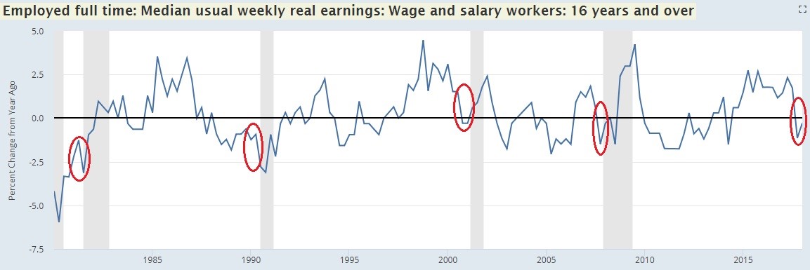
Source: FRED
As recessions occur, the decline in inflation increases real wages. The Fed doesn’t want a recession, but it hikes rates because it fears inflation more. In the past 4 cycles, real wage growth has been negative before recessions, so it’s not like the Fed is now in an unusual position.
Real Personal Disposable Income Is Also Weak
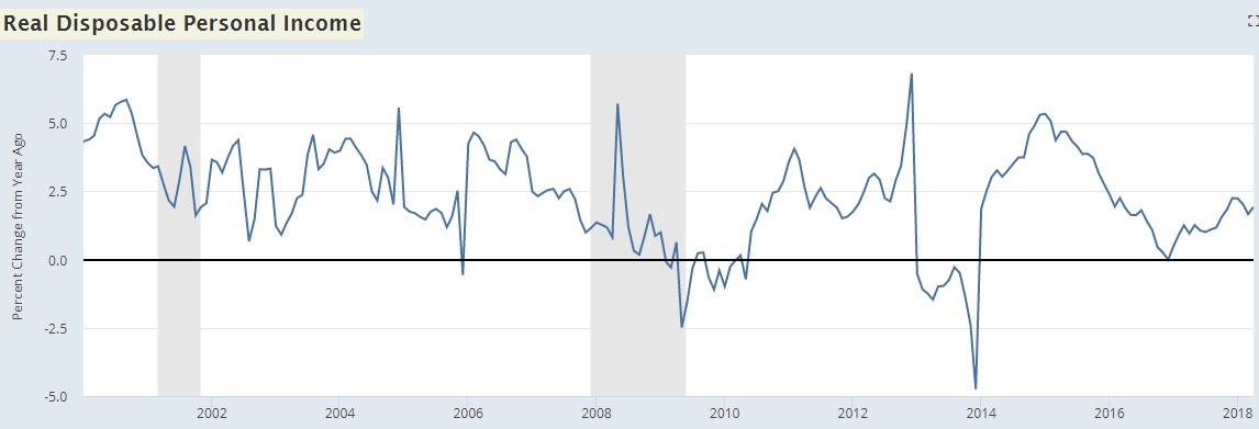
Let’s look at the relative of real wage growth which is real disposable income growth seen in the FRED chart below.
Source: FRED
On an interesting note, personal consumption is about 70% of the economy, but that’s not all from consumers. About 17% of that is government spending. Even with that point in mind, real disposable income is important. Consumers need to have more disposable income or take out more leverage to grow their spending which grows the economy.
Real income growth was only 1.9% in April 2018 which is much lower than the growth peaks in this expansion which were above 5%. To be clear, the two growth peaks seen in this cycle had really easy comparisons. However, growth was 0.96% in April 2017, so the growth comparison is also weak in this case. Spending growth is coming from declines in the savings rate and the consumer taking out more debt. That’s how we get real consumer spending growth of 3.7% in Q2 2018 as estimated by the Atlanta Fed as of June 19th.
Misnomer About The Consumer’s Balance Sheet
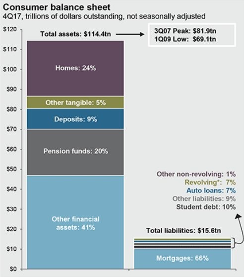
We’ve discussed a mostly bearish economic picture in this article since real wage growth and personal income growth are low. One misnomer about the consumer is that the debt is out of control. That depiction is shattered by the chart below which shows the total assets the consumer has compared to the total debt.
Source: Twitter @LoganMohtashami
The assets are $114.4 trillion and the liabilities are $15.6 trillion. It’s worth pointing this chart out to show the other side of the debt story. The caveat to this depiction is that the assets are mostly held by the richest Americans while many middle and low-income people have a lot of debt and not many assets. Also, the $12.53 trillion in consumer debt in Q1 2009 wreaked havoc on the global economy. However, the current leverage ratio is much lower now than the last cycle. As you can tell, the assets to liabilities ratio was only 5.5 in Q1 2009 and now it is 9.1. The ratio was 6.75 in Q3 2007, meaning the leverage ratio is healthier than during the last cycle.
Conclusion
There is almost no real wage growth despite the nominal improvement in economic growth in 2018. The quarter over quarter seasonally adjusted real GDP growth is expected to be strong in Q2, but wages haven’t followed. You would think that expanding real GDP growth combined with a low unemployment rate would spark real wage growth, but inflation is taking almost all the nominal gains. The 1.3% productivity growth in Q1 isn’t enough to help workers get a real pay raise. The FRED chart below shows the relationship between real earnings and real output per hour on a quarterly basis.
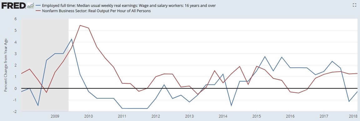
Source: FRED
The only year growth exceeded 1.3% in this expansion was in 2010 when it was 3.3%. In the last cycle, which was much shorter than this one, there were 5 years with above 1.3% growth.
Disclaimer: Please familiarize yourself with our full disclaimer here.


