
Looking For Epic Signs? Enter Silver
In yesterday’s alert we wrote that the reversal in the precious metals market should once again not be taken at its face value and that one should not overreact based on it as the size of the potential rally was limited. Well, it turned out that “limited rally” was an euphemism for a decline. Gold, silver and mining stocks declined once again despite the previous day’s reversal and gold stocks confirmed the breakdown below the key support line. The implications are strongly bearish. However, there’s something ever more bearish and much more profound.
Let’s recall the situation in silver. A few weeks ago we wrote about silver’s move to the key resistance line and the huge importance of the invalidation of the breakdown below the line based on the weekly closing prices. Silver is now significantly below the resistance line, but the key question is if the decline is already over. Well, it seems that it’s far from being over and the analogy that we are going to discuss shows just how far it could be from being over.
History repeats itself – maybe not to the letter, but more or less – that’s the key principle of technical analysis. This principle is usually utilized by using chart patterns, but it goes beyond this – to self-similarity and fractal analysis. Long story short, if one manages to find a pattern that is a good reflection of a pattern from the past (either direct or on a proportional basis) then they could profit on the pattern’s continuation.
Based on the above paragraph and the title of this article, you may already suspect that there is a very important self-similar pattern in silver. Let’s take a closer look (charts courtesy of StockCharts).
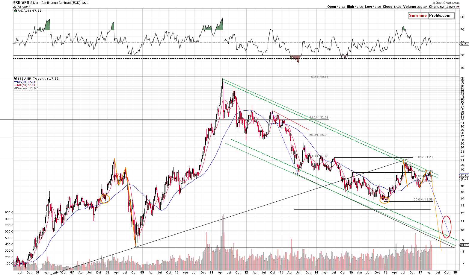
Please focus on the parts of the chart that we marked with orange (in 2016-2017 and in 2007-2008). At first sight there’s nothing similar between what had happened in late 2007 and the first half of 2008 and what’s been taking place since December 2015. However, the more one starts to compare them, the more amazing it becomes.
First, let’s discuss the price moves.
Silver’s early 2008 rally started a bit below the $14 level and took place until the white metal moved above $21 (below $22, though). Then silver declined about $5.50 and then it rallied (which turned out to be its final rally before the big plunge) about $3.
Silver’s early 2016 rally started a bit below the $14 level and took place until the white metal moved above $21 (below $22, though). Then silver declined about $5.50 and then it rallied (which turned out to be its final rally before the big plunge) about $3.
That’s right, the price swings are almost identical not only in relative terms, but also in terms of the (almost) exact prices. What does the above suggest? That silver is likely to decline below $9. Yes, that’s quite extreme, so let’s “conservatively” say that it’s likely to decline to or below $10.
“C’mon that’s only the price analogy – what about time?” one could ask, and they would be correct. At least initially, because it is the price analogy that makes the above even more remarkable. The analogy in terms of time is proportional instead of being exact, but it’s still present and so are the implications.
The time between silver’s bottom in late 2007 and the 2008 top is more or less the same as the time between the 2008 top and the July 2008 top, which is also more or less the same as the time between the July 2008 top and the 2008 bottom.
The time between silver’s bottom in late 2015 and the 2016 top is more or less the same as the time between the 2016 top and the 2017 top, which… Is likely to be more or less the same as the time between the 2017 top and the (upcoming) 2017 bottom.
The existence of the above analogy not only confirms that the price analogy that we discussed earlier is valid, but it also points to early November as the (more or less) time target for the final bottom in silver. Interestingly, the above is in perfect tune with the red target ellipse that we drew based on other factors (long-term support levels and the similarity to the 2012 – 2013 decline). The above makes this price / time target combination even more reliable.
Still, is the above imminent? Does silver have to slide to or below $10? Of course not – the world changes and we should take every silver and gold price prediction with a healthy dose of skepticism and review the estimations when new developments emerge. The above does, however, make a very strong case for much lower silver prices in the coming months, as it confirms multiple signals coming from other parts of the precious metals sector and other markets.
It appears that we are still in the “pennies to the upside, dollars to the downside” territory and short positions seem to be well justified from the risk to reward point of view. ...
more

