
Is The Gold Bull Back?
The price of gold appears to have bottomed, after declining since 2011. Here is a look at the weekly trend.
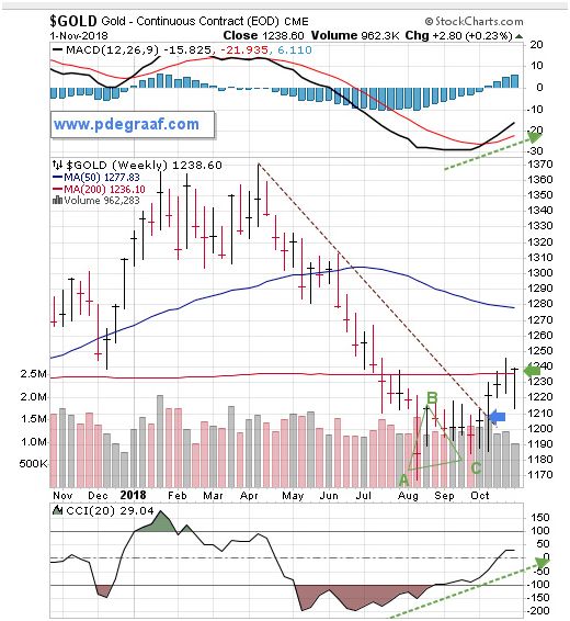
Gold has carved out an ABC bottom, (C above A followed by a rise above B). The breakout at the blue arrow overcame six months of resistance. Price is now tackling the 200 week moving average at the green arrow.
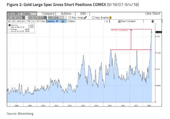
This chart courtesy Bloomberg.com shows the number of short positions in gold futures recently reached an all-time high. From a contrarian viewpoint this is bullish, because these positions will have to be covered – sooner or later.
From a fundamental point of view, gold is overdue to perform as it did between 2002 and 2011. One reason for that is the enormous US budget deficit. This deficit will not be paid off - it will be inflated away.
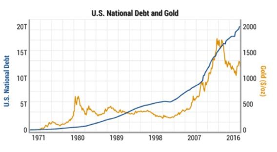
Chart courtesy GATA.org. There are two possible solutions to the wide spread between the US National Debt and the price of gold. Either the debt gets paid off, or gold will rise. The most likely solution is the latter. The longtime relationship between gold and the deficit is obvious.
A number of central banks are adding gold to their reserves. Russia purchased 1.2 million ounces in September. China, India and Hungary among others, are adding gold to their reserves.
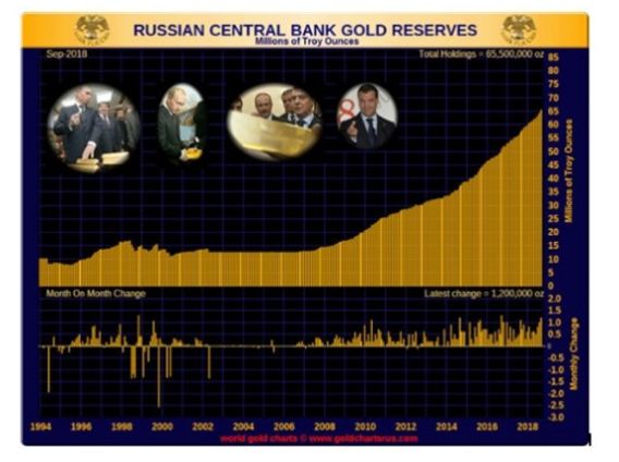
Chart courtesy goldchartsrus.com
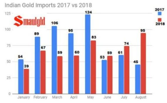
Chart courtesy Smauld.com
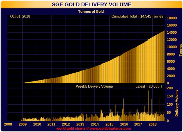
This chart is courtesy Goldchartsrus.com. and it shows the amount of gold that is delivered to the Shanghai Gold Exchange each week. This is in addition to the gold that comes in via Hong Kong.
These three charts show a growing appetite for gold in the East, where the historical importance of gold ownership is well understood.
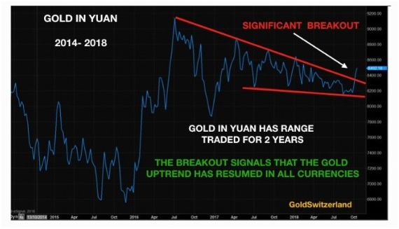
This chart courtesy Goldswitzerland.com shows a breakout that will persuade a lot Chinese investors to buy gold.
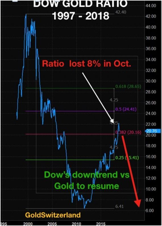
This chart is also courtesy Goldswitzerland.com. It shows the likelihood that the Dow-Gold ratio will turn down. In 1980 the value of 1 ounce of gold was equal to the value of the value of the Dow. Today it takes 20 ounces. Selling Dow stocks and buying gold is beginning to look attractive.
Next is a chart that compares gold mining stocks (GDX) to the S&P 500 index.
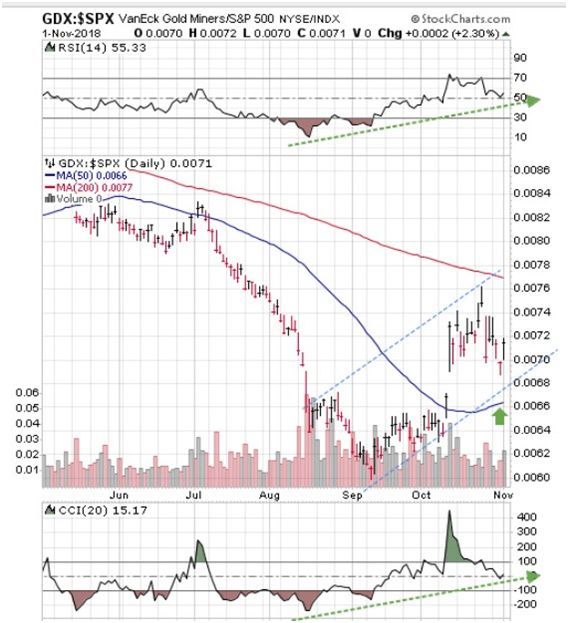
Since September the trend has been moving in favor of gold miners. The supporting indicators are positive and the 50DMA is turning upward.
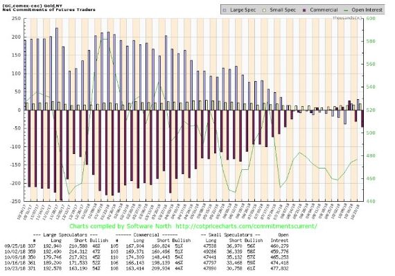
This chart is courtesy COT@softwarenorth.com, and it shows commercial gold traders are ‘net short’ by just 47,000 contracts. As a percentage of open interest the number is bullish at 10%.
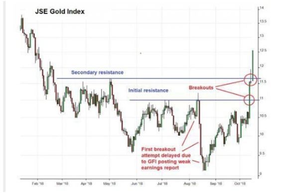
This chart courtesy Dollarcollapse.com, and it shows an upside breakout by the JSE gold miners index.
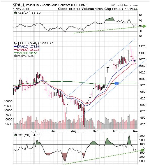
Featured is the Palladium chart. Price often leads gold and silver to the upside. The breakout above the 200 day moving average at the blue arrow has been confirmed and is ongoing. The moving averages are in positive alignment and rising.
Disclaimer: Investing involves risk taking. Please do your own due diligence. Peter Degraaf is NOT responsible for your trading decisions.
Peter Degraaf is a stocks and commodities investor with ...
more

