
Investing For Maximum Profits During A New US Presidency
By listening to President-elect Trump we can anticipate the effect his administration will have on the US economy.
Here is what we know: Mr. Trump plans to beef up the military, and improve US infrastructure, including a wall at the southern border.
While there are other priorities, such as improving on healthcare, just his two main goals will require many billions of dollars.
Being a successful businessman is his asset, and no doubt the new president will surprise us with funding that will be new and novel, such as enticing US companies with overseas assets to repatriate those funds and put them to work in the USA.
Nevertheless, we can be assured that whatever new sources of revenue the new administration comes up with, government spending will increase and so will the Federal Deficit.
The total US Federal Deficit will top 20 trillion before long. This will be accommodated with more printing press money. Congress and the Senate are likely to go along with spending plans. Already the ongoing monetary inflation is causing price inflation, and the expectation is that this price inflation will accelerate.
Our ’investing for maximum profits’ therefore must include stocks and commodities that will grow during a period of price inflation.
Charts are courtesy Stockcharts.com unless indicated.
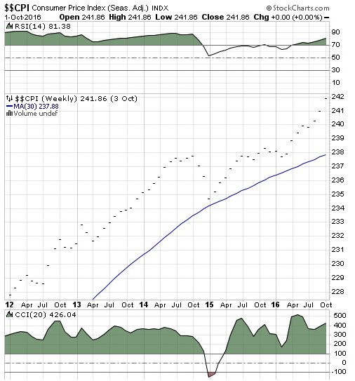
Featured is the monthly US CPI chart. Even though this official government Consumer Price Index is ‘tweeked’ to make it appear as benign as possible, the trend is clearly rising higher.
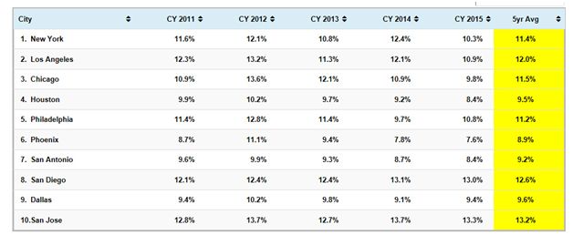
Featured is the Chapwood index of price inflation in 10 US cities. This index www.chapwoodindex.com tracks items that are used or consumed on a daily basis, compared to the components of the index used by the government, which are ‘massaged’ to produce a desired outcome. From these two charts (and especially the Chapwood chart) it is obvious that price inflation is ‘here to stay’.
Following are some charts that feature commodities which will benefit from increased inflation. Our personal portfolio is centered around these commodities and this portfolio has increased by over 52%, during the past 12 months. In order to stay ahead of price inflation, our assets need to grow faster than the rate of inflation.
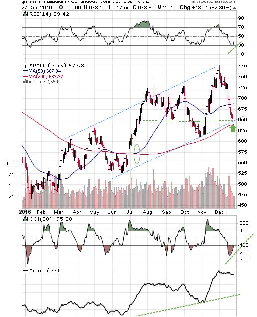
Featured is the Palladium chart. Palladium is used in catalytic converters and price inflation will continue to cause the price of Palladium to increase as people decide to buy a new car before the next price increase. This chart is bullish, as can be seen by the rising channel. The moving averages are in positive alignment (green oval), and rising, along with the supporting indicators. Price is turning up at the green arrow.
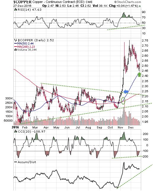
Featured is the copper chart. Price broke out from a large triangle, at the blue arrow. Up volume during the breakout was the highest in years. The rush into copper appears to have been somewhat over-done and the pullback from 2.75 has just now found support at 2.45, where price carved out a strong upside reversal on Tuesday (green arrow). The moving averages are in positive alignment and rising (green oval). The supporting indicators are ready to turn positive, including the important A/D line at the bottom. In any event it is obvious from this chart that copper is benefiting from price inflation. (One of the stocks in our “Model Portfolio” – Western Copper – increased by 50% for a while on Tuesday).
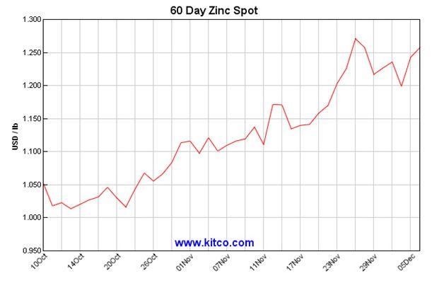
This chart is courtesy Kitco.com and it shows Zinc to be in a bull market. New spending on improving the US infrastructure will benefit zinc along with copper.
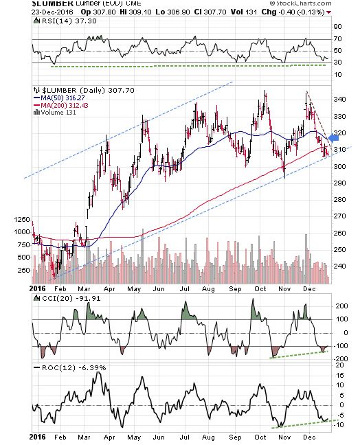
Featured is the lumber chart. The trend is higher, as can be seen by the blue channel. A close above the blue arrow will tell us that the uptrend is ongoing. The supporting indicators are ready to turn positive.
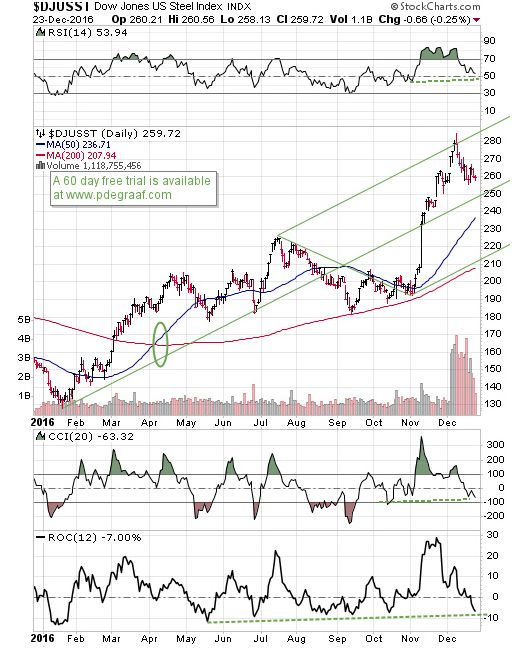
Featured is the Dow Jones US steel index. Price has been in a bull market since January, and the Andrews Pitchfork analysis supports the rising trend. The supporting indicators are back at support levels. The moving averages are in positive alignment and rising.

Featured is GNX the commodity index. Price has been rising all year, while carving out a bullish Advancing Right Angled Triangle (ARAT). The supporting indicators are positive and the moving averages are in positive alignment and rising. The breakout at the blue arrow turns the trend back to bullish, with a target at 690!
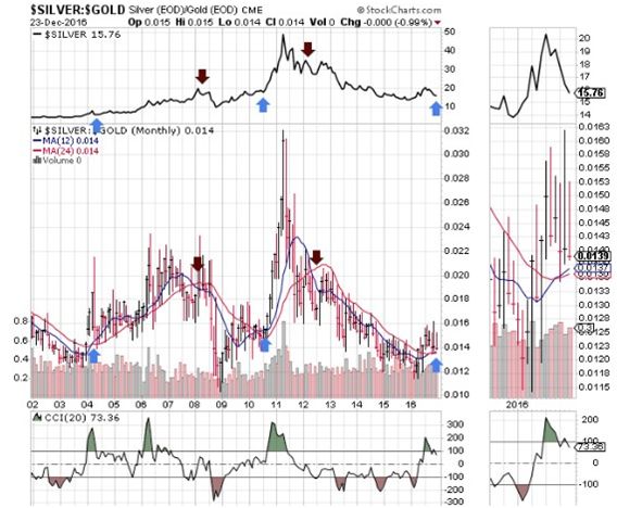
Featured is the index that compares silver to gold, with two moving averages. The silver chart is at the top. The blue arrows point to bullish crossovers (blue above red) that turn out to be buying signals for silver. The purple arrows point to bearish crossovers (red above blue), that turned out to be sell signals. The blue arrow at the right points to a buy signal that is developing. The close-up chart at the right shows this in detail. Because silver is sought by investors as a hedge against price inflation, silver will benefit from the new presidency.
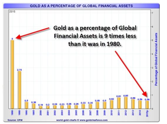
This chart courtesy goldchartsrus.com and annotated by I.M. Vronsky at Gold-eagle.com, shows gold as a percentage of financial assets.
There are at least four reasons why gold will rise again:
- Protection against inflation.
- Reaction against Federal Deficits
- A beneficiary of negative ‘real interest rates’, currently at – 1.22%
- Several billion new investors since 1980. Most of these reside in Asia, where gold is appreciated as a ‘store of value’.
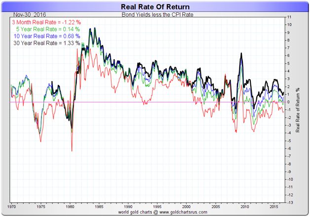
This chart courtesy Goldchartsrus.com shows the ‘real rate’ of interest. The three month rate is -1.22%, while using government supplied numbers. When actual cost of living numbers (such as the Chapwood index) are used, the ‘real rate’ is much lower. Gold thrives when ‘real rate’ are negative.
Disclaimer: Investing involves risk taking. Please do your own due diligence. Peter Degraaf is NOT responsible for your trading decisions.
Peter ...
more

