
How Does 2017 Compare To Historical Bubbles?
Greed And Fear Are Constants

Since greed and fear have remained constant throughout human history, asset bubbles are not a recent phenomenon. The Dutch tulip bulb bubble that occurred in the 1600s shared many of the same attributes of the dot-com and housing bubbles. From Investopedia:
The Tulipmania that gripped Holland in the 1630s is one of the earliest recorded instances of an irrational asset bubble. By one account, tulip prices soared 20-fold between November 1636 and February 1637, before plunging 99% by May 1637, according to former UCLA economics professor Earl A. Thompson. As bubbles typically do, Tulipmania consumed a wide cross-section of the Dutch population, and at its peak, some tulip bulbs commanded prices greater than the prices of luxury homes.
Common Traits Of Bubbles
In all three cases (tulip, dot-com, and housing):
- Asset prices experienced extraordinary gains.
- A wide cross-section of the population participated near the latter stages of the bubble.
- Investors felt “this time is different”.
How Does The Present Day Compare?
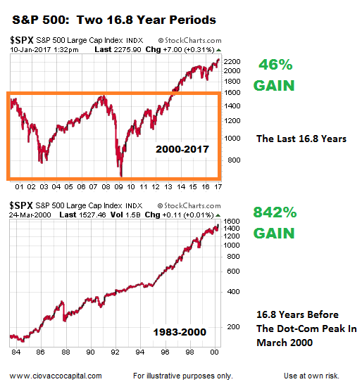
It has been 16.8 years since the end of the dot-com bubble. Have stocks experienced gains similar to the period that ended with the speculative dot-com blow-off peak in 2000? If we compare stock returns in the last 16.8 years to the returns in the last 16.8 years of the tech boom, the gains are significantly different (see bar chart below).
(Click on image to enlarge)
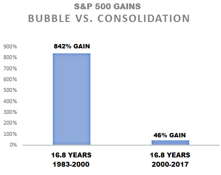
An 18-Fold Difference In Returns
Over the last 16.8 years (2000-2017), the S&P 500 gained 46%, which really doesn’t look anything like the eye-popping 842% gain that occurred in the prior 16.8 year period (1983-2000). The 842% gain represents an 18-fold increase over the 46% gain.
(Click on image to enlarge)
New All Time Highs vs. Consolidation
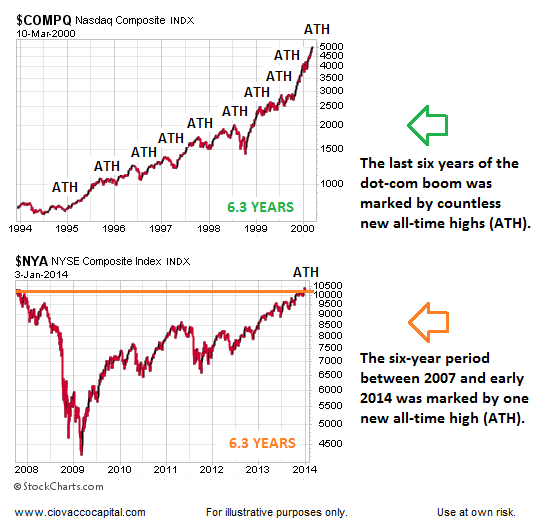
Bubbles see participants push asset prices to never seen before heights, which is exactly what occurred on almost a daily basis between 1995 and 2000. Consolidation periods are marked by a very low number of new all-time highs (ATM), which is exactly what occurred between 2007 and early 2014. Both graphs below span the exact same number of calendar days (2,286).
(Click on image to enlarge)
Bubble vs. Consolidation
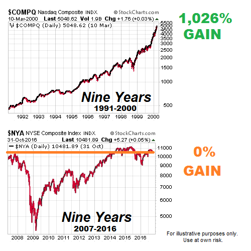
On October 31, 2016, the NYSE Composite Stock Index was trading at the same levels seen nine years earlier. Contrast the “zero progress” look of the nine-year period on the bottom portion of the image below (2007-2016) with the 1,026% gain that occurred during the last nine years of the tech boom era (top portion). The top portion looks like a bubble; the bottom portion looks like consolidation.
(Click on image to enlarge)
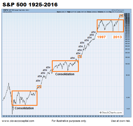
Consolidation Can Be Very Relevant
The expression, “the longer a market goes sideways, the bigger the move that follows” applies to the S&P 500 chart below, which dates back to 1925. The orange boxes highlight periods of consolidation marked by a low number of all-time highs. The periods between the orange boxes represent secular trends marked by a large number of new all-time highs. The chart below was created using data from Stockcharts.com.
(Click on image to enlarge)
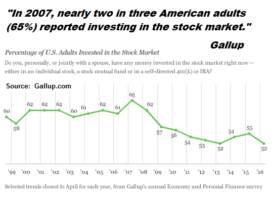
Do We Have Widespread Participation Today?
It was not unusual to go to a cocktail party in 2006 where 50% of the attendees worked as realtors, appraisers, developers, flippers, etc. It was not unusual to discuss tech stocks with your cab driver in 1999. It was also common to hear “you can’t lose money on tech stocks” or “real estate is a sure bet.”
The percentage of adults that own stocks has been declining since peaking in 2007. Therefore, participation has been on a downswing rather than a bubble-like upswing in recent years. The recent decline in stock market participation may also provide a source for new funds in the coming years, as outlined on January 6.
(Click on image to enlarge)
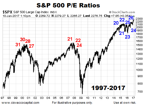
Are Valuations A Showstopper?
Based on numerous valuations metrics, it is difficult to make a case that stocks are cheap in 2017. However, a recent analysis of P/E ratios at major peaks, major bottoms, and within the context of secular trends says present day valuations, taken in isolation, are not a showstopper for stocks.
(Click on image to enlarge)
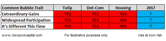
Historical Bubbles vs. 2017
The July 2016 description below of the current bull market hardly paints a picture of euphoric market participants with a “it’s different this time” state of mind. From The Wall Street Journal:
The seven-year bull market in stocks still doesn’t get much love. That is precisely why more milestones could be in the offing. The S&P 500 closed at a record on Monday—its first since May 2015 and the 109th of this bull market. Yet the higher stocks climb, the more skeptical investors seem to get, at least judging by where they put their money. That lack of exuberance and the market’s increasing resilience could be exactly what propel stocks in the months ahead. Consider the reaction to Brexit. Investors pulled nearly $8 billion from U.S. equity funds in the week following the June 23 U.K. vote to leave the European Union, the fourth biggest weekly withdrawal of the year, according to the Investment Company Institute.
Ultimately, personal opinions mean very little in the financial markets. Therefore, it is appropriate to leave the 2017 column in the table below blank. Only time will tell.
(Click on image to enlarge)
Disclosure: This post contains the current opinions of the author but not necessarily those of Ciovacco Capital Management. The opinions are subject to change ...
more


Thanks for sharing