
Has The Market Fallen Ill?
There’s no question that the U.S. economy is undergirded by consumer spending. As much as 70 percent of domestic GDP is attributed to personal consumption. So, when the consumer sector sneezes, the economy inevitably catches a cold.
Welcome to flu season.
This past week’s market break was accompanied by a symptomatic test of the 200-day moving average in the XLY/XLP ratio. The ratio is the quotient of two exchange-traded funds targeting the consumer market: the Consumer Discretionary Select Sector SPDR ETF (NYSE Arca: XLY) over the Consumer Staples Select Sector SPDR ETF (NYSE Arca: XLP). Think of the funds as carve-outs of all the consumer stocks in the S&P 500, most famously tracked by the SPDR S&P 500 ETF (NYSE Arca: SPY). XLP tracks the companies that make and market the goods and services people need; XLY, the stuff folks want.
Outfits like Wal-Mart (NYSE: WMT) and Proctor & Gamble (NYSE: PG) dominate the consumer staples fund. You know, the maker of toothpaste and the place where you can buy it. As for the discretionary ETF, its big stocks include Nike (NYSE: NKE) and McDonald’s (NYSE: MCD), providers of things you’re more likely to buy when there’s money in your pocket after paying your bills and basic living expenses.
From a market perspective, XLY tends to outperform XLP when economic prospects brighten, driving the price ratio higher. As clouds darken the economic horizon, XLP takes the lead and the ratio falls. In short, the ratio’s pretty good, if indirect, real-time indicator of consumer sentiment.
A test of the XLY/XLP ratio’s 200-day moving average isn’t altogether uncommon. Take a look at the indicator’s long-term chart below. There have been several tests – and even penetrations – of the average even during the current bull market. The ratio last dipped to its 200-day average a year ago.
(Click on image to enlarge)
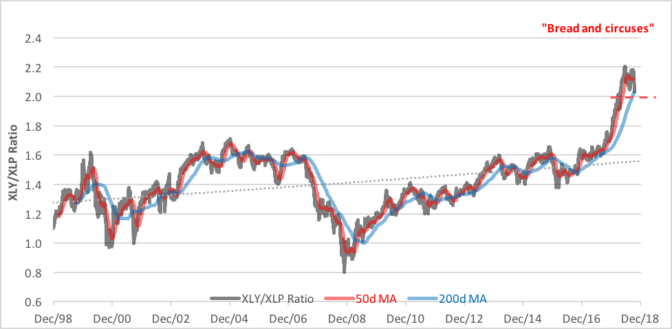
Real trouble, marketwise, is signaled when the ratio’s 50-day moving average crosses below the 200-day marker – a so-called ”death cross.” That hasn’t happened during the current selloff, though the spread between the two indicators is rapidly narrowing. It’s been more than halved since its summertime peak.
About a month ago, we pondered if it was time to abandon the bull market and found some investors were already bundling up against a chill. A death cross in the XLY/XLP ratio would be a sign that a market infection has indeed set in.
Disclosure: None.


