
Halfway To A Textbook Recession – Weekly Market Outlook
After three straight weeks of bullish progress, the weight of those gains finally proved to be too much. The prod was a surprisingly weak revised reading on Q1's GDP growth. Rather than growing at a 0.2% clip as first thought, the second (of three) updates on the nation's overall economic activity rolled in at -0.7%. That was enough to send the S&P 500 (SPX) (SPY) down 0.63% on Friday, bringing the weekly loss to 0.87%.
And yet, the market has yet to move past the point of no return and start a selloff that can't be quickly halted. It's close to some key levels though.
We'll look at just how close the market is to the edge of a possible cliff in a second. Let's first take a look at last week's major economic reports and preview the ones in the lineup for this week.
Economic Data
The news started to flow right out of the gate coming back from the three-day weekend, with a double-dose of home price data coming out on Tuesday. The Case-Shiller Index was up 5.0% (year-over-year) in March, while the FHFA Housing Price Index advanced 0.3% between March and April. Both indicators of home values were still in broad uptrends, but the strength we've seen over the last couple of months has really lit a fire again on this front.
Home Price Indices Chart
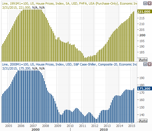
Source: Thomson Reuters Eikon
It was also a big week for consumer sentiment measures, though also a confusing one. The Conference Board's consumer confidence score ticked a little higher for May, but the Michigan Sentiment Index edged a little lower. Either way, both measures are still in bigger-picture uptrends.
Consumer Sentiment Chart
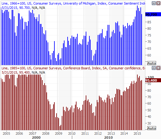
Source: Thomson Reuters Eikon
It was obscured by the hysteria surrounding the revised GDP reading for the first quarter, but on Friday we saw another minor red flag start to wave – the Chicago PMI score fell from 52.3 to 46.2. Anything under 50 is considered negative, so it'll be interesting to see if this dip goes anywhere… especially considering three of the last four PMI readings have been below 50.
Chicago PMI Chart
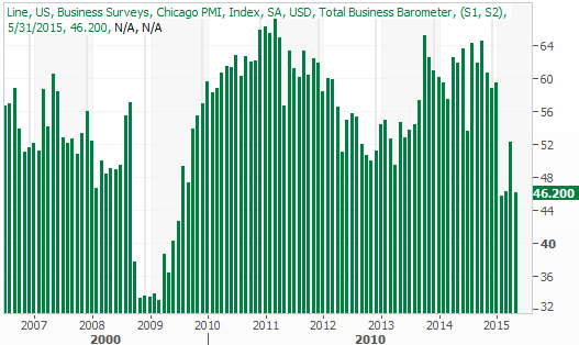
Source: Thomson Reuters Eikon
Last but not least, an updated look at the quarterly GDP readings. The revised reading was rough, but mostly driven by a strong dollar and a severe cutback in oil infrastructure investment. Though it takes two consecutive negative readings to constitute a technical recession, oil is still very cheap heading into the end of the second quarter, and the greenback is still prices quite high.
U.S. GDP Change Chart
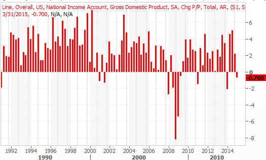
Source: Thomson Reuters Eikon
Everything else is on the following grid:
Economic Calendar
Source: Briefing.com
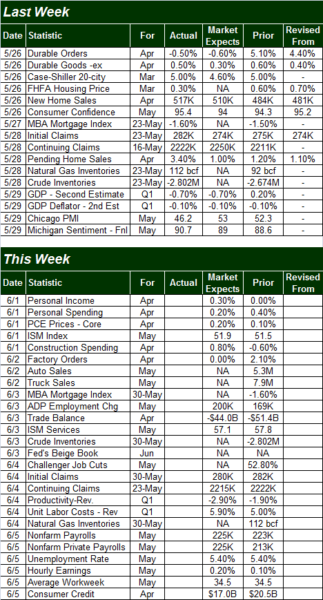
The coming week is clearly going to be a busy one, but there's little doubt as to what the highlight will be…. Friday's unemployment report. Economists don't expect much change on that front. The unemployment rate should hold steady at 5.4%, while payroll growth is projected to move a little higher, from 223,000 to 225,000.
Unemployment Rate, Payroll Growth Chart
Source: Thomson Reuters Eikon
Considering the employment picture is one of two key data nuggets the Fed is watching closely to determine if and when it needs to raise interest rates, any surprising employment numbers could really rock the boat.
Stock Market Index Analysis
It's still far too soon to assume the worst yet, but last week's trouble – and last Friday's trouble in particular – was a nice reminder that stocks don't travel in just one direction. We're still dealing with a lot of headwinds, technical as well as fundamental, and last week the headwinds won.
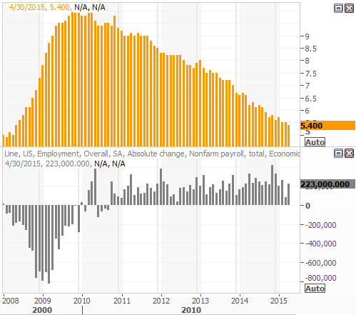
Let's just start with a look at the damage the bears did to the S&P 500 last week. That is, the S&P 500 closed under its 20-day moving average line (at 2112), the Percent R indicator was knocked back under the 80 threshold, and we just barely logged a new bearish divergence from the MACD indicator. Also note the volume behind Friday's selloff was unusually high. Did the majority of traders suddenly tip their hand when Q1's GDP reality landed in their lap?
S&P 500 & VIX – Daily Chart
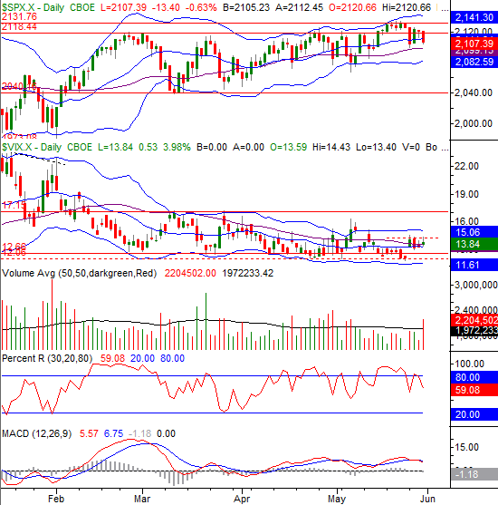
Chart created with TradeStation
On the flipside, it's not as if the S&P 500 has broken any major floors, nor has the CBOE Volatility Index (VIX) (VXX) broken any major ceilings.
At this point we have to assume the lower Bollinger band, currently at 2082.6, is going to be the first real confirmation of the beginning of a new pullback. That is, a couple of consecutive lower closes below the lower Bollinger Band will confirm a long-overdue corrective move is underway. At the same time, the VIX will need to print a couple of consecutively higher closes above its upper Bollinger band currently at 15.06 to signal it's starting to trend higher… which is bearish for stocks. Anything less than those two confirming clues, and the bulls could still easily rekindle the bigger-picture uptrend – as they have several times this year.
Zooming out to a weekly chart of the S&P 500 we can glean a little more perspective on how and why this pullback materialized. With the long-term uptrend already slowing down and the index near the upper edge of the trading range's boundaries established by its Bollinger bands, the path of least resistance was to the downside. Moreover, the path of least resistance is still to the downside… IF the 26-week moving average line at 2077 fails to hold up as a floor.
S&P 500 & VIX – Weekly Chart
Chart created with TradeStation
The VIX also has room to rise, though in the weekly timeframe the VIX needs to hurdle a ceiling around 15.1 before that room matters.
For what it's worth, the NASDAQ Composite's (COMP) lower Bollinger Band is its make-or-break support level. As out chart shows, the lower band line was the prod for the last three major bullish reversals.
NASDAQ Composite & VXN – Daily Chart
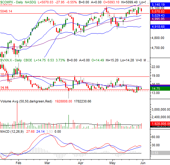
Chart created with TradeStation
With all of that being said, perhaps the most important line in the sand we should be watching for both indices right now is the 26-week moving average line.
On the weekly chart of the S&P 500 above it was the 26-week moving average line that has been a near-perfect floor over the past three months, and several times since the beginning of last year. On the weekly chart of the NASDAQ Composite the 26-week moving average line (blue, bold, at 4879) hasn't been the key floor in recent weeks, but it was a big floor in January, and has been a key support level off and on for a while. So has the 200-day moving average line (green) at 4766.
NASDAQ Composite & VXN – Weekly Chart
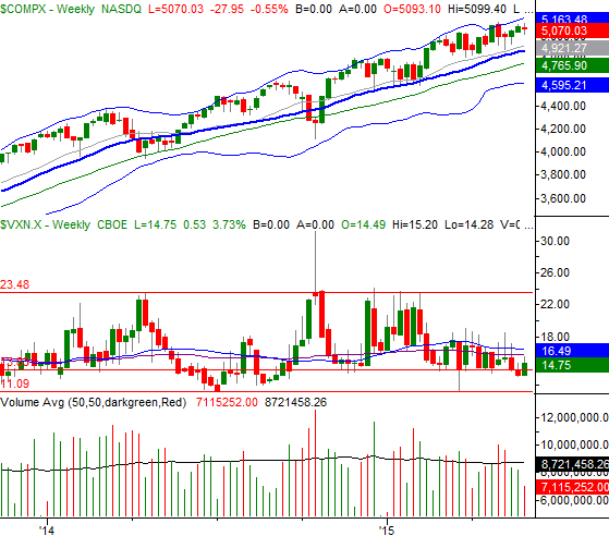
Chart created with TradeStation
Unless these bigger picture support lines – the 26-week moving average line in particular – break down and let the indices move meaningfully flower, the risk of a decent correction is nothing more than a risk, and the bigger uptrend will remain intact.… especially if the VIX and the Nasdaq Volatility Index (VXN) don't start to trend higher at the same time. Any dip that tests the 26-week moving average lines without pulling under them may well just be a buying opportunity. Let's see what happens if and when those lines are touched.
Disclosure: None.


BEA is changing the way it calculates GDP again. Even if Q2 sees a contraction, the government will produce numbers saying it grew.