
"Great Rotation" Ahead; Will It Be Inflationary Or Deflationary?
Think back to the blaring headlines about the Great Promotion Rotation in the financial media in 2013. Perhaps the media circus started in January of that year when The Economist asked the question of whether the rise in bond yields signaled a “flight” out bonds and into equities. It was probably an earnest and right-minded question asked by The Economist, but you know our friends in the greater financial media; get a good story and flog the hell out of it to harvest eyeballs. Reality be damned, man, it’s the eyeballs that matter!
As the mini-hysteria grew that year we called it a “Great Promotion” (by the financial media) in expectation that the Continuum’s limiter (the red monthly EMA 100 on the 30 year bond yield chart below) would hold once again, just as it had during Bill Gross’s inflation hysterics that signaled a top in inflationary angst in early 2011. By the end of 2013, our ears were ringing with the media buzz and drone about the “Great Rotation”.
Then? Poof! The ‘limiter’ limited, yields went back down, stocks got rocky over the following 2 years and Goldilocks eventually took over once again amid the Brexit/NIRP buying opportunity that developed in mid-2016 (Ref. AMAT Chirps, B2B Ramps, Yellen Hawks and Gold’s Fundamentals Erode from May 30, 2016).
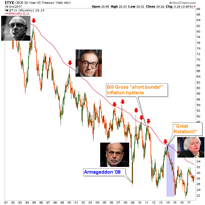
So that was the sordid history of the original “Great Rotation” media promo. But the actionable ‘career maker’ rotation that may lay ahead is one focused on a would-be bottoming and steepening of the yield curve as opposed to the flattening that has been in place ever since the Fed’s maniacal and brilliant Operation Twist forced it to decline impulsively in 2011.
To review, Op/Twist manipulated the curve by buying up long-term bonds and selling short-term bonds, thus enforcing by decree the official view that inflation must be “sanitized” (Fed’s word, not mine) out of the picture. Here’s a chart with a message from John Lee Hooker for equity and asset market bears: “Boom boom boom boom, I’m gonna shoot you right down”…
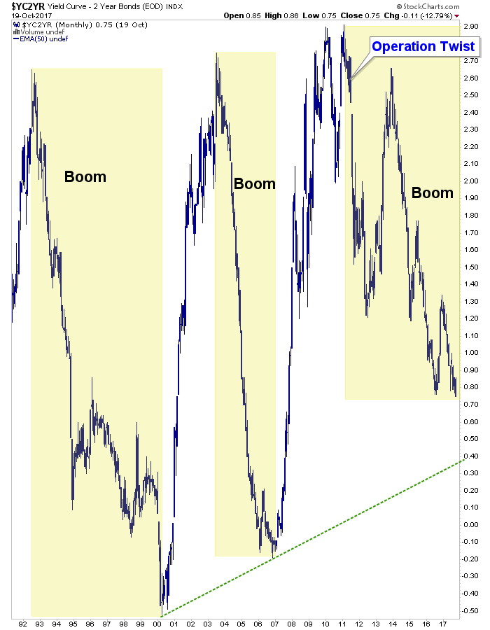
That was 6 years ago and everyone is on that trade in the form ‘long equities’, ‘short volatility’, ‘long junk bonds’ and a host of other risk ‘on’ vehicles. What’s best about it from a contrary view is that it is firming up confidence in the average market participant that an all-powerful Fed will never let the market drop. Well, we’ve heard stories like that before (anyone recall the famous “Greenspan put” that made the rounds during Boom #1?).
We’ve talked at length about the implications of a bottom and trend reversal in the curve but importantly, also about how a trend is a trend until it changes. Simple, I know. But all too often people let their intellect overrule their patience. The trend in the yield curve is down (flattening). That is Goldilocks’ ideal situation with the Fed seen as in control and the stock market in full compliance.
Yet for a well laid out case for a yield curve “steepener” play, see this post by Kevin Muir of the Macro Tourist…
Can Someone Please Help Me With the Timing?
Sorry, Kevin, the best I can do with your question is draw the trend line above from boom tops (yield curve bottoms) 1 & 2 and project it will come at or above that line (it need not invert). The other hunch I have is that the end of the US dollar bounce (I’ve been nursing the USD rally view since mid-summer at least) may coincide with the timing of a yield curve bottom.
Here’s Uncle Buck in a bottoming pattern, looking for the SMA 200 (currently 97.12 and declining). I don’t really have a fundamental answer as to why this may coincide with a yield curve bottom other than they would both be important signals of macro changes. For instance, if the dollar were to fail at around 97 as expected, a long-term bear phase would go well with an inflationary macro scenario. If it breaks through and bulls, it would go well with a deflationary macro scenario.

So what would be the preferred methods of playing such a dramatic change in yield dynamics? Well again, first you’d have to determine if the curve steepening is inflationary or deflationary. That should be pretty easy because if the move is inflationary you’d see nominal interest rates rising (with the key being the red ‘limiter’ on the first chart above (30yr yield) as the bond market adjusts for years of unmitigated inflationary monetary policy (that has benefited equities on this cycle). If it is deflationary, the play would be similar to 2008’s unwinding of the Greenspan era excesses.
There is a reason you hear Fed officials talk so much about getting inflation up to 2% and that is because the system they oversee literally runs on inflation. Deflation takes apart the game, plain and simple. Why again did Bernanke’s Fed go so balls out with the monetary fire hoses in 2008 and then keep the pedal to the inflationary metal for years after? I think you know why.
But the Fed wants just the right amount of inflation, just as Goldilocks likes her porridge “just right”. A coming rise in the yield curve (timing notwithstanding) will work against their “just right” goals. It will imply either inflation getting out of the barn or deflation making a return to try to finish what it started in 2007/2008. Like Kevin Muir linked above, I think the move will be inflationary. In that case, there will literally be a world full of assets to invest in, but also many to avoid. In the case of a deflationary episode, it gets trickier because liquidity would drain so fast it would make your head spin. But after the initial drainage, the gold sector would likely bottom first and lead the next macrocycle (ref. 2001 and dramatically, Q4 2008).
So the bottom line is, a yield curve bottom and a rotation to a steepening environment is out there somewhere on the horizon. It will either be inflationary or deflationary. But whatever it is, it will not favor many of the best performing items of the post-2011, post-Op/Twist Goldilocks era. I am nimbly long the current asset market party (with a boatload of USD bull fund UUP and cash) and with the mature trend. But for the few looking ahead to trade dynamic changes in the yield curve and possibly even nominal long-term bond yields (again, see 1st chart above) the real party has not yet begun.
Subscribe to NFTRH Premium for your 40-55 page weekly report, interim updates and NFTRH+ chart and trade ideas ...
more

