
Great Graphic: Stocks And The Dollar
The S&P 500 has fallen around 5.75% since the post-FOMC high. The dollar has risen against most currencies in the same period. It begs the question what is the current statistical relationship between stocks and the dollar.

To set the table, consider the year-to-date performance. The S&P 500 has fallen almost 7%.The dollar has risen against nearly every other currency. The notable exceptions are the Swiss franc, which strengthened dramatically after the SNB lifted its cap on the currency. The yen has also risen against the dollar this year, though its 0.13% rise can be accounted for by today's price action alone. Excluding countries that peg their currencies against the dollar, the greenback has risen against all the emerging market currencies as well. Still, some observers have argued that the dollar has become correlated with stocks.
Yet their arguments are not particularly robust. First, for the dollar they use the Dollar Index. The problem with this is that the Dollar Index is a weirdly-weighted index that gives much weight to the euro and currencies that gravitate in the euro's orbit, like the Swiss franc and Swedish krona. It is not a trade-weighted index as two of the US biggest trading partners, Mexico and China, are not included.
Second, they talk about correlation but do not actually get their hands dirty with the data. Instead, they show two time series with two different scales and through what amounts to a curve fitting exercise show how the two lines move in tandem. Correlation is a statistical relationship and cannot simply be eyeballed.
Third, as investors we are interested in the correlation of returns not the correlation of the level of two time series. To offer a more robust analysis, we looked at the correlation of the euro-dollar and the dollar-yen and the US S&P 500 on the basis of percentage change. Using Bloomberg analytics, here is what we found:
This Great Graphic shows the rolling 60-day correlation between the percentage change in the S&P 500 and the percentage change in the euro. There are three things to note. First there is a negative correlation. And not only is it negative (-0.52), but it is negative by the most since 2003.
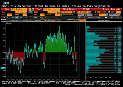
Second, the correlation fluctuated between positive and negative correlation in the first nine months of 2014. It was inversely correlated from last September through early March. It was positively correlated through most of Q2, poking through 0.50 in April. The euro and the S&P 500 have been negatively correlated since mid-June, reaching -0.63 earlier this month.
Third, the frequency distribution bar chart to the right of the correlation chart illustrates that the correlation tends to spike to extremes but does not stay there for long. Since 2000, there are two main frequency concentrations. One is between about 0.38-0.46. The other is between zero and 0.12. There is a smaller concentration from -0.12-0.30.
The other Great Graphic, we created on Bloomberg, is the correlation between the dollar-yen exchange rate and the S&P 500. We employed the same methodology, conducting the correlation on the basis of the percentage change of each on a 60 -day rolling basis. To keep the results similar and avoid confusion, we look at the yen against the dollar (inverse of dollar-yen).
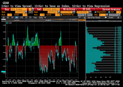
With three exceptions, the yen is inversely correlated with the S&P 500 since early 2007. The first time, mostly December 2010, seems a bit like a statistical fluke. The second time was for 6-7 months from August 2011 into March 2012. The positive correlation reached 0.42 at its peak. The third period was in the April-July period this year.
The yen's current correlation with the S&P 500 is about 0.76. Since 2000, it has rarely surpassed this extreme. The frequency distribution has two main concentrations. The first is from about 0.01 to 0.12. The other concentration is found between -0.15 and -0.26. There is a smaller node developing between -0.67 and -0.74.
It is a misleading question to ask what is the correlation between the dollar and the stock market. The dollar does not exist like that. The dollar's value is only know in terms of something else, such as against the euro or yen. Using the Dollar Index lends itself to confusion because of its weighted components. It is also not particular rigorous to eyeball the time series to claim a correlation, which is a statistical relationship. It is also preferable for investors to conduct the correlation on the percentage changes rather than on levels, which helps reduce spurious correlations.
The conclusion of our little exercise is that both the euro and yen are inversely correlated with the S&P 500. Both correlations appear to be near extremes though the 30-day correlations are even more extreme. While recognizing that the inversion can become deeper, these levels do not seem sustainable. The correlations are likely to become less inverse in the period ahead.
Read more by Marc on his site Marc to Market more


