
Basic Materials Offering Some Clues
There are so many different areas and charts to look at tonight it’s hard to know where to begin. The precious metals complex had a good week, the stock markets are still slowing rising and I’m seeing some reversal patterns completing on some of the basic material stocks. The question is, is this really just a counter trend rally taking place or is there something more happening behind the scene?
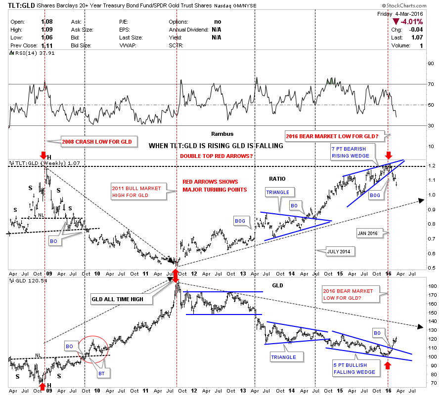
Lets start with a combo ratio chart that has the TLT:GLD ratio chart on top and GLD on the bottom. I posted this chart several times in the last couple of months looking for a direction in gold. I explained in detail a couple of weeks ago about the inverse relationship this combo chart shows so I won’t go into that again right here. The main thing to understand about his ratio chart is that when the TLT is under performing gold the ratio should be falling meaning GLD is stronger. Just a short six weeks ago the price action was still trading inside the blue rising wedge and had not shown its hand yet on which way the rising wedge was going to break. As you can see, the blue rising wedge finally broke to the downside five weeks ago, which told me gold was most likely going to rally and because the blue rising wedge is pretty big the rally in gold should also be pretty big. The bottom chart which has GLD on it is matching the ratio chart on top inversely by breaking up and out of its bullish falling wedge. The red arrows shows you the major inflection points going back to the 2008 crash low. So far this combo chart has been spot on in signaling the potential bear market bottom in gold.
Note: Click on images/charts to enlarge
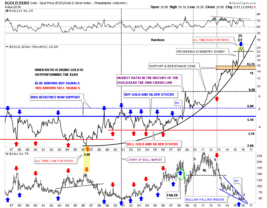
Below is another combo ratio chart we’ve been following which has the Gold:XAU ratio chart on top and XAU on the bottom. The ratio chart on top shows the massive divergence between gold and the XAU. When the ratio is rising, gold is out performing the XAU,which it has been doing since 1996 as shown by the parabolic arc. The last time we looked at this combo chart the ratio chart on top was breaking down from the double top reversal pattern which was the all time high for this ratio. This month is still very young yet but last week the ratio chart on top closed right on the parabolic arc. If the ratio can break below that parabolic arc that would be another very big clue that gold has truly bottomed and the new bull market is well underway. Note the blue bullish falling wedge on the bottom chart which shows the XAU has broken out to the upside. So far this is exactly what we want to see happen.
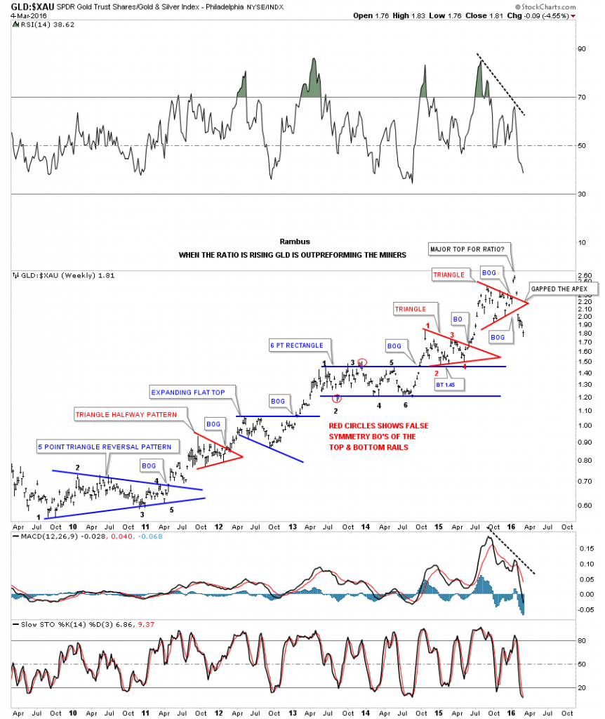
This next chart is a weekly bar chart for the GLD:XAU ratio chart we just looked at above. This bar chart shows more detail of how GLD has been outperforming the XAU since the 2008 crash low. It was hard to get bullish on the PM stocks when this ratio looked like it did. This is what your typical bull market looks like when you see one consolidation pattern form on top of the next.
Note the current price action at the top of the chart. Again, up until five weeks ago, the red triangle was showing just another consolidation pattern in the out performance of GLD to the XAU when suddenly something unexpectedly happened. Note the big gap that occurred at the apex of the red triangle. You talk about an abrupt change in character. That move is called an end around the apex which negates the triangle as a consolidation pattern. Just seven weeks ago GLD was still kicking the XAU’s butt which has dramatically changed the outlook for the precious metals stocks for the first time in a very long while.
Before we move on lets take a quick look at gold’s triangle that looked like a nice breakout last Thursday. The breakout could still be in play if the backtest holds support at the 1245 area, but normally you like to see a backtest on light volume which gold didn’t show us last Friday. We’ll know this week if the breakout is the real deal if the backtest can hold support.
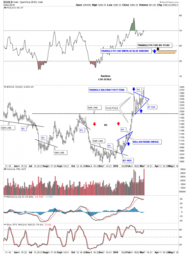
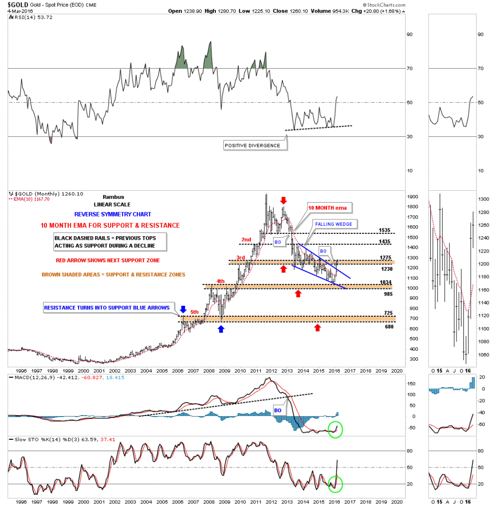
The long term monthly chart we’ve been following for years shows the brown shaded support and resistance zones I put on this chart once I knew the bull market was over. You can see initial support came in when gold declined down to the third S&R zone which eventually failed. The next brown shaded S&R zone is labeled #4 which so far has held support. As you can see the price action is now trading between the third and fourth brown shaded support and resistance zones. These brown shaded S&R zones showed resistance during the bull market years until they were overcome. During the bear market years they should have reversed their roll to act as support until they were broken to the downside, which they have done so far.
There is one more important thing to look at on this long term monthly chart for gold, which is the 10 month ema. During the bull market years the 10 month ema only turned down once during the 2008 crash. Last month the 10 month ema has finally turned up for the first time going all the way back to December of 2012 which is no small feat.
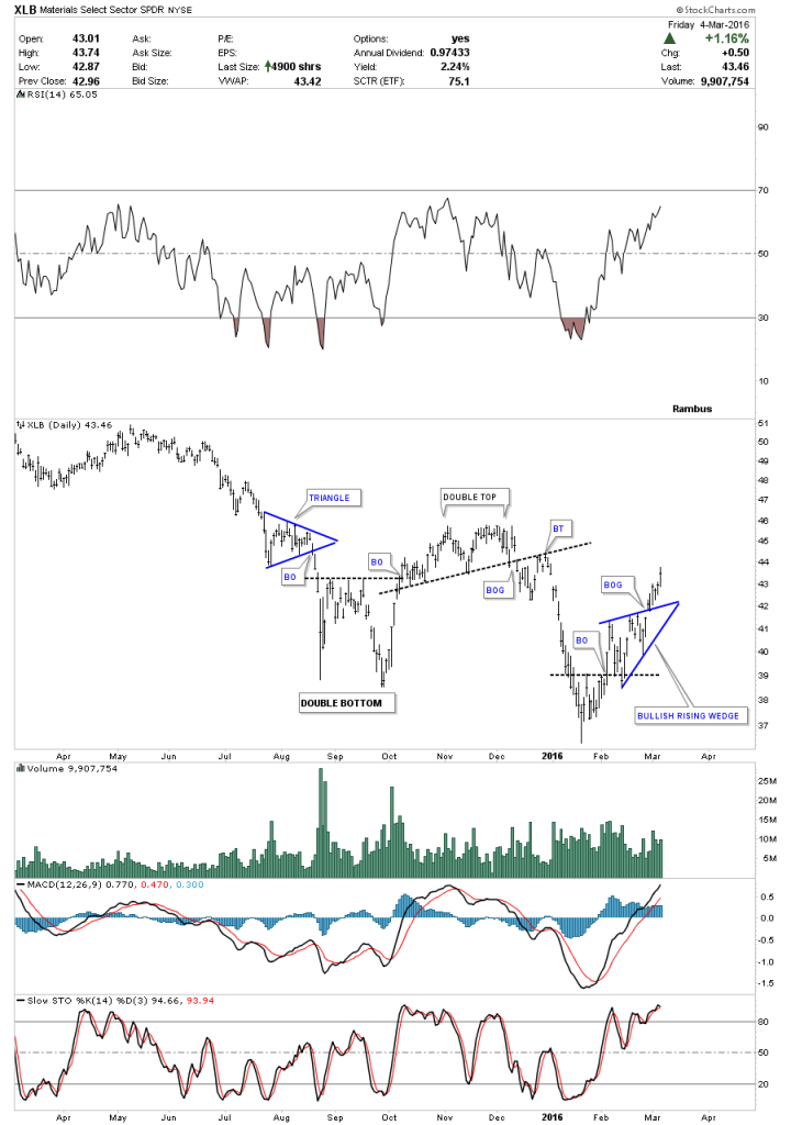
Lets now look at a daily chart for the basic materials sector which is showing some life after a long decline. Below is the XLB, basic materials etf, which is showing a second low following the August – October double bottom low from last year. A little over a week ago it broke out above the blue bullish rising wedge with a nice backtest and now it’s starting to move higher. It’s hard to tell by just looking at a daily chart if this potential double bottom or bigger consolidation pattern has any chance to materialize.
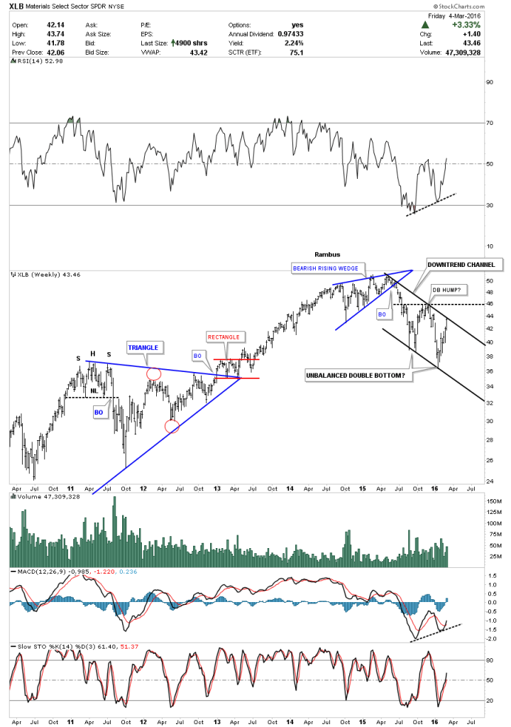
The weekly chart for the XLB shows it formed a seven point bearish rising wedge which broke to the downside about a year ago. It’s still too early to tell yet but the XLB could be forming an unbalanced double bottom at the bottom of its one year downtrend channel. In order to really turn this thing around to the upside the first thing we would need to see is the top rail of the downtrend channel give way and then the double bottom hump at the previous high broken to the upside. The reason I’m bringing this up is because the Dow Jones Industrial Average has several basic material stocks in it which in turn could potentially be bullish for the Dow.
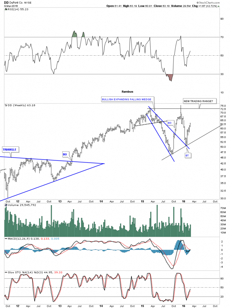
Looking at DD I can see a possible very large trading range building out which could be either a consolation pattern or a reversal pattern depending on how it matures out. Right now it’s working on its potential fourth reversal point to the upside.
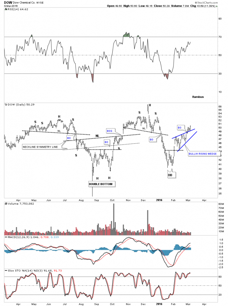
DOW, Dow Chemical is another big INDU stock that looks alot like the XLB we looked at earlier. It could be forming an unbalanced double bottom opposite to the XLB’s double bottom with a higher low on the right side. Also notice it has broken out of the blue bullish rising wedge and has been in backtest mode for the last week or so.
The weekly chart for Dow Chemical shows its bull market that began at the 2009 inverse H&S low. It has been consolidating for the last couple of years forming a flat top expanding triangle which is just below its all time highs. It pays to follow the direction of these big cap Dow stocks.
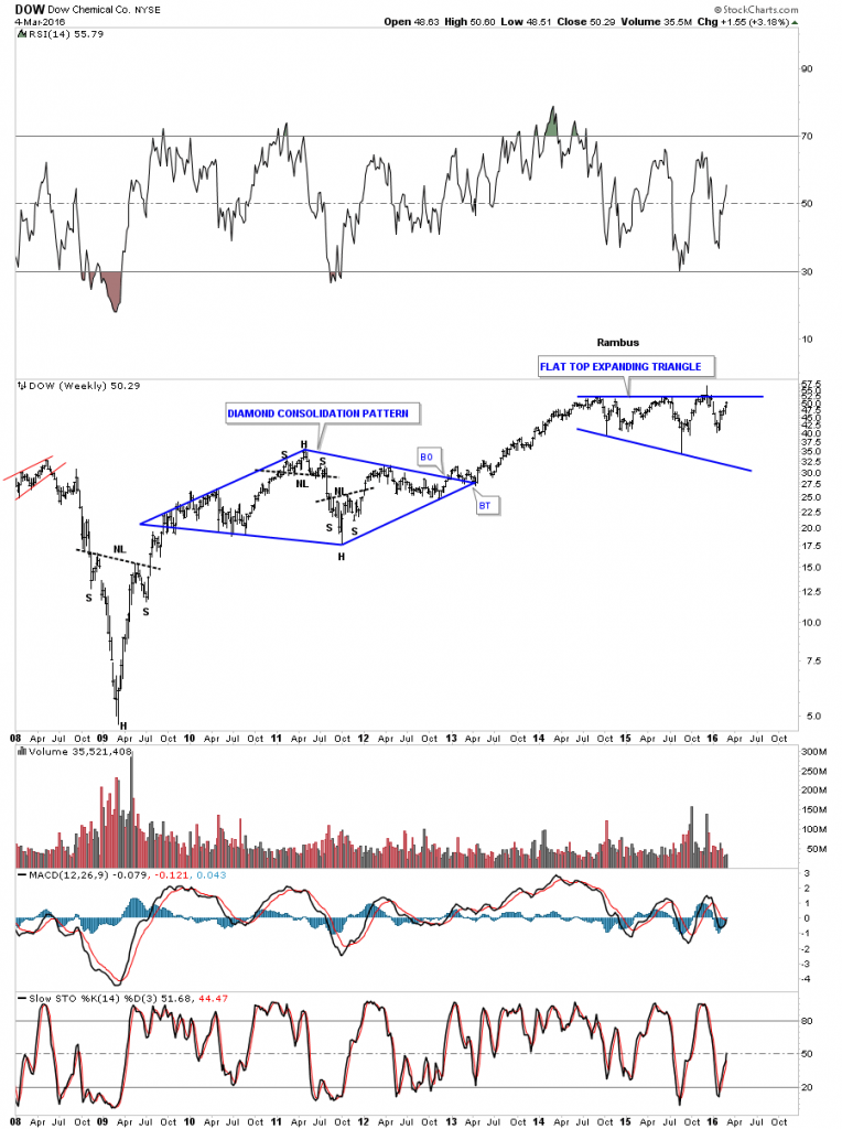
The long term 20 year monthly chart for Dow Chemical shows a pretty strong looking bull market off of the 2009 crash low. If we see this stock take out the top rail of the flat top expanding triangle that would be very bullish for the stock markets, until then it’s in consolidation mode.
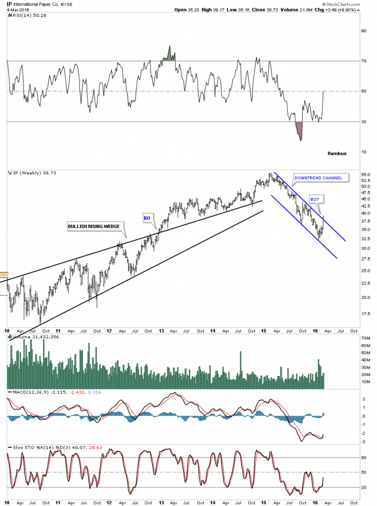
IP, International Paper shows the daily chart breakout out from an inverse H&S bottom last week after a year long decline.
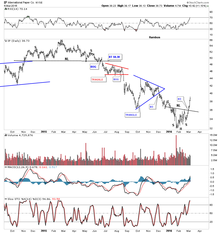
The weekly chart shows it’s cracking the top rail of its one year downtrend channel this past week.
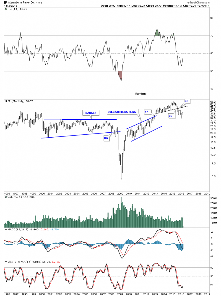
The monthly chart for IP doesn’t look as bullish from the longer term perspective. It’s possible we could see IP rally back up to the underside of the black dashed S&R line and fail. Again nothing confirming yet one way or the other.
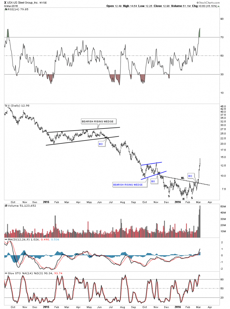
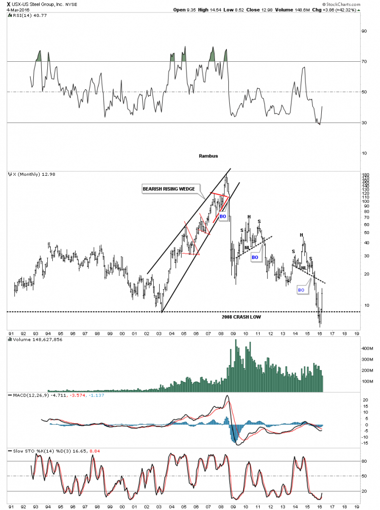
X, US Steel has broken out from an inverse H&S bottom last week in a near vertical move higher on massive volume.
The weekly chart for X shows it’s reversing symmetry back up over the same area it came down during its last decline. That is a monster move for a stock like that.
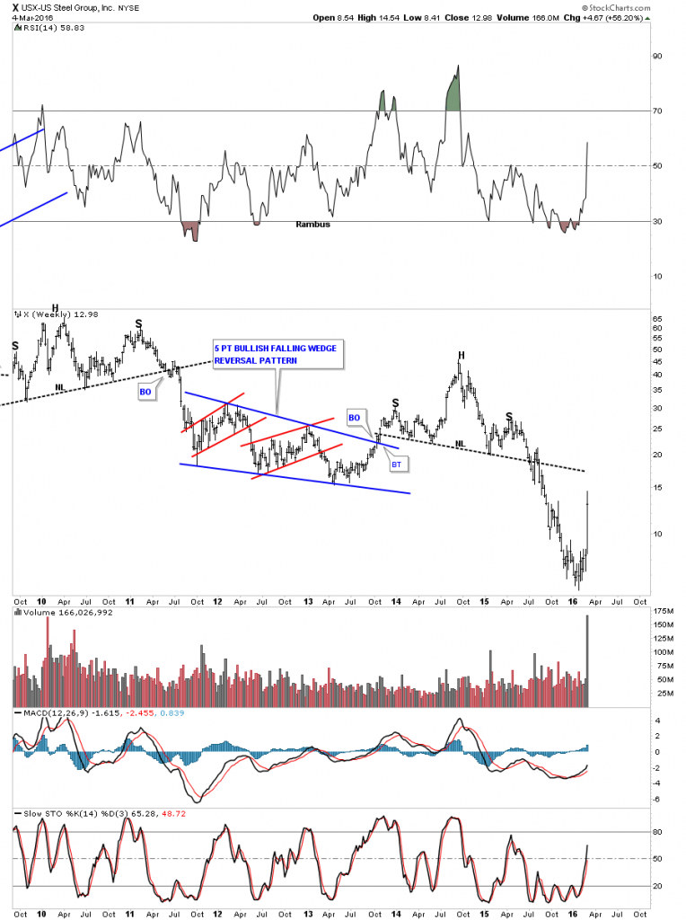
The monthly chart shows it’s bouncing up from its all time lows. Kinda looks like some of the precious metals stocks we’ve been looking at.
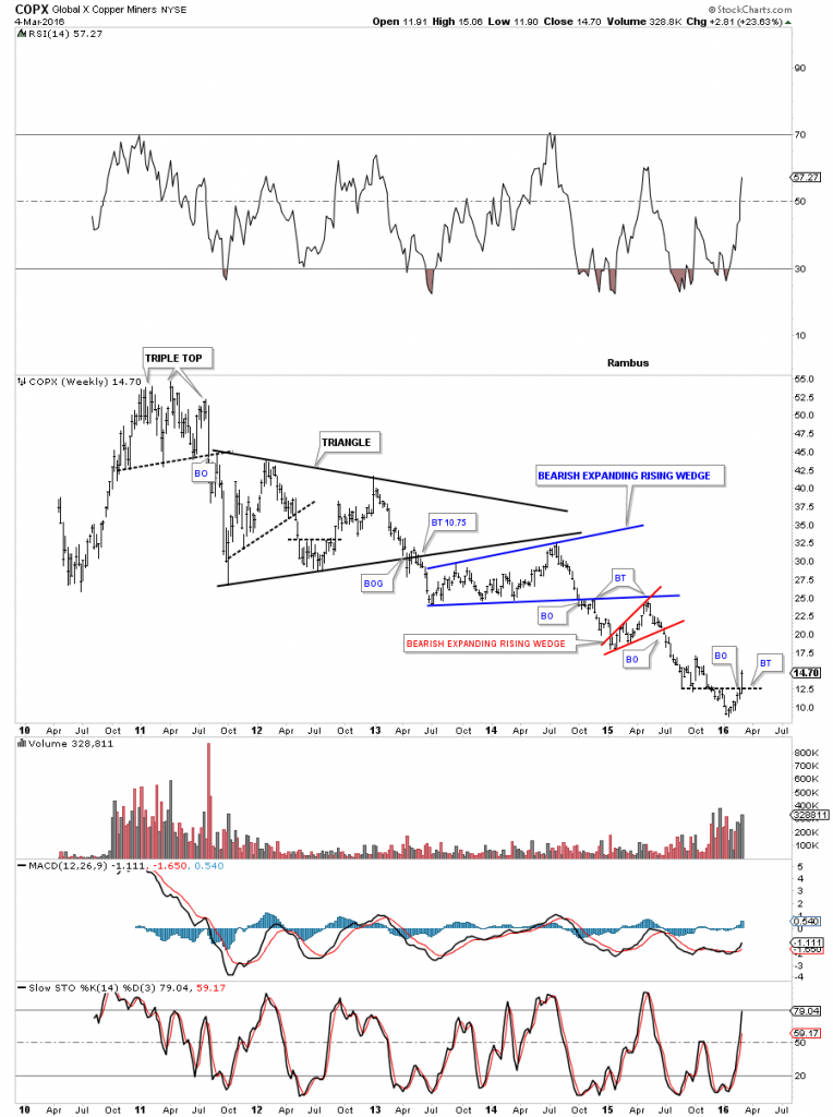
The daily chart for the COPX, copper miners index shows it broke above its neckline last week.
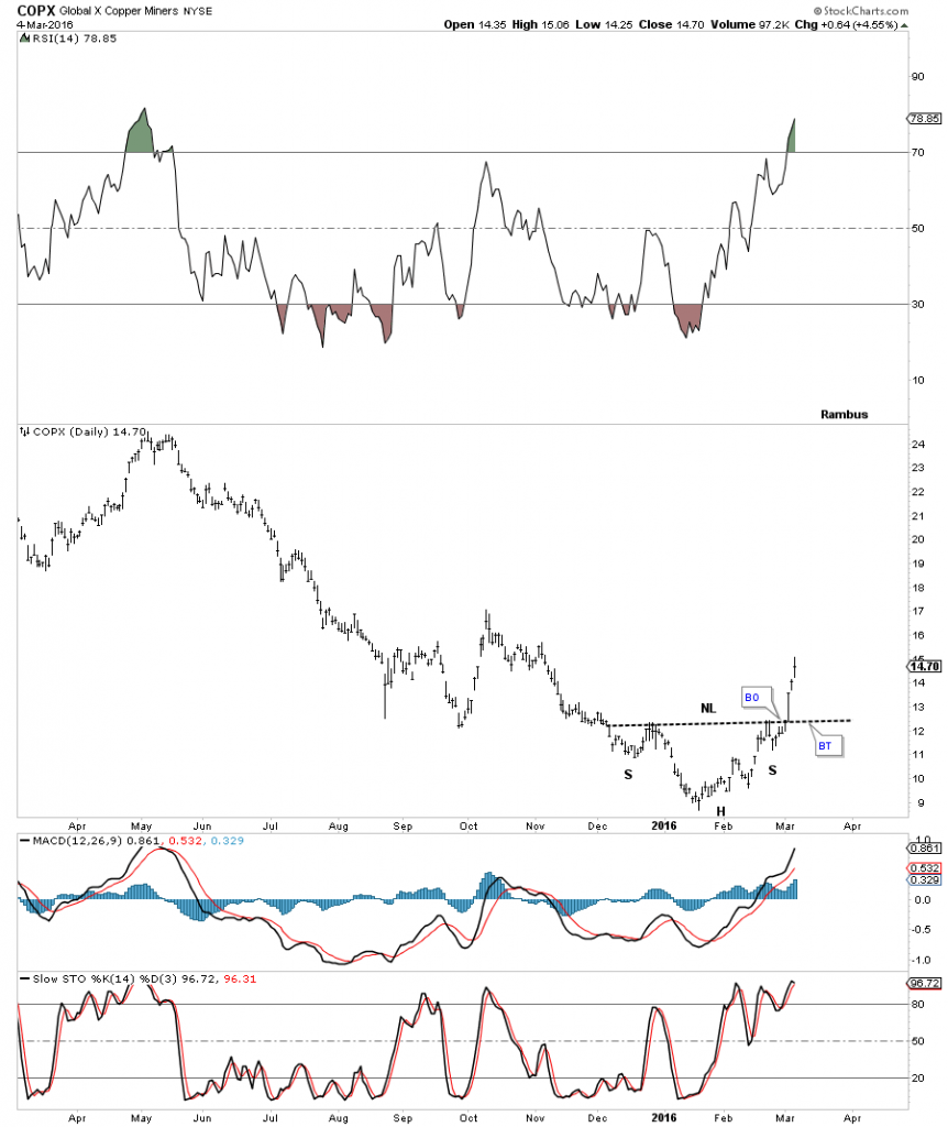
The weekly chart for the COPX shows it has formed at the bottom of its bear market that began in 2011 or so. This is what a bear market looks like.
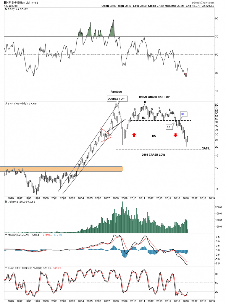
Then we have some of the really big miners that are taking on at least a intermediate term bullish look. Below is a daily chart for BHP which broke out from an inverse H&S bottom last Friday.
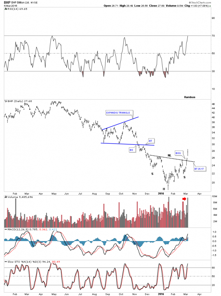
Again like alot of the PM stocks this monthly chart for BPH shows it’s bouncing off of its 2008 crash low.
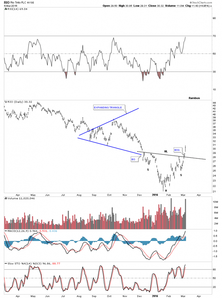
The daily chart for RIO shows it broke above its neckline last week as well.
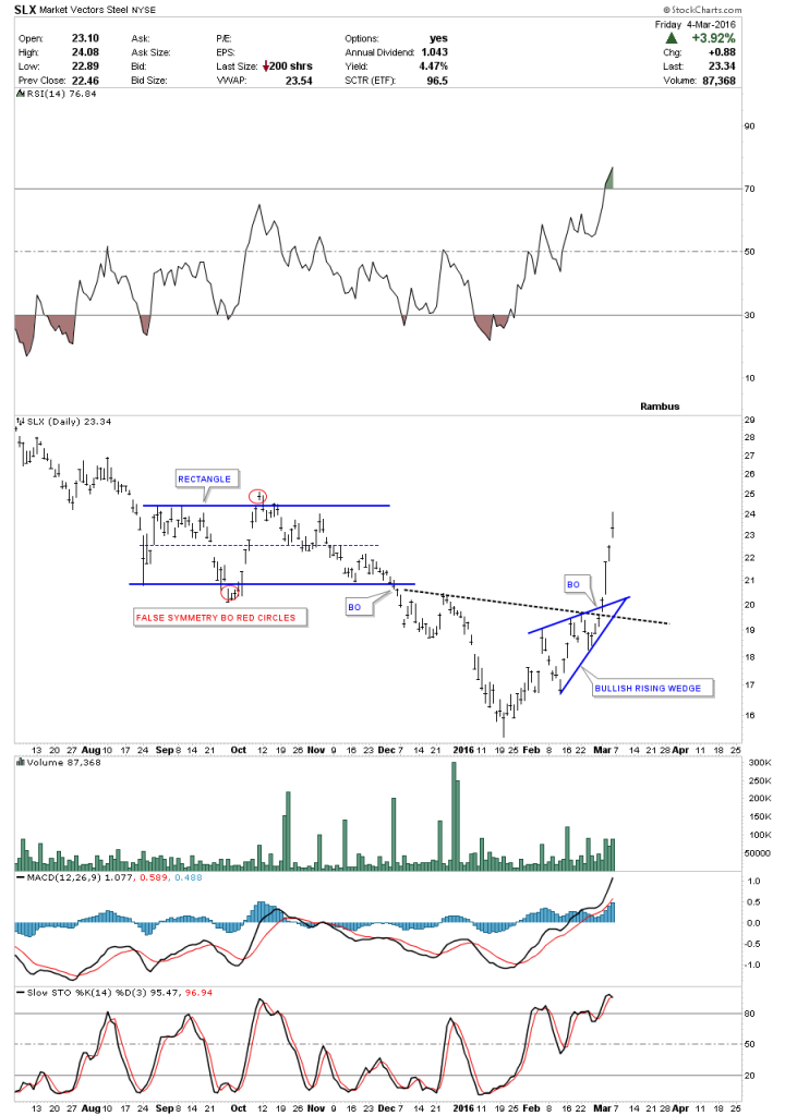
The daily chart for the SLX, steel etf, broke out from it bullish rising wedge last week.
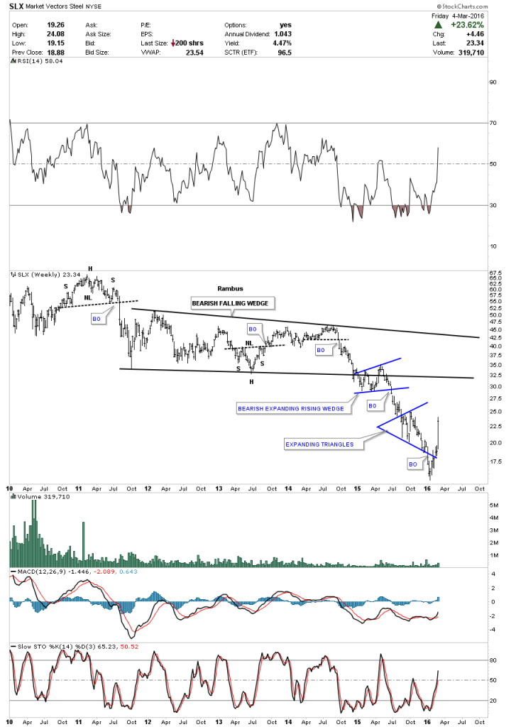
The five year monthly chart for the SLX shows its bear market that began like most commodities and the precious metals complex in 2011.
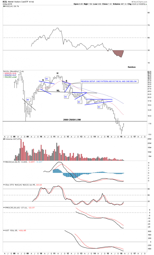
It will be interesting to see what KOL, coal eft, can do at its 2008 crash low.Will it find resistance or will it build out some type of reversal pattern?
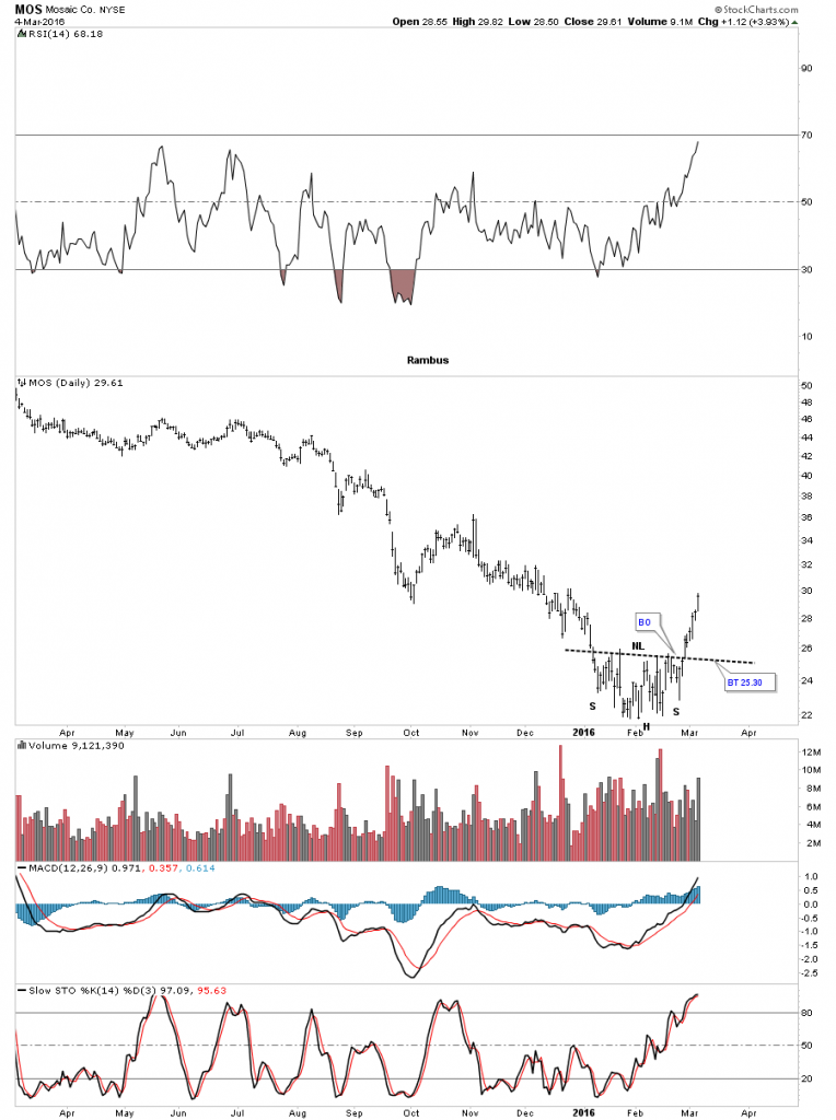
The daily chart for MOS shows it broke out from an inverse H&S bottom the week before last.
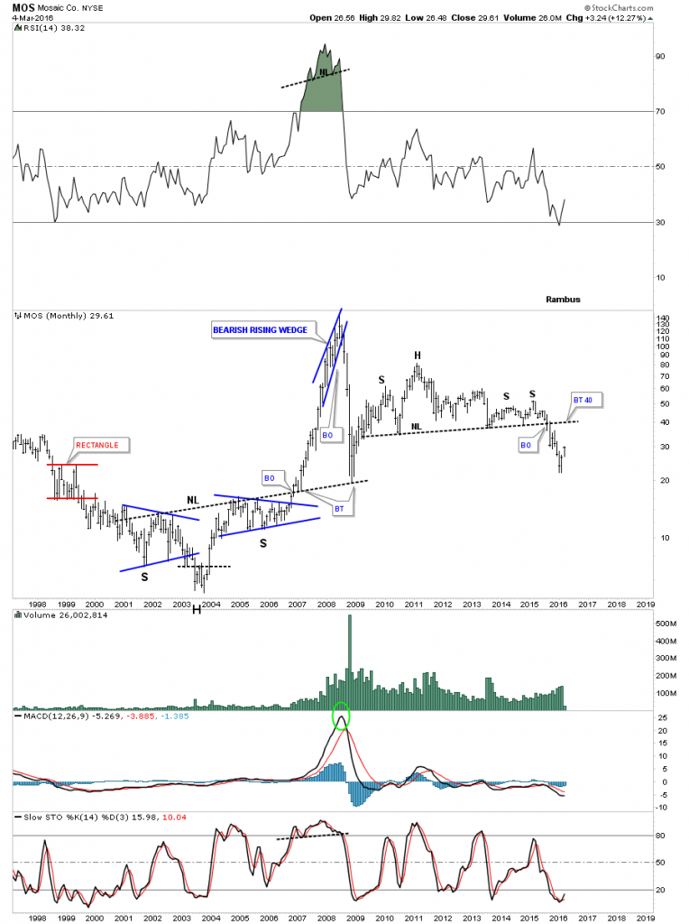
The long term monthly chart for MOS puts this stock in perspective. As you can see it built out a massive unbalanced H&S top reversal pattern. For the time being this move we’re getting right now may only be a counter trend rally back up to the neckline around the 40 area. Again the big question is, are we seeing the end of the commodities bear market and the beginning of a new bull market in this sector?
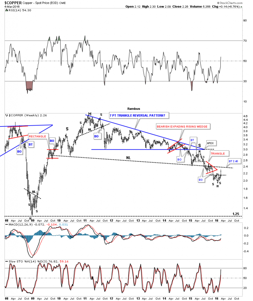
Looking at the daily chart for copper we can see it broke out of an inverse H&S bottom last week.
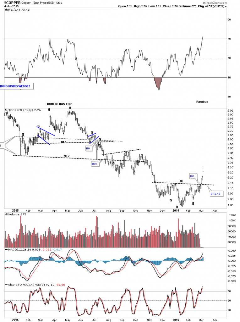
To put things in perspective we need to look at a longer term weekly chart which shows the small inverse H&S bottom, on the daily chart above, forming at the bottom of the bear market that began in 2011. What this weekly chart also shows is some serious overhead resistance that will show up around the 2.40 area.
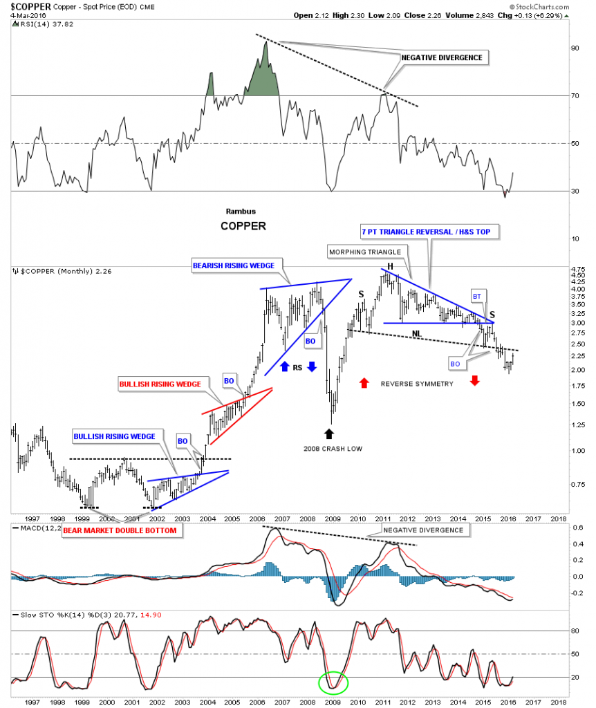
The very long term monthly chart for copper really puts things in perspective. I’m using the neckline as my line in the sand. Below is bearish and above is bullish.
So the big question is are we seeing the very beginnings of a new bull market in this sector or is this just another counter trend rally in the ongoing bear market? We just need to follow the charts for the answers. If this is more than just a counter trend rally what does that mean for the INDU which has several basic materials stocks in it? Eventually we’ll get our answers on the longer term status for this sector but for the time being it looks like we’re seeing at least a counter trend rally that may or may not be the beginning of a brand new bull market.All the best…Rambus
Disclosure: None.


