
A Better Way To Gauge Housing Affordability

It’s official — house prices are now as high as they were at the bubble peak in 2006 according to the S&P/Case-Shiller 20-City Composite Home Price Index. Moreover, Americans believe they will continue to soar, according to an article by Quentin Fottrell at MarketWatch. That makes sense from the perspective of behavioral finance. People often extrapolate recent price movements into the future, which contributes to plenty of misjudgments and sometimes bubbles and crashes.
Does all this mean prices are now in bubble territory again? It’s not so easy to say because a bubble is hard to define. But it sure looks like prices are expensive on some reasonable metrics.
First, it has taken 12 years to regain the 2006 bubble peak. That’s a reasonably long period of time. Also, if prices are indexed to 100 in January 2000 and the index is a 209 now, that means home prices have appreciated around 4.1% annualized. That doesn’t seem like a crazy rate of appreciation, but the problem is that inflation, measured by the CPI has increased by 2.1% over that time. And median household income has increased by 2.2% from 2000 through 2016.
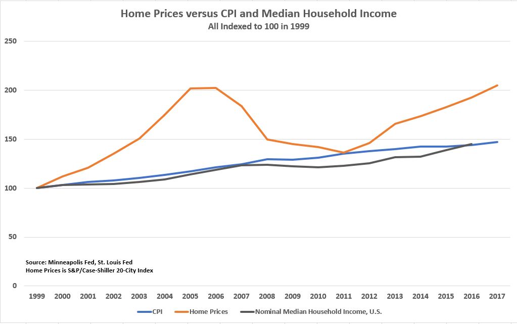
One problem with this analysis is that the 20-City Index might be weighted more heavily to areas where people’s wages are increasing at higher rates than the median. The U.S. economy is bifurcated now so that people living in the 20 cities in the index might be doing better than people in the rest of the country. The 20-City index contains New York and San Francisco, after all. Also, at least some of the cities in the 20-City Index suffer from severe supply constraints due to onerous zoning regulations.
New Approach to Measuring Affordability
Not only is measuring median prices to median income across the country inadequate, but so is measuring those things in a particular area. Median income and prices don’t capture the full distribution of incomes, and they don’t focus on renters specifically – those best positioned to become first-time home buyers — according to a recent study by the Urban Institute. Nor do median numbers capture the full distribution of home prices. In some areas, for example, there is a wide variety of homes available, but in other areas, there is only a narrow set of home types available. Additionally, focusing on renters is important because renters typically have lower incomes, making them less able to afford a home than the median family.
The Urban Institute’s study creates two new affordability indexes called HARI or Housing Affordability for Renters Index, one for local renters and another for measuring housing affordability for nationwide renters who may move to a region. A local index number means that percentage of local renters can afford to buy a home in that area. Local indexes range from 5% to 37%, while the index covering all renters in the nation ranges from 3% to 42% depending on the region to which a renter might move.
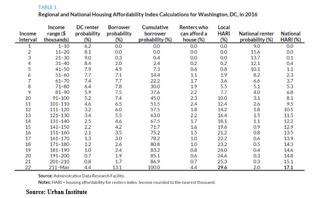
Using Washington, D.C. as an example, the paper shows the steps in the methodology. First, renters’ incomes are broken down into 22 intervals of $10,000, and the percentage of the renter population is indicated for each interval. In DC, more than 40% of renters have incomes in intervals of 1 through 6 or $1 through $60,000. By comparison, 15% of new borrowers have incomes in that range. In interval 7, (incomes from $61,000 to $70,000), the share of renters versus new homeowners with a mortgage is similar. In intervals 8 and above, the percentage of renters is less than the share of new homeowners.
Next, borrower probability for each interval level is aggregated to get cumulative mortgage borrower probability. At each income level, the aggregated number represents the share of houses affordable to renters with that income. So income level 10 ($91,000-$100,000), represents 5.2% of DC renters, and those renters can afford 45% of DC homes that have recently sold. Finally, an aggregate of the share of renters who can afford a house in each income interval is aggregated to arrive at the affordability index. For Washington, D.C in 2016, it was 29.6%, meaning 29.6% of renters in DC could afford a house in DC in 2016.
Nationwide renters have lower incomes than DC renters (70% of nationwide renters have incomes in intervals 1-6, compared to 40% of DC renters). And because of this income difference only 17.1% of nationwide renters can afford a house in DC.
Using St. Louis, Houston, San Francisco and Washington, D.C. (two cities that are intuitively more affordable and two cities that are intuitively less affordable), the new indices show that new borrowers are likely to have significantly higher incomes in the more expensive cities. St. Louis has peak borrower probability of 12% at income interval 4, while San Francisco has peak borrower probability – a little over 5% — at income interval 14.
But the affordability index isn’t determined only by incomes of local new borrowers. That statistic is combined with the full distribution of local renters’ incomes to see if renters earn comparable incomes to borrowers. In St. Louis and Houston, most renters fall in the first 10 income intervals. But in the more expensive cities, there are more renters at higher income intervals.
An interesting result from the study is that “cross-sectional investigation shows that the MSA-level indexes vary less than many might expect.” In other words, the difference between the most unaffordable city – Los Angeles, where 18% of renters can afford to buy – compared to the most affordable – Phoenix, where 31% of renters can afford to buy – isn’t that great. Another surprising result is that Washington, D.C. is more affordable (29.6% affordability) than Houston (22.4% affordability) when considering local renters only. Does this also indicate income and wealth bifurcation? The authors don’t say, but it is a surprising statistic.
There is more to the paper, including a comparison of current affordability to affordability in 2005. That comparison is mostly flattering to the current market, and it may have been better for the authors to consider another point of comparison given the strange market conditions in 2005. Nevertheless, these new affordability indices convey a much deeper and more complex reality compared to, say, the rosier National Association of Realtors’ Affordability Index, which has current affordability at over 100 (meaning median income can afford the median home assuming a 20% down payment) in every region of the country.


