
My Favorite Way To Analyze Charts

There is not a best scientific approach to investing that works 100% of the time, but there are some measurement techniques that are pretty darn close. One of these techniques was first introduced to me when I worked as a stock trader and was highly exposed to technical analysis. Our investment team had a meeting with one of the most revered economists from Oppenheimer Funds, who explained his scientific approach in using the 150-day moving average on stock charts to determine the optimal buy and sell positions of a stock.
Carter Worth is one smart cookie: he is an American financial analyst and stock market strategist, and he is a seven-time member of institutional investor's All America Research Team. Ultimately, he rose to prominence in the investing world thanks to several well timed market calls the most noteworthy being one of the first analysts in print to call the beginning of the bear market on November 9, 2007. He is frequently a guest on CNBC and usually makes calls on how the different stock indices are doing using a valuation technique that he developed.
This approach is very simple to use and understand, and is particularly great for new stock investors.
The 150-day moving average results when you take the closing price of a stock for the last 150 days and come up with an average that can be charted with a stock’s price. In theory, this should be a linear trend showing a consistent slope upwards for a stock. Since it lies between the 50-day and 200-day moving averages, it provides an average of these points too. The idea is ultimately that the stock’s chart will always “revert to the mean.” Meaning that the stock price of any stock or any market chart will always pull back to the 150-day average (mean) after it strays too far in either direction. If a stock is trading far away from its 150-day moving average, it should be sold before it pulls back. If the stock is below its 150-day moving average, it should be bought before starts rising again. This is a great strategy for traders and has been tested through a variety of conditions over the past few years, and the results have been pretty consistent. Here are a few examples of charts that demonstrate how a stock’s price moves around the 150-day moving average. These are charts for Target (TGT ), Delta Airlines (DAL), and Microsoft (MSFT), in that order.
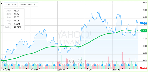
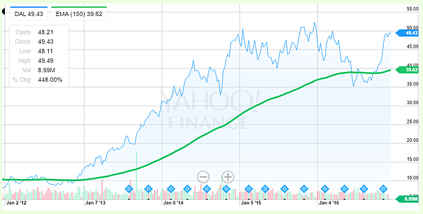
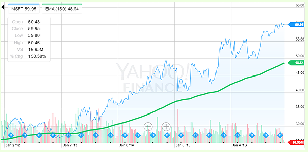
It should be noted, however, that many factors go into changes in the price of a stock that the 150-day moving average will not account for; earnings, corporate announcements, mergers, acquisitions, divestitures, bankruptcy filings, additional share issuance, or other major market specific changes can cause dramatically wild swings in the price of a stock. This is the risk you take for using this technique in the short term. However, if you are a long-term investor and are buying and holding shares for the sake of your retirement account, this is a great technique for all investors to use as part of their analysis process.
Disclosure: If you're a parent, you can check out a few ways to more


