
Hewlett Packard: An Introduction To Statistical Indicator Analysis (SIA)
In Hewlett-Packard: Should You Buy, Hold, Sell Or Short The Stock?, I analyze the quantitative and qualitative aspects of Hewlett Packard (HPQ) using my unique free cash flow system. In the present article, I introduce a new system that I have been working on that has to do with technical analysis. I call it “Statistical Indicator Analysis” (SIA). Since TalkMarkets.com welcomes articles on technical analysis, I will devote many of my articles at TM to SIA.
Investors should try to verify investment decisions by using a variety of different methods. Much of my success as an investor has come from using free cash flow analysis. By using such ratios as Mycroft Free Cash Flow per share, Free Cash Flow Return on Invested Capital (FROIC) and CapFlow, I established a solid methodology for identifying strong companies selling at attractive prices. These ratios are explained in the article linked above and in the introduction to my book (here: “Mycroft’s Blue Book Stock Guide.”)
I have never really had a problem identifying what to buy or when, but have always struggled with when to sell. I hate to lose money and thus tend to sell once a company hits a certain level of Price to Mycroft Free Cash Flow per share, or for example, has its FROIC go from 20% to 5% in a given year. In business, my company’s motto is “Capital Appreciation through Capital Preservation.” I don’t mind going to large positions in cash when negative catalysts are everywhere (October 2008) or going fully invested when positive catalysts are everywhere.
Security analysis is very complex subject. Some investors do little or no research at all when they buy and just invest in Indices as a one shot investments or throw caution to the wind when they get a supposedly good stock tip from CNBC or a friend. Also if a stock that I own gets included in an index, its fortune then gets linked to that index. Basically it’s all about money flows and as an investor, if you get caught on the opposite side of an outflow from an index, your stocks could get seriously affected, even though the fundamentals of the company are sound and the management has proven itself competent.
The actions of the market are mostly due to investor behavior or panic on the upside or downside. This was clearly the case in 2000 when the dot com Bull Run burst or in 2008 when Lehman filed for bankruptcy. When panic erupts, things tend to move to extremes and are clearly shown throughout history in both Bear and Bull Markets.
So though we have done all our research and feel confident that we are in the best stocks, if panic erupts, then unfortunately we will go down just like everyone else and this proves why most money managers cannot beat the Indices. In the end we are just one investor in a sea of investors and though we may have the best stocks, in a panic we will suffer as well.
In order to avoid getting caught in this sea of panic, I have come up with a way to gauge it. My method, as alluded to in the first paragraph, is Statistical Indicator Analysis. Before I explain how it works, I will just give you a little preamble. Prior to the formation of the Security and Exchange Commission, corporations were not required to give out details on their internal finances, such as balance sheet, cash flow and income statements and all the investor had to rely on was price data. Unless you were an insider in the company, you never had the opportunity to look at “the books” like we can today.
So price action in the market was all that was in the public domain and that data is what I call “Statistical Indicators” or what investors as a whole thought the true value of the company was worth. From this data, what we know as “Technical Analysis” was created and theories were formalized for short term analysis of the markets. The problem with Technical Analysis is that it is geared to traders, who look for short term movements to make trades. But if you go out further than 200 days, Technical Analysis is of little use.
In creating “Statistical Indicator Analysis” I have broken out of the short term limitations of technical analysis and created what I believe to be a solid base for analyzing market sentiment and investor behavior. What SIA does is run a moving average that plots the average of 3650 trading days at a time, but not days on a calendar - for example 10 years, but actually 3,650 trading days, where the markets were open. I have experimented with 1 year, 3 years, 5 years etc. The number that has worked best has been 3,650 trading days.
Here is my SIA Chart for Hewlett Packard.
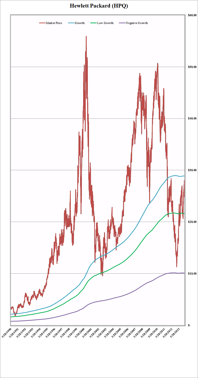
The red line is the daily price action of the stock and the blue line (SIA line) is its 3650 trading day moving average. The farther a stock trades above its SIA line, the greater the risk to the investor. The greater the stock trades below its SIA line, the greater the opportunity for gain.
This system is designed to assist the “Deep Value Investor” and concentrates on three levels of growth:
1) Growth
2) Low Growth
3) Negative Growth
The “Growth” level is the actual SIA result or 3650 trading day moving average and I consider that a key level because when a company’s stock price breaks below that number and then resurfaces it usually means that it may be in the initial stages of growth again after it forms a “V.” This “V” is a strong signal that deep value investors have started to invest, and in the process are working toward forming a bottom in the price action.
At the other extreme, when an “upside down ^” formation occurs, such as what happened in the year 2000, it signals a top, usually followed by a large selloff, usually driven by investor panic. The stock price of Hewlett Packard at that time is a perfect example of what happens when a company’s stock price goes farther and farther above its SIA or Growth line.
When a company is having problems on Main Street it usually shows up after the growth line is broken on the downside. Then we enter a period of “Low Growth” and if things get really bad and the company ever gets down to my “Negative Growth” level, then either the company will go out of business or get serious as this level is 75% off its SIA. Low growth, on the other hand, is equal to is equal to 25% off its SIA. At the other extreme, in a company that trades for 500% or 5 times its SIA, it’s usually a strong signal to short it. On July 7, 2000, HPQ was trading at 556% of its SIA and then proceeded to fall -83% over the next three years until it hit the low growth marker before turning around. It originally attempted a brief recovery when it hit its SIA level, but the knife continued to fall.
In recent history we almost had HPQ completely run off the rails as it almost hit our negative growth indicator. Therefore the true deep value investor must wait for the “V” to form before buying. With HPQ presently approaching its growth (or SIA) level, it is at a crucial point.
In conclusion my Statistical Indicator Analysis system is can be used for anything that trades, including commodities, ETF’s, and Indices. It can give you a good indication of where the markets are at any given point in time. Here is an SIA Chart of the S&P 500 Index.
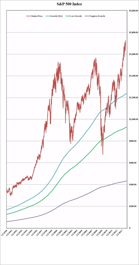
At the top in the year 2000 we were trading at 271% of our SIA and right now we are at 144%. In the crash of 2008-2009 we hit a 37% discount to our SIA and then a sharp “V” happened. Technical analysis can provide key indicators for investor euphoria (2000) and investor panic (2008-2009).


