
Stock Risks To Watch: Choose Your Bear Market Dashboard
Ya gadda have a praaacess
- British porfolio managers mimicking their American colleagues
When long ago, a former employer sent me to London to join the other Americans, or mostly Americans, building out its U.K. office, my job was to create a process. In institutional asset management, process was the American way. For sales presentations and especially dealing with investment consultants, you needed process charts that showed information flowing this way and that and, ultimately, morphing through its travels on the page into repeatable investment decisions. Those charts proved your legitimacy as an institutional manager—regardless of whether they described your actual decision making, they let the community know that you weren’t just a “bunch of gunslingers.” Essentially, you couldn’t build a business without your process charts.
But British consultants were different. They didn’t care so much about your process as they wanted you to knock them over with flair. They wanted imagination, story-telling, charisma. The process charts in your pitchbook didn’t matter as much as the command in your voice. In London, gunslinging was nothing to be ashamed of, as long as you slung with style.
So it all came down to process versus flair. Along with baseball caps and mismatched accents, the clash of cultures depended on which of the two qualities was deemed most important. And along with the accents, in particular, the contrasting approaches explained mimicry performed by amused Brits when the conference room door was comfortably shut or when the pub was crowded enough that voices didn’t carry. Ya gadda have a praaacess.
So today, I give you what else but a few pieces of process. Not a complete one, not even close, but I’ll share two dashboards that compare current stock market conditions to the conditions that shaped past market cycles. The dashboards can support your portfolio decisions, in my opinion, regardless of whether you’re a process Kool-Aid drinking septic or a flair fancying Anglophile. (For the same approach applied to the economy, see “Here’s a Strong Signal from the Economic Dashboard.”)
VCURVE, Redux
I’ll start with an indicator that combines monetary policy and inflation risks. By wrapping the two risks into a single indicator, I can approximate where the Fed stands versus the curve, as in whether policy is ahead of the curve, behind the curve, or somewhere in between. Here’s the calculation:
- From the current fed funds rate, subtract the lowest rate since the last market correction.
- Add the change in inflation over the past twelve months
The “VCURVE” indicator is highest when the Fed tightens aggressively but inflation is rising, suggesting policymakers are behind the curve. But the indicator can still flash a warning when just one of the two major risks—policy risk and inflation risk—is elevated. As discussed in my last article, VCURVE spiked upward before or during all S&P 500 (SPY) corrections over the last sixty-four years, although with a growing number of head fakes once Alan Greenspan introduced the Fed put. Here’s a chart I included in the earlier article, which shows all instances of the S&P 500 correcting by more than 10% and for longer than one month:
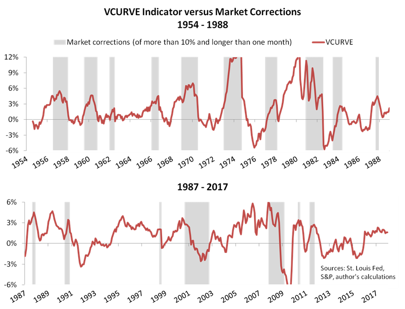
As you can see, VCURVE correlates strongly with stock price cycles from the mid-1950s to the 1987 market crash, and then less strongly but still significantly over the last three decades. This article covers the last three decades, when VCURVE began serving more head fakes. After Greenspan’s aggressive 1987 crash response and then reinforced by occasional plunge protection thereafter, stocks have often powered through policy and inflation risks, continuing upward despite rate hikes and CPI volatility. In fact, my dashboards will show that bull markets have persisted until something breaks, each dashboard showing a different type of breakage.
The Pre-Recession Plunge
We’ll look at the first “breakage” example in Dashboard 1, where I compare today’s fundamentals to the fundamentals that sunk stock prices during three episodes of credit market and real economy turmoil. The economy fell into recession in each episode, following a pattern that’s as old as bank loans. First, one or more economic sectors ran into difficulties that led to a jump in loan delinquencies or bond defaults or both. Those delinquencies and defaults may have seemed contained at first, but they soon impaired bank balance sheets and depressed credit conditions. Business earnings weakened alongside or shortly after the deterioration in credit conditions, and, if housing was among the leading sectors as it often is, real house prices fell.
We’ve seen three such “pre-recession plunges” during the last thirty years—namely, the corrections or bear markets of 1990, 2000–2 and 2007–9. Here’s the dashboard comparing the three plunges to present conditions:

While the data shown in Dashboard 1 is imperfect (for example, mortgage delinquency data doesn’t fully capture housing finance insolvencies in 2007, which were concentrated in the structured credit space), I’m comfortable with four observations:
- The latest VCURVE reading of 1.4% remains below the readings that tend to predict bear markets. (See here for historical thresholds.) So VCURVE isn’t predicting a market top just yet, but it does bear watching as the Fed continues to raise rates.
- Delinquency and default rates are non-threatening in the sectors most likely to affect stock prices, notwithstanding a recent wave of energy company defaults, which is fading as oil prices rise.
- Credit conditions look nothing like they did in mid-1990, mid-2000 and late 2007. Spreads for BBB bonds are within twenty basis points of their lows for the millennium, and bank lending standards are mostly benign.
- Neither S&P 500 earnings nor house prices show signs of an imminent recession.
All things considered, a pre-recession plunge seems unlikely in early 2018, but stay tuned— the fundamentals depicted in Dashboard 1 will certainly change during the year.
The Credit-Contagion Contraction
Removing the three plunges from the six S&P 500 corrections of the last three decades, there are three corrections left. You might recall that the correction in summer 1998 followed Russia’s bond default and the hedge fund Long-Term Capital Management’s near-collapse and bailout. In that instance, the credit market clearly led the equity market, as in the three plunges discussed above.
The other corrections began in April 2010 and April 2011, respectively. In each case, stock prices dropped before anticipated pauses in the Fed’s QE programs, suggesting the bull market may not have been established enough to survive without central banker support. But the 2010 correction also included a flash crash, while the 2011 correction included Standard & Poor’s downgrade of U.S. federal government debt from AAA to AA+. And just as importantly, both corrections breached 10% thresholds near critical points in the Greek debt crisis—EU leaders approved the first Greek bailout in May 2010 and then agreed a second bailout, although subject to austerity measures, in June 2011.
So, with 1998, 2010 and 2011 corrections overlapping breakage in the world’s debt markets, I’ll include them in a second dashboard that considers credit contagion:
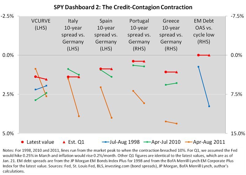
Unfortunately, Dashboard 2’s predictive power is limited, for two reasons. First, credit events sometimes arise without much advance widening of the spreads depicted on the chart. Second, the chart only includes sources of contagion that were most obvious in 1998, 2010 and 2011. If the next market-rattling credit event occurs suddenly in, say, the U.S. municipal bond market, Dashboard 2 won’t be especially helpful.
All that said, it’s notable that spreads in many markets—Portugal, Greece, and many issuers in the emerging market debt indices—fell to post-2010 lows in recent weeks. Credit risks may be building as governments and businesses continue to add debt, but they appear less immediate than before any of the 1998, 2010 and 2011 credit-contagion contractions.
Conclusions
The above dashboards are useful, in my opinion, for checking current conditions against past markets. As of today, they help demonstrate a “virtuous” loop of mutually reinforcing strength in risky assets and the global economy. I recently predicted, looking as far ahead as I think is reasonable, that the loop will keep the economy humming until at least mid-year and will probably support the bull market in stocks through the first quarter.
But my outlook carries risks, as usual. Stocks are clearly overbought, and they might have priced in greater benefits from the GOP’s tax cuts than businesses will actually realize. (See, for example, this analysis by Morgan Stanley and ZeroHedge.) If present trends continue, the rise in government bond yields might also weigh on stock prices, as happened before the market tops in 1990, 2000, 2010 and 2011. And perhaps most importantly, we’ve yet to hear Jerome Powell field a question about stock prices as FOMC chairman. If investors detect any hint that there won’t be such a thing as a Powell put (see herefor discussion), stocks would be more vulnerable than the above dashboards imply. In that scenario and certain others, we might learn in hindsight that you would have needed to use your imagination to predict the next bear market. After all, you can’t just rely on process—you might also like to show some flair.
(Thank you for reading. For more background on the economic thinking behind our research, see my book Economic for Independent Thinkers.)
Disclosure: I own stocks within a diversified portfolio.


Very interesting analysis, I tend to agree that stocks are over bought but I believe in sticking with a trend until it breaks.